 I’ve been really enjoying using my 6 colour Foundations palette this year. This palette lives in my ‘local’ bag which means that I use it for my daily coffee and sketch outings. A few weeks ago I did a further colour chart which I want to share with you today.
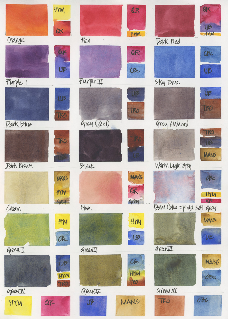
Previously I did the usual grid colour chart and while this was really fun to do (particularly at the large size thanks to the 11×14 sketchbook I was using at the time) it doesn’t immediately help me in my day to day sketching. When I’m out of location and I want to use a specific colour quickly I need to already know how to mix it and do it efficiently. In a limited palette of 6 colours, I often need to use 3 different colours to achieve the hue I want.
And so I created this chart to document the common colours I want to mix and the order and approximate proportion of each colour. Not only is this a better ‘quick guide’ to carry around with me (if I needed to do that) but the act of creating it recently cemented in my mind how to quickly achieve the mixes I want. So this is the type of colour chart that I highly recommend people to do! 🙂
BTW these are the colours in my 6 colour palette:
DS Hansa Yellow Medium PY97
DS Quinacridone Rose PV19
DS Ultramarine Blue PB29
DS Monte Amiata Natural Sienna PBr7
DS Transparent Red Oxide PR101
DS Cerulean Blue Chromium PB36
More about the selection of these six colours can be found here.
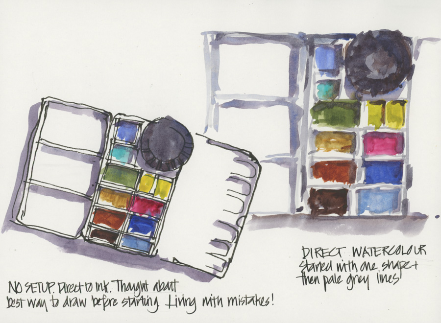
Finally, earlier in the week I shared this sketch of my 6 colour palette… with a few more pans in it.
This is what it now contains:
- a mixed green and a mixed grey for convenience
- Cobalt Turquoise Light (WN): my favourite paint and one that can’t be mixed
- Cobalt (DS): added mainly because of its pigment characteristic
Both of these extra colours haven’t actually been used yet… but I just feel better having them on hand!
If you have any questions please ask them in the comment section below.
(If you are reading this via email, please click on the article title link below and add a comment on my blog. Thanks!)


19 Comments
you offer up such great information, Liz. Thanks so much for sharing this process and concept with us — I appreciate the way your heart gives, as well as the way your mind thinks!
Thanks Cathy. I love sharing!!!
Hi Liz, this was very helpful. It is so good to get reminders to 1. slow down 2. Look at your materials 3. Play 4.Reflect Thanks for all the work you do and make available on your blog.
Glad it was helpful and agree with your points. Thanks Judy.
This is the most helpful color mixing chart I’ve seen. showing the approximate amounts of the mixing paints is brilliant. Thanks for this!
My pleasure Barbara!
I love the six color palette, but I find I still must reach for the Cobalt turquoise light. There really is nothing else like it! The mixing chart with proportions is a great tool!
Yes Jamie. Can’t live without CTL 🙂
Genius! I just swatched my best (first) imitation and learned a great deal. If I’m reading them correctly, the little recipe keys give an indication of juiciness as well as proportion? Anyway, by taking them that way, I obtained not bad results from my first go. As I was doing so, I found it easier to imagine where I might use each mix – as compared to the all-perms-and-coms mixing grid. Just brilliant.
Hi Barbara. Yes the recipe is designed to show the amount of pigment in each mix – eg. grey vs black swatches.
I have been well pleased with St. Petersburg watercolours–they have been good value for money, and I eventually worked out a palette to my liking. But in view of the current international news I feel obliged not to purchase any more. That’s a shame.
Hi Alan, I’m also a fan of White Nights colours, but decided to not to purchase them any more for the same reason as you did. There’s actually an Ukrainian brand called Rosa Gallery, that I’ve heard good things about and is in the same price category. However, their future is uncertain. So I think I’ll be shifting to Schmincke, that is fairly local to me once I’ve used my old stock. Good luck with the transition!
Hi Liz,
Thank you so much for your generosity, expertise and sharing. Your brain amazes me on a regular basis! Your color chart is beautiful and I plan to do one today. The percentage of each pigment will be so helpful. I’m especially intrigued with the mixed greens because I’m a fan of foliage. I’m loving foundations and onto watercolor next! Thank you for all of your hard work and sharing it with us.
Hi Liz, great info! One question about cobalt blue: what characteristics do you mean are so special about cobalt blue? Is it because it is a primary color? Or are there more great things about it? Thanks!
Hi Liz,
And what difference, please, between Cobalt blue and Ultramarine blue ? They look so similar…Thanks for all.
Hi Veronique – thanks Frieda. More in this article which also explains how I use them for different purposes
https://www.lizsteel.com/colours-in-my-palette-blue/
Cobalt blue is less granulating and more of a mid blue. Not much red in it (warm) and not much yellow in it (cool). I hope this helps.
Hi Liz, thank you for this exercise. It’s been helpful. I wanted to ask after the grey you listed in some of the mixes. Which grey is it? One looks like the grey from warm light grey mix but I’m not sure about the other one.
Hi Li – I mix grey using TRO and UB adjusting the blue vs brown depending on whether I want it cool or warm. And if I want it yellower – I add MANS.
NEWSLETTER
Subscribe for first notification of workshop + online classes and more.