After a few weeks off (for Oneweek100people and my sabbatical week) I am ready to wrap up the Foundations course and get ready for opening the doors to Edges again.

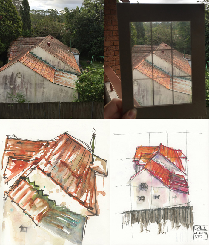
Last time (Lesson 9) I drew a version of the house next door using a viewfinder and compared it with an earlier sketch drawn by eye with no measuring. I asked for feedback and got lots of interesting comments, which I would encourage you to go and read now.
I will now share a few comments as it ties in directly with what we will be looking at this week.
- In essence, the first sketch was done as a ‘very quick, end of the day, wind down’ type of sketch. Little thought went into it and the main agenda was simply playing with paint and the texture of the roof.
- The second sketch, using the viewfinder is more accurate, shows dramatic foreshortening and sets the roof more in context (as it includes the wall and fence).
- Note: both are aerial views as I am standing on a balcony looking down to a single storey house downhill.
- Although the viewfinder sketch is more accurate in terms of perspective I feel as if it is too distant – it doesn’t actually create an impression of how dominant the roof is when I look out from my balcony.
Summary: So although the first sketch isn’t as accurate and doesn’t have any context, I much prefer it as it better describes the view and my response to it. It tells the story that I wanted to record.
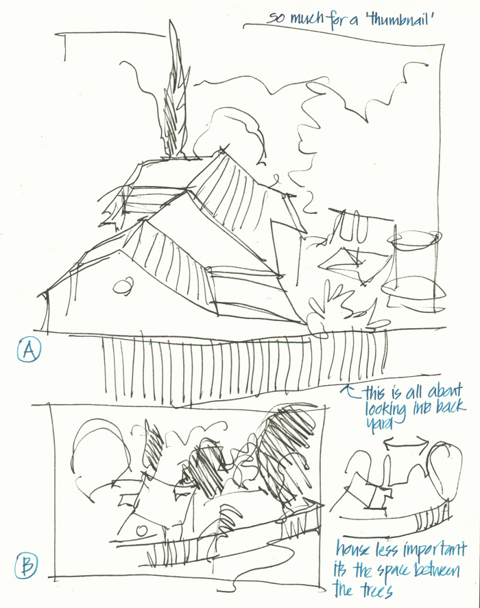
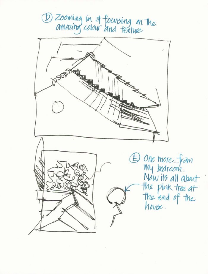
This is a perfect lead-in to the topic of Lesson 10 which is all about creating a focus, looking for a story and using thumbnails to explore a few options. Last year I wrote a detailed article specifically about how I use thumbnails (more reading for you), but today I simply want to share a few different versions that I explored from the same spot.


 Once again I am not going to analyse my thumbnails, but simply share my messy sketches as they are.
Aside: I really love doing these working drawings as they are the closest to architectural design. I don’t miss much about the architectural career I have left behind, but I do miss designing, so doing these kind of sketches makes the architect inside me very happy.
Which version (A- E) do you think I should work up into a proper sketch?


12 Comments
Liz – your post today was a great example of the difference between when we are drawing for ourselves to capture an idea or a moment vs. when we are drawing something we know others will see, and perhaps judge. I really liked your thumbnails, and I’m certain that for you, there is a kernel of an idea in each of those that the rest of us will never know – because it is a way of putting down what your mind is seeing on paper.
I much prefer the initial sketch, its looser, more vibrant and interesting. As a professional photographer, I’ve spent my life looking through viewfinders. I want to sketch my own interpretations, and not necessarily what is really “there”.
Hi Liz!
What a terrific post! I find it so helpful to see inside this process because so often get lost when I contemplate sketching on location. I love C because the view includes the context of your home and communicates a sense of place. I also like E because the pink tree is an unexpected and ephemeral focal point. Can’t wait to see more!
With love,
Tara
I love D!
I like C – the focus is the view and the balcony framing it emphasizes that. Maybe a series starting with C and the others as variations!
I like A – it’s got movement in it – and I know that the pink tree will be in there too!
The pink tree. The structure doesn’t appeal to me.
I would vote for thumbnail C, the diagonal line at top, the diagonal balcony lines at bottom, the emphasis on the roof, and the sky view in the upper right corner make this one attractive to me. I love the colors that you did on the spontaneous painting in Lesson 9, here in C it seems you have framed the red roof and made a bigger picture out of it.
They are all good but I think I am drawn to “C” the most.
Hi Everyone – thanks so much for your comments! It’s great to hear all your preferences. I think that I just MUST do a version with the pink tree since this is seasonal. Will see what comes out on the page… hmm, a good lead in to Foundations Lesson 11! 🙂
I really enjoyed this post and the timing is perfect – I’ve been pondering those big art ideas like ‘expression’, ‘feeling’, ‘realism’ and I want to be telling a story in each painting, but I’m …. scared. Barns are much easier than stories. I’ve also been fighting with the ‘what Should it look like’ instead of ‘what do I Want to make it look like’. Artist growing pains.
I like C the best, it was how you brought the outdoors inside, and I like the unique way your balcony creates the frame naturally.
NEWSLETTER
Subscribe for first notification of workshop + online classes and more.