Today I finally get a chance to discuss my favourite group of paints – the earth pigments!
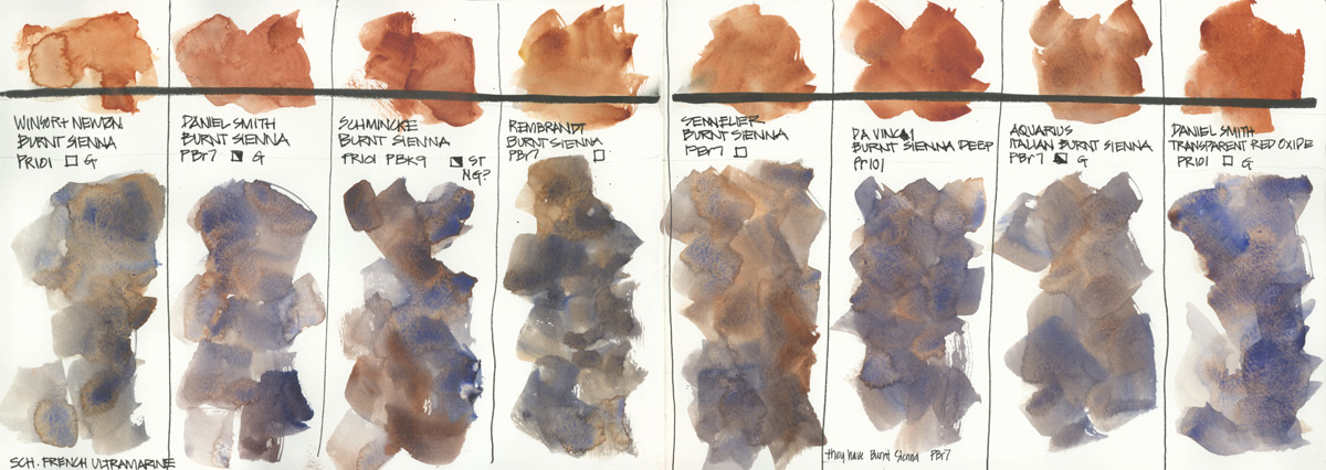
In fact, it was earth colours which started my journey into the world of pigments many years ago. Because of the difference between Daniel Smith Burnt Sienna (PBr7) and Winsor & Newton Burnt Sienna (PR101) I began to look at pigment numbers and explore the Handprint site. I shared this ‘pigment story’ and some of my early colour books inside a special Pigment Characteristic Bonus Lesson which I recently added to my SketchingNow Watercolour course. This page was done for this lesson and shows the difference between Burnt Sienna in a few brands.
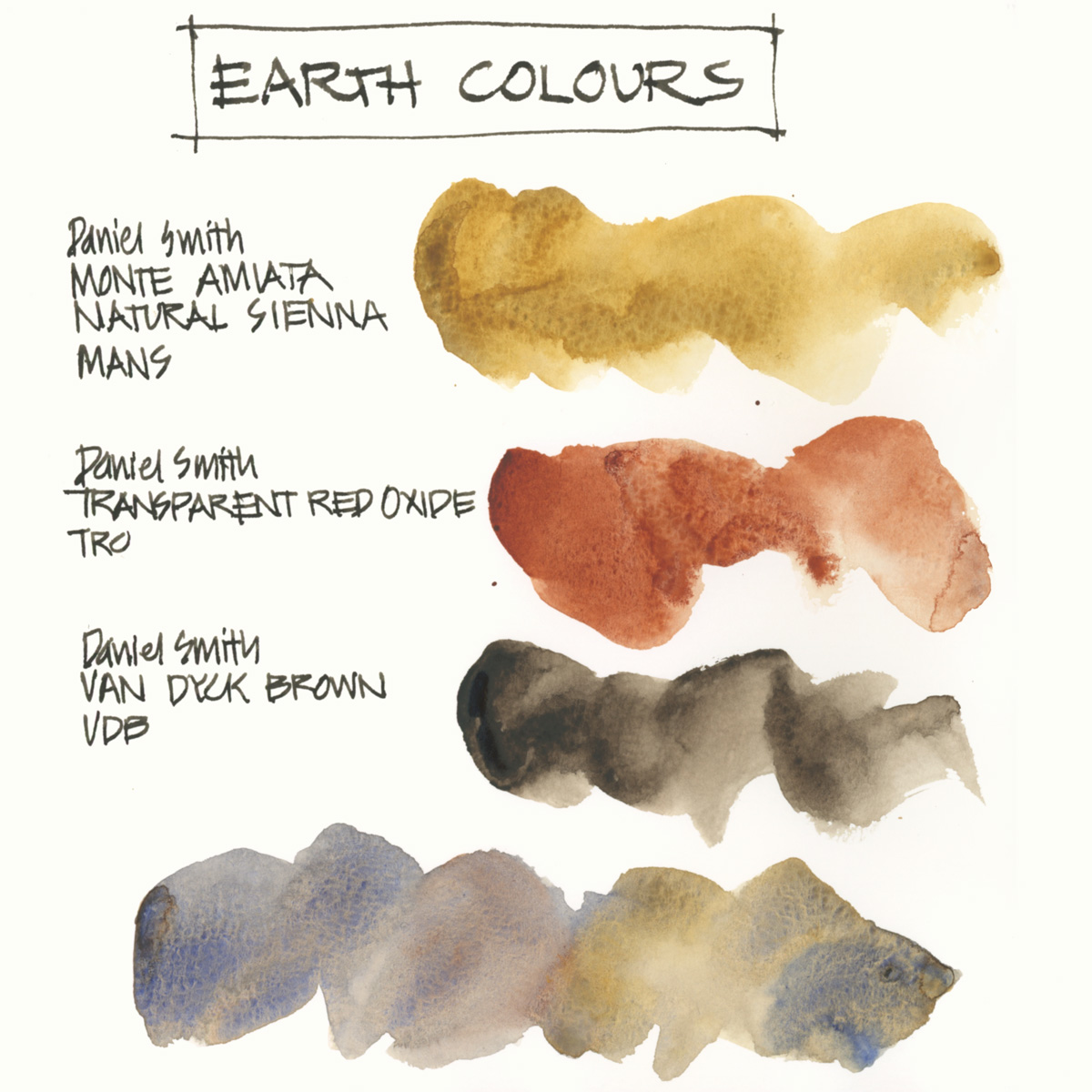
Once again my selections are non-standard! So here are a few general comments about my earth selection.
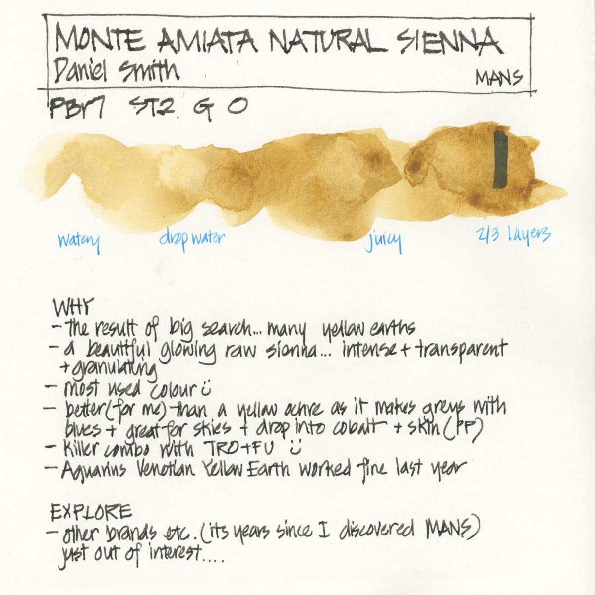
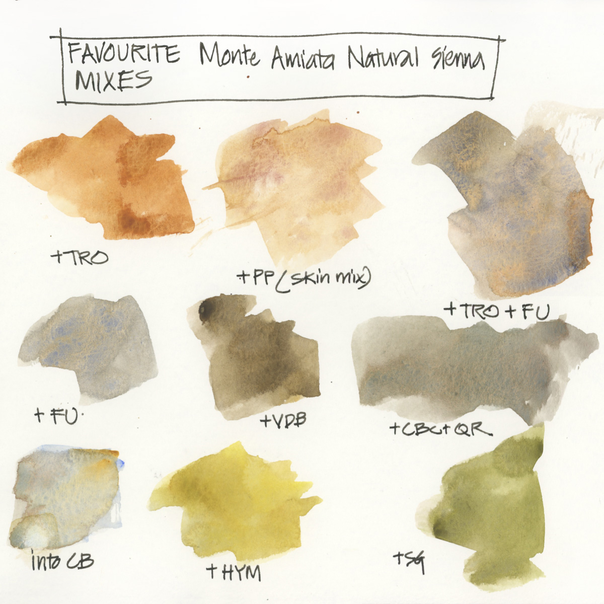
- Earth Yellow: I prefer a raw sienna colour over a yellow ochre one as raw sienna (being slightly more orange) will create grey (rather than green) when mixed with blue. I use my raw sienna paint (in my case it’s actually Monte Amiata Natural Sienna – MANS) in a lot of grey washes and it also works well as a glow on the horizon when doing skies. If you only have yellow ochre in your palette it will be harder to use it for these purposes.
- MANS is the paint colour which I use more than any other!
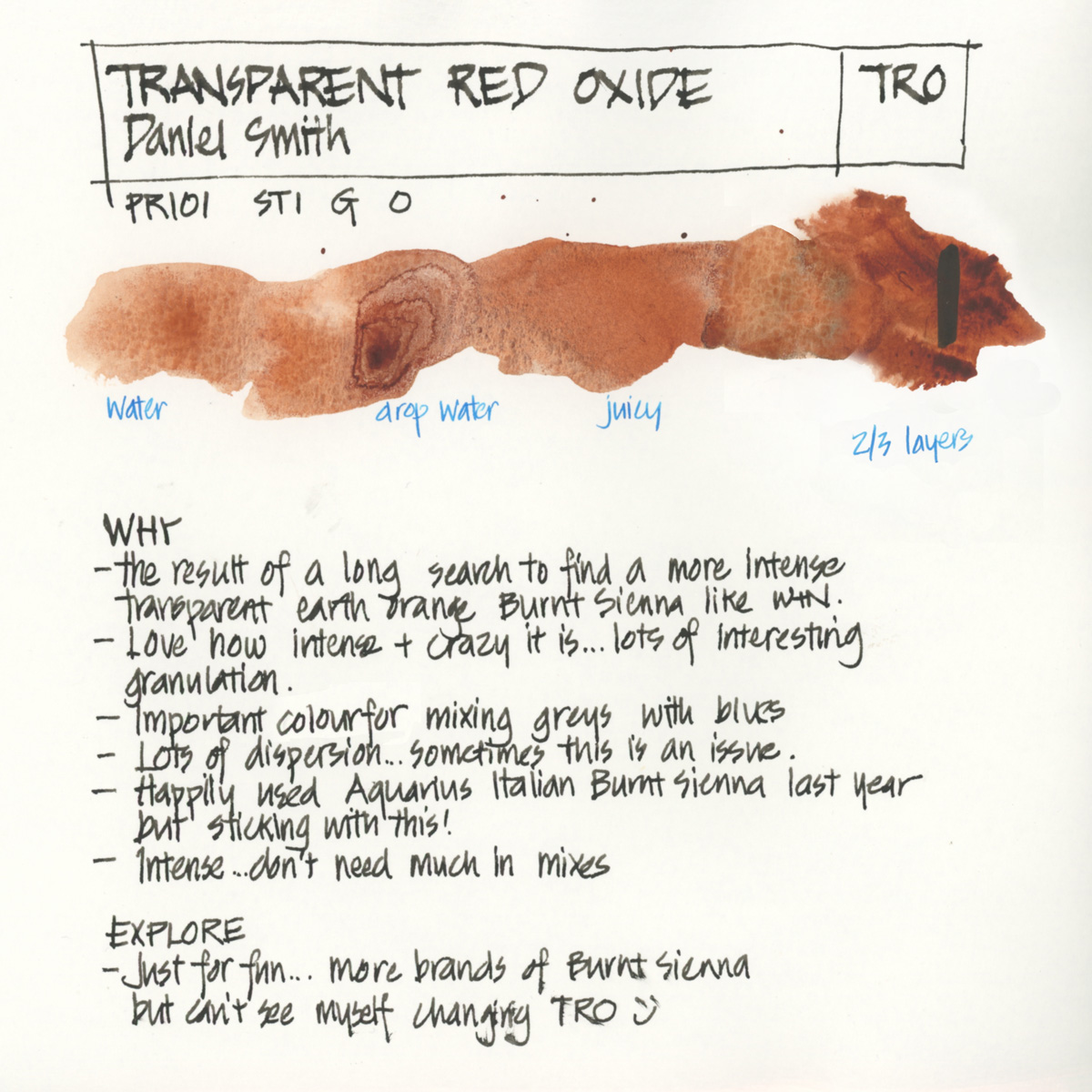
- When it comes to Burnt Sienna, I generally prefer a transparent orange version of the pigment PR101 – rather than the traditional semi-transparent red earth of PBr7. This is because I started out with the WN version and so that is how I like my Burnt Sienna.
- I tested many Burnt Sienna type colours a number of years ago and Transparent Red Oxide was my favourite.
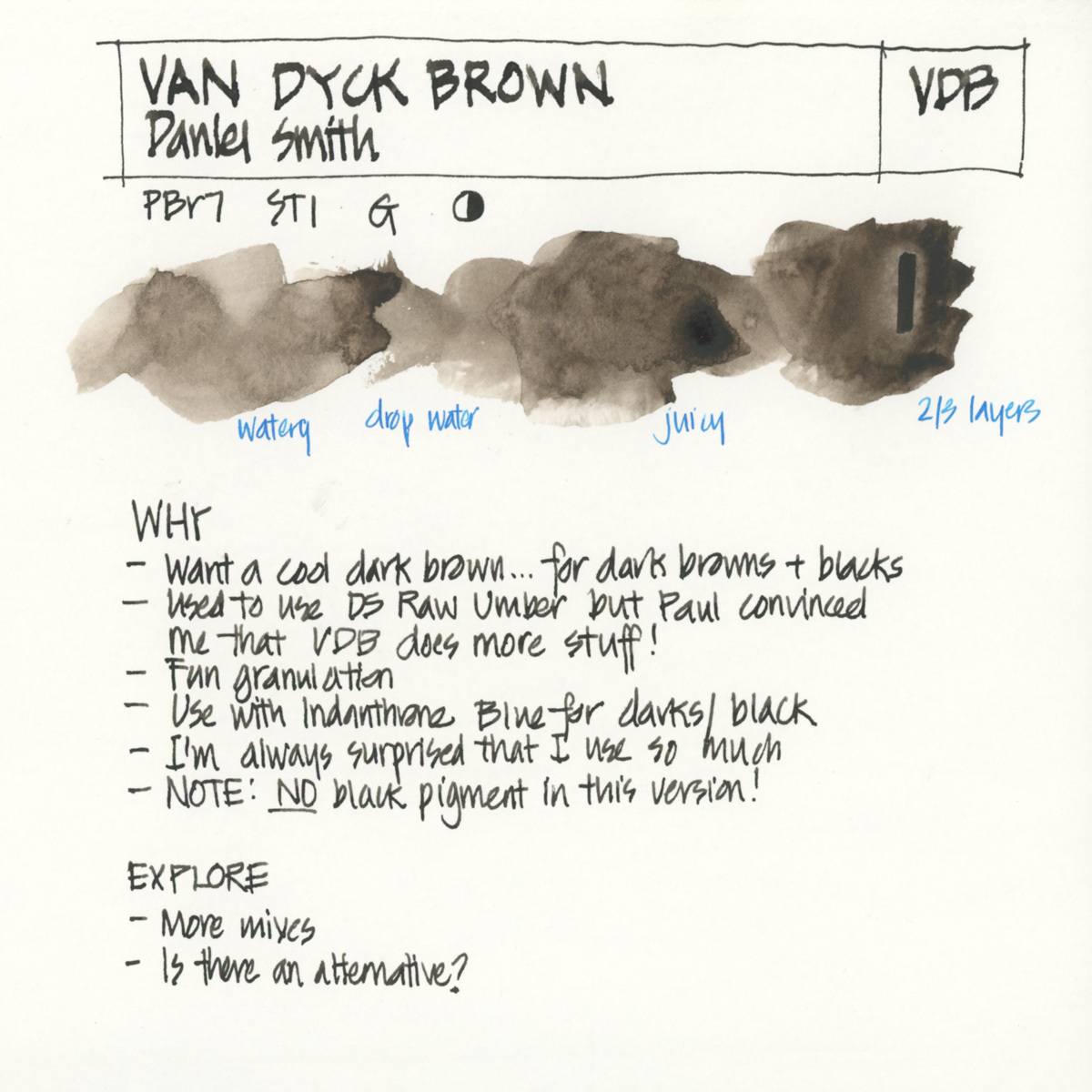
- For my darker earth colour, I like a cool brown and use Daniel Smith Van Dyck Brown (VDB). This version of VDB has no black in it (VDB in other brands often includes a black pigment which can lead to duller washes). I used to use DS Raw Umber which is very close in hue, but after some late night pigment comparisons with Paul Wang and Whee Teck in Singapore a few years ago, I decided the VDB is a little more interesting. Thanks Paul!
- Last year when I was traveling I tried a number of the Aquarius colours – they have a huge range of earth colours! I really enjoyed using their Venetian Yellow Earth and Italian Burnt Sienna along with their French Ultramarine. The reason for choosing these two earth colours was because they were Italian pigments and I was traveling in Italy, so I haven’t fully tested the full Aquarius range to see if they are in fact the best options.
Here are my pages with some more notes….
Monte Amiata Natural Sienna (Daniel Smith)
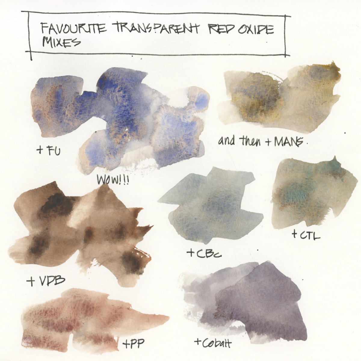
Transparent Red Oxide (Daniel Smith)
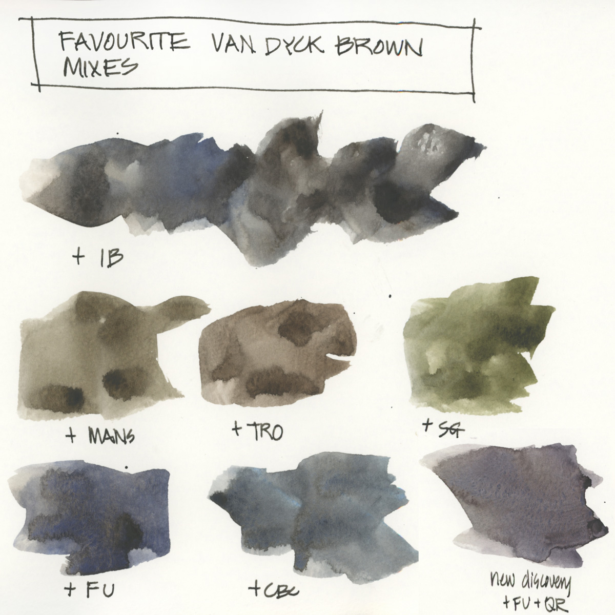
Van Dyck Brown (Daniel Smith)
Full Palette – Further Reading
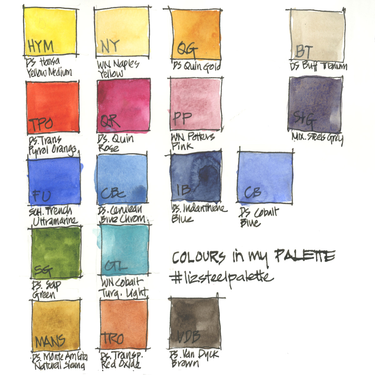
Just for reference… here is my complete palette with the abbreviations I use for the other colours.
More…
- The general principles behind my palette selection
- All my palette articles
- My SketchingNow Watercolour course – Learn how to increase your control of water, how to decide when to layer/glaze and when to work wet-in-wet, how to create vibrant colours with a limited palette, how to be more confident with your use of colour and much more! I also recently added a bonus lesson into the classroom all about pigment characteristics and how to practically get to know your paints better.
So what earth colours do you have in your palette? and why are they there?


13 Comments
So interesting! I prefer PR101 for Burnt Sienna, too, although I also love the granulating maroon brown that Schmincke offers (PBr7). As for Raw Sienna, I can’t quite get these neutral mixes out of it, but I still love it. I also like to use Green Umber from time to time as I find it very useful as a neutral dark hue for landscapes. I loved this series, thanks for the insights!!
Thanks for sharing Julia. I often need a bit of red in my raw sienna mixes – eg. TRO. Never tried Green Umber – thanks for the comment!
Hello Liz! Thank you for such a great post!
I have been struggling with the brunt sienna (WN) + ultramarine (schmincke) blend. While in you case your blend tents more towards brownish, in my blend it goes towards greens. i tried mixing different proportions of brunt sienna and ultramarine but still the mix is not nice.
any reason why the mix moves towards green ?
thanks
Hi Flower – the greenness is due to the position of the two colours on the colour wheel… maybe add a touch of red (alizarin crimson, a rose) to neturalise the greeen.
Love the series, I learned a lot. Thank you for sharing!
Thanks! My pleasure!
Hi Liz – I thought I had read everything on your blog, but somehow I missed this color series! I’m currently taking your Live Watercolour class and since we’re exploring pigments this week, my “research” led me to these great posts of yours. I wanted to share some magic I discovered today: I tried using DS Mummy Bauxite as my burnt sienna and I love it, especially with SCH French Ultramarine. Curious what you think of it.
I’m working my way through all your posts and just love it. Do you ever use M Graham Watercolours?
Hi Gayle. I bought a few tubes years ago but found they didn’t dry in the pan for me here in Sydney. So can’t really comment on them.
Hi,
I was reading, and apparently MANS is more yellow than other Raw Siennas (which are more orange leaning), so still makes green.
I can’t tell much difference between the greens made with MANS Vs my yellowist yellow ochre.
But I favour MANS particularly for it’s yellow glow.
Just thought I’d share!
Dave
Thanks for sharing Dave – yes, the yellow glow of MANS is the best!
NEWSLETTER
Subscribe for first notification of workshop + online classes and more.