This article contains my recommendation for a small palette of 6 colours. This is the palette that I use for my very popular SketchingNow Foundations online course.
This palette can be further paired down to 3, 4 or 6 Daniel Smith paints and I have also found alternatives in Winsor & Newton and Schmincke.
The advice to “buy the best quality materials you can afford at the time” is very sound. When it comes to watercolour, the quality of the paints you use has a HUGE impact on what you can do from Day 1. Therefore spending money buying a few artist-quality tubes of paint early on is certainly worth it (if you can afford it – I am VERY much aware of many of my readers that have very tight budgets and as always, my advice is, do what you can!)
Note: This article was last updated in August 2023
Why my ‘minimal palette’ is 6 not 3 colours
I am not a huge fan of only using 3 colours for on-location sketching. You have to know your paints SO well and put a lot of homework time into working out exactly how to mix the colour you want (the right proportions and order of paint) or else you spend more time mixing than painting!
Not to mention the danger of over-mixed washes and getting your water very dirty very quickly.
I also miss the granulation of certain pigments. For me, using watercolour is more about pigments suspended in water than it is about mixing colour.
The idea behind this selection is:
- a vibrant lightfast transparent primary triad
- a burnt sienna to make the mixing for earth colours and greys (colours I use a lot) easier
- two additional very useful colours that form an ‘earth’ triad. Cerulean Blue and a Raw Sienna.
So you could choose:
- 1-3 and have a primary triad,
- or 1-4 with the addition of burnt sienna,
- or all 6 colours.
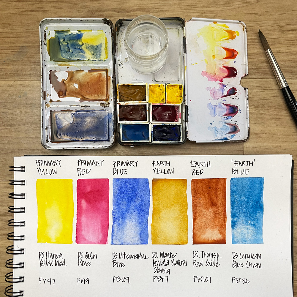
My 6-colour palette
These are all colours by Daniel Smith:
- Hansa Yellow Medium PY97
- Quinacridone Rose PV19
- Ultramarine Blue PB29
- Monte Amiata Natural Sienna PBr7
- Transparent Red Oxide PR101
- Cerulean Blue Chromium PB36
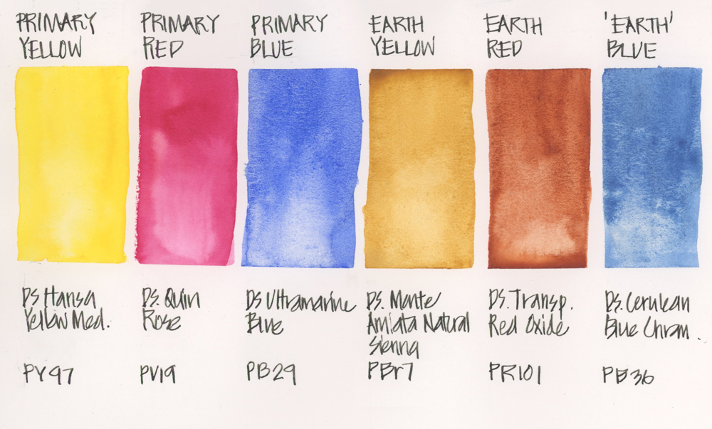
Thoughts on the colours in this palette
Primary Yellow: Hansa Yellow Medium PY97
It is hard to get a transparent yellow and this is a truly beautiful all-rounder. HYM is a beautiful bright transparent mid-yellow that mixes beautiful greens as well as oranges and is just stunning on its own.
Primary Red: Quinacridone Rose PV19
This is a pinkish red that makes a great mixed orange with my yellow. Also makes a great pink and purple and if mixed with a neutral will add some warmth. Really this is one of the most important and versatile colour in the palette so essential to get it right.
Primary Blue: Ultramarine Blue PB29
Many people use a Phthalo Blue as a Primary Blue but I don’t like that it is a highly staining colour and would prefer a granulating blue. I use it for purples, greens AND all my warm greys and browns, blue greys. This palette used Ultramarine Blue rather than French Ultramarine but both work well.
Earth Yellow: Monte Amiata Natural Sienna PBr7
This is a lovely transparent single pigment alternative to raw sienna. I prefer Raw Sienna often over yellow ochre as it is more transparent and closer to the colour of Sydney sandstone. Monte Amiata Natural Sienna is the most gorgeous earth yellow I have found.
Earth Red: Transparent Red Oxide PR101
This is my version of Burnt Sienna. I can’t live without this colour – browns and neutrals mixed with Ultramarine.
‘Earth’ Blue: Cerulean Blue Chromium PB36
This is a brighter version of Cerulean and is useful for Australian light and sky. I do not recommend the DS Cerulean Blue as it is too weak. The WN version (below) might be more suitable for people in the northern hemisphere. Great for skies, and lovely neutrals!
Alternatives – Winsor & Newton and Schmincke
Please note: I have used these WN colours in the past but the Schmincke selection have been tested in the studio only – I do plan to make a little set and test it out on location.
Winsor & Newton
1. Winsor Yellow
2. Permanent Rose
3. French Ultramarine
4. Burnt Sienna
5. Cerulean Blue
6. Raw Sienna – this is not a single pigment colour but is preferred over yellow ochre which is opaque
Schmincke
1. Pure Yellow
2. Ruby Red
3. Ultramarine Finest
4. Translucent Brown
5. Cobalt Cerulean Blue
6. Raw Sienna – same note as above: this is not a single pigment colour but is preferred over yellow ochre which is opaque
Mixing with this palette
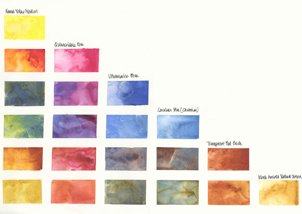
Here is a large-scale chart showing the possible mixes you can make with these 6 colours.
But you can also do more sophisticated mixing with three colours and achieve an even wider range of hues. To find out more about these mixes check out this series of articles.
As mentioned at the start of this article, the 6-colour palette is the one that I use for my SketchingNow Foundations course.
This course is perfect for beginners and will help you build a solid foundation for your own sketching journey by learning fundamental observational skills and the basics of urban sketching.
Find out more about Foundations
And as always let me know in the comment section below if you have any questions about this palette or my online courses


32 Comments
As a complete beginner I was confused by the choice of a rather pinkish red choice, but I trust you and got it anyway. I wonder how you go about mixing intense reds or perhaps you don’t at all. We’ll see how it goes!
Hi Daniel. This minimum palette can’t mix every hue that you might need, but the pink ‘red’ is the best single pigment I have found for mixing both purples and oranges-red. In my expanded palette I use trans pyrrol orange witht he quin rose to mix my primary reds.
I love this class! Trina
Hey, I just wanted to ask you which one would you recommend for beginners. I’m a fashion student and I’m a bit confused on which brand to buy and which one will be suitable.
Thank you
Hi Jen, I recommend that you start with the best quality you can afford – so my favourite is Daniel Smith. The better quality the paint the better results you can achieve right from day 1
Can you please green. I like landscapes so will be using green a lot. In gear pthalo green is a good one for mixing but could use some advice. Thanks.
Finally an answer to my issue with yellow ochre! It’s always the opaque one and takes over everything. Swapping it for raw sienna right now!
I LOVE the DS Monte Amiata natural sienna – hope it works for you. Lovely glowing transparent colour
Hi Liz, I’m trying to put together a (minimum) basic palette for me too. I’m still a beginner, so to choose few basic colors out of so many colors there are, is a bit too confusing for me. I can refer to your 6 basic colors recommendation, but I think I’m missing green color there. As for trees and plants I’m gonna need a lots of green variation, that’s gonna be hard to generate only from those 6 colors, isn’t it? Do you have any suggestion? Maybe some extended version to 8-10 color max would be fine for me. Thanks.
Well, I know I can generate some greens by mixing blue & yellow, but are those 6 basic palette enough to produce variety of green?
Hi iwan. Yes you are right – you can’t mix a bright green using these 6 colour. Depending on where you live will effect which green is best but I like Daniel Smith sap green.
Hi Liz!
I’m putting together my very first pallette and wanting to keep it simple. My thoughts are a cool and a warm version of the three primaries plus Burnt Sienna and Sap Green. So, eight pigments in total.
1. Can you recommend a cool and a warm pigment for yellow, red and blue?
2. Am I missing any important pigments?
Thank you very much!
What is 1+2+3 above in the mixing of a 6 color tin?
Hi Kellie, not sure exactly what you are asking about … but 1. Hansa Yellow Medium
2. Quinacridone Rose
3. Ultramarine Blue.
Does that help?
Hi Liz, I am travelling on the Ghan in July and was wondering if you could suggest colours that I should have in my palette? I normally use AS Watercolour paint as it is easier for me to purchase.
Thanks
Kate
Hi Kate, off the top of my head… can’t say. What I normally do is to look at some photos of the area and try a few test mixes to see if you can get a close enough match with your existing colours. Of course the colour in real life is always different but it will give you a good idea.
Hi, there! I just came from Teoh Yi Chie’s article/ YouTube video.
I’ve found your article very helpful, especially since I don’t have Daniel Smith paints in my area and to get them would cost more than is reasonable to spend- so the Schmincke alternatives are beyond helpful!
Some of these choices are ones I’ve already roughly decided I would get. It’s a very big job as a beginner!
The colour set I’ve had in the past was very limited in mixing ability- purple’s and greens were 9/10 mud. I’ve come to the conclusion that of the many paints I do have, I must be lacking the blues and reds of the right warmth to create the vibrant colours I desire without just using one of the convenience mixes I already have.
I really wanted to improve my colour theory and mixing abilities. I want to be able to create more Harmony in the pictures I paint, because only recently have I realised how disjointed my colours look. Lord have mercy if they touch each other and mix because while those colours certainly have their place, their place is not the entire picture thank you very much.
So, my question, do you have a similar post for a slightly larger set of paints? I was thinking a maximum of 12, but I really did want a few more choices.
Even if I don’t end up with the exact same colours, I really just need some guidance so I can feel secure I’m going to get colours that can do what I need them too!
Thanks so much!
Hi Ruthie,
yes I have my 16 colours here https://www.lizsteel.com/my-2017-watercolour-palette/ and a 12 colour palette https://www.lizsteel.com/my-basic-palette/
Dear Liz,
I bought a fountain pen that is listed in your supplies(the white Joy Pen. and it comes with black ink that is not waterproof. I expected ink that is waterproof so you can watercolor over the ink lines without getting a smear. Do you use the waterproof ink?
Thank you, Sharon
Hi sharon. Please check out this article for details of ink
https://www.lizsteel.com/permanent-fountain-pen-inks-for-ink-wash/
Yes, this comes years after you posted this, but wanted to say Thank You! for helping out a beginner with the basic palette. Recently began tinkering with watercolor using just the basic $3.00 children’s set (cakes in a plastic box), an d felt the urge to branch out a bit, but reluctant to be oversold on “beginner sets”.
Great to hear Maria!
Hi Liz,
Thank you for all the colour information you have provided, it has helped me a lot.
I was especially interested to see your personal colour experiments because all we usually see on the internet is perfect neatly painted charts. I don’t think you see the full potential of mixing although they are beautiful. I have a question; could you tell me what paper you experiment on? Do you use top quality or a cheaper option?
Many thanks,
Rachel
Hi Rachel. Yes neat colour charts don’t explain enough for me – don’t show the pigment party that I want when I work wet-in-wet.
I only test on the paper I use as paper has the greatest impact on the result – so Stillman and Birn Alpha and Moleskine Watercolour
Serendipity when I was looking up which colors you have in your sketch palette and I wanted to enroll in the Foundation’s course now that I am retired.
Imagine my joy when I saw that I enrolled a couple years ago but sadly never started the course.
Making art and sketching a priority now.
Curious as to why Ultramarine blue and not French Ultramarine? I see you have had French ultramarine in an earlier palette.
Heather, it’s actually the other way around… I used to use this version DS Ultramarine BLue but have now changed to SCH French Ultramarine in my everyday palette. I’m sticking with UB in this palette as its part of the Foundations set. More here
https://www.lizsteel.com/ultramarine-comparisons/
I’m a big believer in a six-primary palette but I notice there’s no way to mix a bright, clear orange. I imagine there are few times that kind of secondary would be needed but if it is, do you bring along a cake of cadmium orange?
NEWSLETTER
Subscribe for first notification of workshop + online classes and more.