Yesterday I shared some watercolour mixes for skin colours on Instagram, and asked people to share their favourite mixes as well. I would love to do the same here so that this article becomes an easily accessible resource for others.
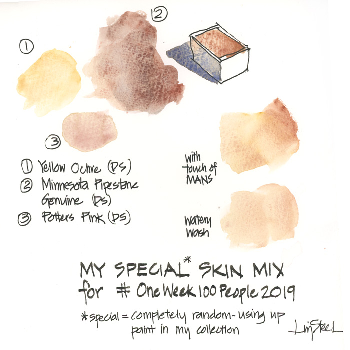
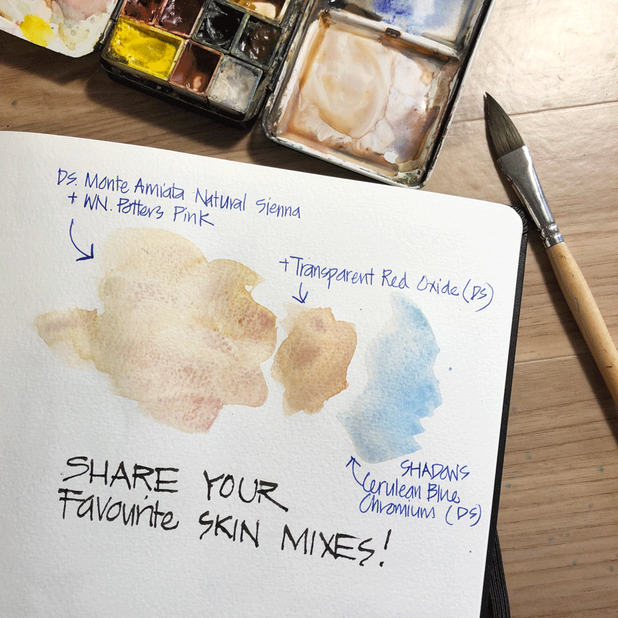
Even though I am experimenting with this rather random combination right at the moment (using up spare paint), my usual watercolour mix is Daniel Smith Monte Amiata Nautral Sienna and Winsor Newton Potter’s Pink. I also use DS Cerulean Blue Chromium for shadows.
I mainly sketch Asian and Caucasian skin colours as that’s what normally seen at my local cafes so don’t have much experience mixing other shades.
So please share your favourite mixes/colours for all different skin hues. It doesn’t have to be watercolour. I would love to hear about pencils and markers and another other media! Can’t wait to read the comments and hope it will be really helpful for everyone.
As for my sketches on Day 2. This is what I wrote at the time:
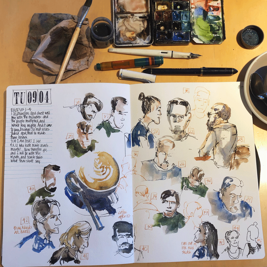
I’m feeling a little overwhelmed by all the work I’m juggling at the moment. And this impacted my sketches and how I approached the challenge today.
I lowered my expectations and just went for hitting the target. Most of my sketches include watercolour but I also added some burnt sienna ink drawings to speed it up. I was also thinking about capturing gesture and find it easier in ink at the moment. I like the variety of the coloured ink drawings on my page and it felt good to get the people sketching out of the way and get onto some work.
I think it’s really important when you are doing any challenge like this to be flexible and not put too much pressure on yourself. Some days it will feel good and inspiring while others the challenge can feel hard and a bit of a burden. It’s not feeling like that for me – I want to sketch so it’s not a burden – but it’s just that I feel the time pressure today.
Hope you all have a good day 2. Are you trying to hit the 100 number or just simply sketch more people than normal?
Looking forward to hearing how you are going, and what your favourite skin mix is! Thanks in advance!


9 Comments
I discovered a very watered down Daniel Smith Burnt Sienna does pretty well for skin tone since it is less orangey than then Winsor Newton Burnt Sienna. And it does for red hair when it’s more juicy.
HI Arlene – yes I know that that is a good option! (I prefer the orange version of Burnt Sienna generally thoough 🙂 )
I don’t do enough people sketching to have a favorite skin color yet, so reading your comments is very interesting and made me think about it! Because I rarely sketch people, I decided to embark on the 100-people challenge, and yesterday was my first day. I hiked to town (50 min) where we own an ice-cream business and sat on one of the chairs outside where I had a view down the street. It is usually filled with tourists “window shopping”. It was Monday during business hours so not an enormous amount of people walking around but maybe that played to my advantage. I could see the coming in the distance and as soon as I could see enough of their shape I would start. It turned out to be 20 to 30 seconds per person, which was quite a challenge for this sketcher who is used to take 2+ hours to sketch a stationary view, lol. I sketched people walking towards me, and people walking away from me. I felt more comfortable when they were heading away as I faces are still very hard for me! It is 8am here in Colorado so soon I will be heading to a cafe to do the challenge. I think sketching people that are sitting down sipping tea or coffe will allow me more time to sketch them , I hope!! It has been fun though, and I plan to complete the challenge even if I have to follow my family around the house to sketch them 😉
Thanks for sharing Yvonne!
Perylene Maroon and Cerulean Blue in the shadows. This was a combination I picked up from Marc Taro Holmes a few years back. Perylene Maroon and Cerulean Blue have permanent places and positions in my palette. Every person receives the same color combination. Sometimes the PM is lighter or stronger …CB makes it come to life.
Hi Carmel – oh! that is an interesting combination. Will have to try it!!!
Yellow ochre and alizarin crimson, in varying weights of mix and dilution, and add French Ultramarine to create a warm grey shadow.
Thanks for sharing Stef!
You do love your potters pink Liz.
NEWSLETTER
Subscribe for first notification of workshop + online classes and more.