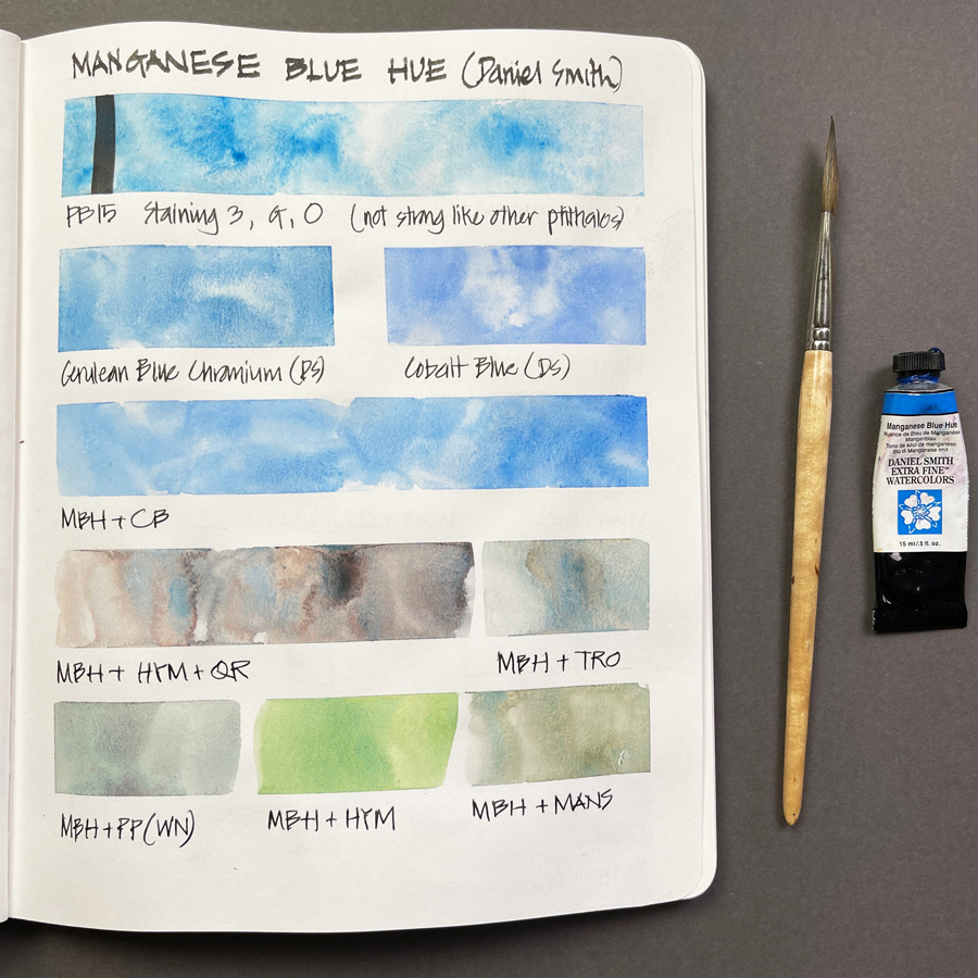
I’ve had Daniel Smith Manganese Blue Hue(MBH) in my palette for nearly a year now and today I finally got around to doing a few mixing strips with it. When I was in Beechworth in May 2021 my friend Angela Williams re-introduced me to this colour. I had MBH in my palette back in 2011 which you can see here, so it was not a new colour for me.
I said at the time: Angela was using it for skies and it looked very similar in characteristics to Cobalt but is a more greenish-blue. I think mixing Cobalt with Manganese Blue Hue would be the perfect match for our skies. (See more here.)
I halved my Cerulean Blue Chromium (CBC) and have had a half/pan of MBH in my palette ever since.
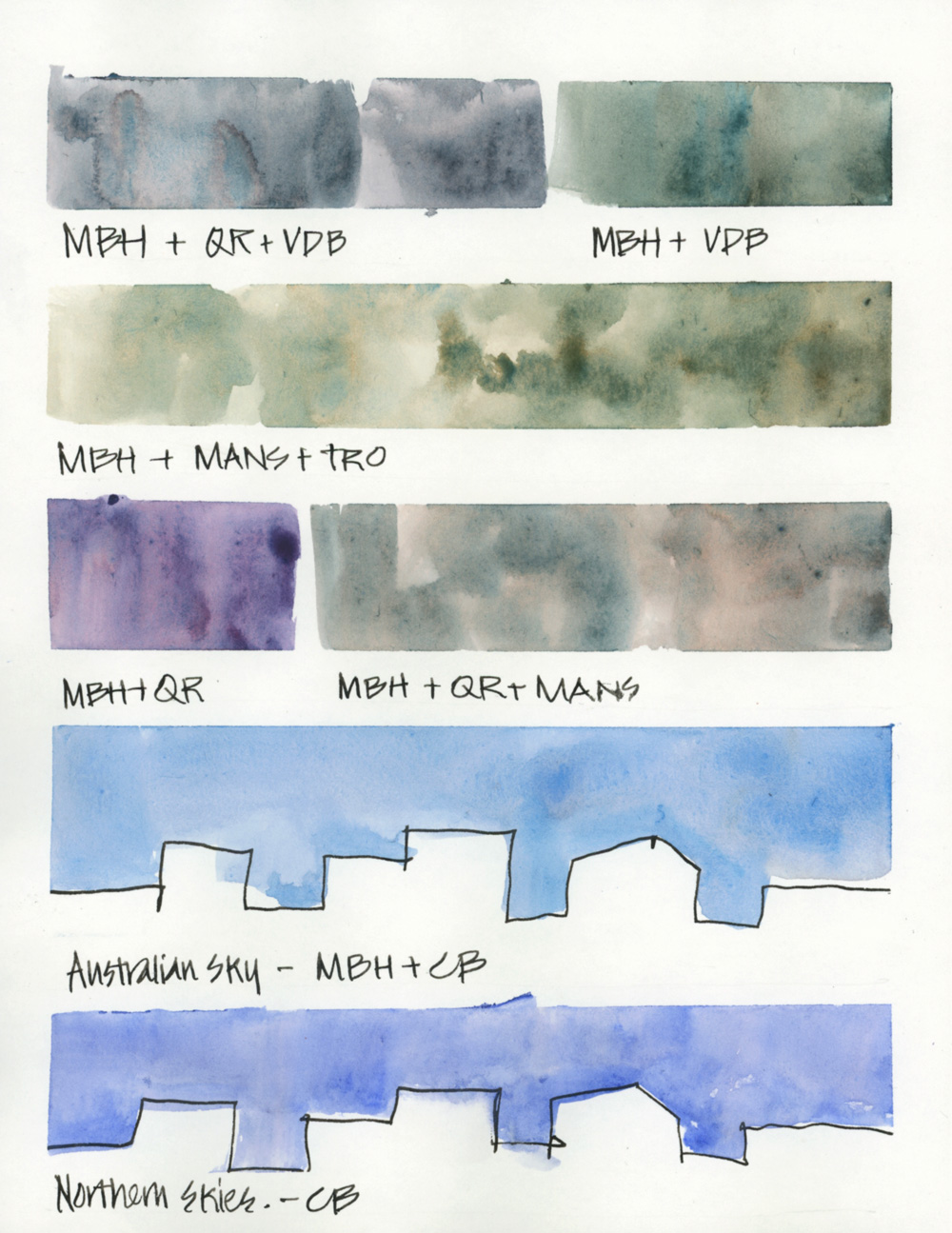
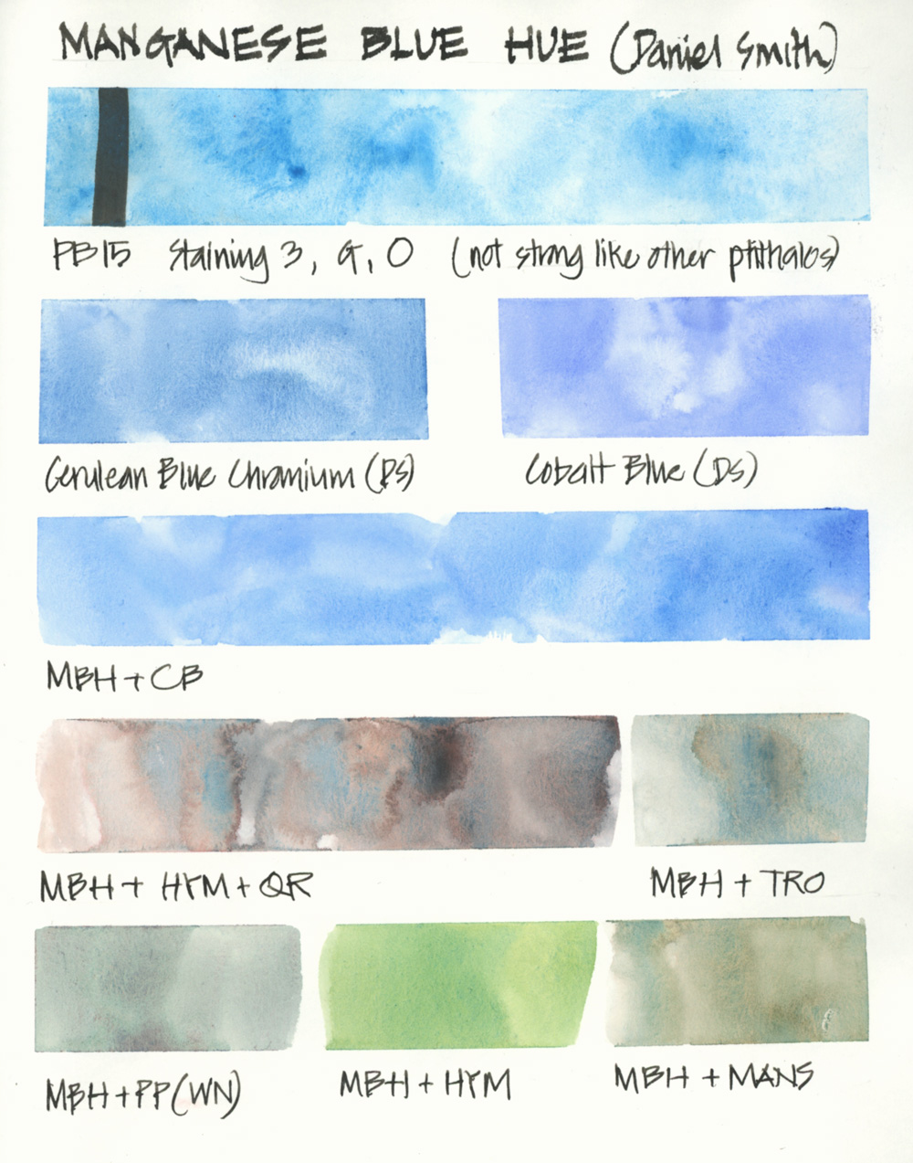 I still love the granulating and sedimentary characteristics of CBC but I am finding that I’m using MBH a little more often. This is mainly because I have indeed ended up using it a lot with Cobalt for Australian skies. Note: Our skies are more blue-green than northern hemisphere skies which are often a perfect match for Cobalt Blue.
It also makes a lot of beautiful subtle greys and greens.
I haven’t made a final decision about CBC and MBH, but I’m definitely enjoying having both in my palette at the moment.
To find out more about the blue pigments in my palette and the reasons why please refer to this article.
Does anyone else have this colour in your palette?


6 Comments
Great chat, thanks Liz!
I had tried it years ago and given up on it because of the pale color and flocculation. But after reading this I think I’m ready to give it another chance.
I have the Winsor & Newton Manganese Blue Hue, but it looks different. I guess I’ll keep my question of why until the Watercolor class in June!
I may be going slightly mad trying to colour match the coastal skies up here in British Columbia. We are at the 49th parallel north; I find our summer skies more cyan than cobalt blue. Recently on a day with patchy clouds, the difference between blues at the zenith (with a hint of violet blue) and those seen closer to the horizon (more blue green) become very obvious! I’ve picked up both the Winsor Newton and the Daniel Smith Manganese Blue Hue (both are PB15); the Daniel Smith is quite a weak mixer and sort of blotchy to me. I also picked up WN Cerulean (PB35) to try, and I have the DS dot samples to compare from. I suspect the WN MBH will make its way into my palette, but it’s a very bright cyan and will require mixing to dull or shift it. Anyone else in Canada? I’m curious how everyone else sees the colours in the sky here.
Thanks for sharing your thoughts Nicole!
Hi Nicole – I live on an island off the coast of New England and our skies are rarely cobalt blue (only when a northerly brings cold clear air from Canada!) I learned about Daniel Smith cerulean blue chromium from Liz and it is perfect for our skies. I also find it very “forgiving”…it doesn’t cause me any problems to adjust a wash it even after it’s almost totally dry.
I think coastal skies have more green because of the salt water, esp if the coast is facing the ocean. Although the water can look blue here, it’s usually some shade of green. The daylight and skies here are so striking, even on cloudy days! I think it is because there’s always lot of moisture in the air. And the color does vary from the zenith to the horizon. Regardless of time of day, sky color closer to the horizon will be quite different in the southern & eastern sky (facing ocean) compared to the northern & western sky (facing the Sound beyond which is the mainland). In winter, I use a more dilute CBC or pale gray wash for the sky. I find the skies endlessly fascinating! 🙂
NEWSLETTER
Subscribe for first notification of workshop + online classes and more.