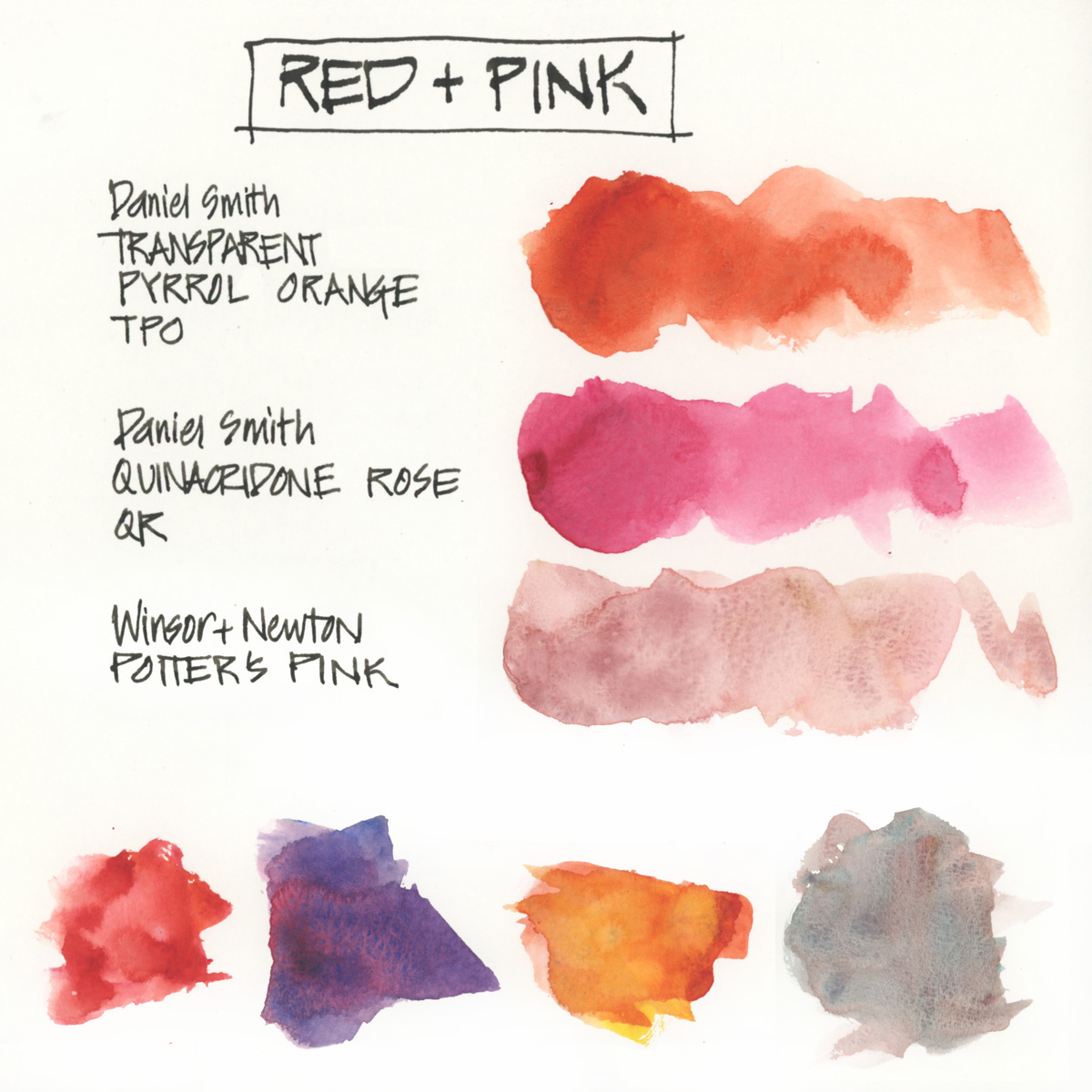
Red is another hue in my palette where my selections are a little unusual. A standard split primary red would include a Cadmium Red or a Scarlet as the warm red, and Alizarin Crimson or a Carmine as the cool version.
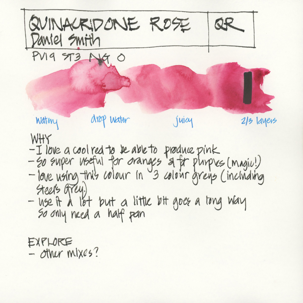
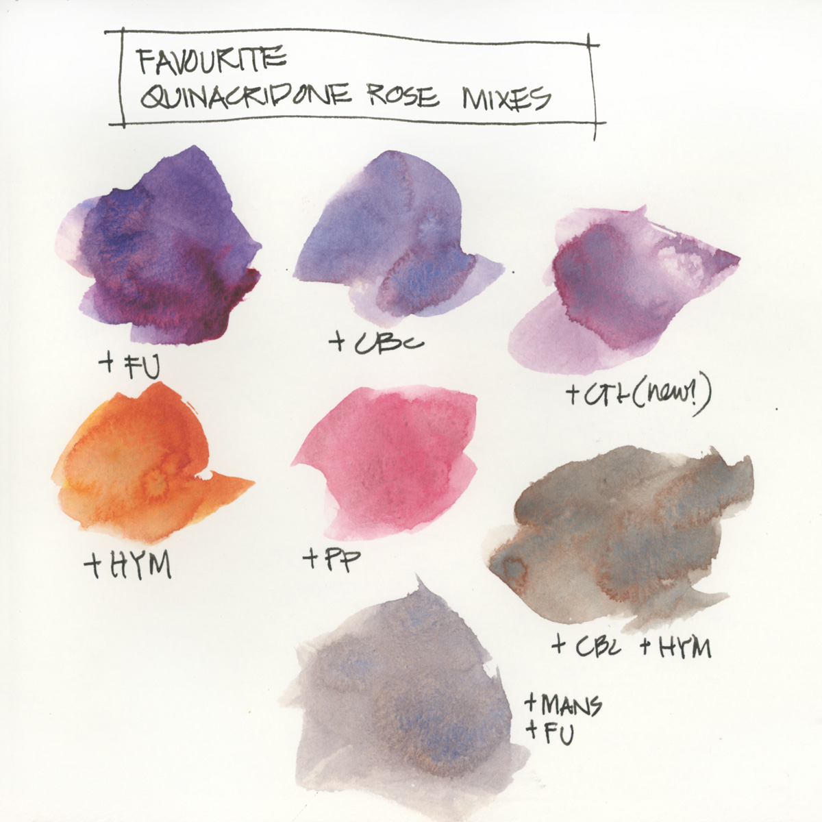
Instead I have a dark orange for a warm red (DS Transparent Pyrrol Orange) and a pink version of a cool red (DS Quinacridone Rose). Quin Rose is a real workhorse for me as it can mix lovely oranges as well as nice purples. Therefore if I only could have three colours in my palette this would be my single red. Some people like to use a magenta which is another very versatile ‘red’ but I find it too unnatural on its own to be usable in my palette (refer to my earlier posts for some of my general principles). Quin Rose makes a nice range of pinks as well.
The reason for Transparent Pyrrol Orange (TPO) is because I like it’s transparent nature and refer working with it over the stronger Pyrrol Scarlet, Vermilion colours or the more opaque Cadmium Reds. I love that TPO is the same pigment as a favourite colour of mine – Schmincke Transparent Orange. This is a stunning beautiful orange paint but sadly I don’t use it enough these days (now that the T2 Teahouse is no more) to justify it in my everyday palette. (Note: The T2 Teahouse is the ‘random colour reference of the day’ and if you know about it, then you are a long time follower!)
TPO is dark enough that it can function as a red and it’s a lovely orange! (Thanks to Jane Blundell for introducing me to this colour.) It’s a paint which is unique to Daniel Smith and there are no directly comparable paints in most of the other brands I have explored. Sadly I’ve been told that the latest tubes of this colour are lighter. What!?! I’m rather concerned about this as it means that I might have to reconsider it’s inclusion in my palette down the track.
I’m not particularly concerned about creating a wide variety of reds and pink and so these two pigments do the job for me nicely. I mix them together to get primary red and add a touch of Ultramarine if I need a darker red.
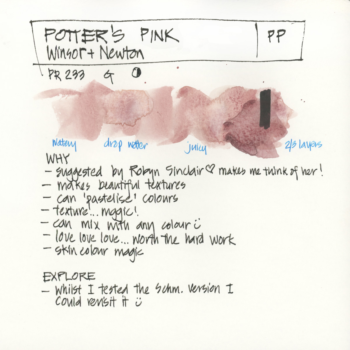
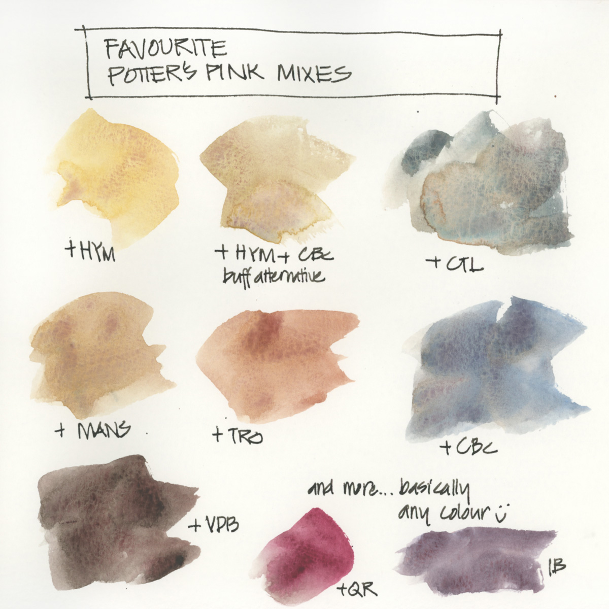
And in the red section, I’m including Potter’s Pink which is very quirky selection. I wrote a whole article on it previously so have included a link to that below.
Just for the record, I don’t have a purple in my palette as I find it so easy to mix with Quin Rose and French Ultramarine. Therefore tomorrow we will go straight to my blue pigments!
Once again I have to stress that these are my personal preferences! Everyone is different and you might like some of the colours mentioned above which don’t do it for me! My hope is that by sharing my own thought process and preferences you’ll be able to think through your own palette and personal colour needs.
Transparent Pyrrol Orange (Daniel Smith)
![]()
![]()
Quinacridone Rose (Daniel Smith)
Potter’s Pink (Winsor & Newton)
Full Palette – Further Reading
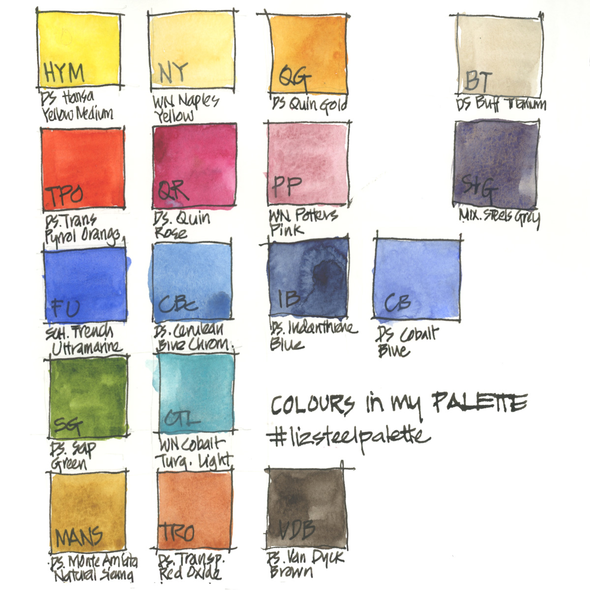
Just for reference… here is my complete palette with the abbreviations I use for the other colours.
More…
- More about Potter’s Pink
- The general principles behind my palette selection
- All my palette articles
- My SketchingNow Watercolour course – Learn how to increase your control of water, how to decide when to layer/glaze and when to work wet-in-wet, how to create vibrant colours with a limited palette, how to be more confident with your use of colour and much more!
So what reds do you have in your palette? and why are they there?
Thank you in advance to anyone who takes to the time to share in the comment section – it really makes this article more valuable for other readers. Plus I always LOVE reading about other people’s WHY’s


17 Comments
I don’t use much red, but I really like Quinacridone Red (PR209) – it’s very transparent and flexible in terms of warm/cool mixes. You get lovely oranges out on it, and it doesn’t turn to mud like a lot of other warm reds. I currently use the W&N variety.
Thanks for sharing Julia!!! Quin Red is a colour which I did try many years ago… and I would guess works well.
I have both the old and new TPO. DS recently denied a change in a live webchat on FB … but there is a change. I would say the newer version is a bit higher in chroma. It’s like in between the Schmincke and the old DS version.
DS has some rich warm reds that are comparable–Quin Sienna is one and Deep Scarlet is another. I am not sure how they compare mixing wise (particularly my favorite combo of TPO and Pthalo Turquoise PB 16 … which is a great neutral).
Hi Alejandro – thanks for the info. I think Quin Sienna would be too much of an earth colour – I haven’t tried Deep Scarlet though. And I haven’t mixed TPO with PB16… that is something which I have to try. thanks!!!!
Excellent post again! I love this series, and how you explain your thinking so clearly. I totally agree with you that there is no need for red in the palette. Now that I know it’s not a primary color, my understanding of how to use it has shifted. Here are a few more thoughts:
QoR also makes Transparent Pyrrol Orange, and it seems to me just as good as the DS one.
I was talking with George at Rublev paints a few months ago, and he told me that recent testing indicates that TPO is not as lightfast as was previously thought. I haven’t been able to find anything more about this on the web, so am conducting my own lightfastness test right now (paint a piece of paper, cut it down the middle, put one strip in the window and one in a dark place—compare after 6 months). I’ll let you know what I find.
I think there’s a lot of confusion out there about Quinacridone Magenta from the way different manufacturers label their pigments. For example, DS’s Quin. Magenta is PR 202, which I think is a much duller and dirtier color than Turner’s* Quin. Magenta which is PR122 and looks a lot like DS Quin. Rose, which is PV 19. And to make it even more confusing, there are a lot of different PV 19s out there, most of which lean more towards the violet.
*Turner Paints are only sold by Jerry’s Artarama, as far as I know. I like their Quin. Magenta a lot, and it’s a bargain at US$4.99 for a 15 ml tube. https://www.jerrysartarama.com/turner-concentrated-artists-watercolors
Thanks Laurie – someone else suggested QOR but I’m not sure how well they perform with normal watercolours. Thanks for doing a light fast test – that is important to know.
I don’t know anything about Turners Paints – ah! so many brands!!!! Thanks again for sharing!
Hi Liz! i’m more of a colored pencIL person, but i also use watercolors. Once i was in a place QOR was giving out a small sample palette card and i have integrated them with my other watercolors. Not from a place of knowledge, you understand, just working with what i have. And any problems there might be have not yet presented themselves to me. So, taken with a grain of salt, that’s my impression.
Really loving this series.
Great to hear Barbara!!!!
I’m a Potters Pink fan now! Thank you!
Fantastic series, thank you for sharing your knowledge. Roman Szmal has a PO71, called Pyrrole Orange (#355). I cannot compare it to Daniel Smith as I do not own it, but I have enjoyed using it.
Thanks for sharing Melanie – need to do some serious testing and comparisons with Aquarius!
I’ve only just figured out this change to TPO and ugh. Why change a unique color that is hard to reproduce DS! So many times I land on keeping TPO in my palette because nothing else will work as I want. so disappointed. Would love to know if you have found a replacement.
I know Nancy – it’s sad when formulations change. I still have a number of old tubes so I haven’t had to make a decision yet.
You’re lucky to still have the old TPO! It is such a big change, and VERY noticeable especially in mixes. The new is almost identical to WN Transparent Orange but pretty useless in mixes. The old TPO was such a brilliant mixer.
I have desperately tried almost any red/orange paint under the sun to find a replacement but there simply isn’t one. DS Deep Scarlet, Anthraquinoiud Scarlet, Perylene Scarlet, Quin Burnt Scarlet, Pyrrol Scarlet, Quin Sienna, Mayan Orange, Organic Vermillion, WN Scarlet Lake, Winsor Red, WN Transparent Orange, Sch Transparent Orange. But none of them work the same in mixes. Not even close. The only one I haven’t tried so far is Aquarius Transparent Pyrrol Orange but it looks very much like the new TPO, at least online. Do you have it? I f you do maybe you could make wome test mixing and let us know?
I really don’t understand why DS would deny the change, it’s so weird.
Hi Lina – I did do a quick test with a more recent tube a while ago and I thought it was still usable but maybe it wasn’t the new version. I will have to do a more substantial check. And yes, the change is very disappointing.
I just came here to say I found the same thing – just bought a tube of TPO and it’s very much an orange rather than a red. I haven’t tried it any mixes yet. I wish I’d read the comments of this post before buying!!
NEWSLETTER
Subscribe for first notification of workshop + online classes and more.