As I shared last week, I’ve recently started to play with the GoldFaber Aqua Dual Markers by Faber Castell.
These are water-soluble dye-based (non-permanent) markers that I used a few times during my marker month in August.
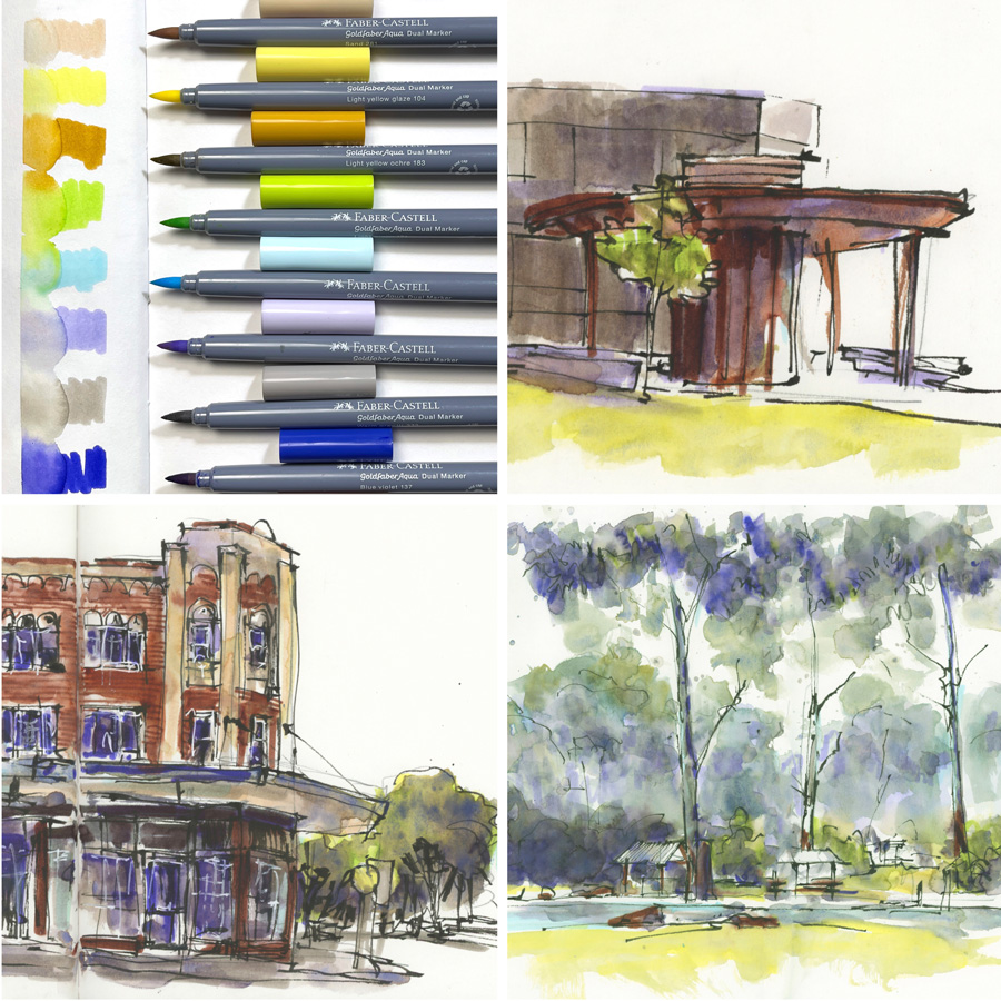
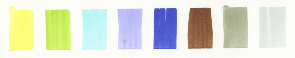
In Preparation for Lesson 2 of Watercolour On Location, I initially was thinking about using them for value studies and chose 7 colours to start. On a 5 step value scale (what I use in my own sketching and inside the course) these represented:
- 2 colours (Apricot and Titanium Violet Light) Value 2,
- 2 colours(Light Yellow Ochre and Warm Grey III) for Value 3 – hmm, the grey isn’t quite a 3
- two colours (Blue Violet and Burnt Sienna) for Value 4
- black for Value 5.
And then I started playing. Here is a sequence of my experiments with these markers over a period of a week.
And then I explored these colours for my next few morning sketches – creating multi-coloured value studies.
The colours were fun but a little intense! Especially that blue-violet!
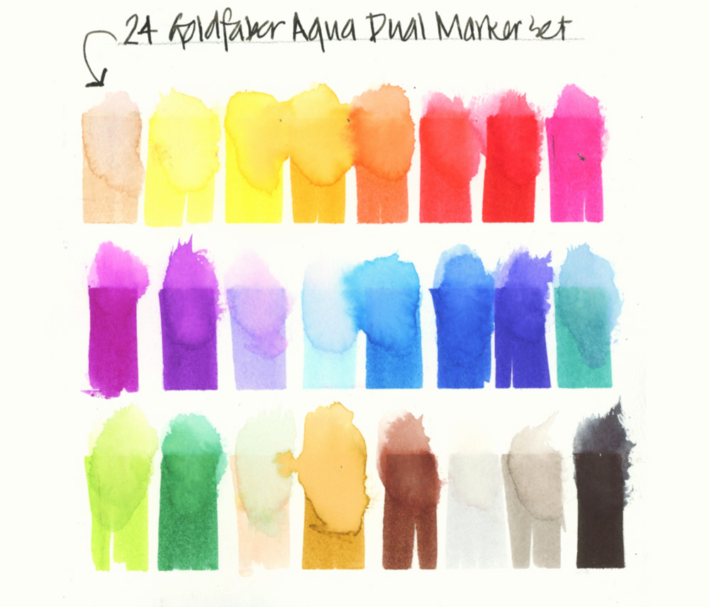
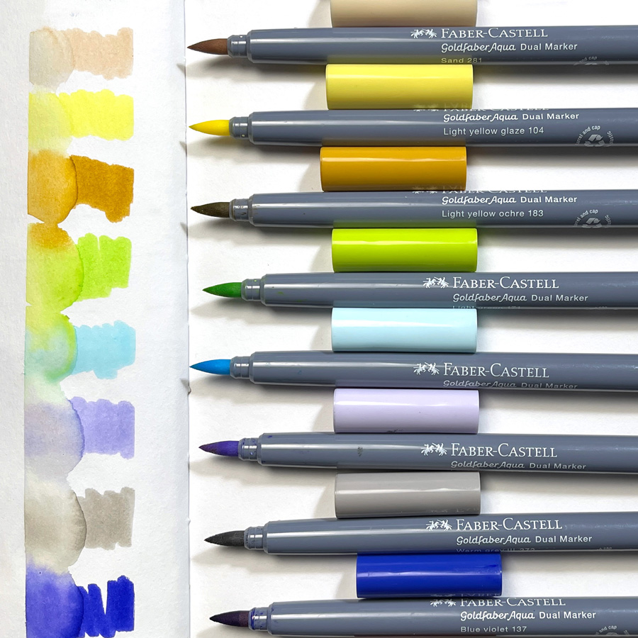
What other colours are in the set? I grabbed a few more to take out with me…
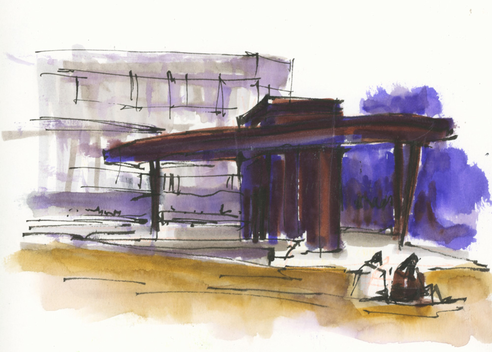
And then did this sketch mixing the GoldFaber Aquas with watercolour and a little coloured pencil. Oh ah! mixing the GFAs with watercolour to tone down the intensity might be worth exploring further.
But the first attempt was still a little too much.
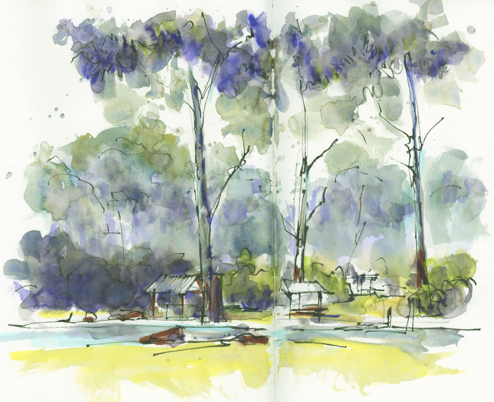
And then that afternoon I decided to do a Lane Cove sketch with some of the lighter/ more pastel colours.
These are the markers I used and then painted over the top. Okay… my new favourite colour is Lavender Light!

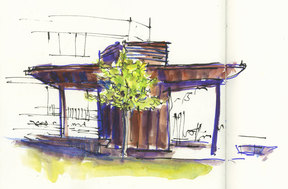
So I did another version of the Village Green scene with more muted coloured markers and being much more restrained in my use of the Burnt Sienna marker. I also left off the Blue Violet totally!
BTW I kept adding layers to the background building, sacrificing the values in this sketch for the sake of experimentation.
I have to say that there are some really beautiful colours in this sketch -particularly the lavender and blue marker areas under the Transparent Red Oxide watercolour wash!
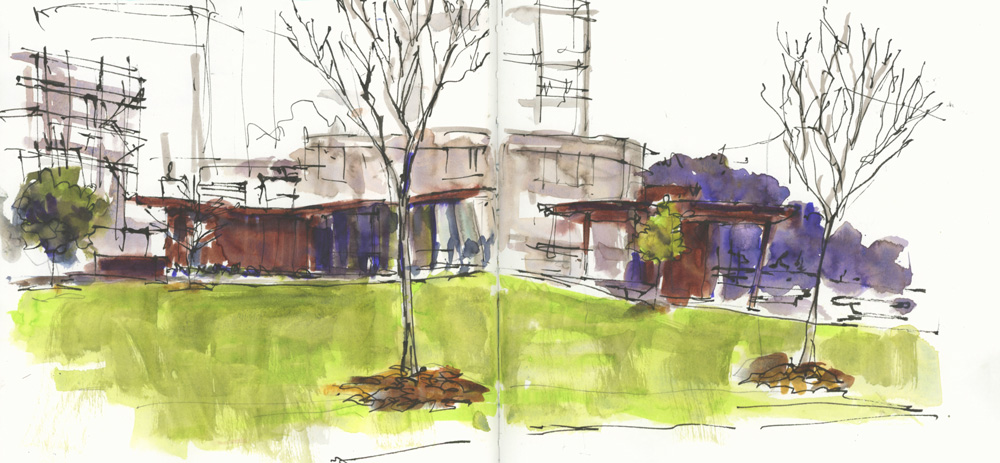
More tests applying a Steel’s Grey wash over some of the pastel colours.
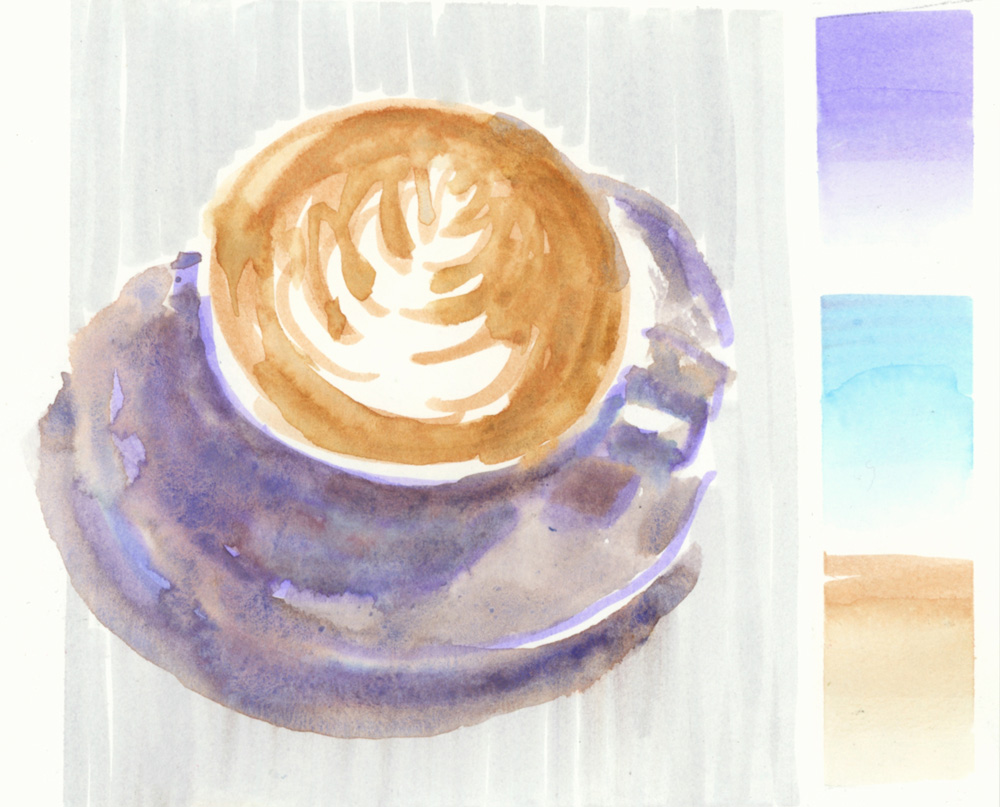
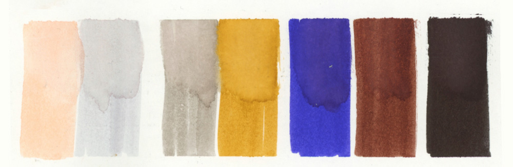
And then a little more experimentation with a coffee cup – using these three marker colours.
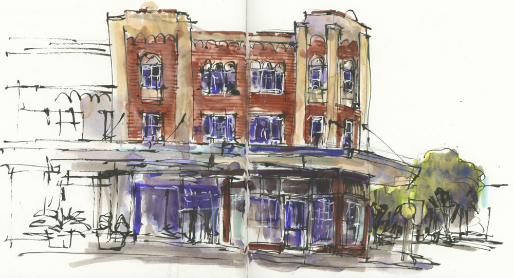
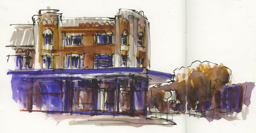
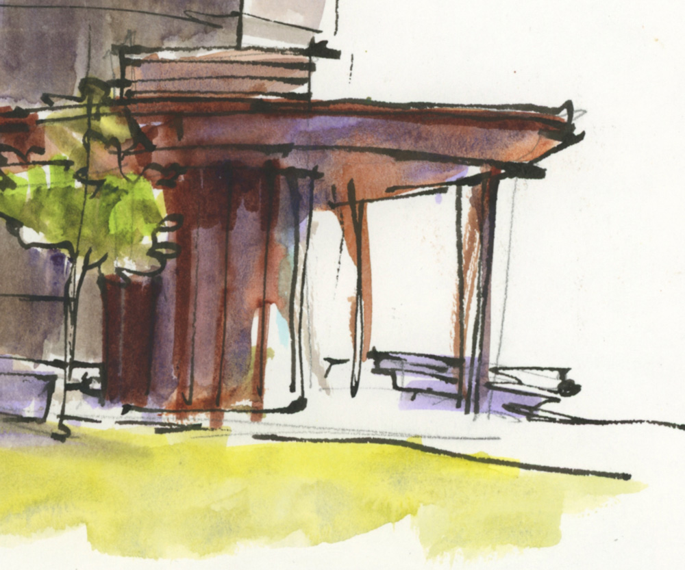
The final sketch in this article is another version of the Spanish Mission building on Lindfield Avenue – once again a layer of marker first, then watercolour over the top.
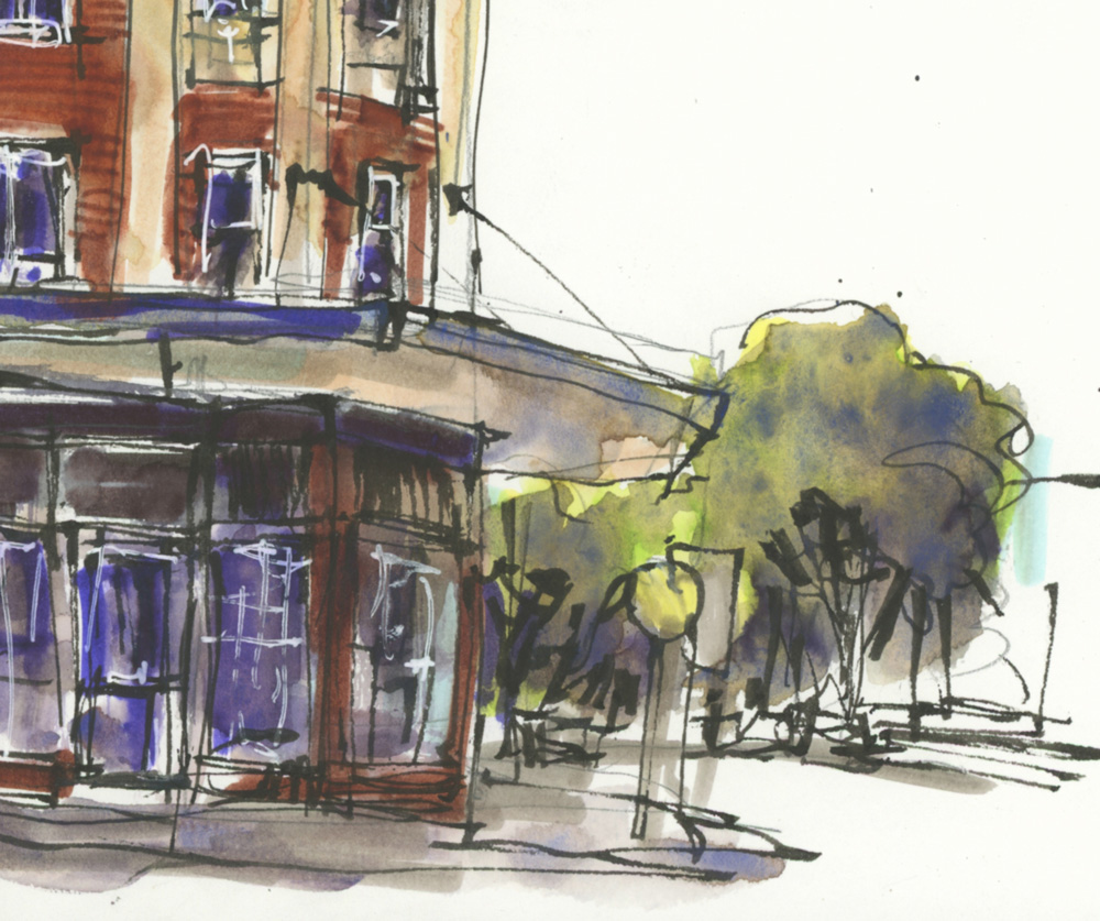
I really enjoyed doing this sketch and I’m loving some of the colours and layers that I’m achieving.
Some of you might be wondering why I don’t just stick to watercolour…and trust me, I’m asking myself that question too. 🙂
A few reasons why I feel compelled to do these experiments:
- I absolutely love mixing materials as it gets me into a state of play which I think is really important for sketching. Mixed media keeps things fresh, fun and experimental
- I also love the effect of bright intense colours under watercolour washes. I was doing this a lot earlier in the year with coloured pencils – so I’m using the same techniques here.
- Something special happens when I use markers – there is a wonderful type of freedom I experience with my marks when using markers. I think this comes from the ability to be able to rapidly add and layer colour without having to wait for anything to dry. This Spanish Mission sketch has a very special kind of liveliness that I felt at the time.
- I love the challenge of using new materials and especially the challenge of taming super intense colours.
I’m not sure how long I will continue mixing watercolour and water-soluble markers but at the moment I’m having lots of fun!


2 Comments
Hello Liz,
Thank you for this post.
Thanks to you, I am ordering the set of 24 GoldFaber Aqua markers and am looking forward to experimenting with them as I’m taking on WOL for the third time 😉
Thanks Alexandra – great to have you in WOL again!!!
NEWSLETTER
Subscribe for first notification of workshop + online classes and more.