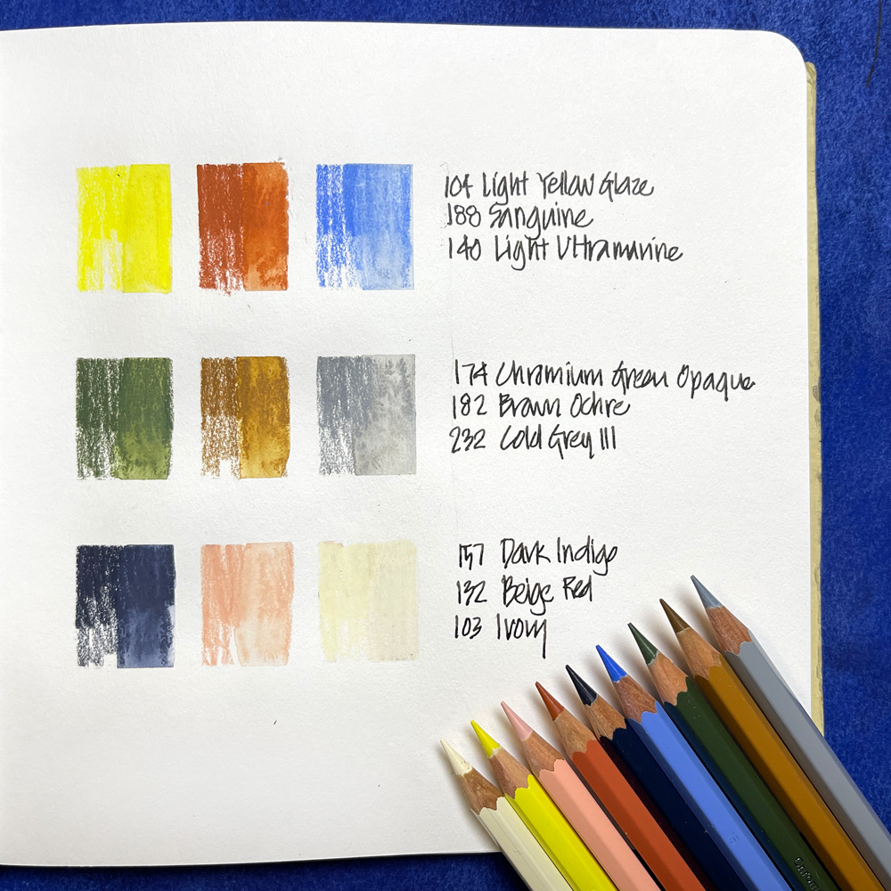
 For the last 6 months, I’ve used this selection of Albrecht Durer Watercolour Pencil by Faber Castell for my everyday sketching.
And I absolutely love this combo of colours!
So much so that I have used them for my upcoming Travel Sketching course. (Note: this is similar to a selection I shared a few months ago when I was still in exploration mode.)
This is a fairly unusual combination of colours and here are a few thoughts behind my selection:
- I wanted to have colours that were different from the hues in my watercolour palette and to have fun with some more pastel colours. I just love light creamy opaque coloured pencils (or watercolour pencils) and so these were the core of this set.
- I generally mix my watercolour pencils (WCPs) with watercolour rather than blending the pencils themselves to get the right hue, so I didn’t have to worry about how well the colours in this set mixed together.
- I also wanted to test myself with a limited palette and get used to not having the exact colours.
- I needed to have a good range of light, mid and dark toned colours. As I normally use my WCPs close to full strength I wanted this set to achieve a good contrast if I used them dry.
So, how did I decide on these nine colours?
 Primary Triad
Yellow: A light, bright lemon yellow (104 Light Yellow Glaze) that can easily be adjusted to a more primary yellow with my watercolour Hansa Yellow Medium.
Red: I chose an earth red – 188 Sanguine. This is one of the more quirky decisions in this set but I’ve been pleasantly surprised by how I’ve managed to survive without having a primary red. Many times over the last 6 months my subject has had some red, and everytime I’ve used Sanguine and it’s been just fine! Once again it is easy to adjust the hue with some watercolour over the top, but often I’m happy with the sanguine on its own.
Blue: I decided to use 140 Light Ultramarine for this set as I’m generally choosing lighter /pastel colours. This colour is working great for a lot of different situations – especially for skies.

Green, Brown and Grey
Green: I chose an earthy green 174 Chromium Green Opaque (which suits Australian vegetation), and I’ve been happy with this. If I want a brighter green I mix the yellow and blue (more about that below).
Brown: 182 Brown Ochre (a raw-sienna-type colour) has been my favourite WCP for years, so this was a no-brainer as my ‘brown’ pencil.
Grey: I generally prefer warm greys, but after testing this selection for months decided that a cool grey (232 Cold Grey III) worked better.
 One Dark and Two Light Colours
Dark: Another one of my favourite WCPs of all time, 157 Dark Indigo, was another no-brainer!
Light1: Although I don’t use it often, 132 Beige Red is good for caucasian skin tones and some light building materials. It’s another example of a pastel colour that I just like (a non-scientific reason!), and so it got included in this set.
Light 2: I use this 103 Ivory pencil a lot! (By the way, it has become a good substitute for Buff Titanium paint.)
Mixing Colours
As mentioned above, I typically don’t do a lot of mixing with my WCPs – with the exception of greens.
Below are four greens that I regularly mix with my yellow, blue, green, indigo and grey. I then further adjust with watercolour.
I also sometimes mix some browns by adding the Cold Grey III or Dark Indigo to Brown Ochre or Sanguine.
Limitations on this set
The main limitation of this set is that it’s lacking in red, pink and purple hues. As mentioned above, Sanguine has been a great substitute for red, but I don’t really have a good pencil for pinks or purples. However, I’ve managed to cope without these hues and rely on watercolour for them.
I’m also limited with browns. I sometimes want a neutral mid-brown but always end up surviving without it. However, the one pencil colour that I would like to add to this set is a dark brown *such as Walnut Brown). However, for the Travel Sketching course, I stuck with the 9 pencils listed above and didn’t add them.
Watercolour Pencils and Travel Sketching
I use these watercolour pencils throughout the Travel Sketching course as I strongly believe that using dry media is a secret weapon when it comes to starting a sketch when on the go (either travel or out and about locally). In the course I will show you how I use WCPs dry and also how I combine them with watercolour!
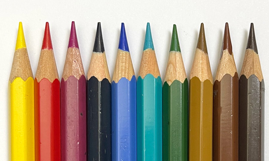 If you are interested in doing the Travel Sketching course and only have my Foundations set of watercolour pencils (see here for more)…
These colours are totally suitable for doing the exercises inside the course. The only additional colour that would be useful is Ivory.
Let me know in the comment section below if you have any questions about this selection or about the Travel Sketching course.
Find out more about my Travel Sketching course here!




18 Comments
I am heavily interested in sketching on the go, as I rarely have time for dedicated sketch outings. But I am not a huge watercolor pencil fan. I don’t know exactly why, maybe I should dive into that. But I did recently start using neocolour II crayons. Would those work for this course too?
Hi Martine – yes neocolors will work too (a little harder to use for small sketch though!)
Yes, I found that latest to be true after some experiments. Although using he waterbrush to pick up paint from the back of the crayon works for smaller (coffee) sketches. But more experimenting is to be done:-)
This article arrived just at the right time! I am traveling for a month starting at the end of August. Yesterday I finalized my watercolor palette and started thinking about what else I should bring. I appreciate knowing which colors you recommend but also why you chose the colors you did and how they compliment your travel watercolors. I can’t wait for the class! I hope early sign up is available before 26 August!
Thanks great Terry – have a great time on your trip!
Hi there Liz,
Thank you for sharing this selection! 😀 This looks like a really fun set. I always love to read your thoughts on color. 🙂 I would love to try each of these WCPs, especially the Chromium Green Opaque and Dark Indigo. I love your substitution of Sanguine for a traditional red, too!
Right now I only have two watercolor pencils, but I adore both of them. They are both Faber Castell Albrecht Durer, in the hues Raw Umber and Walnut Brown. Raw Umber looks very similar to the Brown Ochre you have. I would love to compare them someday. 🙂
Both of my WCPs live in my barebones sketching kit that I have with me at all times. When I’m pressed for time or just low on energy, I fall back on those two WCPs. I’m always pleasantly reminded that these two WCPs alone can provide such a wonderful range of textures and values! 🙂
My barebones kit consists of a toothbrush case filled with a few pencils: The two WCPs, a 6B graphite pencil, a non-photo blue pencil, and three Prismacolor pencils (White, Black Grape, and Greyed Lavender). The non-photo blue pencil is for construction lines when I’m working on a new or tricky subject. The white is for use with toned paper, since I have been experimenting with that a lot lately. The Black Grape and Greyed Lavender are fun accents that work surprisingly well with the Raw Umber and Walnut Brown WCPs. 🙂 They’re stored in a toothbrush case because it’s slim, compact, and protects the pencil tips from damage.
I love carrying this minimalist kit with me all the time. 🙂 You’re so right, dry media is way easier for sketching on the go! And WCPs are perfect, since you can activate them so easily with a waterbrush later. 🙂
Thank you for sharing your thoughts, as always! 🙂 Someday I hope I’ll be able to take your Travel Sketching course. It sounds amazing! 😀
Happy Sketching! <3
thanks for sharing London – glad you have a good minimal set. And just to make sure you are aware – there will be a special Earlybird price if you sign up for the waiting list https://sketchingnow.com/travelsketchingupdates/
Okay, thank you for sharing the earlybird price reminder! I’ll go ahead and sign up for the waiting list. 🙂 Thank you!
And this just makes me even more excited for your new course!! Come on September!!
Yay! great to hear Lisa!
Hi Liz and everyone. I have aset of Derwent, watercolor pencils. Can you give a cross reference to the colors that you selected so that I use my Derwents? Thank you.
Hi Donna – I don’t have a set of those pencils I’m afraid I can’t list an alternative set in that brand. However, if you follow the guidelines you can create your own selection:
– primary triad
– a green, a grey and a brown
– one dark and two light colours
Hi, all of you eager to begin this course. I sure am !Liz, a few years ago. I noticed that you used some Caran d’Ache museum watercolor pencils. did you like them? How do they compare to the Faber Castell Albrecht Durer waterclor pencils you have used in previous courses and that are proposed for this course. what are some special qualities of this brand? thanks
Hi Margaret – Museum wcps are beautiful but I generally prefer the colours of the Albrecht Durer. They retain their points a little longer and are more readily available (and affordable) here in Australia that the Museums.
Liz,
I love this color selection – it reminds me of all the different bold and sun-lightened colors in old Italian architecture.
thanks Lee!
Oh! What a lovely set of colors! I always like to try different palettes of color, I learn a lot that way. This one really makes me happy as I adore sanguine and that chromium green opaque. Using a cold grey instead of warm grey? I’ll give it a go! I can see it better balances this set as so many of the colors are warm as it is. I’m ready to give watercolor pencils an honest try!
Hi Jamie – I’m more of a warm grey girl but the set needed another cool colour, so cold grey got the nod!
NEWSLETTER
Subscribe for first notification of workshop + online classes and more.