Before I put my Norfolk Island sketchbooks away in my bookcase (will there be room?), I wanted to do some more controlled tests on the Pentalic paper to check my on-location assessment of how it worked. I also wanted to compare it with the Moleskine paper which is what I normally use.
But first, I thought it would be useful to do a quick overview of the Pentalic Aqua Journal sketchbook.
In summary this is a beautiful sketchbook and I highly recommend it!
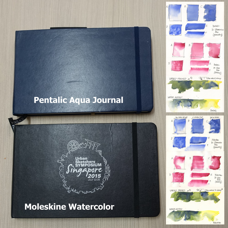
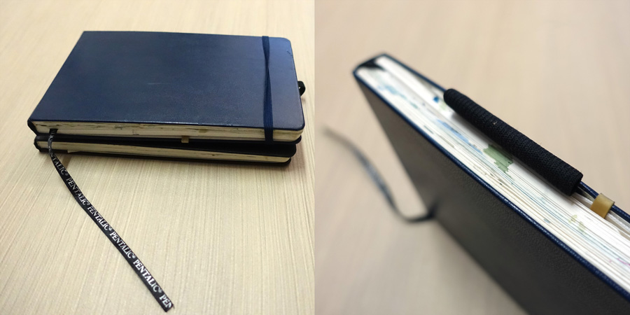
The quality is excellent and there are a lot of nice features. The book is approximately the same A5 landscape size as the Moleskine Large Watercolour Notebook, but with a nice blue colour (I am a blue girl, if you haven’t already noticed!) and a long cloth bookmark and a pen holder. Neither of these two additions were any use to me, but they’re a nice touch. The paper is thicker than the Moleskine (300gsm vs 200gsm) with few pages (only 48 pages vs 72 pages) and it is a fraction whiter. If you don’t like the way the Moleskine paper buckles then you’ll really appreciate the extra thickness of this paper.
The book opens flat and the stitching appears solid, although there is a gap between the signatures which is a little larger than ideal and there was some glue showing.
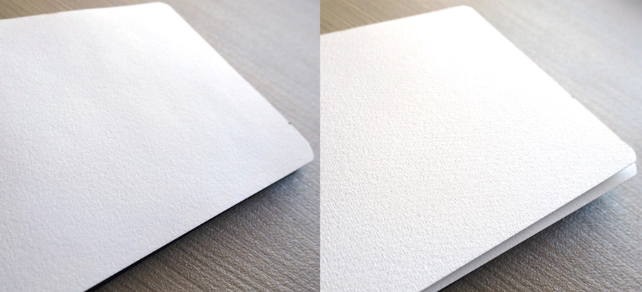
There is a noticeable difference between the two sides of the paper and one side has quite a strong mechanical grain. The current Moleskine paper has a similar difference and strong grain. Interestingly this grain had less of an impact than expected and I didn’t really notice it while I was working.
The paper is perfect for people who want to achieve uniform washes, who don’t work too wet, and who are happy to wait between passages. I don’t fit into any of those three categories, so that is why I found paper challenging! As I mentioned in my Norfolk Island posts (in particular this one), I initially thought it was a big disaster to take an untested sketchbook away with me! However my determination to work out a way to use the paper to suit my approach certainly paid off, and I now have a sketchbook full of sketches that I love.
So what am I talking about in terms of paper, and why did I have so much trouble?
Basically I believe it is the sizing on the paper that caused my main problems. Sizing is the coating that is put either on the surface of the paper (external sizing) or internally to prevent the water being immediately absorbed into the fibres. I am used to working with paper that has a reasonable amount of external sizing which enables me to manipulate the pigments in the water on the surface, and create edges through my varied brushstrokes. I also like patchy washes and textured passages to suggest details without having to draw them.
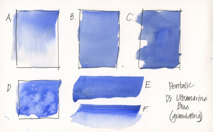
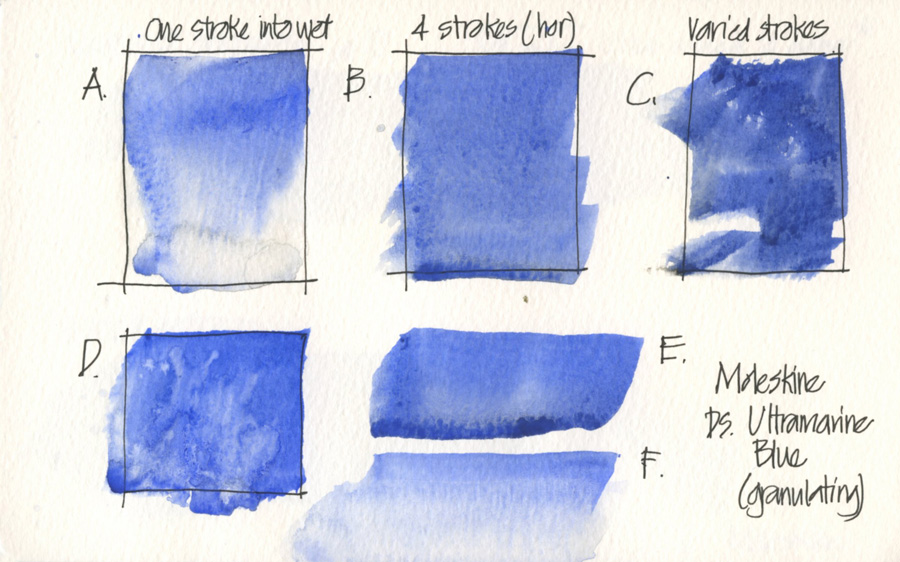
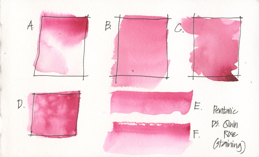
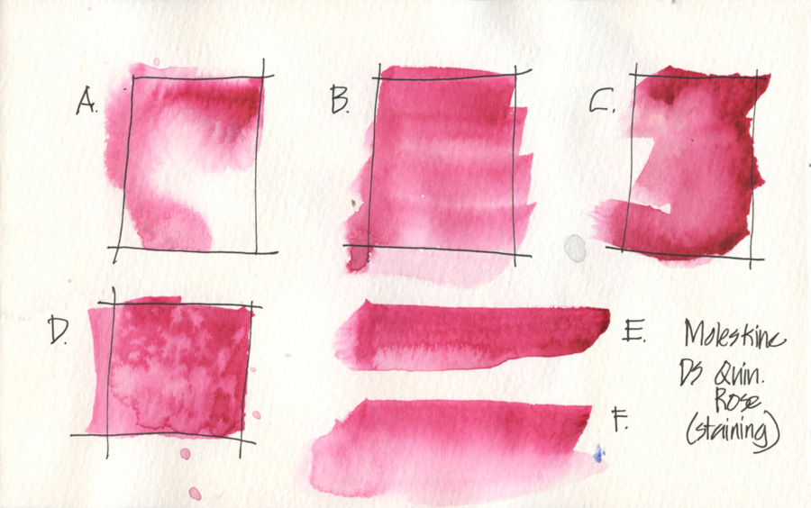
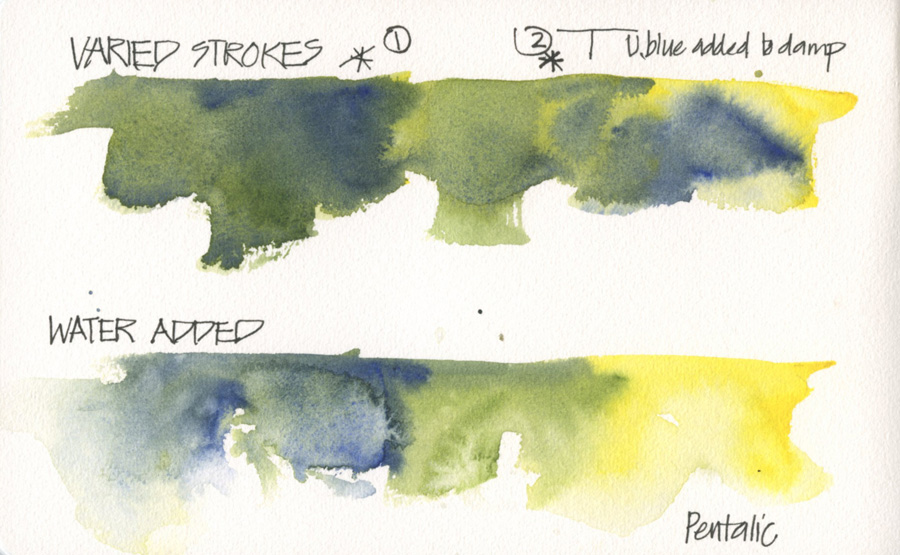
So let’s have a look at the tests I did to explore the characteristics of the paper:
A. Pre-wetting the square and dropping colour in through a single stroke on the top edge.
B. Four strokes laid over each other – not a zigzag motion which is what I would do to create a even wash. I was not trying to get an perfect wash but rather wanted to see what happened to the bead at the end of each stroke.
C. A number of varied strokes overlapping each other.
D. Some water drops splashed over a wash similar to B.
E. A single stroke.
F. Trying to achieve soft edge over a single stroke by using a clean damp brush.
I did these tests using Ultramarine Blue to see what textures would be achieved through the pigment granulation, and also with Quinacridone Rose which is a staining colour with more of a tendency for backruns (cauliflower effects).
I could go into a lot of detail comparing each test but here are a few important points
– The Pentalic paper produces even washes (refer B and C) as opposed to the Moleskine which does show the brush strokes. This is not to say that you cannot achieve an even wash on the Moleskine (you can!) but see how easy it is to achieve it on the Pentalic! This is particularly noticeable in the C samples!
– Because of the sizing (water and pigment staying on the surface longer) these is generally more granulation on the Moleskine paper.
– It is harder to achieve soft edges on the surface on the Pentalic (F), once again I beleive this is because the water is absorbed so quickly into the paper. The best way to acheive a soft edge is by pre wetting the paper (A).
– Adding water to produce crazy effects is more even on the Pentalic.
Doing these tests really confirmed what I discovered while using the Pentalic sketchbook on location, and as I have said earler, it is a beautiful sketchbook and would suit many many people’s watercolour techniques. The evenness of those washes is very impressive – really great for beginners!
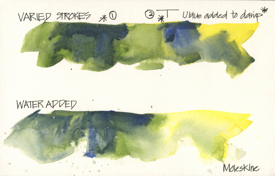
This next comparison tried to replicate the way I work on location by putting down a collection of strokes with a varied wash and colour direct from my palette. As you would expect from the first tests above, the strokes on the Pentalic paper merged together. The big deal for me was when I came into the drying wash on two occasions (1 and 2) and added a horizontal and vertical stroke with pure Ultramarine – occasion 1. was when the wash was still quite wet and 2. when the wash was almost dry but still a little damp. I hope you can see how ‘lost’ these strokes were in the Pentalic book.
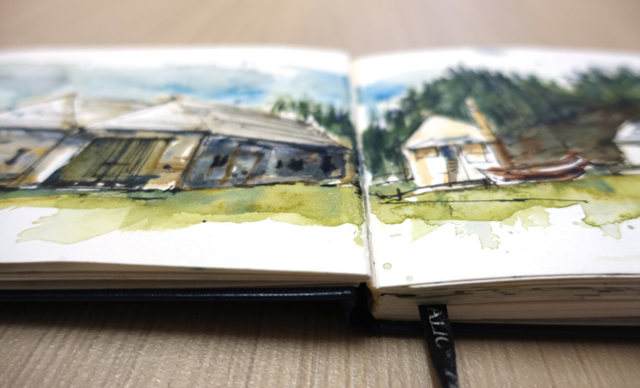
After a few days of experimentation on Norfolk Island, I discovered that the best way to achieve textures on this paper was to apply my varied wash and then splash some water into it (achieving texture by backruns rather than my brushstrokes), letting the paper totally dry and applying a second pass later. There was no way that I could achieve the textures I wanted while the paper is damp!
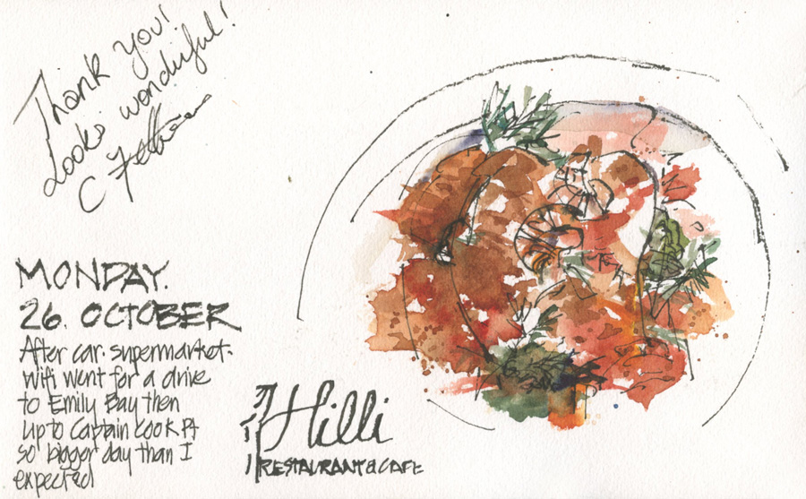
Using the Pentalic book has made me realise how much I rely of my brush strokes for edges to describe my subject matter – particularly as I keep my lines to a minimum. This was very obvious to me on the first evening when I tried to sketch my lovely meal at Hilli. I just got a watery blob of colour and had to wait till it dried before I could layer some more washes (or splashes) in order to achieve texture. It also made me realise how much the paper is a factor in how fast I can sketch and how many ‘wet in wet’ and ‘wet in damp’ risks I run when I work – how much I rely on a sense of timing, or take risks ‘going for it’ anyway!
Note: I have not commented on the paper fibres – I have read that the Pentalic is supposed 100% cotton but it is not listed as such on their website. Both Pentalic and Moleskine books are described as acid free. I personally find sizing to have a bigger impact than the fibres and just because a paper is 100% cotton and a ‘superior’ paper doesn’t mean that it is going to be perfect for your use.
Some of you might find this post a little technical, but in fact I wish I had a little more detail knowledge about paper fibres and sizing to confirm my theories of what was happening.
But I suppose the two takeaways from this exercise are:
1. The more you understand about your materials the more you can achieve the results you are after. Note: This is an advanced application of what we look at in the first lesson of Foundations – its another example of how I never move past the basics!
2. How powerful and useful it is to have an understanding of the edges of your brushstrokes. This post is a follow-on from what we looked at during my recent Edges course (if you missed it, the course will be re-offered in the new year!) So I hope all my readers that did the course can make the connection!
And finally – a huge thankyou to my friend Stephanie Bower who gave me this sketchbook in July when we were in Singapore. I have been wanting to try one of these books for ages and am so glad that I now have… and that I took it to Norfolk Island and filled it with such special sketches. Thanks Stephanie!
Would love to hear your comments… and if you have any questions. I am always learning more about watercolour and paper – it is such a rich media that I don’t think I will ever stop expanding more knowledge!
Subscribe to my mailing list for my monthly newsletters including first notification of my new SketchingNow Online Sketching Courses and face-to-face workshops.


4 Comments
Great site Liz, with loads of very useful information – especially using permanent inks in fountains pens! Up to now I had been using a sharpened matchstick dipped in indian ink!
Hello Liz, your detailed experiments are exceptional. I have been using the Pentalic and the Moleskine journals and could not explain why they behaved the way they did. It makes total sense what you are saying about the sizing. I am sure the Pentalic has only a little amount of cotton (if any) and the sizing makes the washes more controllable.
Thanks for all the info!
IG @gm_art.photo
Hi Liz … thanks for all the info. I’ve been trying to find a Pentallic sketchbook for a while now and can’t seem to find anyone who stocks them … even if they have them listed, they are listed as ‘unavailable ‘. Do you know of any stockist in Australia that you can recommend? Many thanks.
Susana Smith
Tasmania
Pentalic Aqua sketchbooks had a major backorder, I’d been waiting over a year for them to come back in stock. I can’t speak for where they will be available in Australia or where to check, but they have finally been coming back in stock over here in the States. DickBlick, Jerry’s, and CheapJoes all have them right now as of this week. Might be worth asking shops in your country if they will be getting them in soon since that long backorder seems to have finally come to an end. Good luck!
NEWSLETTER
Subscribe for first notification of workshop + online classes and more.