Last week I had two sketching outings in the City and did some fun colourful versions of a few of Sydney’s important buildings.
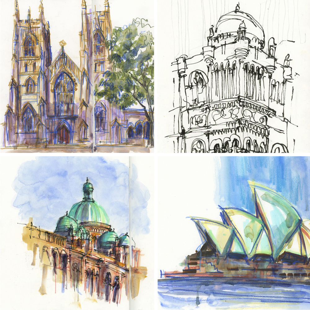
In February I did an ink drawing of Sydney Town Hall (see here) and last Wednesday afternoon I was hoping to do a coloured version… but it was a warm day and I would have had to sit in the sun to sketch the view I wanted. So I kept walking through Sydney Square and came upon the western facade of St Andrews Cathedral. And I said to myself “wow! how have I never managed to sketch this before?”
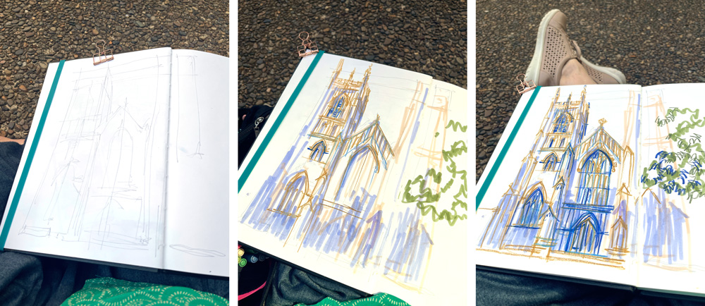
I sat down on the ground (leaning up against a column) and started mapping out the sketch with loose pencil lines. My intention was to do a classic ink-and-wash sketch but I was in the mood to do a looser style of sketch.
So instead I just grabbed some coloured pencils and my Lavender Light GoldFaber Aqua Marker and started filling in the details with free and rapid strokes.

Here is the finished sketch – I had so much fun doing this! Can you tell?
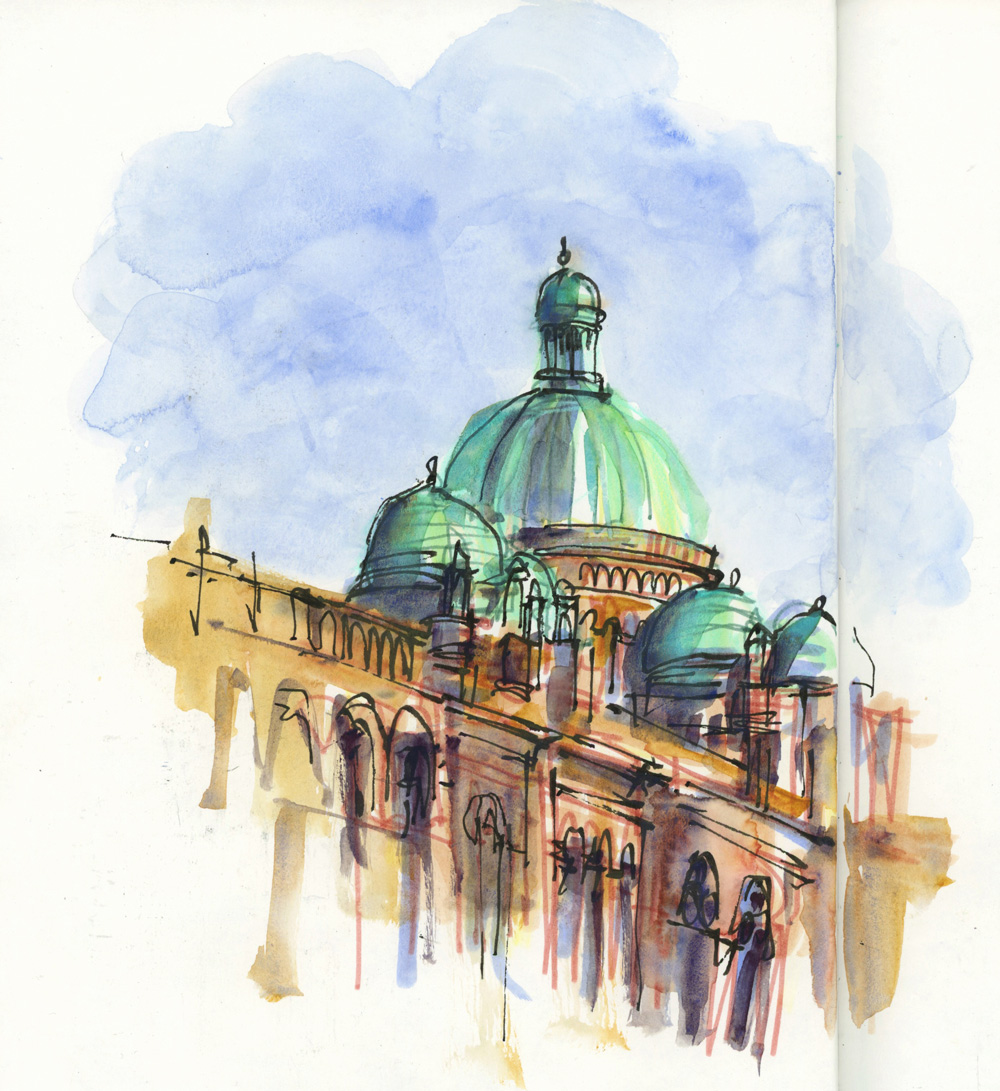
The City is pretty busy at 4:30 in the afternoon so I wandered around for a bit until I found a good spot to sit and sketch the domes of the Queen Victoria Building (QVB). This was another sketch where I allowed it to develop as I worked.

And then to complete the double-page spread I did a fun continuous line drawing of the corner of the building. This sketch was the direct result of a question I was asked during the Live Sketchbook Tour I had done on YouTube earlier that day.
On Friday I was back in the City again – this time with two friends from Singapore – one of them wanted to sketch the Sydney Opera House (SOH) and I’m always happy to sketch it. (See here for last month’s version)
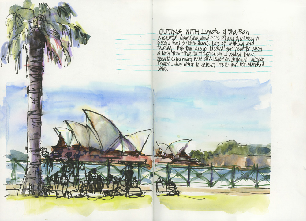
I had finished my sketch and wanted to do another one but a big tour group came and sat down on the grass for a LOOOONG time blocking our view. It was a little frustrating so I ended up adding them over the top of my sketch – risking ‘ruining’ my sketch for the sake of story-telling.
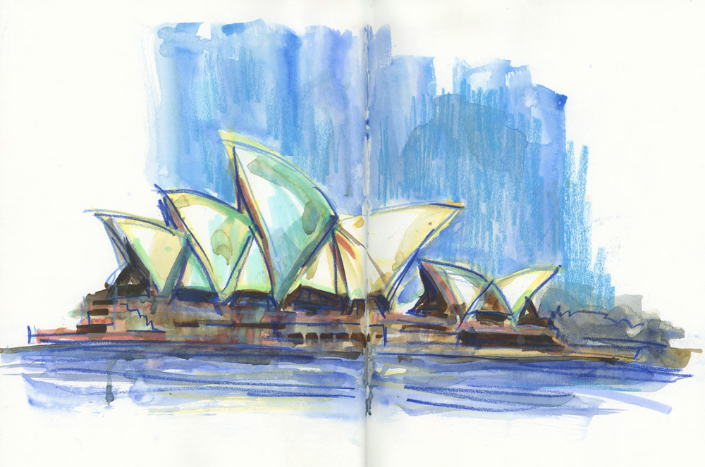
And then I turned the page and did this slightly crazy version of SOH!
Ah! It feels so good to be back to regular sketching outings and to feel free to experiment with colour and texture!


8 Comments
Gorgeous, as usual!!! Really like the free rapid strokes you made on all the sketches. For the QVB what was used to create that beautiful green some?!!
Thanks Tami – its a bit of marker under my favourite watercolour paint – WN Cobalt Turquoise Light
As a beginning sketcher who is intimidated with drawing people, I usually leave them out of a scene of buildings or landscape. Your simple gesture sketching of the figures in black ink captures their presence without getting bogged down in anatomy…. well, bogged down is what I would be. Thanks for this work around. Yes, I know I’m going to have to learn to draw people sometime…..
Hi Sandra – yes developing a simple way of adding them for scale is good. here is an article on the subject (with a bit of perspective too!)
https://www.lizsteel.com/how-to-include-people-in-your-urban-sketches/
Thank you for so generously sharing your life and learnings with us Liz.
And I was struck by how you let the story be the deciding factor in your choice of content for your first sketch of the SOH. Such an important lesson. As AP Ryder (1847- 1917) said, “What avails a storm cloud, accurate in form and colour, if the storm is not therein?”
My pleasure Ginie – just for clarification… I took the risk of adding the people because 1. its a scene that I’ve done many times before 2. although I was not unhappy with the sketch I didn’t care about the risk of ruining it 3. I was looking forward to doing the second version. If I was really happy with the sketch I would not have added the people over the top like that.
I am in love with your style of sketching! I am new to art sketching and just getting started with some supplies. I am so attracted to the color blue you added on top of some areas for that pop that really draws me in. What is it and what color is it? Thank you for sharing, I will be following you on YouTube.
Hi Maricela. Great to hear that you are starting to sketch. The blue is cobalt blue watercolour at times over a blue coloured pencil. Cobalt blue is my go to sky colour
NEWSLETTER
Subscribe for first notification of workshop + online classes and more.