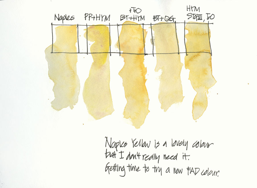
Two weeks ago I shared an updated list of paints in my palette and I wrote: “this might change and chances are it will happen within a month or two of my listing all my current colours! It normally happens that way, as soon as I put a line in the sand I shift it!”
Ah… make that a week or two!
I also mentioned that I had a ‘fad’ colour spot in my palette and that was currently occupied by WN Naples Yellow. As much as I love the colour, I knew that it wouldn’t stay long. Mainly because it is very opaque and therefore not ideally suited to ink and wash. I used to work with all transparent (or semi-transparent) pigments as I dislike having the paint visible over the top of my black lines, but as I work a lot more varied these days, it is less of an issue, but the more transparent the easier it is to manage.
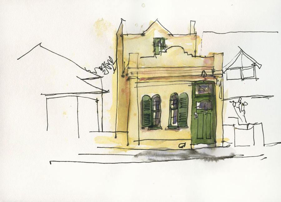
I also realised while I was doing this sketch in Launceston on Saturday (and just for the record I was pretty tired after 3 days of teaching) that I could easily mix a similar colour – one that was more interesting in terms of granulation – with two of my standard colours in my palette. Hence, I did a few swatches to try some alternatives. The mix I was thinking about was WN Potters Pink and DS Hansa Yellow Medium and it does create a very different result. None of my alternatives match the lovely yellowy creamy colour of Naples Yellow, but if I am honest, I rarely need that exact hue anyway. After all, it was a fad colour.
Aside: A lot of people question my use of Potters Pink (and BTW WN is much superior to Daniel Smith) but this swatch shows why I have it in my palette. It creates great granulation and is also a way to mute a colour while still maintaining a juicy pigment:water ratio. However, I do realise that it is certainly not a colour for everyone and it is definitely one of my more quirky selections. Special mention must be made of my friend Robyn in Tuscany who introduced me to this colour – thanks!
Ok… this is developing into a bit of a rambling post, but it is nice for me to have the time to get back to blogging more consistently as I really miss it when I am too busy! Anyway, to get back on track…
I asked on facebook and instagram for some suggestions and Katie (seconded by Issy) suggested Marine Blue by Holbein. “Brenda Swenson got me hooked on it. Makes incredible greens and is surprisingly transparent and liftable, a single pigment color, not exactly like other pthalo blues. wink emoticon I use mostly DS colors, but this one is special.”
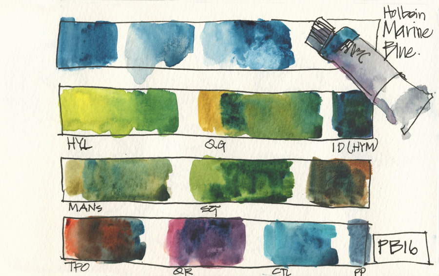
So as I was in the city for an appointment yesterday and vaguely in the vicinity of Parkers Art, who do stock Holbein paints, I popped in to buy a tube. Oh! tragic isn’t it?! This is the first page of tests…
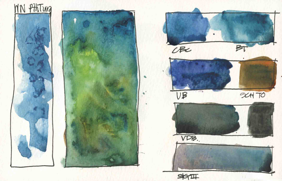
and this is the second. Basically I am just doing a quick mix with every colour in my palette to get a feel for the possibilities, but the real testing begins when I fill a half pan, put it in my tin and hit the streets! I checked the pigment and then my paint tube wall and discovered it was the same as WN Pthalo Turquioise and then I looked up the Handprint site (it’s a top 40 pigment!) This is something that is best done BEFORE you make a purchase… but oh well, the damage is now done!
I think it will be a fun fad colour for the next month or so (perfect for the start of summer here in Australia, isn’t it?) and interestingly does what Pthalo Blue (red shade) did for me – mixing gorgeous vibrant greens, especially with Quin Gold.
Hmm, does this change mean I can(or should) adjust my ‘green’ spot as well? Ah! the colour games continue!


NEWSLETTER
Subscribe for first notification of workshop + online classes and more.