As mentioned recently when I shared my updated 12 colour palette, the only one colour that I’m specifically recommending for my Teacups Course (coming next month) is Quinacridone Gold which I use mainly for gold edging.
I still use the original Daniel Smith formulation (PO49) and the last time I compared it with the new version (PO48 PY150) I wasn’t happy with the new version. I felt that the green mixes were a little flatter but I wanted to revisit this conclusion and see if I used a little more pigment in my washes I would be happier with the results. I also wanted to test other brands.
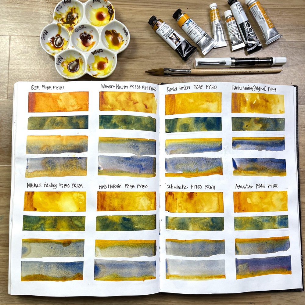
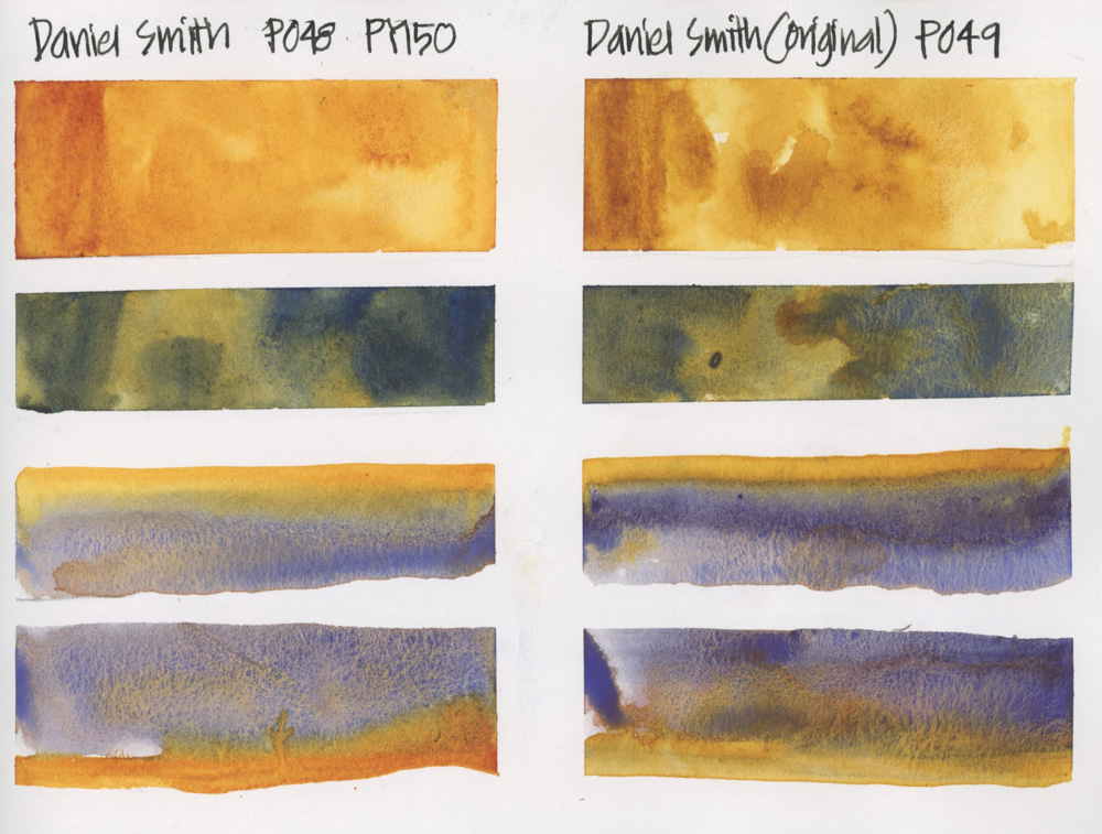
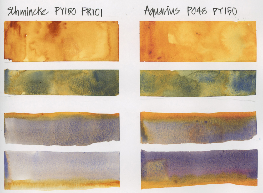
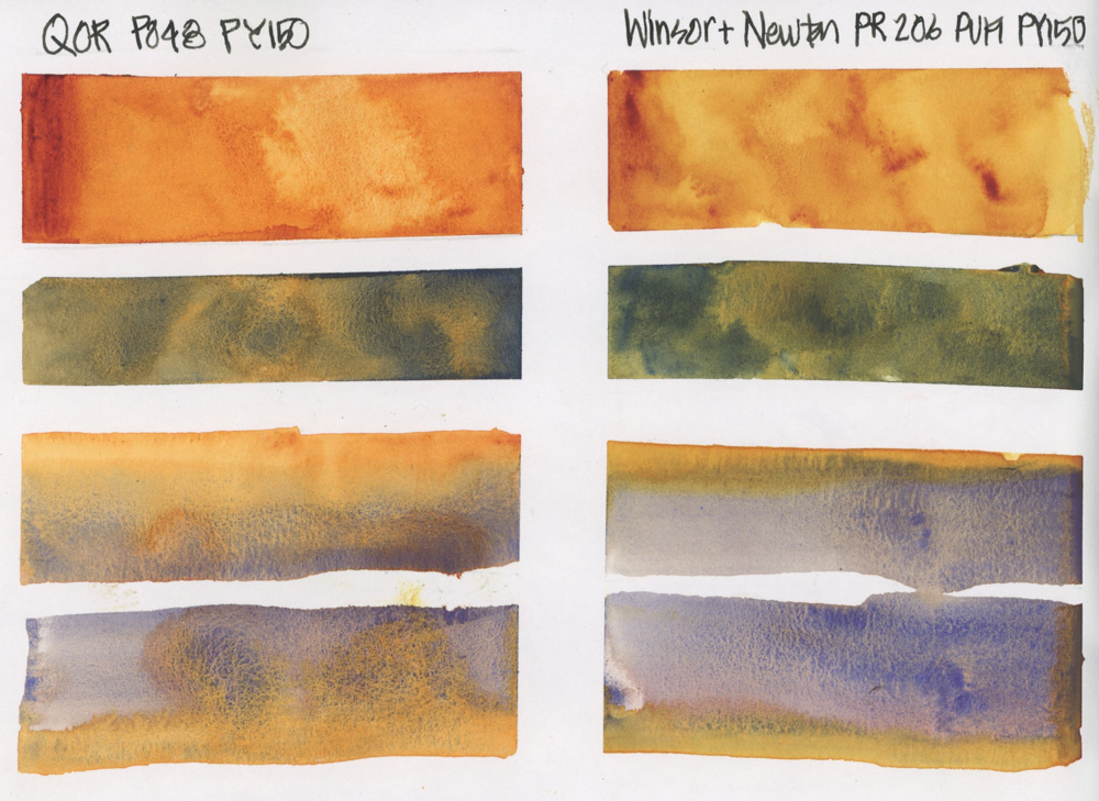
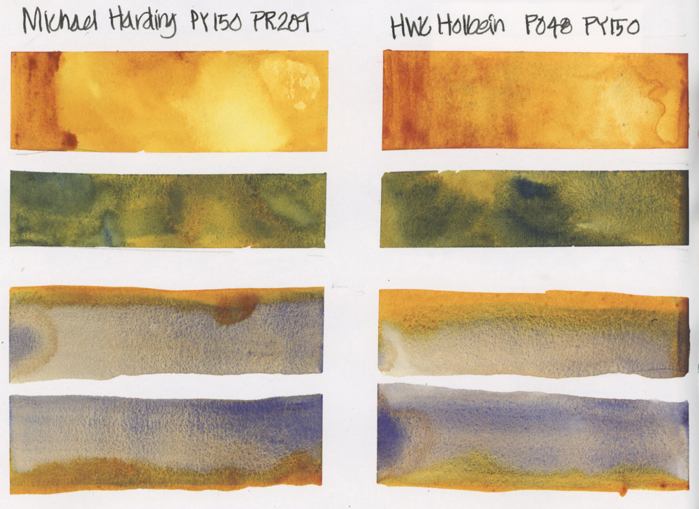
Therefore I created this double-page spread in my sketchbook to test 8 different Quin Gold. Isn’t this an amazing page? The colours and intensity of the swatches are so yummy!
The brands I tested were (in the order that I tested them)
- Daniel Smith (original formulation) – PO49
- Daniel Smith (current version) – PO48, PY150
- Schmincke PY150, PR101
- Aquarius PO48, PY150
- Winsor and Newton
- Holbein
- QOR
- Michael Harding
(Note as I am left handed I work from right to left)
I was testing three things that relate directly to the way I use Quin Gold:
- general hue and variation from pasty (masstone) to watery – I want a Quin Gold that can produce rich mid-tone burnt orange hues and also light warm yellow hues
- what type of greens can be mixed with Schmincke French Ultramarine and
- behaviour in a wet-on-wet situation – when a shadow wash is placed adjacent to a stroke of damp/wet Quin Gold and when Quin Gold is placed adjacent to a wet/damp shadow wash.
For teacups, this last test is very important as I like the gold edging of a teacup to bleed into a shadow wash.
All 8 versions performed adequately in this regard – as you will notice below I did an additional test for WN and SCH as that I could more accurately test the Wet-on-wet behaviour. (It can sometimes be hard to keep a consistent degree of wetness when doing a lot of watercolour swatches.)
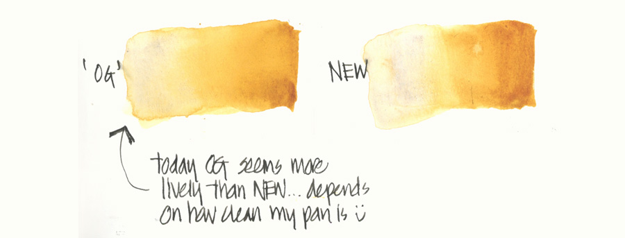
I was also surprised that my swatches done with the original Daniel Smith Quin Gold were a little flat. But on a subsequent test, I think that was just because my ‘OG’ Quin Gold pan was a little dirty! 🙂
I’m now in the process of testing each of these brands separately in individual sketches.
Here are closeups of all the swatches:
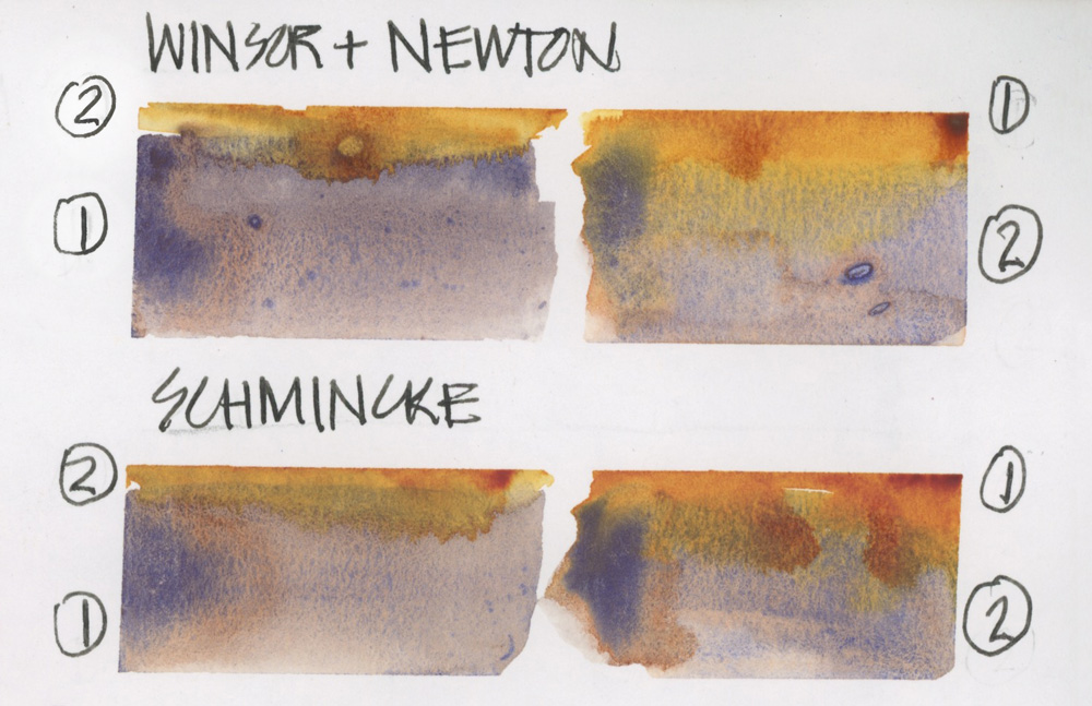
And here is the additional test I did for WN and SCH.
So in summary, if you are going to be doing my Teacups course, any brand of Quinacridone Gold will work fine.
The Teacups Course is now open for enrollment!
4-week video course with community and 2 bonus livesteams – starting 31 May 2023
Find out more and enroll here!
Do you currently have Quin Gold in your palette, what brand do you use and what do you use it for?



22 Comments
Thanks for the comparison, Liz! I’m a longtime DS Quin Gold user and still have 2 tubes of the PO49 formula.
But I also experimented with the new versions of former PO49 watercolor paints, DS Quin Gold (QG) and DS Quin Gold Deep (QGD). I prefer the new DS QGD (also PO48 & PY150) as a replacement for PO49–it just has more depth and gets nice, moody, dark green, olive and violet mixes. In your swatches, I like the RS Aquarius and WNP version in mixes, but each seems a bit orangey on it’s own.
Thanks! I will definitely check out QGD as I agree that one of the amazing qualities of QG is the range from deep gold to bright yellow.
Thank you for the comparison. I had been wanting to try some of the QOR because of the description, which implies it has better flow capabilities, but going from your swatch; it might not be what I am looking for after all.
I use QG from American Journey, where the formulation is PR206 and PY42 so different to all the others. I think it looks closer to the original DS but it is very hard to tell from the monitor. It might not be as vibrant gold though because it looks more brown I think.
Hi Catrin – from this single page test it seems as if the QOR flowed too much and could be hard to use for the purposes I want.
Have never come across American Journey – thanks for sharing.
Thing this brand is from Cheap Joe’s Art Stuff located in the US
Thanks Ruth
Would love your general thoughts on the Michael Harding watercolors
Hi Celeste – What you see on this page is all the testing I’ve done to date on one colour. 🙂 So can’t comment further and am not sure when/if I will test them in general.
What color did you use to mix the greens and purples?
I found this very interesting!
I just purchased Schmincke’s Tundra Violet and love this granulating color for distant hills, etc. The purple mixes here remind me of that!
Thank you!
Beth Freeby
Hi Beth. The green is with SCH French ultramarine. The purple is my Steels Grey
I currently have 3 of the brands of Quin. Gold you sampled & could tell which swatch was QOR. QOR watercolors are fun to use but sometimes challenging. Thank your for sharing your comparison swatches
Hi Nary. Yes QOR are a bit unpredictable – one day I’ll make time to play with them 🙂
Hi Liz,
Thank you so much for doing these comparisons! I’ve only ever used Daniel Smith’s Quin Gold.
Eileen D
My pleasure Eileen!
Thanks, Liz. This was the perfect article for me right now and I love how in depth it was. I ran out of the original DS QG and did not realize there is a new version. It didn’t matter because they were sold out of it at the store. I bought QOR and was shocked to find it was so orange.That took me by surprise. I am off to the store to replace my DS again and if it is sold out,
I will now confidently get Schmincke. This article was a life saver!
Suzanne McV
So glad it was helpful Suzanne
I was a bit surprised to not see M. Graham in your testing. They have such a glorious set of Quin’s. The honey can make them a bit sticky and/or not harden sufficiently for travel in very warm climates. But for a studio palette, seems like it deserves a seat at your test-table.
Best!
Hi S – I would love to try some M Graham but sadly not readily available in Sydney Australia. These were the brands I could easily get my hands on a few weeks ago. Thanks for reminding me about them 🙂
Gulp. Purchased WN Quin Gold and was sent: Trans Gold Deep. They’ve changed one of their pigments from PR206 to PR179. Their website claims the new formulation is a close substitute. FYI
Thanks for sharing! It’s hard to keep up with all the brands and changes
One of these days I’m going to have to experiment and do a page like this! I’m in love with Quin gold, all due to this page. Lol! The real question is how will it work for various subjects and mixes? I’m eager to find out!
Hi Jamie – these pages are so much fun to do – they are also a good option when you don’t know what else to sketch!
NEWSLETTER
Subscribe for first notification of workshop + online classes and more.