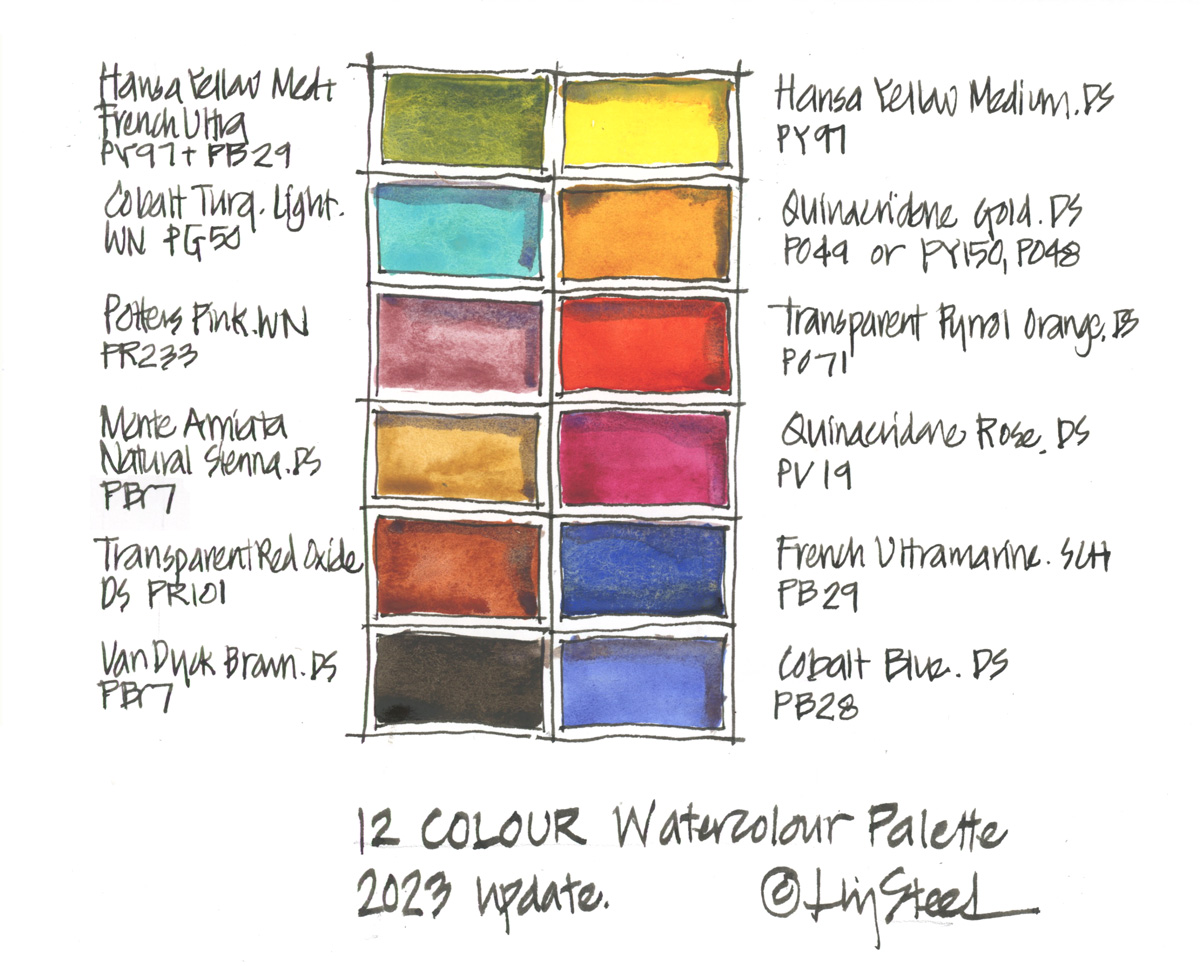
I thought it was time to share an update on the colours that form my 12-colour palette.
DS Hansa Yellow Medium PY97 ( split into two half-pans in the palette see more about why here)
DS Quinacridone Gold PO49 ( I still have the original pigment but the new mix is fine)
DS Transparent Pyrrol Orange PO71
DS Quinacridone Rose PV19
SCH French Ultramarine PB29
DS Cobalt Blue PB28
Mixed Green (DS Hansa Yellow Medium PY97 and SCH French Ultramarine PB29
WN Cobalt Turquoise Light PG50
WN Potters Pink PR233
DS Monte Amiata Natural Sienna PBr7
DS Transparent Red Oxide PR101*
DS Van Dyck Brown PBr7
Note 1: DS = Daniel Smith, WN = Winsor Newton, SCH = Schmincke
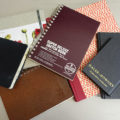
Note 2: I am listing them as I think of them – right column first and then left column (as I’m a leftie) – so I apologise if this list doesn’t relate to the way you are probably reading the above image!
Note 3: Cobalt paints have toxicity issues so please make sure you are aware of this.
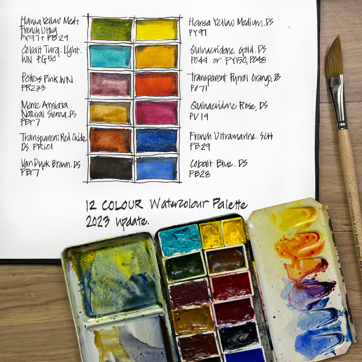
The original 12-colour palette (see here) was the one that I used to film my Watercolour course and it still is perfect for doing that course.
The minor changes in this palette reflect the colours I use the most in my everyday palette (of 16-18 colours) and will be a great starting point for anyone who will be doing my Teacups course and wants to use my colours.
I will be sharing a full materials list for Teacups in the next week or so (join the dedicated mailing list to receive this prior to the doors opening to the course) but I can tell you now that the only colour in this palette that will be recommended specifically for sketching teacups is Quinacridone Gold. You will not need to use exactly the same brand as I do for the course. More about Quin Gold in a separate article coming soon.
Let me know if you have any questions about this palette in the comment section below. You might also like to check out the Colours In My Palette series for the reasons why I use certain pigments.
(If you are reading this via email, please click on the article title link below and add a comment on my blog. Thanks!)
The Teacups Course is now open for enrollment!
4-week video course with community and 2 bonus livesteams – starting 31 May 2023


9 Comments
Is your custom mixed green made of equal parts HYM and Fr Ultra?
Hi Celeste. It varies each time and doesn’t seem to matter much whether 40:60 or 50:50 or 60:40.
Hello Liz, can I ask why you mix up this green in your palette rather than laying on the yellow then mixing the blue in places on paper? Thanks, Fran
Hi Fran – because I get more pigment party mixing two colours with plenty of pigment and water as a wash in my palette, than I do if I just lay over yellow and blue on the page. Just a personal preference
I’m surprised to see that CBC is gone!
I don’t think so could live without it. What prompted that?
I’m totally new to watercolor. Are the colors for your palette something you buy already in the little palette pans already or do you buy the watercolor paint in tubes and squeeze them into the little pans?
Hi Ann – I squeeze tube paint into pans. See more here https://www.lizsteel.com/trip-prep-getting-my-palette-ready/
(I’m signed up for the teacups course.)
I’ve set up this palette for the teacups course, since I had all the colors already, and I had plenty of room in a spare palette box. I’m so excited for the teacups class!
NEWSLETTER
Subscribe for first notification of workshop + online classes and more.