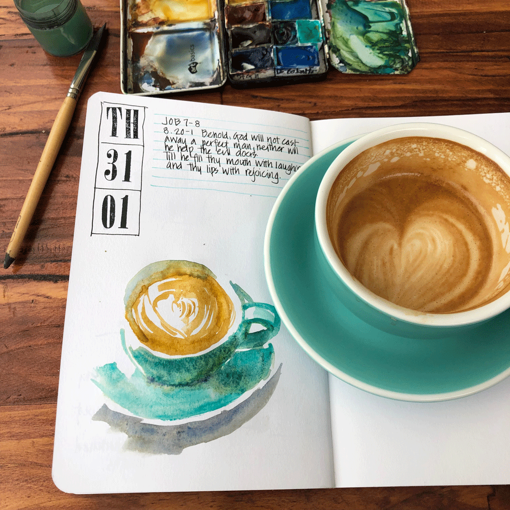
So you might have noticed that a few weeks ago my local cafe got new (turquoise) cups. And (drum roll please) last week these new cups led to a change in my palette. What????
The cups are my favourite colour (and a perfect match for my favourite paint colour) but funnily enough I have been challenging to sketch them. Why?
I use Cobalt Turquoise Light (CTL) by Winsor and Newton a lot but these new cups have made me realize that I mainly use it pure and not often in mixes. It’s a gorgeous opaque pigment and it’s this opacity which is why I have preferred the WN version over Daniel Smith Cobalt Teal Blue. But I’ve been struggling to find a mix that I’m happy with for a darker version of turquoise which I need for these new cups. (Note. I’m pretty picky!) You might have seen some mixing swatches recently in this article.
On Tuesday last week I left my palette at home and had to use my Daniel Smith for card which I have in the back of my Bujo for emergencies. And wow! Cobalt Teal Blue is very different! Less opaque but more granulating and I suspect, a better mixer. Note. I’ve been super happy with WN Cobalt Turquoise Light but the DS version might suit my coffee cups better.
So anyway last Wednesday I put DS Cobalt Teal Blue into my palette. I’m still getting to know it better but excited by what it’s doing on my page.
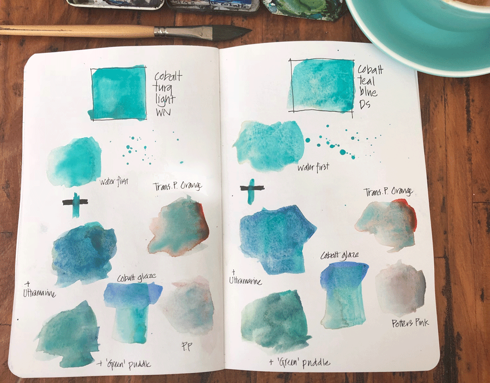
I then decided that I needed to do some testing. Here is what I did – testing for granulation and opacity and mixing it with a few colours. The two paints are the same hue but very different! (Note: Watercolour is much more than colour – its all about the pigments!) You can see a quick video of my testing here.
Normally you would think that more transparent and more granulating is a winner. Not necessarily the case! I have loved having a smooth opaque paint in my palette (CTL) – I love it SO much. But I think CTB will suit me better at the moment as I explore mixing darker versions for my daily latte in a turquoise cup. Not sure that it will be a permanent change, but it’s always fun to tweak my selection slightly.
Still in testing mode so stay tuned for more. My friend Chris Haldane suggested to me that maybe I should test out adding cobalt turquoise (the darker version) as a way of getting the shadows areas for this cup, so that is another alternative to explore.
It’s not the buying of new materials that’s the fun part, it’s the serious testing and seeing if it will work for you.


9 Comments
Hi Liz, loved this post. Where is the link to the video of the testing?
Thanks so much!
Hi Jill. Oops! Link added now – or just try here https://www.instagram.com/p/BtUPSaGlgHv/
Thanks Liz!
Love the colors! What does Green puddle mean in the bottom left corners?
Hi Ricky, Green puddle is simply the puddle of green mix that nomrally lives in my palette – you can actually see it in the photo!
I see It!
The new color granulates so nicely!!! It will be fun to see you using it.
It does, doesn’t it? It’s a bit of a change from the WN version.
Have you tried Prussian blue? Lovely deep turquoise color… plays well with others.
NEWSLETTER
Subscribe for first notification of workshop + online classes and more.