As mentioned in my previous article on how to choose the best sketchbook for your sketching, I feel it’s important that the paper is good for both ink and watercolour. Today, I want to explore this idea in a little more detail and in particular I want to explain why I believe the best paper for watercolour painting might not necessarily be the best paper for quick urban sketching.
But before I go any further it’s very important to note that there are many different ways of using watercolour. I use watercolour in a very unconventional way and so this article is going to represent my own preferences which are certainly not standard in the urban sketching world. I’m not making recommendations, but simply stating how I choose paper according to the way that I work – my quick and spontaneous approach to watercolour. I hope that you will find this interesting and then share your own preferences in the comment section at the end.
What I’m looking for when it comes to sketchbook paper
- As my purpose for sketching is to record my life in images and text, the paper must be good for ink as well as watercolour
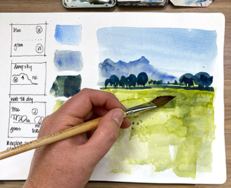
- As I work fast and never wait for a wash to dry, I want to be able to work into damp washes and achieve texture.
- I want to be able to achieve a variety of edges and lots of granulation.
- I also prefer white paper and I want my washes to be vibrant
- For everyday sketchbooks, I want the paper to be less precious (under 200 gsm) but I want better quality paper for my travel sketches
- As long as I achieve items 1-3, I don’t mind using paper that isn’t true watercolour paper, especially for my everyday sketches ie. I don’t mind ‘bad marks’ or buckling paper.
Important characteristics of paper
I don’t want to get into a detailed discussion of paper (you can read more at the Handprint site here) but three aspects that I’m particularly interested in are:
- Paper fibre. 100% cotton is considered the best paper for watercolour as cotton absorbs moisture and keeps the paper damp for longer, preventing hard edges when working in damp areas. Cheaper papers are either 100% wood pulp or have a component of cotton.
- Sizing. A coating (such as gelatin) added externally and/or internally to the paper fibres to control the absorption of water to prevent bleeding and feathering. A lot of external sizing will make the washes sit on the surface of the paper for longer, causing watercolour beads to settle which in turn creates backruns.
- Surface texture – the most common ones being rough, cold press (medium texture) and hot press (smooth). Rough and cold press create lovely textures but hot press paper is generally considered harder to work with. The lack of texture and the compressed fibres on the surface means that the washes stay on the surface of the paper longer increasing the changes of back runs and hard edges.
To achieve items 1-3 in the above list (the most important for me) I like a paper which is smooth enough to draw quickly with a fountain pen, and will also let my washes to stay on the surface for a little while so that I can work with them to create texture, but at the same time be fairly quick drying if I apply thin washes.
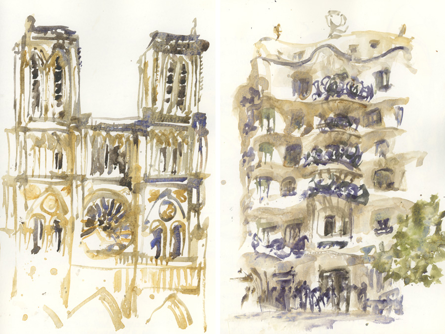
These paint-only (direct watercolour) sketches of Notre Dame in Paris and Casa Mila in Barcelona were done in less than 15 minutes in a Moleskine Watercolour book. I could not achieve these results in many other commonly used sketchbooks as I’m very dependant on getting hard marks when painting into damp washes on the page.
100% cotton Cold Press(CP) paper is generally too absorptive for me. The paper takes too long to dry and as I rarely am patient enough to let it dry totally, my second washes blend in to the first ones. This often results in a smooth watery wash which is not what I wanted. If I actually wait for the first wash to dry I normally find that the second wash has too many hard edges around its perimeter. A lot of 100% cotton cold press paper is also hard to draw on with fountain pen and because the washes sink into the paper fibres, the colours can be less vibrant. You can see some more examples of this in a recent article of teacup sketches, and further discussion on this issue in an older article about using a Pentalic sketchbook here.
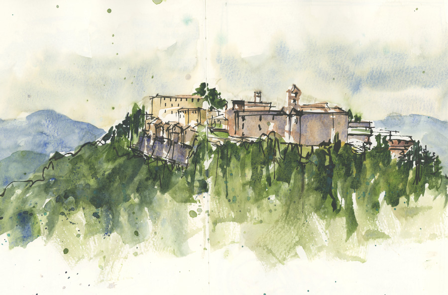
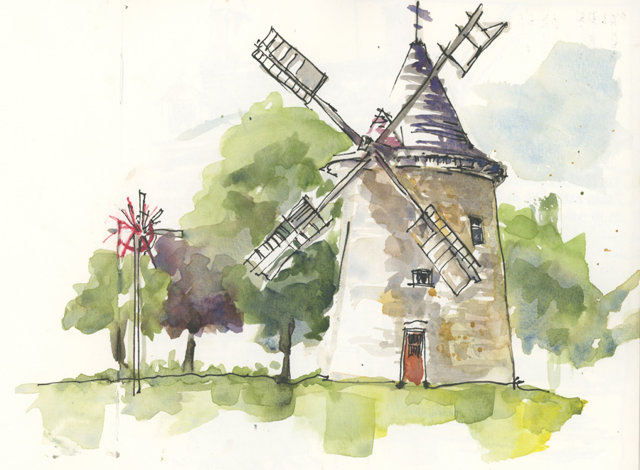
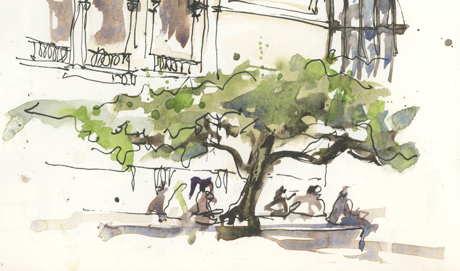
Here are two examples of trees:
In this example (Handbook travelogue watercolour book which doesn’t mention any cotton component on the label) my second wash merged into my frost one. I had to wait until they were completely dry and then I added another layer. This third layer had hard edges everywhere and visibly sits on top of the earlier washes.
In the second example (Moleskine watercolour) I did this sketch very quickly not waiting for the first pass to dry. As the first pass was drying at various rates on the page, I was able to achieve a variety or hard and soft edges by simply painting over the top.
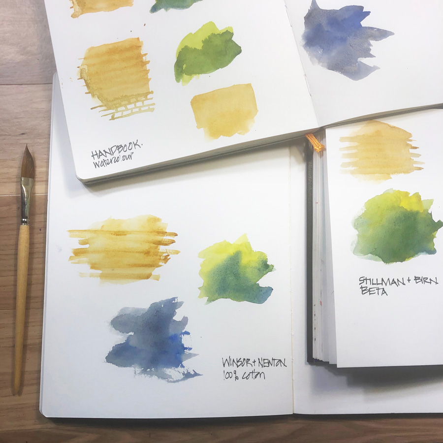
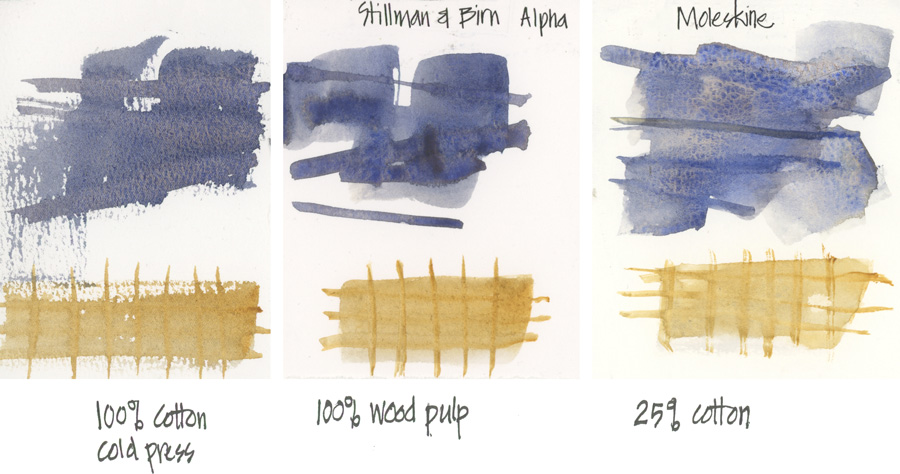
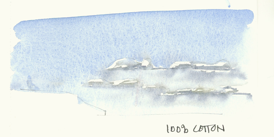
So the papers that work best for me are ones with a little texture, some sizing (but not too much) and some cotton fibres (20-30%). Here are some tests on my favourite paper – Moleskine watercolour sketchbooks – compared with 100% cotton CP and the 100% wood pulp of Stillman and Birn Alpha.
I do love 100% cotton paper but only hot press versions suit my style of sketching. If you are after lovely smooth washes and don’t mind waiting for the paper to dry then 100% cotton is probably what you are looking for. But if you draw with a fountain pen (with an extra fine nib) some 100% cotton CP might be a bit too scratchy for you.
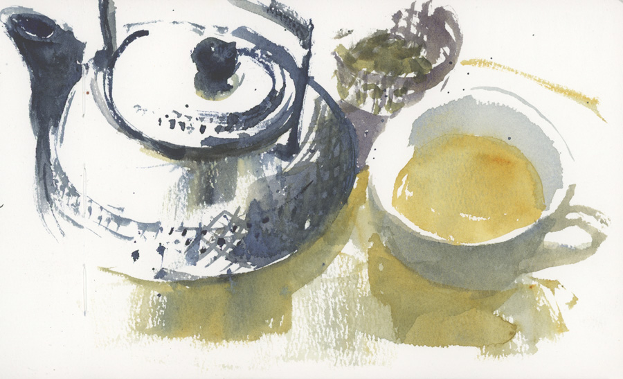
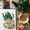
Recently, I have been testing the new Etchr sketchbooks (full review coming soon) and I realised that the only way I could work in my normal way on the 100% cotton CP book was if I made my washes much drier and relied on dry brush for texture. I achieved a result that I was happy with in this teapot sketch, but haven’t yet reached the point where I can get consistent results working this dry. I’m still working on this approach, but it’s a very different way of painting and I personally prefer using more water.
Even though I generally can’t achieve the results I want with 100% cotton CP, there is no doubt that it is the best for creating lovely realistic skies. It is really hard to achieve soft washes on paper with a lot of wood pulp! As the focus on my urban sketches is normally on the street scenes/buildings etc, achieving realistic skies is a big emphasis. If I did more landscapes, then skies would be more important. So choosing paper because of the skies it can produce is not a priority and I’m always exploring new crazy ways of doing ‘expressive’ skies, embracing the ‘bad’ marks. If you are enrolled in SketchingNow Watercolour On Location, check out the section on skies in Lesson 3 theory.
For more paper tests: Please refer to SketchingNow Watercolour course Intro Lesson 3 and Lesson 4 Demo 1.
So the conclusion of this long article is a little bit controversial! As I use watercolour primarily for very quick on location sketches, I prefer lesser quality watercolour paper ie. not 100% cotton paper!
These papers are great for ink drawing and text and enable me to create lots of fun textures without having to wait for washes to dry. Yes, I often get lots of hard edges and patchy washes, but these are an important part of the way I work.
But actually, the real conclusion: There is no one paper that suits everyone! Test out different paper and see which provides the results you want to achieve.
So what is your favourite paper to use and why?

35 Comments
I love the Handbook sketch! Your post suggests that you don’t know the cotton content of that paper. I purchased a Handbook watercolor sketchbook but haven’t used it yet. I actually purchased it for its square shape rather than cotton content so I’ll now I’m curious.
Hi Karen – another person mentioning the handbook sketch (rather than watercolour). I think the watercolour has a good amount of cotton in it, but its a pity it is not mentioned on the label! Enjoy!
I am currently on holiday and brought 3 different sizes of sketch pads. I find the Handbook square my go to – fits into my beach bag and have enjoyed the portability. I use inks and watercolours and am quite satisfied.
Hi Candes – thanks for sharing. The handbook square watercolour book is a favourite with many people – I’m glad it works for you.
I jump around with papers. One day I like one, and the next day, another. I use a Moleskine watercolour sketchbook when I am out on location to capture a building or scene. In coffee shops I am constantly jumping around S&B Alpha, then S&B Beta, I tend to work through a stash of sketchbooks I have collected over the years. This does not always give the best results as it takes a few sketches to adjust to a new paper. My favorite paper is Winsor & Newton 100% cotton cold press. It is a dream to work on especially for people. It is not your usual cold press surface. It is a little closer to a hot press surface but receives pigment like cold press paper it also accepts working in pen. It does take a little longer to dry but for me is a dream to work on. If you asked me a year ago it would be 100% Fabriano cold press. Next year I may have discovered another paper. I love experimenting.
Yay for experimenting! And its a good stretch to have to adjust to new paper 🙂 Thanks for sharing Carmel!
My preference is the Handbook Journal sketchbooks. These are different from their watercolor sketchbooks. The paper has a nice tooth to it and works well with fountain pens and the “fineliner” ink pens. I use Faber Castell Pitt pens the most. When I do add watercolor washes to my sketches the paper holds up very well. I’ve had pages quite wet and the water doesn’t soak thru to the page below. The pages buckle with a really wet wash but I like that look. The label from the book says it won’t buckle with a light wash. Not sure I agree with that. It would have to be a really light wash. Also the label says 100% acid free. To me this would indicate cotton content but I don’t know that for sure.
Thanks for sharing Douglas – does that have a strong yellow/cream coloured paper? I haven’t used one of those since my very early days of sketching… hmm, maybe I should try them again.
My everyday carry sketchbook for doodles, lists, planning, and random sketches is the Handbook (not watercolor). I would definitely say it has a strong cream tint to the paper, but for my purposes it’s not an issue.
Thanks Phoebe – really do need to try those books again!
Yes Liz, the paper is a cream color but light rather than strong.
I appreciate that you always preface your reviews by stressing that the materials you like best work for you and your specific ways of working, rather than “This is THE best paper on earth.”
I wish I would stick to one medium — it would make my choice of paper so much easier! But when I use watercolor pencils, I prefer the texture and sizing of S&B Beta, and when I use graphite and ink, I prefer smoother S&B Zeta. I would like S&B to make me a book containing both Beta and Zeta papers! 😉
“Beta and Zeta” they sound like a winning combo!!! 🙂 I love it and totally understand your wish.
I also find that 100% cotton watercolour paper takes too long to dry in urban sketching situations where time is limited.
I discovered by accident that Leuchtturm paper can actually take quite a bit of watercolour washes. I had originally bought the A5 notebooks for fountain pens and was surprised the paper didn’t fall apart when I added watercolour. And with not much show through either! That said, I found that if I added too much water at once, then my washes would take forever to dry, so be warned.
Also, I agree that cold press isn’t so nice to draw on with fountain pens so I’ve been sketching less and less now with fountain pens because of it unless I’m painting in my Leuchtturm notebook. So the question is should I switch to hot press? The last time I tried hot press paper, it wasn’t very good. The washes set in quick and there was no way to make corrections. I’m hesitant!
Yes totally Monique – 100% takes forever to dry fully.
Are you referring to the normal thin yellowish notebook paper of Leuchtturm. I found that the thicker whiter sketchbook paper from them didnt take watercolour at all…. but tht was years ago
Yah it’s the thinner notebook paper that I’m using. I also read somewhere that the Leuchtturm sketchbook paper wasn’t very good for watercolour.
It’s funny, looking at your 3 paper tests side by side, I saw the 100% cotton swatch and went “ooh, baby, that’s the one!”
My whole approach to painting has been built around getting that look, and everything else just doesn’t do it for me. I’ve had a Moleskine watercolor sketchbook sitting around half-full for 10 years because I get so frustrated with the paper that I can’t bring myself to work in it. Same with a couple of Stillman & Burns ones I bought to try out. But I have been enjoying the Hannemule watercolor sketchbook that came in the goodie bag at the Amsterdam Symposium, and have done some good work in the new Bee Paper spiral bound watercolor sketchbook. The HandBook ones are fine for minimal watercolor usage, especially if I’m doing a lot of ink work, as are the Bee Paper “Super Deluxe MIxed Media” sketchbooks.
It really is all about the way you’re used to working!
Hi Laurie, yes totally!!!! And I think most people want smooth washes.The colour is often a bit duller though and this isn’t showing well on a digital image. I’m going to be using a larger size Hahnemuehle next… I liked using the small size….surprisingly!
I tend to switch back and forth a bit. For a while I was working in the Bee Paper sketchbook, but the spiral binding started getting annoying. More than anything else I use the Stillman & Birn Beta when I sketch. The paper is really multi-media paper not watercolor paper and handles ink nicely as well as watercolor…AND the softcover lays flat so you can sketch across 2 sides. Stillman & Birn also now makes a square sketchbook which I really like. If I make my own sketchbooks I usually use Fabriano Artistico paper. But sometimes I just want my Arches 140 lb so I usually have a few small pieces of it with me. That doesn’t take the ink as well. Like you’ve said, there is not one paper that suits everyone…there isn’t even just one that suits me.
Thanks for sharing Joan – yes, the softcovers are so nice!!! as is Fabriano Artistico!
I personally would like to have an S&B Alpha surface with the weight of a Beta. The Alpha gets wet and ripples, causing the WC to pool. The harder surface of the Beta doesn’t ripple but the paint stays on the surface longer, taking longer to dry, result pools. Zeta is even longer drying. As I’m coming to WC Painting from ink and colored WC pencil sketching I love Epsilon & Zeta but when I start swishing water around with bruises at my novice skill level the harder papers are hard to control. The Alpha is very novice friendly and forgiving.
I would like to find a heavier paper that handles like S&B Alpha. Any suggestions?
HI John – I know exactly what you mean. I can’t seem to get Peta to work for me at all. I’m really liking the Hahnemuhle Watercolour paper at the moment.
Thanks for the response. My advantage in all this is that I’m an absolute beginner. There are people that learn to do great work on smooth surfaces. Since I’ve got to learn something I might as well learn that.
By the way. I love your book on sketching Architecture. It’s what led me to looking you up on the net. Love your site. I’m copying your work surface using a Legal sized clipboard.
Which sketchbook (paper) do you use for daily sketching and which for travel sketching?
Hi Rockie, Aplha is my favourite everyday sketching paper and typically I’ve used Moleskine Watercolour for travel sketchbooks. However last year I used Alpha for two trips and was very happy
https://www.lizsteel.com/tag/bluemtns2022/
https://www.lizsteel.com/tag/pmq22/
I LOVE the Handbook sketch journals (not the watercolour version). I don’t think they buckle anymore than Moleskine Watercolour and dry flatter – they handle quite a bit of water.
I also like the sketch version better than the Handbook watercolour 200gsm version, which I read somewhere is wood pulp, not cotton. I’m trying to get better at fast, loose sketches / washes and the paper is perfect for that. And I’m experimenting with water colour pencils. Also, with 120 pages, I don’t feel I have to worry about messing something up. I’ve finished 2 5.5” green books and have 5.5×8.5” portrait books arriving tomorrow – a green and vermilion.
Thanks for sharing Cheryl! – I think I prefer the handbook sketch books to the Handbook watercolour books too
I was excited to try a square 8.5” Watercolour version a few months ago (and it wasn’t cheap) and I struggled with the paper from the first page and gave up using it about 1/2 way through. Just couldn’t get it to work for me at all.
As an aside, I am SO excited about the upcoming May course 😉
Liz, I’m with you on my sketchbook preferences….and over the years have tried just about all of them out there. I do love the Stillman & Birn softcover mixed media, beta series for travel. It packs up light, and the surface is smooth enough for pen, and okay enough for watercolor. For 100% cotton, I am liking the Hahnemuhle cold press, it doesn’t seem as ‘toothy’ as other papers like Arches or Fabriano, and has been a fun one to use. But recently I’ve gotten hooked on S&B hard cover hot press paper books (I think it’s the zeta series). I’m having fun with getting the ink drawings in, and following up with watercolor (and other media) as I have time. I’m wanting to get more comfortable with bringing other dry media along to layer in with inks and watercolors! (so fun!!).
Hi Roxanne- thanks for sharing. Yes Zeta is great!
Liz, I’ve been trying to get the Stillman and Birn Alpha book a5 landscape you have suggested for the Travel Sketching course next week but have had no luck here in France (without paying a small fortune, which will make me reluctant to experiment!). Most places are out of stock. Can you, or anyone else, suggest an alternative book please?
Thanks
Hi Lesley – we will send you an email today. But in the meantime here are some more options
https://www.lizsteel.com/sketchbooks-for-ink-and-light-wash/
Really interesting to read Liz. I now see how prejudiced I have been with non-cotton sketchbooks. I will give them a try for the Travel Sketching course I have just started!
Hi Anna – glad to open your eyes to how good wood pulp paper can be! (Cheaper too!)
NEWSLETTER
Subscribe for first notification of workshop + online classes and more.