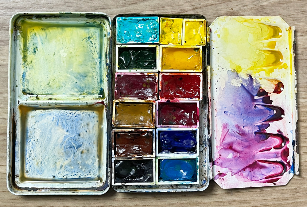
This is the palette that I used in my online course SketchingNow Watercolour. It contains 12 full pans in a small folding metal tin made by Art Basics and available at my local art store Artscene.
Notes
1. I shared an updated 12-colour palette in 2023 (useful for my Teacups course) that reflects the colours I use most these days in my own sketching. Refer to this article for this 2023 version.
2. You might also be interested in my recommendations for a Minimal Palette or 3, 4 or 6 colours that I used in my Foundations course. (BTW: This is the course I recommend for beginners!)
3. I prefer using metal tins with three mixing wells in the lid. I now generally use a metal palette made by Derivan in Australia – see here.
A couple of general comments
(before I share the details of the colours)
- When I started painting in Jan 2007 I bought the small Cotman sketchers box and started using it. I got rid of the white and add cerulean blue (as a blue to use of the sky) and had no idea how complex watercolours were …but I was aware of making many muddy mixes! (refer below to my comment about Cotmans)
- A book that influenced me strongly in the early days was “Transparent Watercolour Wheel” and ever since then I have eliminated very opaque colours (like the cads) from my palette. I probably have too many staining colours but do manage to control them and rarely have a problem with their staining properties.
- Also HUGELY influential is the Handprint website – I have spent hours and hours reading and comparing pigments. It is the most comprehensive resource for watercolours!
- I also found the blogs of Cathy (Kate) Johnson and Roz Stendahl when they talked about their palettes extremely helpful!
- I am indebted to the advice of my great friend Jane Blundell – ‘colour Jane’ (sometimes we agree, sometimes we differ!)
- I try not to make brand generalisations but focus on the pigments (I compare pigments not colour names). Some pigments are best in one brand rather than another brand.
- For many years I was using a certain brand purely because it is readily available. Winsor and Newton was the most available brand in Australia so I started with that. But over the years I have found Daniel Smith to be generally more vibrant than WN.
- Choosing colours that go in your palette is a very PERSONAL choice. You will find some pigments work better for you.
- I LOVE colour!!!! There are some pigments that I just fall in love with and I just want them to be around – so reducing my colours to 12 for this palette was a big exercise.
- I love vibrant colour and so I am looking for colours that are intense and that easily give me ‘juicy’ washes.
- Some of my choices have been influenced by the way that I work (ie. fast spontaneous watercolour). I need to ensure that I can mix a colour quickly and also recover a mix if I accidentally mix the wrong colour in (ie. transparent colours are more tolerant of mixing 3 colours together than opaque colours which are more likely to give you mud with more than 2) and I have convenience colours to make my mixing easier.
- I try to use single pigment paints so that my colours are brighter and clearer.
- I LOVE granulating colours!
- You just have to get to know your paints! How do they mix with other colours and react in different situations? How versatile are they, and what mixes you will typically use them for?
- My palette is designed for the bright light of the harsh Australian light so might not be the best selection for people that live closer to the poles.

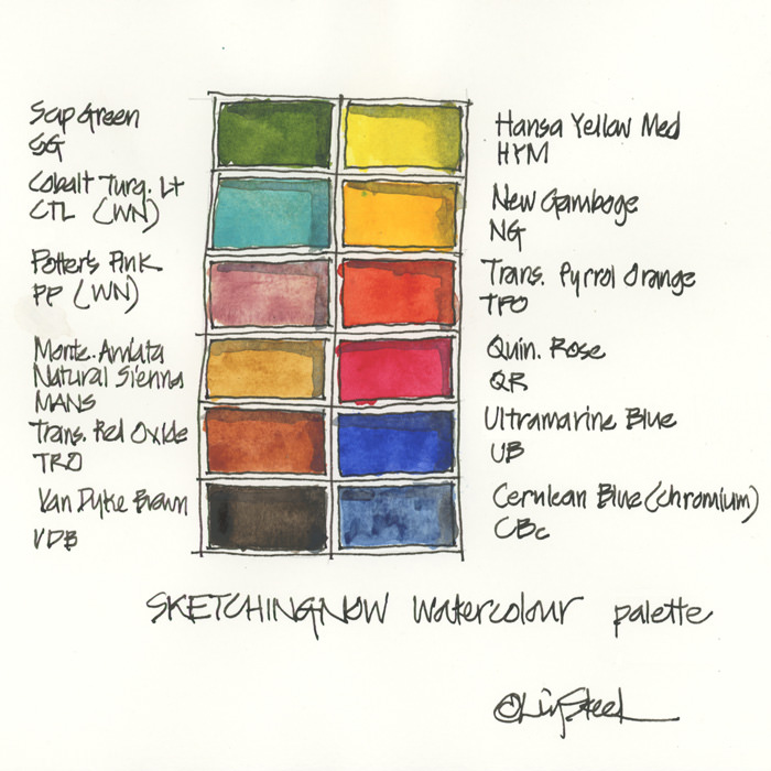
SketchingNow Watercolour 12-colour palette
DS Hansa Yellow Medium PY97
DS New Gamboge PY97, PY110
DS Transparent Pyrrol Orange PO71
DS Quinacridone Rose PV19
DS Ultramarine Blue (not French!) PB29
DS Cerulean Blue Chromium PB36
DS Sap Green PO48 PG7 PY150
WN Cobalt Turquoise Light PG50
WN Potters Pink PR233
DS Monte Amiata Natural Sienna PBr7
DS Transparent Red Oxide PR101
DS Van Dyke Brown PBr7
This basic palette follows more or less a standard approach of a warm and cool version of the primaries, a green, a few earth tones but with a few personal quirks.
All colours Daniel Smith unless noted otherwise.
Why I selected these colours
1. Cool Yellow: Hansa Yellow Medium.
Rather than a Lemon Yellow, I have a middle yellow. It is hard to get a transparent yellow and this is a truly beautiful all-rounder. HYM is a beautiful bright transparent mid-yellow that mixes beautiful greens as well as oranges and is just stunning on its own.
2. Warm Yellow: New Gamboge.
I used to have Quin Gold in this spot but as that colour is no longer available, I am changing to a more traditional warm yellow instead of using the new Quin Gold blend.
3. Warm Red: DS Transparent Pyrrol Orange.
A colour that I really love (I say this about a lot of colours!) and it is more of a dark orange than a warm red but works the same. Makes lovely primary reds with Quin Rose.
4. Cool Red: DS Quinacridone Rose.
This makes a great mixed orange with my cool yellow. Also makes a great pink and purple and if mixed with a neutral will add some warmth. Really this is one of the most important and versatile colour in the palette so essential to get it right.
5. Warm Blue: Ultramarine Blue
You can’t go past a French Ultramarine… but in fact I prefer DS Ultamarine Blue over the French version I find the Ultramarine makes better greens and a more neutral grey with Burnt Sienna than the slightly cooler French Ultramarine. Mix for purples, greens AND all my warm greys and browns, blue greys. Total addiction!
6. Cool Blue: Cerulean Blue (Chromium)
Great for skies, and lovely neutrals!I use the Chromium version as it is brighter and more suitable for Australian skies.
7. Green: Sap Green.
I used to mix green with a Pthalo blue and quin gold, but these days I prefer to have a green that I can use to reduce mixing time.
8. Earth Yellow: Monte Amiata Natural Sienna
I prefer Raw Sienna often over yellow ochre as it is more transparent and closer to the colour of Sydney sandstone. I use DS Monte Amiata Natural Sienna PBR7 – it’s the most gorgeous earth yellow I have found.
9. Earth red: Transparent Red Oxide
This is my version of Burnt Sienna. I can’t live without this colour – browns and neutrals mixed with Ultramarine.
10. Earth Brown: Van Dyke Brown
This is a lovely cool granulating dark brown – similar to DS Raw Umber and used in the same way than the more traditional Burnt Umber which is slightly warmer. Please note that the DS version does not contain black.
11. Personal Colour 1: Cobalt Turquoise light (Winsor & Newton)
No real scientific reason for this colour it except that I love it and it makes me happy
12. Personal Colour 2: Potters Pink (Winsor & Newton)
It makes lovely muted colours and great for cream (as in scones, jam and cream).
These last two colours are VERY personal and the idea is that you can substitute them for any particular colour that you feel you NEED to have.
Winsor and Newton alternative
Note: I have never used this palette and but these are the colours that are the closest to the Watercolour course palette. Some of these colours will behave differently but they are still a good selection!.
Winsor Yellow
Winsor Yellow Deep
Winsor Orange (Red)
Permanent Rose
French Ultramarine
Cerulean Blue
Cobalt Turquoise Light
Potters Pink
Sap Green
Raw Sienna
Burnt Sienna
Burnt Umber
My everyday palette
Now the reality is that I rarely use a 12 colour palette. My standard palette has a few more (16) and changes from time to time. I find that it is good to have a few more choices when you are working quickly on location…. but these 12 colours are the foundation.
If you want to find out more about my everyday palette: Colours in my palette series
Final word
It’s easy to get obsessed with trying new paint colours and worrying about putting together the perfect palette. So my advice is – just start using the paint that you have and get to know the pigments as you would with a bunch of friends.
If you wanting to start sketching with watercolour or want to get to know your paints better please check out my Watercolour course. Find out more here


24 Comments
A great post and thank you for sharing all your experience. I am falling in love with watercolour all over again !
Liz,
First of all, I felt obliged to congratulate you for this post that is really instructive and, as usual, pushes us a little further.
Second, I would also avail myself this opportunity to recommend you to test Naples Yellow to mix in your pallete while sketching ice creams or similar textures.
Miguel
thanks Miguel … naples yellow- never tried that one at all! Don't tempt me!!?!
thanks Carol … falling in love with watercolour all over again is a lot of fun!!! enjoy!
thanks Plonk! I am glad it has helped …though you know that those hours and hours ARE fun… and in a way you have to put some effort in to really bond with the pigments yourself- how is that for a lecture!
Yes, would love to meet you at one of my sketching days one day… I am thinking of online course down the track…. or even better trying to work out how to travel the world with my sketching class!
Thanks so much Liz. You have saved some us hours and hours of trial and error
Love the blog
Hope to join you one at least one of your sketching days…. Being thousands of miles away makes it difficult
Thanks so much for sharing this! I'm just beginning my sketching/watercolour journey, and the color choices can be overwhelming! Of course I want all the pretty colors when I see them in the art supply store. You have inspired me to play with my pigments to find out which work best for me. I do hope you decide to travel the world with your sketching class! If you make it to California, I will be sure to sign up!
Thanks so much for sharing this! I'm just beginning my sketching/watercolour journey, and the color choices can be overwhelming! Of course I want all the pretty colors when I see them in the art supply store. You have inspired me to play with my pigments to find out which work best for me. I do hope you decide to travel the world with your sketching class! If you make it to California, I will be sure to sign up!
Hi Liz. I always include Buff Titanium (Daniel Smith is the only one to make it) in my sketching palette – so useful for all the sandstone, beaches, rocks- and cream! And I pre-mix Ultramarine and Burnt Sienna (PBr7) to make a dark grey or Bistre that is also extremely useful and time saving.
I totally agree about finding the right cool red. I am tossing up between Quin Rose PV19, Quin Red PV19 (in DS it is a lovely paint to use), Permanent Carmine (more of a crimson but washes down to the essential pink and mixes cleanly) and Quin Magenta PR122. Permanent Alizarin doesn't make the bright purples and pinks that you just MAY need while sketching. I've settled on Old Holland Quin Magenta for now, but the experimenting continues.
Another favourite is Goethite (Daniel Smith) – a gorgeous granulating earth. Beaches and rocks just paint themselves with that little beauty and Buff Titanium.
Hi Liz, only today have I come across to this magnific post that taught me a lot. Thanks for of this. Hope to see you at Barcelona
Helena Monteiro (HFM)
Your work is fabulous! I've switched from Moleskine Watercolor Journals to the Pentelac Brand – much less expensive, and really thick delicious paper that takes paint well. I'm going to make some little travel palettes in Altoids boxes – I finally found empty half-pans in a local art store. Keep posting, your stuff is sooooo inspiring!
Just found this very informative post.. I have a similar story about discovering color. Transparents are the way to go with me, but a few new ones along the way.. I use WN , but have always wanted to try the DS paints. You are very convincing. Lol !
I recommend the book “Powerful Watercolor Landscapes” by Catherine Gill (available on Amazon). She’s my watercolor teacher and superb with color. She’s an outdoor painter, so knows the value of a no-fuss approach.
She shows you the value of opaques–that’s where to juiciest color is–but she has tricks and tips on how to avoid the mud that can result. I’ve tried other color approaches and always come back to this book. The charts for mixing grays and greens alone are worth the price of the book.
Cathe knows her stuff. She is one of the major painting teachers in the Pacific Northwest part of the US and teaches around the world. She has painted in Australia–I think the painting on the front of the book was done plein aire in Australia.
Full disclosure: the writer of the book is my sister, Beth Means. She a painter and a professional writer–they spent five years laboring over this little beauty–but I read and reread it because it is so helpful.
Hi Liz,
How do you come up with the really dark almost black colour? I mixed all three primaries and all I get is dark brown. If I add more blue it may turn into slightly bluish dark gray but never get really black looking colour like yours.
I completed your Foundation class and are going back to watch the materials for the second time and I found that I am absorbing more information in the second round, it’s amazing! I plan to sign up for Edges class soon, once I built up more confidence, need it badly 🙂
This introduction already warms us with a desire to start. I could not resist and I painted your palette
Hi Liz, any video or blog with any tip on how to make sand. I am trying to figure out not only the colors but how to make the sand texture
I appreciate your post which are very helpful for beginners like me. Thank you.
Hi Liz, do you have a list of all 12 colours in a Winsor & Newton version? I’ve seen the list of the main 6 colours in a W&N version, but not all 12.
Thank you1
Sally – just added them to the blogpost. they do not behave the same as Daniel Smith but are still a good selection!
Thanks so much.
I’d suggest Winsor & Newton’s Transparent Orange as a closer equivalent to DS Transparent Pyrrol Orange! Winsor Orange (Red Shade) is more like DS Pyrrol Orange. I love WN Transparent Orange and it makes wonderful reds with Quin rose just like PO71.
NEWSLETTER
Subscribe for first notification of workshop + online classes and more.