As well as playing with new paints and a new fountain pen lately, I have also been testing the new A4 portrait format Moleskine watercolour books. I was ordering my usual landscape ones on Book Depository and suddenly discovered the new format. So I bought a few of both and then started agonising over which I should take on my big trip. You can read more about my thoughts here on the blog and here on Instagram.
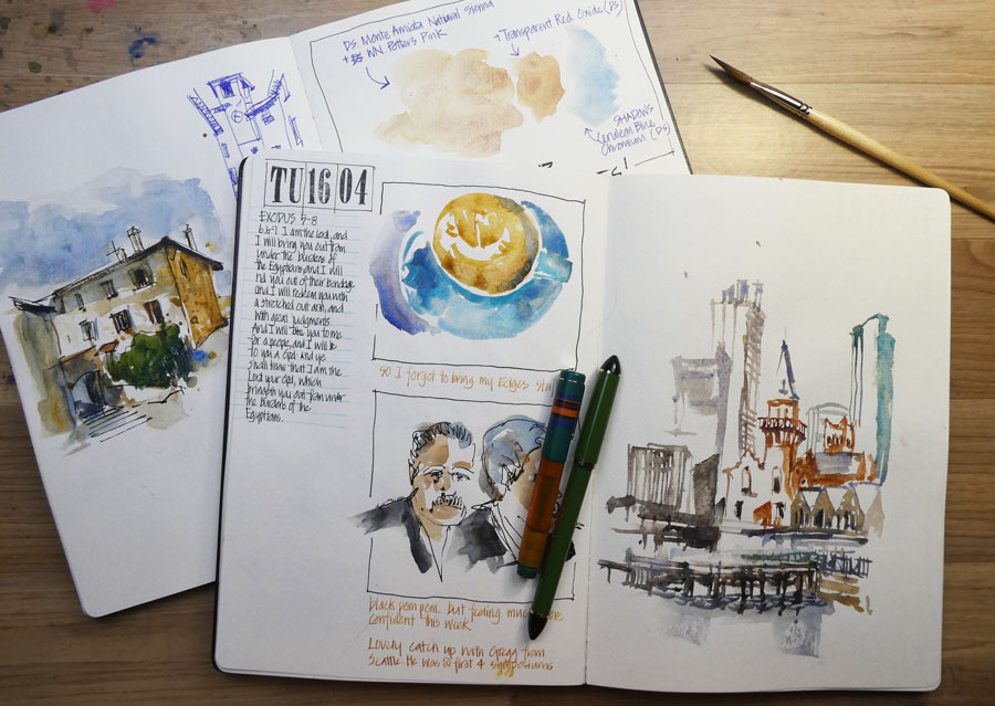
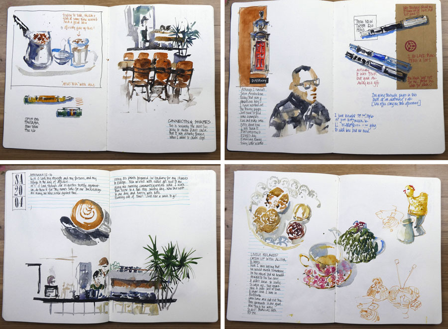
I loved hearing everyone’s thoughts a few weeks ago but knew that ultimately the best way to decide was to start using one of them as my everyday book. So a few days before the oneweek100people challenge I started one and to my surprise I finished the book in just over a week. What? that’s crazy! This was partly because of all the sketching of people, but also because I was doing a lot of sketches in preparation for my upcoming Palladian Odyssey Umbrian workshops.
And I absolutely loved the format. So much so that I have started another one!
I’ve also decided that I am going to go all ‘portrait’ for my trip. (This is big news!)
Why do I like the format?
Composition
Well mainly because it is a new compositional challenge and sketchbook page design is a massive part of my work. It has been a bit strange to fit landscape orientated sketches into these vertical pages, but this is exactly the type of challenge I love.
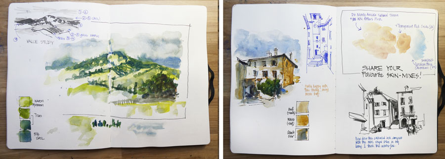
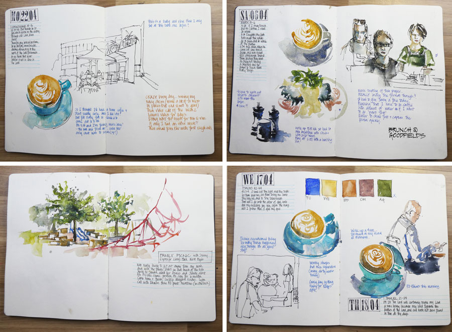
There have been times when I wish I had more room for a landscape sketch but when I’ve gone vertical instead, I’ve been pleased with the result. This sketch of Circular Quay is an example of that – my first response to the scene was to do a horizontal sketch, but the vertical one turned out well. I’ve been saying for a while that I should do more vertical sketches!
I had the feeling that this format would not be as suitable for my normal travel sketching. In particular, I thought that I do a lot of two horizontal sketches in a double page spread in the landscape moleskine and this would be hard in the new format.
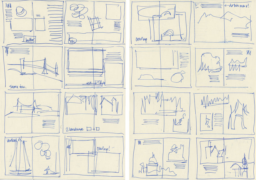
So I flipped through two sketchbooks from last year and re-designed some of the pages into two pages of thumbnails. This was very useful as I discovered that this format suited most of my spreads (and in fact would produce more interesting results) and that in fact, I rarely do two landscape format sketches side by side. Also, even when I do long panoramic sketches in the landscape book, I often don’t use the full spread so I think I will be happy with the width of the portrait book.
The two things that I learnt from doing this exercise (and my usage of the book over the last few weeks) was that:
1. It is indeed harder to fit two landscape sketches in a double page spread. There is no way to do it without working smaller and/or crossing the gutter for both and/or some overlap.
2. It’s easy to make the spread feel top-heavy by sketching at the top of the page so I am going to be more conscious of positioning the bigger sketches lower on the page.
Every format has its pros and cons, and right now I’m seeing many pros for the vertical format.
Handling
The vertical format is much easier to handle than the wide landscape version and it just feels good to handle. It’s much easier to fit onto a small cafe table.
I did have to make a new support board that was a little longer to suit the portrait book.
BUT… and it’s a big but…
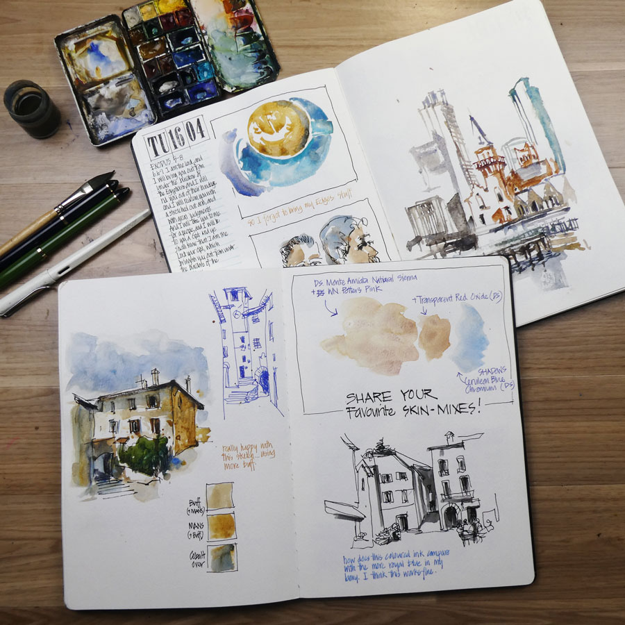
Sadly, the paper has gone downhill again and what’s in these portrait books is inferior to the paper which I have been using recently in the landscape books.
Back in 2014 Moleskine changed their manufacturer and the paper changed significantly for the worse. I still used them as I love these books and the paper still works for me (more about this shortly. Since then the paper has improved, almost to what it was like pre 2014. But now it seems to have gone backwards. I don’t understand why the paper has changed and it’s rather disappointing.
The paper in the portrait books is more textured on one side, buckles more and doesn’t like a lot of water, it’s not as soft and feels a bit thinner.
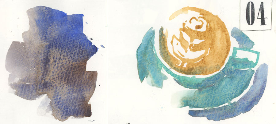
However, despite this negative, I am still enjoying the portrait book a lot. The Moleskine paper, even when it’s textured and buckling, is still the best paper for my style of working. Paper such as Stillman and Birn Beta, Handbook Travelogue, Hahnemuhle and anything 100% cotton doesn’t allow me to create quick textured watercolour sketches. (For those of you who are enrolled in SketchingNow Watercolour – check out Lesson 4 Demonstration 1 for more about this). So although I’m not loving the extra texture, the paper is still working for me. (Note: I love Stillman and Birn Alpha for everyday use, but when I travel I want a better watercolour paper)
Two other issues about the paper…
I have received comments that the paper feels different for ink, but I haven’t noticed anything.
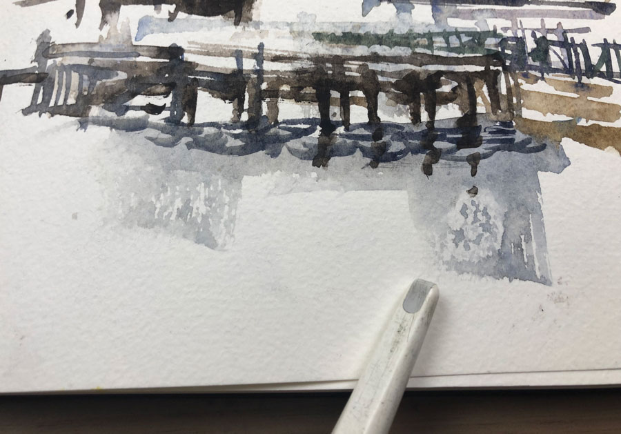
Also for the last 18 months numerous people have told me about weird areas of resist. I had never experienced this until recently. My theory, from a few tests which I have done, is that it seems these spots are caused by my fingers on the page, but it doesn’t happen all the time. Weird! Why this has started to be an issue I don’t know but at the moment I’m trying to be careful handling the paper before I paint on it. As I like textured washes it hasn’t been a huge issue as I just work over the areas of resist a few times and then it takes the watercolour fine.
As for the buckling, this is a photo of a ‘tornado’ while doing a reasonably wet sky. There was a huge buckle when the page was wet but it dried okay. Honestly, I don’t mind a little buckling as it creates a ‘well-loved’ sketchbook feel. My sketchbooks are all about recording my adventures, not creating masterpieces!
Anyway, that’s my big decision. I’ve absolutely loving the new format but just wish the paper was the same as it is in the landscape books.
NOTE: I have based this article on my usage of two recently purchased portrait format books and landscape books purchased last year. I don’t know if the landscape paper has changed too, or what the paper is like in the A5 sizes (either format). It would be great if you could share your experiences. It is also possible that the paper could change further in a few months time!
Stay tuned to see how I use it when I’m in Europe – I’m really looking forward to the new challenge!


7 Comments
Is there a reason (I know there will be!) that you prefer Moleskine over Stillman & Birn?
Yes. Refer to the paragraph near the end of the article and references a demo in my Watercolour course. It’s all about getting hard edges in damp paper… Moleskine is one of the only papers I can use that does that.
It is always very interesting using your take on different paper and the various books that you use.
For me your reporting on such issues as how the paper handles watercolour (water saturation etc) is what we never see in normal reviews on the sites where we buy our watercolour books from.
So for whatever reason your blogs and reports are worth a fortune because we don’t have to buy something that might not be brilliant for the purposes as you have stated.
Thankyou once again, always love seeing your sketches and reports.
“The Moleskine paper, even when it’s textured and buckling, is still the best paper for my style of working.”
That remark was an eyeopener for me.
Due to my inexperience I tend to fret about the ‘right’ kind of paper and whether I should stick to one brand to be sure I have the ‘right’ paper. This frees me up to be more adventurous, get to know some more brands and see what I like/dislike about them.
May an idea with the format is to turn the A4 portrait 90 degrees and you get a landscape format.
Also, that partial resist you mentioned, I actually experienced that in other brands like the Stillman & Birn and Caslon. I wonder whether this is related to the manufacturing of the paper…
Hi Liz!
I am loving the Amsterdam Symposium aftermath…the “having learned so much, let me try this” glow!!
Since your workshop I have had a new approach to my sketchbook…loving planning pages and drawing on both sides as opposed to just one!! The result is that my sketchbook excites me…no longer frustrated with the output.
My question is…Did your moleskine A4 portrait book have a HARD COVER or a SOFT COVER.
It looked like a soft cover..so I’ve had a frustrating week trying to find where and what to order the same book..
I really liked the way your moleskine performed.
Thanks Liz..you’ve really opened an art window for me. Saving up for a course of yours..
Dominique.x
Hi Dominique – so great to hear. I loved having you in my workshop. The book is a hardcover A4 watercolour.
NEWSLETTER
Subscribe for first notification of workshop + online classes and more.