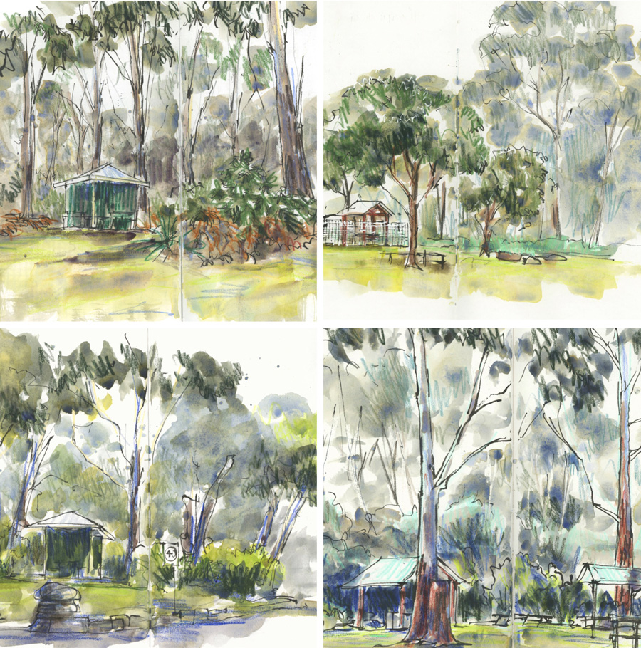
After a month or so of no visits to Lane Cove National Park (due to rain and travel), I’m trying to get back into the routine of a few visits a week. And I’m finding that every bush sketch I do is very different in terms of hue. (Note: ‘Bush’ is the Australian term for forest.)
These changes are mainly due to the fact that I’m using different coloured pencils under my watercolour washes and on one occasion, I changed my palette.
It’s fun also to see how the bush has changed due to the season (it’s now winter and the last time I sketched in Lane Cove it was late summer.) As most trees in the bush are evergreen there is no radical difference in hue during the seasons, but there are subtle changes. These include shedding of bark in late spring/early summer, new leaves (that are often red) in spring and flowering trees such as wattle in winter. In terms of deciduous plants, the only change that I’ve noticed has been the ferns which are starting to die back.
Here are a few thoughts on my recent sketches…

1. Blackbutt
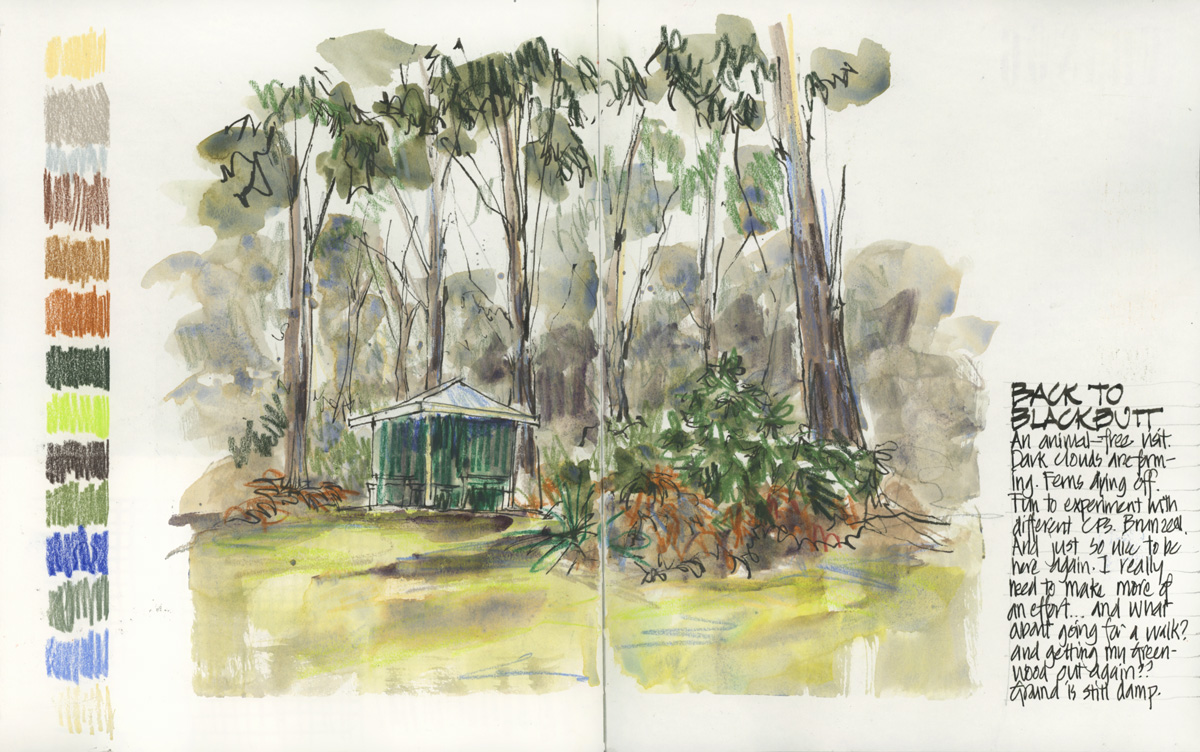
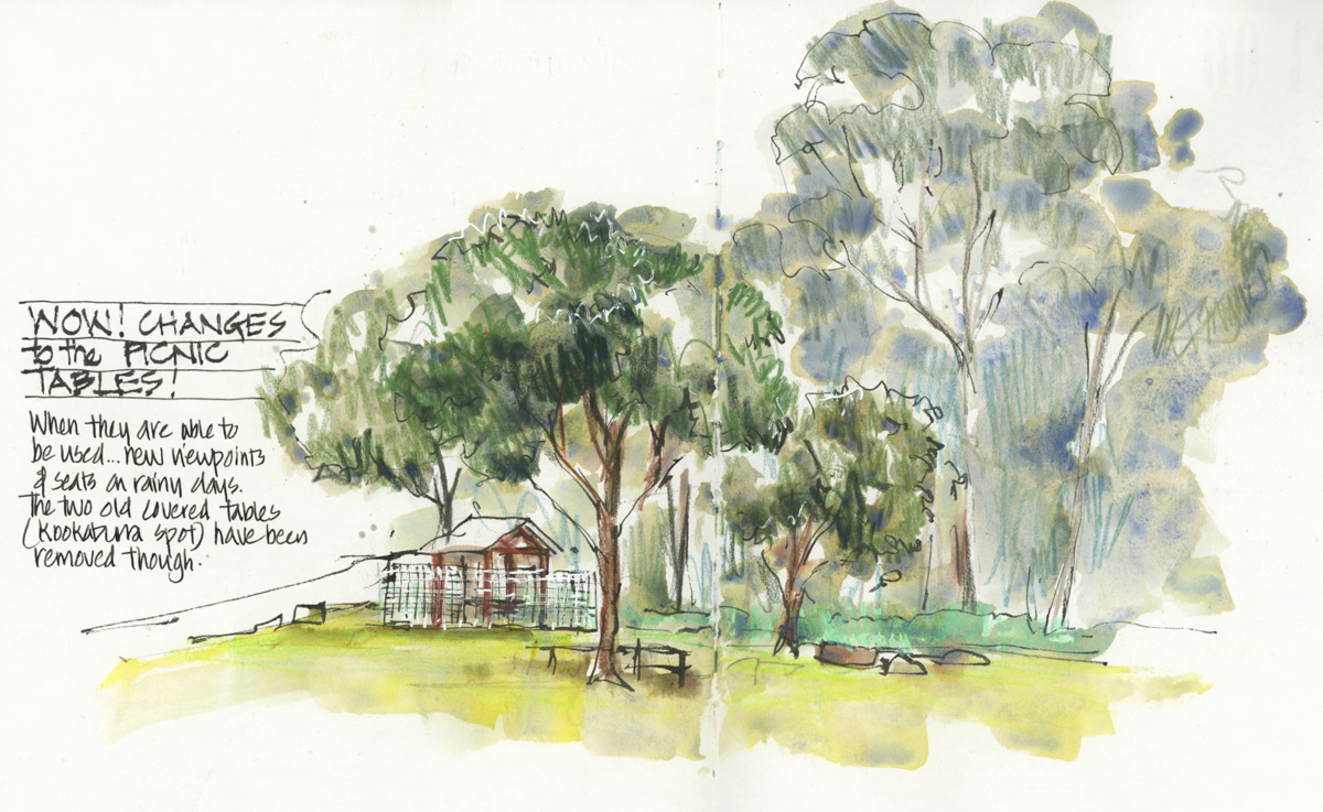
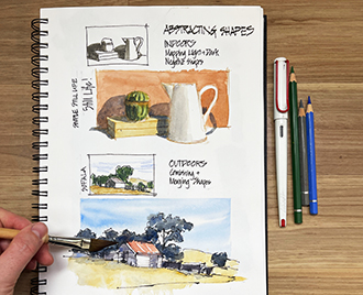
The above sketch done in one of my favourite picnic areas – Blackbutt – shows the changing colours of the ferns and grey-ish hues as the skies became more overcast while I worked. I started creating coloured pencil swatches as a way of testing a few different brown Bruynzeel pencils and then I extended it to include all the additional colours I used. So I used most but not all of these CPs in this sketch. It’s a lot of different colours I know!

2. Haynes Flat
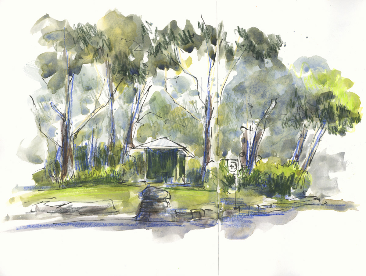
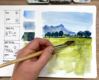
The next day when I visited the park it was raining and I was amazed by some big changes to the northern side of the river – lots of new picnic shelters! I didn’t have a lot of time and so the result was a bit rushed.
This sketch included strong ‘Australian greens’ to the foreground trees and greyish/turquoise hue in the background bush.
As mentioned in a previous article, the most important part of my bush sketches is the pigment parties created by the watery washes I use – especially in background areas. This wash is SCH French Ultramarine and DS Monte Amiata Natural Sienna. But having said that, the use of a light mint-coloured pencil for the low bushes has significantly affected the hue of the watercolour in that area.

3. Riverview
The most recent sketch was done using Aquarius watercolours. I’m currently testing out various different colours (see the palette I’m using here) and this was a good chance to explore a few different mixes. And the hues in this sketch felt very different than usual (more vibrant) because of switching the brand even though many of the pigment numbers are the same. The use of an ultramarine blue pencil also impacted the overall colour scheme.
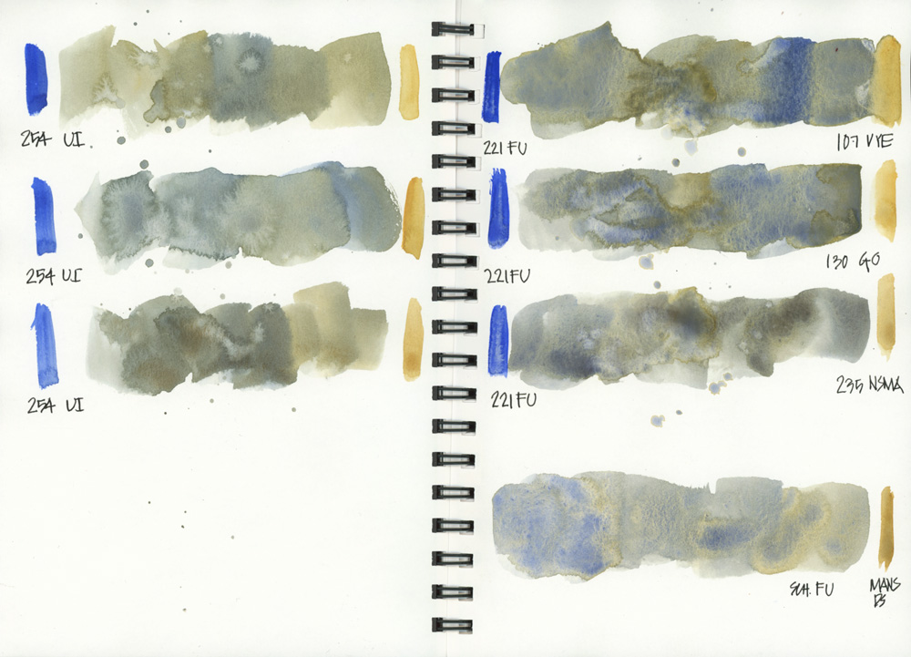
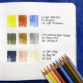
When I got home I did some colour mixing in my new colour book in order to work out how to get an Aquarius wash that behaves similarly to the FU and MANS mix mentioned above. This page compares three earth yellows – Venetian Yellow Earth. Gold Ochre, Natural Sienna Monte Amiata – and two Ultramarines – French Ultramarine, Ultramarine Intense.
NOTE: In my opinion, this kind of mixing – with a specific goal in mind – is a really important step in the development of my work. It’s also important to do mixing swatches in a way that relates to the way I paint – so my swatches are always include varies strokes, wet-on-wet and some splashes. It’s easy to spend a lot of time doing colour swatches but then not be able to use the results successfully in a sketch and also it’s easy to get in a rut with your mixing/washes in your sketches because you are not reviewing and refining back home. So mxing and sketching should always go hand in hand!
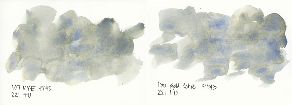
Now the challenge is to see if I can get these results out on location while working on a sketch! 🙂

4. Carters Creek
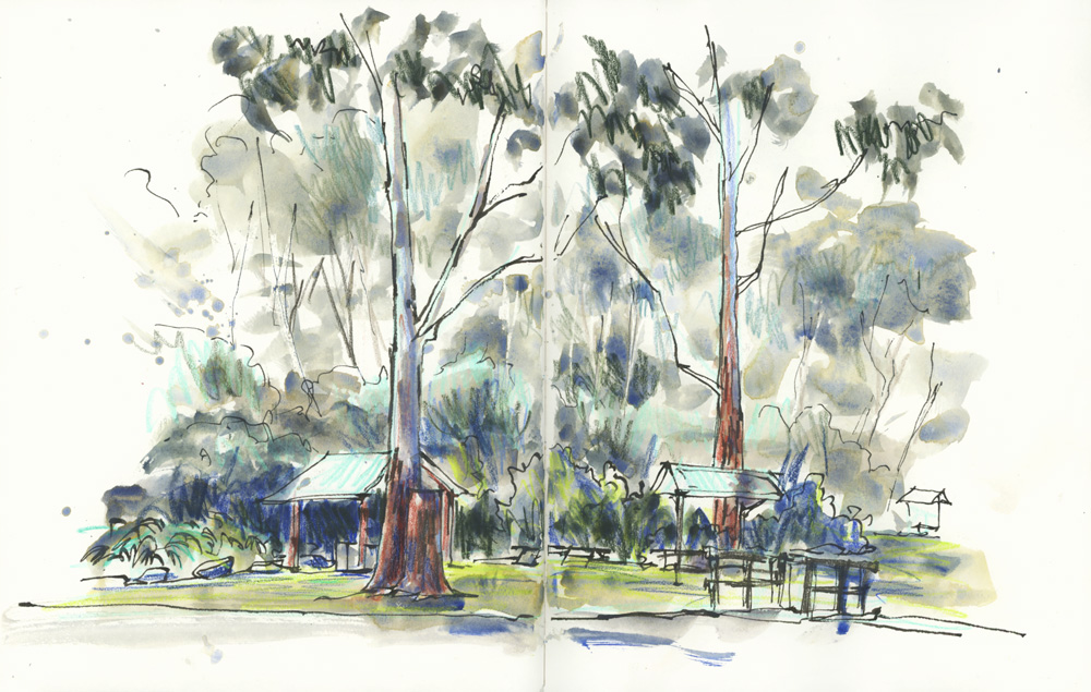
And just for comparison, I’m re-sharing this sketch that was done a few weeks ago. It has another colour scheme (even though I’m predominately using the same green washes as 1. and 2.) because of the underlying colour pencils. But in fact, as I review it now, the CPs used in this sketch are fairly similar to Sketch 2. but they were used in varying proportions and for different elements each version.
So to summarise my thoughts in this article….
There are so many possibilities when combining watercolour and coloured pencils! 🙂


3 Comments
I’m fascinated by your use of colored pencils under the watercolors! The various color schemes are so interesting!
Liz,
what paper do you use? I struggle with nature and trees. I tried to use colored pencils on top like you do but on my watercolor Strathmore paper the marks come out very thick and rough. Do you have a class for this?
Hi Stephanie,
I use Stillman and Birn Alpha and generally put down coloured pencils and/or watercolour pencils before watercolour. I do have some demos of using watercolour pencils inside my Foundations and Edges courses.
NEWSLETTER
Subscribe for first notification of workshop + online classes and more.