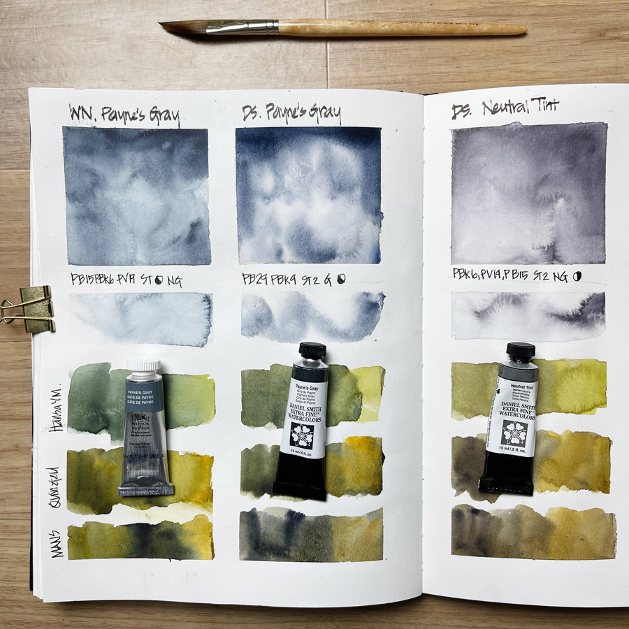
Last week during the livestream as part of my Watercolour course, I was asked about using Payne’s Gray to achieve darker versions of colours. So I thought I would do some mixing with Winsor and Newton Payne’s Gray, Daniel Smith Payne’s Gray and Daniel Smith Neutral Tint. This last colour is supposed to be a neutral grey so that when you mix it with other colours the result does not involve a shift in hue.
Whilst I understand the appeal of using these grey paints for easy mixing when you are a beginner, you’ll always get more lively results when mixing colours that don’t include black pigments. In Watercolour Lesson 3 (Theory 2 and Demo 1) I explain how to create darker colours by mixing complementary, or adjacent darker colours.
But as I haven’t used Payne’s Gray at all for many years I thought it was a good opportunity to do a colour chart. (Hmm, I’ve been doing so many mixing swatches lately, haven’t I?)
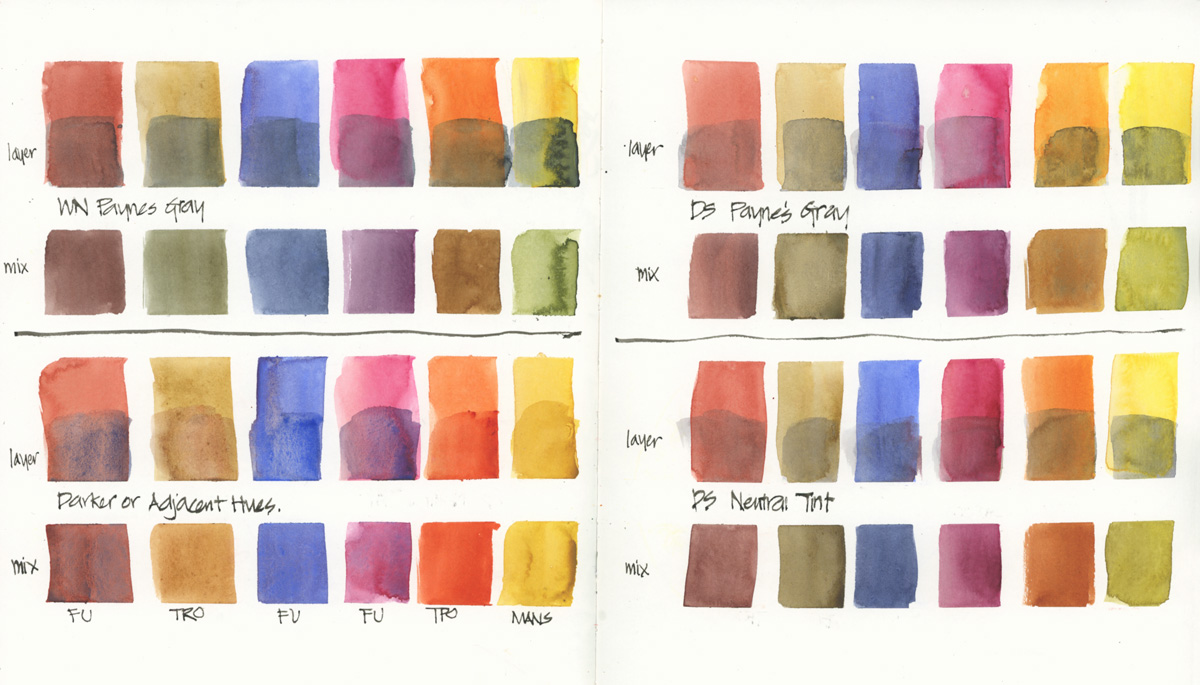 On this page, I used the three paint colours listed above – both layering and mixing with various colours in my palette. I also added my normal way of getting darker versions of these colours. I did this page late at night and in the morning I realised that some of these swatches should have been juicer.
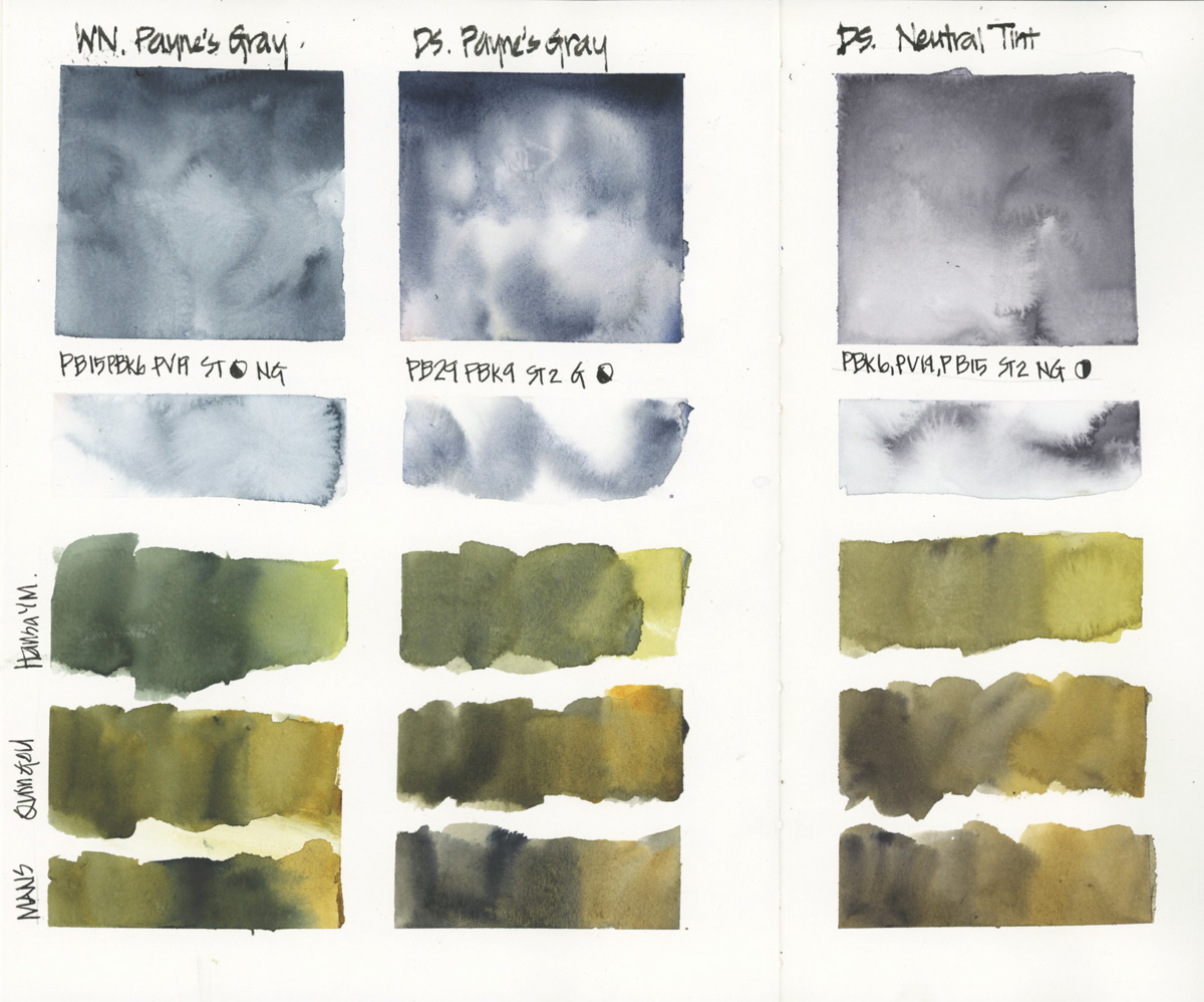
So I then did a more detailed study of each including mixing them with my three yellows – Hansa Yellow Medium, Quinacridone Gold and Monte Amiata Natural Sienna (all Daniel Smith).
I really liked the granulation of the DS Payne’s Gray on its own and I loved the greens mixed with the WN version when they were wet. Sadly they dried lighter and duller… but I was expecting that due to the black pigments. Doing a bit of research on the Handprint site… PBk9 (Ivory Black) has less of a drying shift than PBk6 (Carbon Black) but is a lighter black to start with.
Three uses of Payne’s Gray that I know of are:
1. for stormy skies
2. for dark muted greens
3. for value studies/ monochrome paintings.
Hmm, I want to do more green tests and compare with Perylene Green.
But right now, I’d love to hear from any of you who use it – why and what for?
(If you are reading this via email, please click on the article title link below and add a comment on my blog. Thanks!)



14 Comments
I use M. Graham’s Neutral tint, both alone and as a mixture. It has no black in it, and is made from Phalo Green and Quin Violet.
I use DS Payne’s Blue Grey – PB60 aka Indanthrone Blue, PBk6. I don’t like granulation, so with a new 15ml tube it’ll be the Payne for me forever…
Am no expert- use it for shadows which seem more natural to me than other greys (off dot swatches). Mixes are far more predictable than WN Perylene Green too.
That said I’ve had some crazy colour matching with DS Ultramarine Turquoise and Schmincke’s Transparent Orange for, well, all eucalypt green variants. Couldn’t get that (foliage match) with WN Perylene Green no matter what mixes I tried- probably because the PBk31 threw me off. Yes, duh, primary black, of course it won’t mix the same. I only got a 5ml tube as an experiment for eucalypt shadow work and I don’t like it anywhere near as much X(
I also use M Graham’s Neutral Tint after trying Daniel Smith’s Neutral Tint. I like the M Graham much better because it doesn’t have black pigment in it. I also have a half pan of Daniel Smith’s Jane’s Grey in my portable kit. It doesn’t have black pigment either.
Hi Liz,
In answer to your question ‘why’ do I use Paynes Grey.
When I first attended a beginners watercolour class (way back in the dark ages!), Daler Rowney Paynes Grey was a colour that was recommended to me. I used it for a while, but wasn’t really struck with it – it was ‘OK’, but no more than that. Someone then suggested I try the Winsor & Newton which I immediately found was more blue, granulated far better, and I thought was excellent for dark brooding skies.
Hence it became one of my ‘stock’ colours, and so I suppose my continued use of it has become an ‘old habit’.
I also sometimes use it in conjunction with either Lemon Yellow, or Cadmium yellow as it produces what I think are some excellent greens.
I have tried Paynes Grey, James Grey and neutral tint (all DS). PG and JG are the same thing with slightly different percentages of Ultramarine Blues and Burnt Siena. (I slightly prefer JG.).
I use neutral tint most often to lay down a layer of shadow first then paint color over it. Essentially doing a value study then add color.
My favorite color in this genre is DS moon glow. I love this color. It leans to warm rather than blue but since I love it ; it works in more situations for me than most people
That’s Janes grey not James. I’m a spell checker and I’m here to help you.
Hi Liz, I always enjoy reading your emails and “thank you” so very much for your inspiration and training. Retired now, self taught (thanks with your help) I sketch, urban sketch and watercolor almost daily. It is a wonderful hobby that I love and embrace. I want my palette to be small [ travel, mobility and confidence in use]. I have one warm and one cold primary colors. Only green is Sap. But I added Ivory black to help quickly with shadows, darken hues etc. Should I add Paynes Gray to my small DS pallet box I put together? I am seeing the same benefits I can obtain with watered down DS Ivory Black. Just a side question to your wonderful explanation above. Thanks as I hear a lot about PG. But think I can get same results with IB that I hear little to nothing about? Thanks and “keep sketching” and helping us all. ?? Wayne, Arizona
Hi Liz, I love Payne’s Grey and use it for monochrome works. Sometimes I add a little of colour (some more blue, some red, or some green) to give a nouance to the general work. For darker area i.e. shadows I do not like to use dark colours such as neutral tint or even Payne’s Grey, I prefere to define shadows with bistre I made by mixing the three primary in my palette. It’s the classical way to render shadows and tone. Even if I appreciate most modern way of paintings, this is the way I feel most in my strings. Thank you for your articles where you share your knowledge, experience and experiments. They are very interesting and also inspiring.
roberto, Italy
I use Payne’s Grey often. I tend to use it for deeply shaded areas, shadows and windows. I have not used it for mixing, but will now. Thanks!
I had never realized Paynes Grey could make such lovely greens! Ha! I’ve never used it much, finding it too blue as far as “grey” goes.
Hi Jamie,
I think that Paynes Grey is one of ‘those’ colours – people tend to either love it, or wouldn’t use it if it was the last colour on earth.
But this is where I find that Liz’s courses are SO good as she is never, ever judgemental – she will merely say ‘Well, I wouldn’t do this, I’d do that instead’.
And that’s fine – because any art is always subjective, so if something works for you, the go for it.
But should you want help and advice, then Liz and her courses are a brilliant place to both discover information, and to work from.
I use DS Bloodstone for this, because I’m lazy (but I do use complementary colors too). It’s such a quick and convenient way of dulling down or darkening any color. And I love the granulation!
Thanks Liz for putting out a whole blog post in answer to my question! I clearly see the difference now for getting darker mixes with an adjacent color vs the use of Paynes’ Gray. I have started using Payne’s Gray in value study and love it there, and will keep it for the monsoon crazy clouds. I’m very curious about the green mixes so will try for sure.
Thanks again for sharing all this and help us all learn!
‘Monsoon crazy clouds’ – brilliant description for a great use of Payne’s Grey.
Love it!
NEWSLETTER
Subscribe for first notification of workshop + online classes and more.