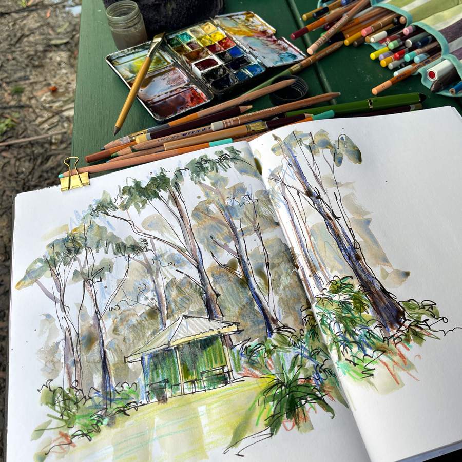
Just a short article today to share two sketches this week done at Lane Cove National Park.
I just feel so happy to be in the bush sketching! I know that you know I love visiting LCNP and that sketching out on location (especially on sunny days) makes me happy… but some days I just feel extra joyful! 🙂
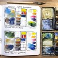
Tuesday’s version above was the first time I did this scene using Quin Burnt Scarlet in my green mixes. (Notice the new bright white full pan in my palette!)
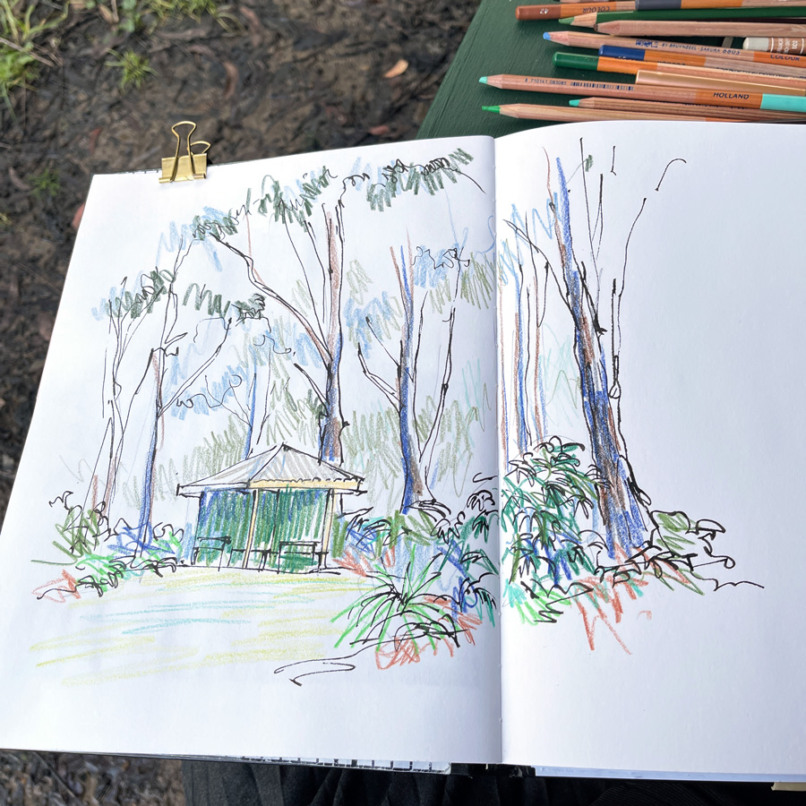
Here is the photo I took at the end of the coloured pencil stage. BTW I’m still loving Bryunzeel Design Coloured Pencils. Their greens are crazy bright colours so I’m also using some select colours from other brands (Faber Castell Polychromos, Caran d’ache Luminance and Derwent Coloursoft).
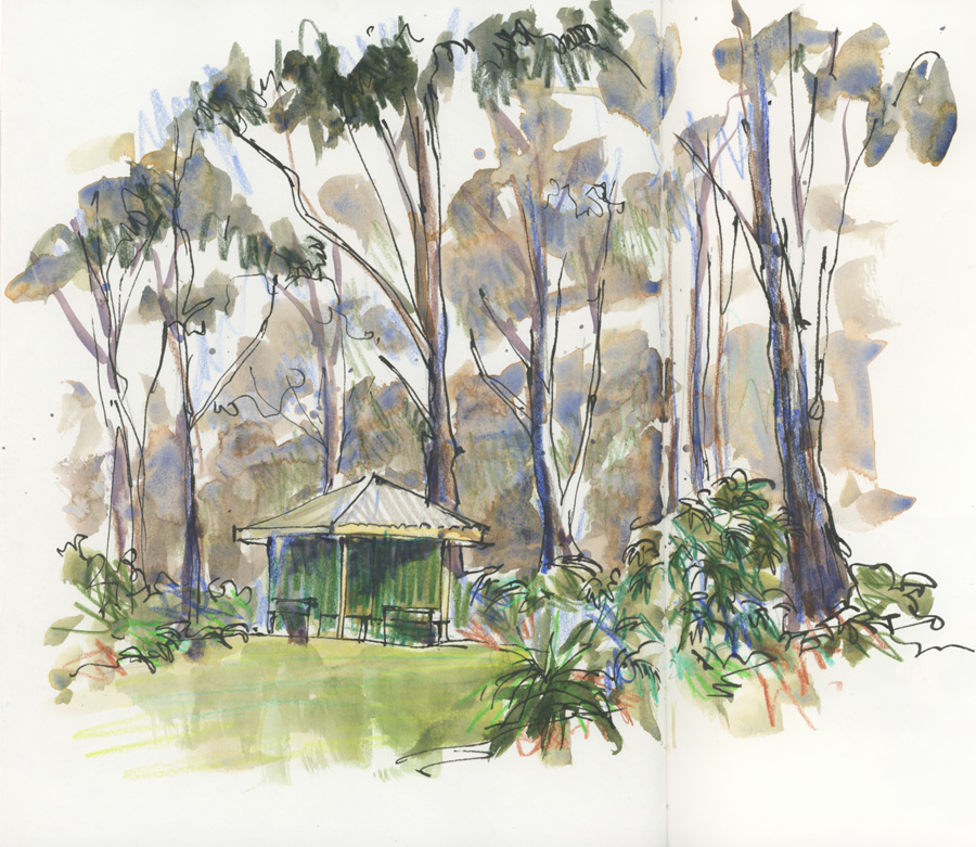
And then the final sketch. Look at the rosy hues in the QBS mixes.
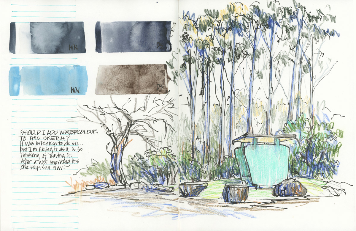
Yesterday I intended to use the same technique but I got this far with my coloured pencils and decided to stop. Hmm, I don’t think it needs paint although adding watercolour would relate better to the swatches (the overall composition is a little awkward but I’ve done the best I could!)
So what do you think?
Should I add watercolour to it???
Let me know your thoughts in the comments below. (If you are reading this via email, please click on the article title link below and add a comment on my blog. Thanks!)


23 Comments
With watercolour ! I can see the excitement with pencils during the past few weeks but I still prefer when there is a bit of watercolour.
I too think add a touch of watercolour. Maybe just on the trees.
No watercolor. Just my opinion. The understory is so lovely how it recedes into the sunlit background. It reminds me of walking in an alder grove on a summer day near where I grew up in Oregon.
Hi Liz, I would leave it like that. I like it very much without watercolour. The picture is consistent. Greetings from Germany, Karin!
No, it’s bright snd fresh as it is. I wouldn’t do a thing to it!
When you compare with the other sketch, this one is complete with just the colored pencils. In the previous sketch, the watercolour was needed to add depth and atmosphere to your subject. I too prefer watercolour, and you know how sometime we find it hard to stop working on a painting, but if you are hesitating so much, I think you already know the answer : STOP!
I like it as is but i think I would like it better with watercolor- watercolor seems to claim the space , adds a sense of space , with depth and mystery, that isn’t there from with the pencil alone.
I love it just the way it is.
Looks good! But how about adding some darks with watercolor to enhance the sens of light & shadow?
Love the open air feel and lightness of just the watercolor pencils. Although — the turquoise building/shed seems so bright/vibrant that a splash of watercolor over it might tone it down (?). I always love your sketching adventures! Hello from Colorado, USA.
Nope, reflects how you felt at the time and typical of Aussie bushland. Colours always changing.
The bush and the outdoors has helped us get through the last couple years of covid. Lane Cove., like North Head, Sydney, great places to wander and look. ????
Lovely, Liz. The pencil strokes have a vibrancy, a positive energy. The turquoise is lovely amidst the colors of nature. Thanks.
Leave it as is. It’s fresh and clean. You then have 2 different approaches and can try both approaches on a similar subject again elsewhere and see how you feel having decided beforehand how you’ll tackle it.
I think it looks complete, but I like the lushness of the one with watercolor better.
Add watercolour ?
The question mark was suppose to be the ‘thumbs up’, web changed it to question mark.
I am For adding Watercolour
I like the pencil, however, I prefer the smoothness of the watercolor where the picture seems to have more of a hazy, blended texture.
I love the lively pencil lines. No watercolour this time even though I love your watercolours. I like the composition too!
Yes..add some watercolor..Brenda TX USA
..me again from TX..what is brand of burnt scarlet..Daniel Smith?
I think adding watercolor would make it fit those swatches and the previous sketches better. Unless the intention is to document/keep what the pencil layer is. What story is this page about, in your heart?
Personally I prefer the addition of watercolour, agree it would match your swatches better. However I know you like to change up your pages in your sketchbook, so by leaving it as is, it’s a change!
So to solve it, I think you need to go back and do another version with the same colours/technique and add watercolour to that one. Then you have an excuse to go back again, sooner rather than later (not that you need one ;)).
Thanks everyone for your thoughts!!!!! I ended up adding watercolour to it but plan to go and back and do a CP version 🙂
NEWSLETTER
Subscribe for first notification of workshop + online classes and more.