The OneWeek100People challenge is next week and so it’s time to top up my palette and work out what I’m going to do about my skin colour mixes.
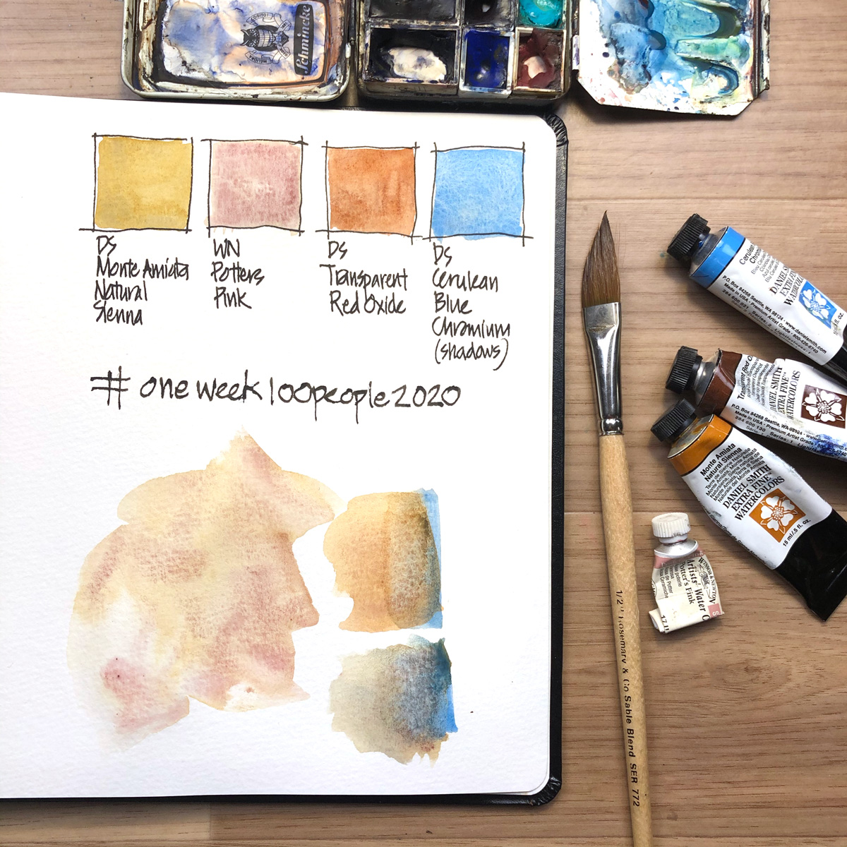
Last year I made up some special skin tone paint out of some spare paint (a random combo of Daniel Smith paints: Yellow Ochre, Minnesota Pipestone Genuine and Potter’s Pink) but this year I think I’m going to stick to my usual combo of Daniel Smith Monte Amiata Natural Sienna and Winsor and Newton Potter’s Pink.
Please note: My local area is made up almost entirely of caucasian and asian people so I don’t have a lot of experience mixing darker skin tones. I use a little transparent red oxide when I do, but really need to explore this further.
I can’t survive without Potter’s Pink when it comes to sketching people and it looks like my supply is low!
And for the record, this year my challenge involves 100 watercolour people sketched on location. Please note that this challenge does not require you to sketch people on location and you can easily join in from the comfort of your own home using an app like Sktchy for some reference photos.
More prep coming later in the week.
For full details on the challenge please check out this page on Marc Taro Holmes’ site.
If you don’t have any go-to mixes and you want to use watercolour for the OneWeek100People challenge, it’s a great idea to do some testing now!
What are your favourite skin colour mixes? I know some of you shared last year (thanks!) but is your favourite mix still the same?


12 Comments
Hi Liz, I just use Perylene Maroon (DS) and Cerulean Blue for shadow areas. So no mixing in the palette. This was a combination I picked up from Marc Taro Holmes a few years back. P. Maroon is a strong pigment so you do need to be careful. I start with a watery wash and go back in the shadow areas with stronger pigment and then add a touch of Cerulean Blue. Another choice is a very a watery wash of Indian Red.. similar to Potters Pink…or a watery wash of Transparent Red Oxide and add a blue in the shadow areas. My favorite is Perylene Maroon ..it give a nice cool skin tone, single pigment.
After years of trying to work out the exact best skin colors, I’ve decided it doesn’t much matter. You just need something subdued and to have different colors shifting around on each face. (The reason why the skin color never looks right on clothing store dummies is that it’s all one flat color.) But you still have to pay attention to overall color relationships in any crowd scene. Most people in San Francisco are some variation of brown and gold, with a few people going to pale pink (me, alas) and a few going to burnt umber with blue undertones (but you can’t go too dark, or you’ll lose all detail on the face.) If there are little bits of some common color in all the faces (usually a gold-ish ocher or sienna) then the scene will be more unified and it will look like we’re all members of the same species.
Hi Laurie – thanks for sharing all those tips and I agree with you that it doesnt have to be a exact matter. Good point about having some common colour in a scene – I’ve done that my default, but it totally makes sense!
I love the idea of sketching people from scenes of a movie or television show, for those of us still in the winter weather. I think I’ll also make up a “special mix” too.
Hi Kim – yes, I do screen captures if I watch something on my ipad for sketching later. hope a special mix helps.
I always use a combination of any plain yellow+ water down red and a touch of Titanium white, the mix is adjusted with colour(s) and water to skin tone of the of the person we all have different shades, further this colour can be darkened by the ambiance If you really want a close colour match Test on scrap of paper when dry compare with existing
Thanks for sharing Carlos!
Very watery yellow ochre and permanent alizarin crimson, with a touch of ultramarine blue for shadow areas. I found this combination in a YouTube video by Teoh Yi Chie several years ago.
How our memory deceives us. My mix uses cerulean blue, and came from a video by The Art Tutor. Teoh’s video suggests other useful combinations for skin tones.
Thanks for sharing Cora!
Is it a 50:50 mix?
Thanks, TinaG
Yes! approximately
NEWSLETTER
Subscribe for first notification of workshop + online classes and more.