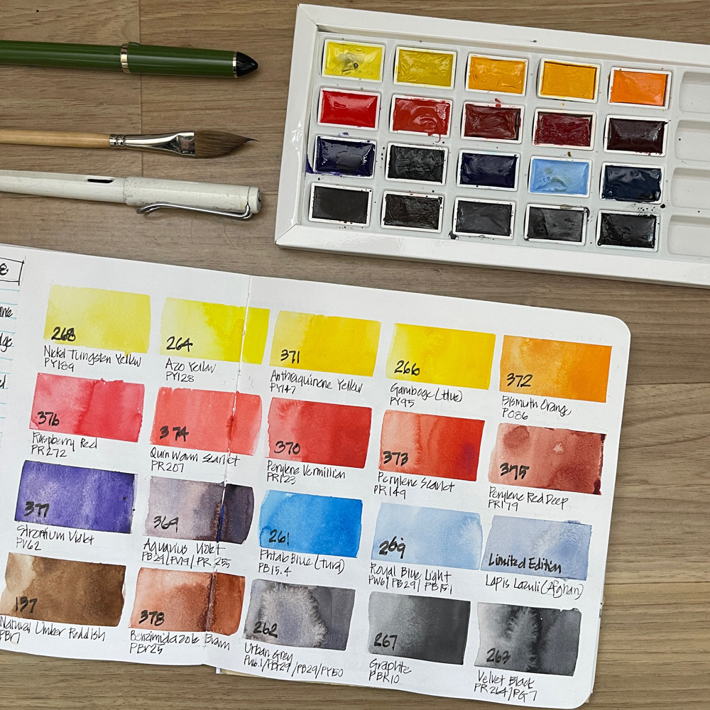
 A few weeks ago I got an exciting package from Poland with the 20 new Roman Szmal Aquarius colours for 2023 – thanks Roman for sending them to me.
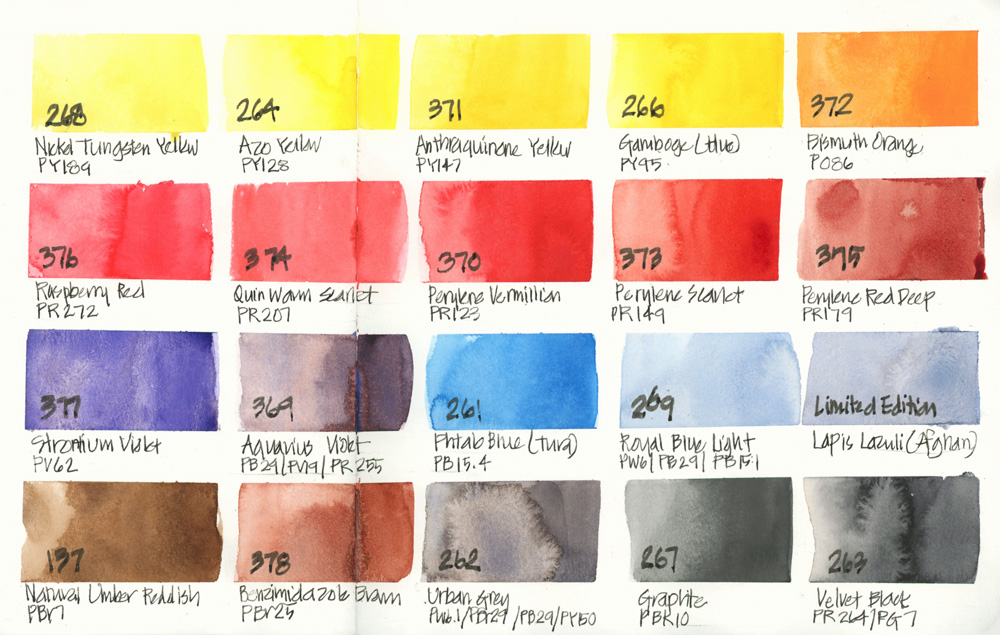
Of course I immediately swatched them out (there are some beautiful colours in the collection) but then didn’t know what to do. Having 20 new colours is a lot to get my head around!
So I then decided to build a palette out of as many of the new colours as I could.
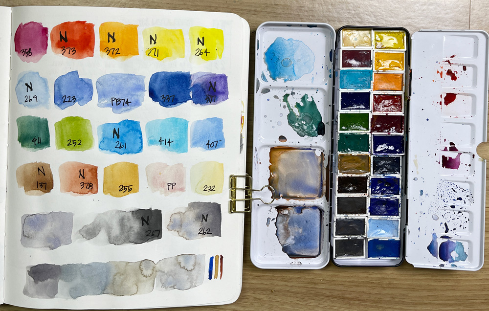 I ended up using 9 of them and then filling out the 24 set with some other Aquarius colours I found. Roman has very kindly sent me lots of samples over the years so I have a good collection although it is somewhat random. (ie. I don’t have the full range.)
The idea of this palette is mainly to use new colours but a few favourites (such as Potter’s Pink) managed to find their way into the set. 🙂
This palette is sitting on my desk at home (it’s too heavy for an everyday urban sketching palette) and so I haven’t used it much yet. I did use it for my recent Canowindra Revisited sketch – see here.
I’m still not sure how I will tackle testing these new colours (twenty new colours at one time is a lot!) – so I thought I would ask you…
Is there any colour you are interested in or would like me to test first?
Please let me know in the comment section below.
(If you are reading this via email, please click on the article title link below and add a comment on my blog. Thanks!)




19 Comments
I met him also, his earth colours are nice: brow and green
Hi Liz, I like the look of Aquious violet. May be for some shadows or some of the gorgeous rocky outcrops you have up your way. They look lovely and rich.
I agree. My first draw was Aquious violet. Definitely a nice shadow color. But I can see, possibly, painting a foggy misty morning with this color? Liz, how can we document or include the weather with urban sketching? Thank you.
I’d like to see what could be done with the orange. That and blues can make some interesting grays. I’d also be curious in what the graphite does. I’ve seen these paints advertised on Jackson’s blog so it’s nice to see how they work, thank you!
The Lapis Lazuli looks interesting, particularly how it might mix for grey. Beautiful colors!
Aquarius violet, benzi brown, peryelene red deep, and lapis lazuli are all new shades to me. Make a few triads and try some mixes with your favorite yellows?
Hi Liz – a a partially colourblind person, I see very little difference other than slightly darker tones in the yellows. Perhaps they mix quite differently or some are more transparent?
I also love the Aquarius Violet and thinking it would be great for shadows. Please experiment with this one!
Susan
Hi Liz and Chantal – a a partially colourblind person, I see very little difference other than slightly darker tones in the yellows. Perhaps they mix quite differently or some are more transparent?
I also love the Aquarius Violet and thinking it would be great for shadows. Please experiment with this one!
Susan
How exciting! I bought the Phthalo Blue Turquoise, Strontium Violet, Raspberry Red, Aquarius Violet, Urban Grey, and Velvet Black and have been enjoying all of them. Raspberry Red quickly became my new favorite mid/warm red!
I’d love to see some testing of the yellows and orange. Yellows tend to look so similar in swatches it’s hard to tell which ones I might want or what they might be a good replacement for without hearing more about how they’re performing in mixes and actual use.
The two violets and Lapis Lazuli look really interesting! And the urban gray reminds me a bit of my favorite color from Beam Paints, Timberwolf!
What a wonderful problem to have! I’m not sure where I would start either. Maybe a monochromatic sketch using only reds and purples or only blues and purples. Or you could try a sketch using none of your usual choices and only colours you rarely use. Whatever you do, it will be a lot of fun. I look forward to you writing about it and showing your results.
I pick the violet, PV62. I can’t quite read your writing of the name, but I’d like to learn more about it.
Hi Liz-
Would love to see Bismuth Orange in action!
Hi Liz, lapis lazuli for me. I’ve been playing with Daniel Smith Kyanite Genuine and it reminds me a bit of this. Love to see lapis in action. Thank you.
Poor orange always seems to get overlooked so I’d love to see what you can do with that Liz ??
Oooh, the lapis lazuli sounds like fun!
thanks for all the comments and suggestions everyone – more here
https://www.lizsteel.com/aquarius2023-part1/
I am not able to post a picture here, but my trick is to utilize the Compeet bandage box to make my palette lightweight. I am using medicine blisters for paints, molding mass to divide the space for mixing, and I have painted it with a white mat paint.
thanks for sharing Marta
NEWSLETTER
Subscribe for first notification of workshop + online classes and more.