I thought it would be fairly easily for me to sketch all my teacups in a year but there are only a few weeks left in 2019 and I still have about 20 to sketch!
I’m just not sketching as many teacups these days as I no longer drink tea in the evening.
Another reason why this project has been harder than I expected, is the fact that I often use my teacup sketches as crazy experiments and end up with very mixed results. So I’ve been doing multiple sketches of the one cup and then only sharing the final version. But I’m not going to worry about that any more as I realised that you might be interested in seeing my experiments!
Recently I have been testing out some sketchbooks with paper that is very different from what I am used to. When I sketch teacups I always take extreme risks in regard to working with damp areas and applying shadow washes over the top of paint which is in different stages of ‘dryness’. If I change paper my usual techniques might not work at all, and this has happened during some of these examples below. The first time I try a teacup sketch on new paper, I often test how much water I can use and how the paper copes with working into damp areas. I sometimes make a real mess as I’m experimenting with how much ‘fiddling’ the paper can take. I’m not trying to produce a good sketch, but rather testing to see how the paper behaves.
But enough preamble… here are the teacups.
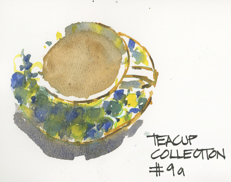
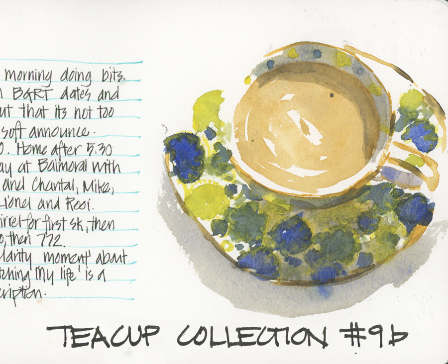
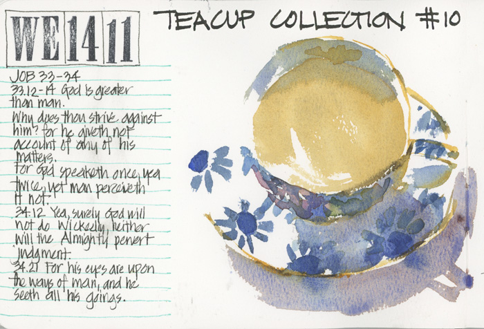
Teacup 9: T2 Mahabharata Yellow
These two attempts at sketching one of my new ‘Watercolour On Location cups’ on the 100% Cold Press Paper in the Etchr sketchbook were not very successful but they did help me understand the paper better. I promise to share more about these sketchbooks soon and also a little about why 100% cotton paper generally doesn’t work for me. But in essence the first washes soaked into the paper and then merged together. The paper stayed wet for a long time and so trying to define the pattern by layering over the top didn’t work as it does on Moleskine Watercolour or Stillman and Birn Alpha. I expected this to happen and it was fun to make a bit of a mess to see what the end result was.
In the second version I added some watercolour pencil over the top to see how that worked.
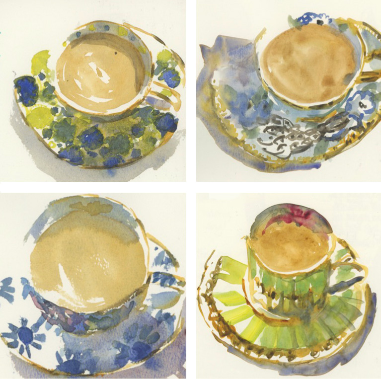
The next teacup I tried is one of my least favourites from my collection. The floral pattern on the cup (which you can hardly see in this sketch) is okay, but I’m not at all keen on the saucer design. As a teacup sketcher, saucer pattern is much more important that cup pattern. The cup shape and any decoration inside it is nice as I see that when I sketch, but the outside pattern is normally greatly foreshortened! This T2 teacup – called Bonnie and Neil – is a tea-for-one set and has a matching teapot that sits on top. Hmm, I haven’t ever sketched the teapot.
Once again I took some risks working into damp areas. This time I left it alone and came back and added another layer once the first washes had totally dried. I liked the granulation in the shadow wash under the saucer though!
I didn’t end up working out how to successfully use this paper for my teacup sketches before switching to a new book. But I kept some pages at the end of the book so I can come back and try again!
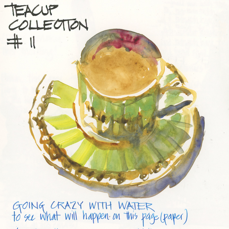
The next book I used was the Hahnemuhle Nostalgie in A4. This paper couldn’t be more different from the 100% cotton Cold press as it is 100% wood pulp and super smooth (such as Stillman & Birn Epsilon or Zeta). So the first teacup sketch in this paper was all about pushing the amount of water I could have on the page and once again seeing how much of a mess I could make! Ha! so much fun. Here the water stayed on the surface a lot and ran together, so as a result of watching this while I worked, my perspective is a little off. I liked the ‘bad’ marks on this paper but needed to be careful how much water I use.
This teacup – once again from T2 – was bought for the first run of my Edges course ( in 2015) since it has some soft edges due to the flutes on the cup and saucer.
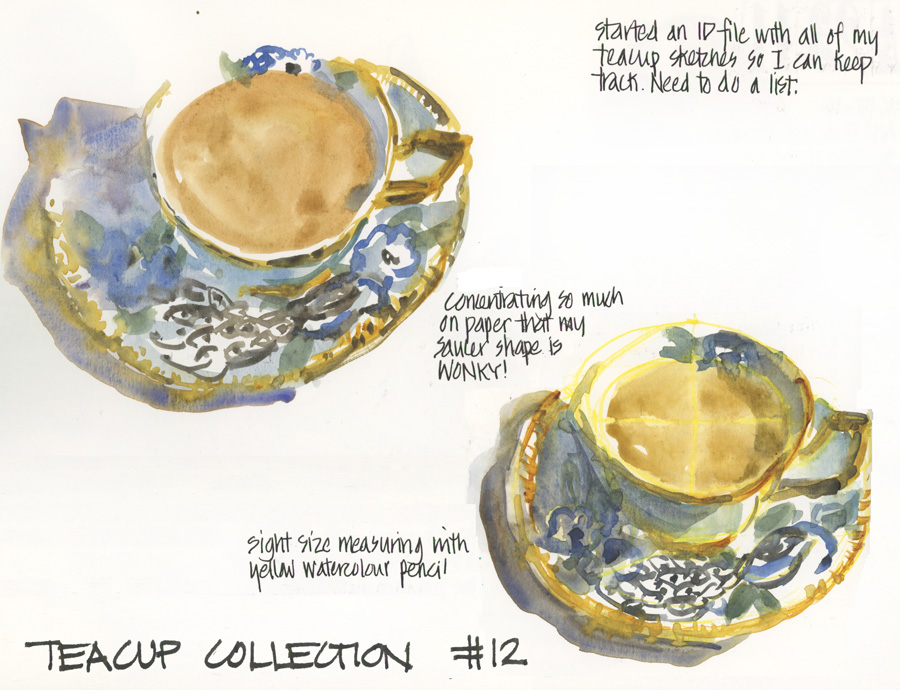
The final teacup for this article is a cup by Christina Re which I bought on the way to a workshop at the Central Coast when I realized that I’d left my usual teacup prop at home. I also used this teacup as the signature image for my Fountain pen Sketching Series.
I was working on the Nostalgie paper again and once again was so focused on how the paper was behaving that I completely lost the shape of the saucer.
So I did another measured version of the cup using yellow watercolour pen setup lines (no real reason why I used yellow – it was the first pencil I came across).
Both of these teacup sketches have some nice parts to them, but I’m still not achieving the results I wanted.
I could ramble on more about these sketches, but the main point is that changing paper can have a massive impact on your sketches. Don’t expect the same results, and also don’t be afraid to make a mess as you work out how the new paper behaves differently from what you are used to.

4 Comments
Thank you for posting your sketches. I have a couple of the cold press from Etchr. I have filled 1 book. It was truly a struggle. I kept telling myself I must be missing something. Every so often I would produce something that inspired me to keep going. I do have a new paper I love . It is Winsor & Newton 100% cotton cold press. It is halfway between hot press and a cold press and takes pen & ink beautifully not to mention watercolor. I will go back to the Etchr cold press because I am seeing some incredible work posted online using this paper. My favorite in the Etchr range is the hot press.
Yes! I prefer the hot press too. And I’ll have to try the WN book again. when I tried it a few years ago I had a similar experience to the Etchr cold press.
Hello Liz, thanks for this beautiful content. Can you explain me the difference in working with watercolor hot or cold pressed? Many thanks.
As promised… an article is coming soon 🙂
NEWSLETTER
Subscribe for first notification of workshop + online classes and more.