As I mentioned on Friday, last week I suddenly started using coloured pencils. Not only did I find it very refreshing to use a different tool but the old much-sketched local scenes started feeling new!
A few general comments before I share all the work I did last week:
- I don’t have any idea how long I will stick with coloured pencils and whether it will mean a complete break from watercolour for a while. It’s nearly been a week since I touched my paints and that feels a little weird. So I’m very interested to discover how long it will take before I long to have pigment and water on my pages again. The last time I had a big break from watercolour was back in 2012 when I used markers almost exclusively for a few months.
- The brands of pencils I’m using are simply whatever I already had in my collection. The colour chart shared last week (and included below again) indicates the brands: a lot of Derwent Coloursoft plus Caran D’ache Illuminance, Faber Castell Polychromos and a few Prismacolor Verithins.
- I’m sticking with coloured pencils (wax or oil based) at the moment rather than using watercolour pencils as I want to resist adding water! I want to explore the characteristics of wax vs oil pencils. At the moment, due to the loose way I’m using them and the little layering that I’m doing, the differences are not a big factor in my work.
- I’m wanting to expand my mark-making and pencils are perfect for this.
- I’m also wanting to explore new colour combinations and especially have fun with some pastel hues!
Okay, enough thoughts for now, here are my pages…
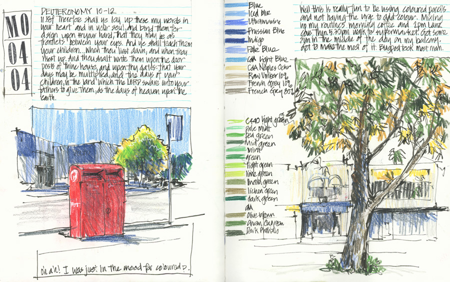
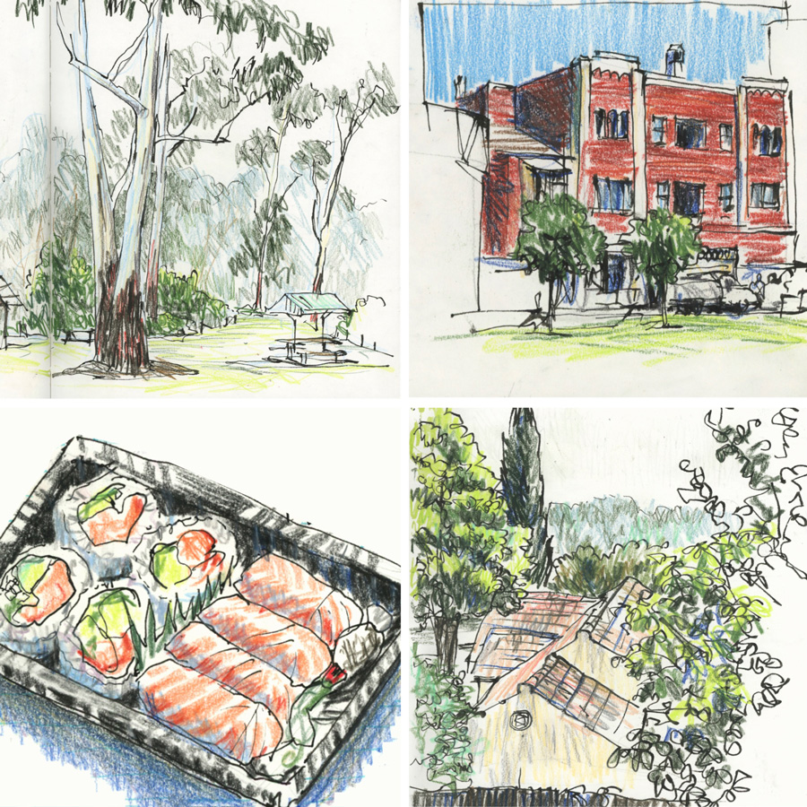
The first two coloured pencil sketches as were shared previously as separate images. Here they are in the full spread with a colour chart down the side as I tried to find some good blues and greens.
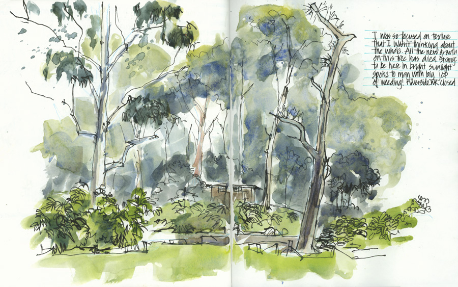
The only watercolour on-location sketch I did all week. Back at Lane Cove National Park thinking more about the texture of my individual washes than the whole. 🙂

Watercolour experiments as discussed previously here.
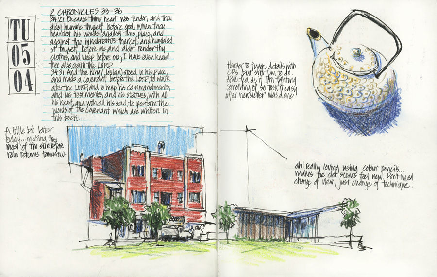
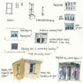
A morning sketch at the Village Green – it felt so different to sketch this scene with coloured pencils. My note about the teapot sketch was: Harder to fudge details with CPs.

The last use of watercolours for the week (on Tuesday) was a little test of coloured mixes and textures. The top swatches are trying to match the threads from a cross-stitch kit. These are the colours it used to describe gold trim on teacups.
On the right a page of quotes from a book I’m reading at the moment.
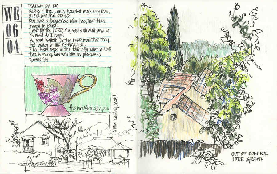
This week’s teacup, documenting the crazy growth of the neighbour’s tree (I don’t have as much of a view these days) and discovering another bus shelter that I can sit at on a wet day.
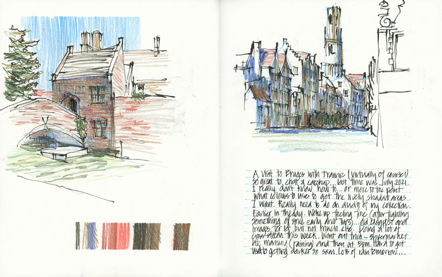
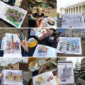
Sketches of Bruges while catching up with Frannie as mentioned before here.
As Frannie and I were talking about Belgium waffles I bought some the next day (once a year purchase!) Plus blind contour zoom sketching and experimenting with cross-hatching.
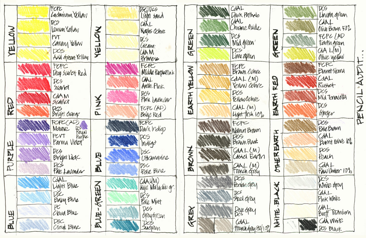
Colour chart as explained in this article – shown in the context of my week of sketches.

More tests and swatches.
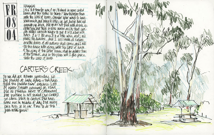
A coloured pencil version of the classic view of Carters Creek (LCNP) using six different pencils. While I’ve done many many bush sketches with watercolour pencils and watercolour paint, it felt different to be only using pencils, especially for the background areas.

A different view of the Village Green.
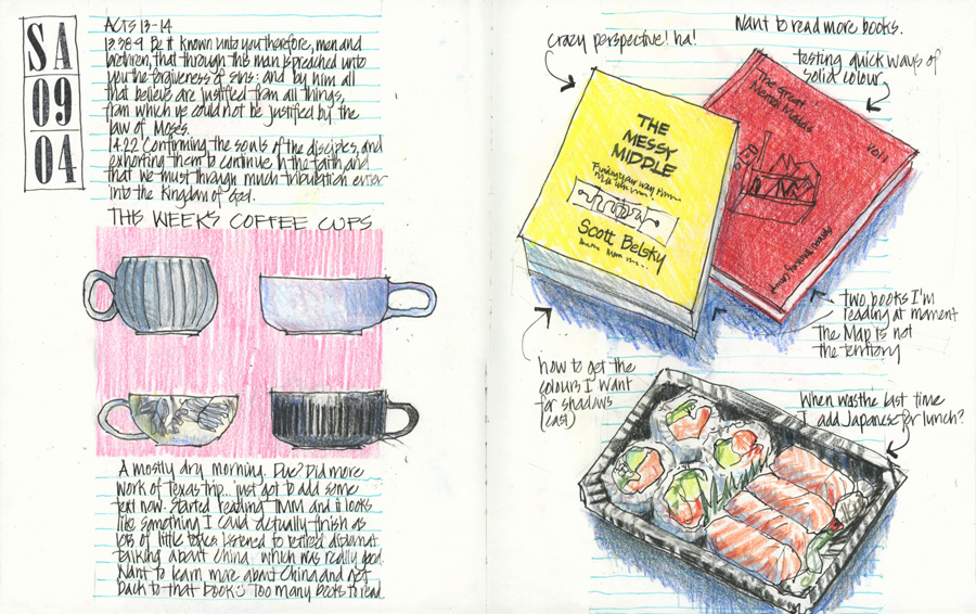
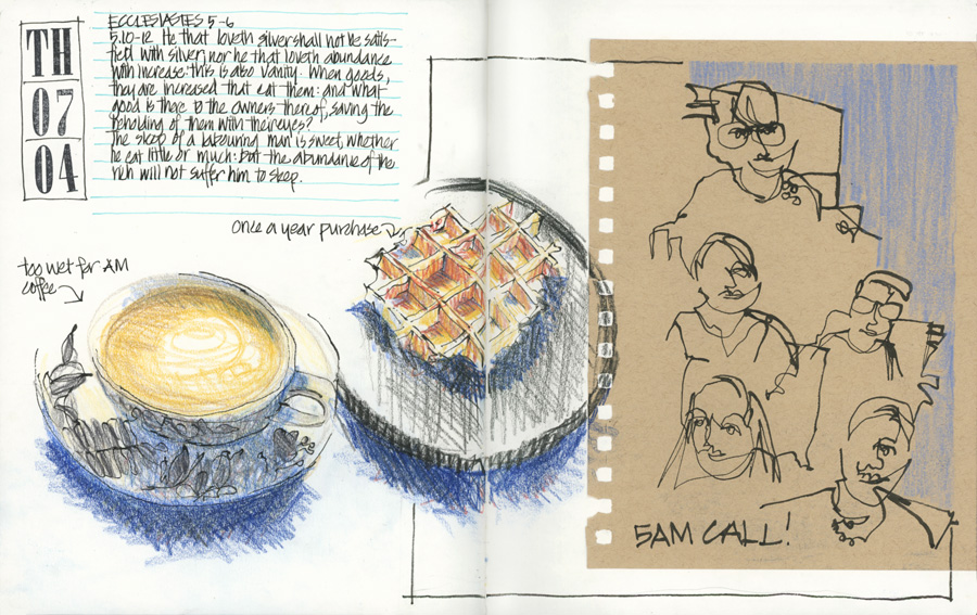
Bits and pieces – coffee cups, two books that I’m reading (with intentionally out-of-whack perspective) and some sushi.
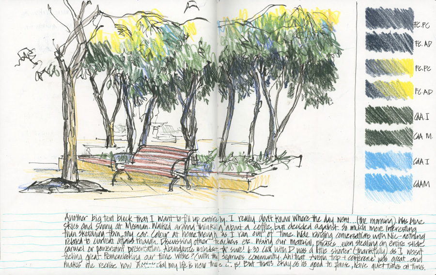
More swatches and a view from the heart of Mosman.
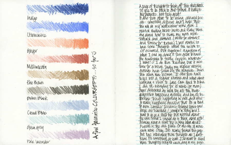
The final spread for the week (and the sketchbook as well!) contains another big text block and some of the colours I’ve gotten to know this week.
It was a good week of sketching and I can’t wait to see what I get up to in the coming week.
Along with experimenting more with pencils and getting to know some colours better I’ll be also adding elements to my pages as part of Lesson 1 in Sketchbook Design.


4 Comments
You could make beautiful art using sticks and stones!
THanks Doug! 🙂
Liz what books are you reading? Is that Frank Webb on Watercolor? Thank you.
Hi Leslie, Yes, I was reading Webb on Watercolour (highly recommended!) but I’ve put that aside while going on my coloured pencil tangent!
NEWSLETTER
Subscribe for first notification of workshop + online classes and more.