Note: This palette has now been changed – the latest version is here.
I’ve just cleaned and topped up my palette for my end of year “stay-cation” so it was the perfect time to updated you on what has changed in the last few months.
(NOTE: This post has been updated APRIL 2019)
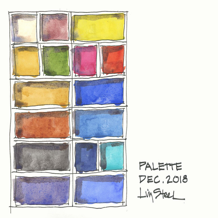
What’s in my palette
DS Hansa Yellow Medium PY97
DS Transparent Pyrrol Orange PO71
DS Quinacridone Rose PV19
SCH French Ultramarine PB29
DS Cerulean Blue Chromium PB36
DS Indanthrone Blue PB60
WN Cobalt Turquoise Light PG50 APRIL UPDATE: I have also been testing WN Cobalt Turquoise
DS Cobalt Blue PB28
DS Buff Titanium PW6
SCH Potters Pink PR233 MARCH UPDATE: I have now returned to using WN Potter’s Pink
DS Quinacridone Gold PO49
DS Sap Green PO48 PG7 PY150
DS Monte Amiata Natural Sienna PBr7
DS Transparent Red Oxide PR101
(DS Bloodstone Genuine) MARCH UPDATE: I have now returned to using DS Van Dkye Brown
Steels Grey III (a pre mix of WN Cobalt Deep Blue with a little DS Quin Burnt Orange and a touch of DS Quin Rose)
APRIL UPDATE: I have added WN Naples Yellow and reduced TRO full pan to half to fit this extra colour in.
Note 1: DS = Daniel Smith, WN = Winsor Newton, SCH = Schmincke
Note 2: I am listing them as I think of them – right column first and then left column (as I’m a leftie) – so please excuse that this list doesn’t relate to the way you are probably reading the above image!
Note 3: Cobalt paints have toxicity issues so please make sure you are aware of this. Check out this great section on the Handprint site about the topic.
What has changed
- I’ve removed my Soft Grey (a premix of DS Cerulean Blue Chromium, Hansa Yellow Medium and a touch of Quinacridone Rose) to make room for DS Cobalt Blue. I can easily mix it and I’m using cobalt as a base for ‘soft greys’ anyway.
- I’m testing SCH French Ultramarine Blue instead of DS Ultramarine Blue as the DS version dries very hard in the pan.
- I’ve temporarily swapped out DS Van Dyke Brown PBr7 for DS Bloodstone Genuine. Bloodstone is a fun colour and seems to do most things that I need Van Dyke Brown for. MARCH UPDATE: I have now returned to using DS Van Dkye Brown
- I’ve testing the SCH version of Potter’s Pink to see if it’s got a little more oomph than the WN version. MARCH UPDATE: I have now returned to using WN Potter’s Pink
Basically, I haven’t changed it much in the last few years, but there are a few minor tweaks to see if there are alternatives that will work a little better for me!
My previous palette (from Dec 2016) can be found here.
Other articles to check out:
My watercolour section – with lots of things to consider when choosing your colours
Recommended minimum palette of 6 colours
A basic 12 colour palette
Putting together my palette for a big trip
Plus:
Brenda Swenson on filling a palette
Jane Blundell on filling half pans
Jane Blundell on ramp filling pans
So are you making any changes to your sketching kit for the start of the new year?


34 Comments
When you were in California did you notice a difference in the sky and ocean colors enough to use different colors in your pallate? Curious about using different colors for America.
Hi Stephanie
The sky in California was an exact match for cobalt. I could have matched a similar hue but wanted to try cobalt for pigment reasons not simply hue. I normally don’t change my palette see here for more
https://www.lizsteel.com/what-are-the-colours-of-chicago/
Hi Liz, how does the Schmincke Potter’s Pink work for you so far? I find it’s nice in mixes but hard to get a juicy wash with. I was wondering whether I should change to another brand so I’m really interested in your findings.
Hi silks. I only just put it in ? but I believe it’s the strongest of all brands. Potter’s pink is very insipid no matter what. But it still is worth the effort of picking up more pigment.
I love Potter’s Pink! I just love pink!! I use the Windsor Newton and am so far happy with it.
Thanks for the recommendations Liz!
Great to see that you have highlighted the toxicity issue Liz! Much appreciated ! As a scientist I always find it strange that the topic of safety and hazard is never touched upon. Atleast, that’s the information I have gathered from those who have had a formal degree in Arts . I write on this topic in my blog but I try not to be too scientific in my approach just so a ‘layman’ can understand . It’s always best to be informed rather than being ignorant !
Also interested in your P.P. impressions! In swatches I’ve seen it looks like a darker, more sombre colour than W&N…
Of course I’ll share ? yes a bit darker I think. Haven’t used it yet. Stay tuned
I was very interested to read about your ultramarine blue switch. I agree about how hard the DS version is. Please give us an update when you’ve had a good chance to judge the Schmincke. As always, love reading about your palette.
Hi Melissa. I’ve been using it for months without noticing a difference on the page. But I want to do a comparison- stay tuned.
Same here! I find mine comes off the pan and rattles around if I don’t use it even for a few days.
Where is the swatch of the Bloodstone Genuine? It still indicates DS Van Dyke …?
Oops – the hazards of copy and paste. Text is updated now!
Fabulous
I found it really helpful when I once saw you go through student work and critiqued it. I think it was Foundations. I wish I could see you do that in more depth. It went really fast! These are just my made-up examples: “A little trouble with the color here.” “The scale of the volumes could have been … ” If you do this again, could you say a little more about the fix for the problem? In in-class art classes, waiting (and dreading) for the teacher to come around and look at my work was like having the lights turned on in the darkness of learning something new. “Oh! I see what I missed! I see how my start got me into territory that was hard to repair.”
Hi Diane. I did a few quick reviews in the lead up to a few courses (they were teasers rather than full reviews) but my Foundations ones – lessons 12 were fairly descriptive including marked up sheets with suggestions. I hope you have another look at them and let me know if there is enough feedback. (Knowing full well that there is never enough feedback ??? we can always have more).
Hi Liz. Thanks for the update – love your work. I noticed that you have Quinacridone Gold as PO49, however I think Daniel Smith ran out of that discontinued pigment (having bought all remaining stocks some years ago). Quinacridone Gold is now listed on the DS colour chart as PO48, PY150. Do you think it’s a problem that it’s two pigment mix rather than single pigment? Would you know of any supplier who might happen to have old stock of the single pigment PO49?
Hi Kay. Sadly no original Quin gold left but I have a number of tubes. Here is an article about alternatives https://www.lizsteel.com/watercolour-mixing-green-and-gold/
Hi again. I have another question, this time about Hansa Yellow Medium. I really like the Hansa yellow family, but would prefer transparent over semi-transparent. Have you found any good transparent yellows in Daniel Smiths?
Hi Kay. I haven’t found a transparent yellow that I really liked and actually like hym being semi opaque so that it jumps off the page.
You might want to check out Jane Blundell’s site For her brush outs of lots of different yellow paints.
Could you share why you choose PV19 instead or PR122? I have them both in my travel palette and have started to realize it might be a little redundant but can’t quite choose one over the other. I am leaning towards PR122 which is why I’m so curious to hear your thoughts!
Hi Mara
Pr122 is probably more versatile in mixing but I find it an unnatural hue to use. As I work very fast I often use paint straight from the pan without any mixing. I find the Quin Rose version of PV19 is a colour that I can use on its own.
Hi Liz,
I am addicted to you and Jane Blundell. You have been one of my go tos for direction and inspiration.
For the life of me, I don’t know what to do with my DS Potter’s Pink. I bought it because of all the talk of how fugitive Rose Madder is and that this was the alternative, but it is such an odd color, not like rose madder at all.
Rhodonite is closer. How do you use Potter’s pink? My sketches are mostly landscapes, cityscapes, working on animals, occasionally a portrait finds its way into my books – very few florals – but I don’t see you doing a lot of florals either. Piemontite is another inigma. I know Jane really like it. Thanks in advance for your help.
Hi again, Liz,
I am so embarrassed – just found your article ON Potter’s Pink. I will do my homework! Thank you so much for all the hard work you put into this medium and helping the rest of us be better at it,
Hi Cheryl – dont be embarrassed, what amazing timing that you left your other comment today 🙂
Wow, I now realize this is a VERY basic, and maybe kinda dumb question, I want to start with your 12 color palette, but am confused how to get the pans of the different colors, Daniel Smith (?) has your basic 6 set, but i would like to get the 12 now. Do you buy tubes of color and “make” your own pans, and if so is there a learning link on web where I could get up to speed?? Thanks a million, loving your course. Amazed you only have 24 hours in the day like the rest of us!!
Hi Linda. Yes you squeeze paint from tubes. Here is my article about that. https://www.lizsteel.com/trip-prep-getting-my-palette-ready/
Hi Liz,
I am going to visit the Outer Hebrides in early summer. What are your must-haves for the Hebridean landscapes, especially for beaches, water and sky?
Thanks, Sabrina
Hi Sabrina
I hope you have a great time with good weather. I don’t make any change to my normal palette for Scotland. I just play with my mixes a little. Buff titanium is always good for beaches.
Thank you Liz!
Will practice a bit and paint from some pictures to figure out what to mix!
Hi Liz,
I’m loving your instagram posts from your current Palladium trip, and am inspired to purchase some new pigments, particularly some DS paints. My question is this……How can we tell which pigments in your palette are transparent? Have you listed this anywhere on your site? Is there another way to know or tell which ones are transparent?
Thanks for your help and for your inspiration! 🙂
Lois
Hi Lois,
palette is listed on the sidebar and then you can look up the various websites or colour charts. Sorry that I don’t currently have that info listed and in the middle of a 2 week teaching session so can’t do that right now 🙂
Hi Lois,
There are sites like Blick’s that lists all the different makers of watercolors and each color’s characteristics like transparencies, history of a particular pigment, etc. When it comes to the Daniel Smith watercolors, Amazon (US) actually lists quite a bit of info about each color. On the other hand, there is little to no info listed about Winsor/Newton’s paints there. No doubt Amazon has a pay scale for how much information they’ll include in the listing. Personally, I read about the color’s description there, then buy my watercolors on e-bay at a much lower cost. : – o
Hope this helps,
Mary
NEWSLETTER
Subscribe for first notification of workshop + online classes and more.