 I’m excited to announce a new series here on my blog – going through each colour in my palette explaining why it’s there and sharing some favourite mixes. It’s going to very personal at times, more emotional than technical (eg. ‘I just love this colour’) and I’ll also be sharing some aspects of my palette which I want to explore further.
But before I get into specific colours I think it’s important to share a few general principles:
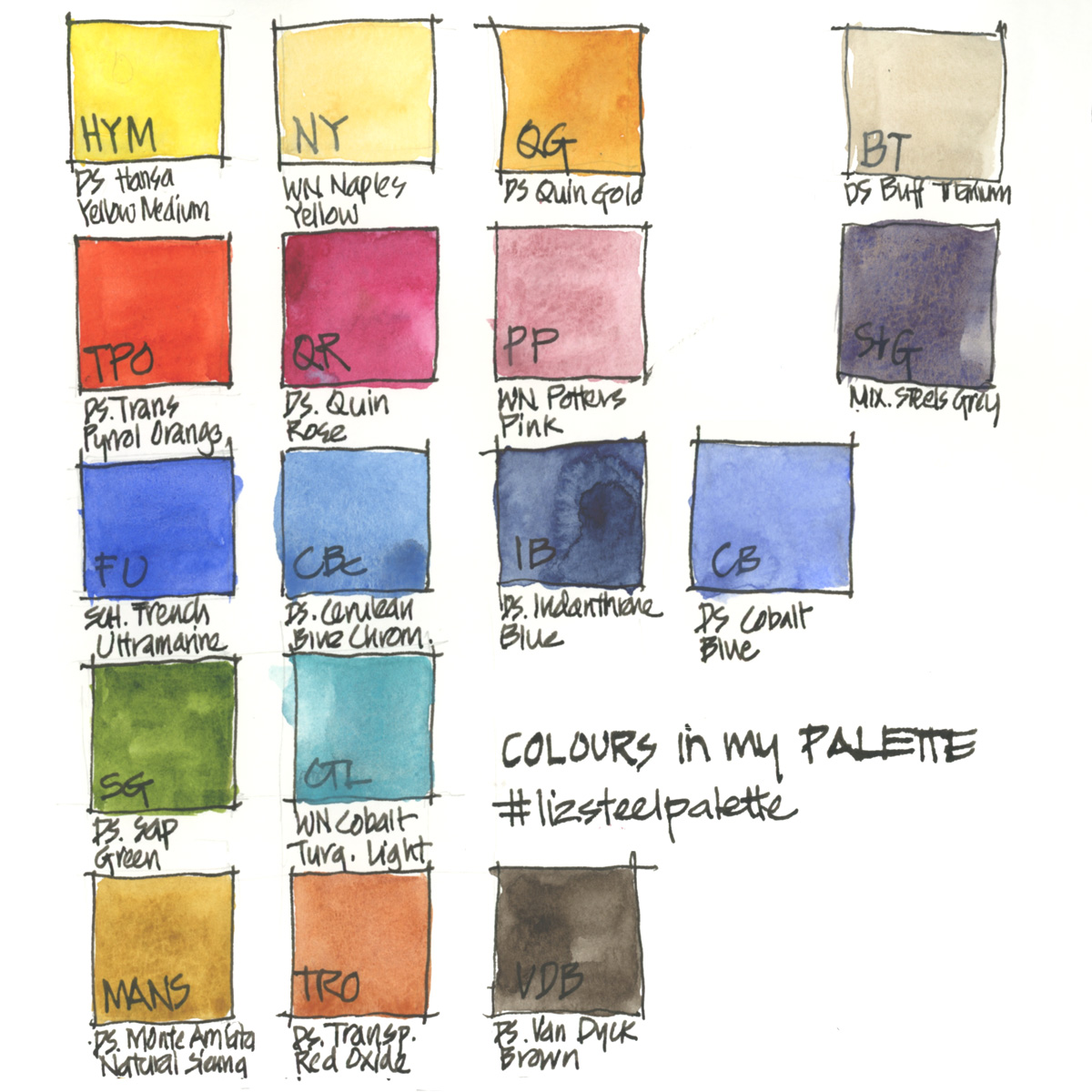
- I more or less follow the standard approach of splitting my primaries into a warm and a cool version (though with a few quirks).
- I’m much more interested in pigment variety than simply hue (the colour of the paint).
- I look for the best version of a pigment rather than stick to a single brand – so my palette contains Daniel Smith, Winsor and Newton and Schminke. I still have many different varieties to test and so part of this exercise is to highlight that. Note: In 2019 I extensively used Aquarius paints during my by 3 month trip in Europe. I really liked some of those paints but haven’t worked out if any of them will find a permanent place in my palette. Since returning home from my big trip in August 2019, I went back to my standard palette as that’s the one which I use for my SketchingNow courses.
- I generally choose transparent or semi-transparent pigments, but try to avoid highly staining ones – ie. Pthalos!
- As I work quickly it’s important that all of the paints in my palette can be used in their pure form, so I don’t have any colours which are good mixers but terrible on their own – ie. Pthalos!
- I love granulating colours but I don’t always choose the most granulating version available. (eg Cobalt Turquoise Light vs Cobalt teal – see more here)
- I’m more interested in creating watercolour magic by using two different pigments which separate in a wash than granulation on its own – so I want to have a mix of different pigment types in my palette to create this magic. More about watercolour magic here.
- I have a number of opaque colours which I use sparingly and normally on their own.
- My colour choices are very personal – I love vibrant strong colour and possibly this is a result of living in Australia with strong light.
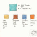
- I have certain biases due to my favourite subject matters. I’m much more interested in achieving a wide variety of greys and earth mixes to suit architecture, but don’t care so much about achieving exact matches for pinks and reds.
- Although I’m constantly tweaking and testing alternatives, my palette has remained fairly consistent over many years. See a collection of palette articles here.
- I have a 12 colour and 6 colour version of my palette too.
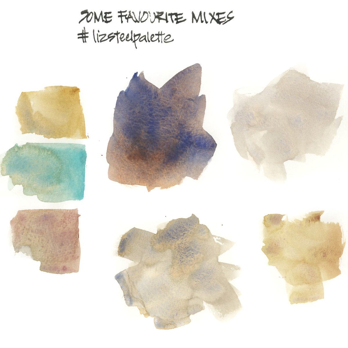
Here’s a teaser for some of my favourite mixes. Isn’t it interesting that although I love vibrant colours in my sketches, it’s the neutral washes (and achieving magic through pigment separation) that I get the most excited about?


7 Comments
Thank you, LIz. Love this post. Can’t wait to read follow-ups. My palette is based on yours with a few extra purples, my favorite color! Could you comment on DS primatek colors? I love them but don’t hear much about them from your reviews. Thanks!
I look forward to these upcoming articles as well! I love the favorite mixes swatches above….beautiful mixes that speak to me!
Thanks Julie!!!!
Hi Kate – I haven’t really used any Primatek paints for a number of years so that would be a totally separate exercise. Your request is noted! 🙂
Hi Liz- I love this idea for a series of posts! I have long wondered why you choose a specific version of a color – e.g., Hansa Yellow MEDIUM (not simply Hansa Yellow) or FRENCH Ultramarine Blue. I look forward to learning the why behind your choices.
Hi Renee, I have a lot of that information scattered in old posts, but it will be great to group them all together – stay tuned!
NEWSLETTER
Subscribe for first notification of workshop + online classes and more.