Here is the last installment in my Colours in My Palette series: Neutrals. I have delayed posting this as I have been testing an alternative to one of the colours – but more of that shortly.
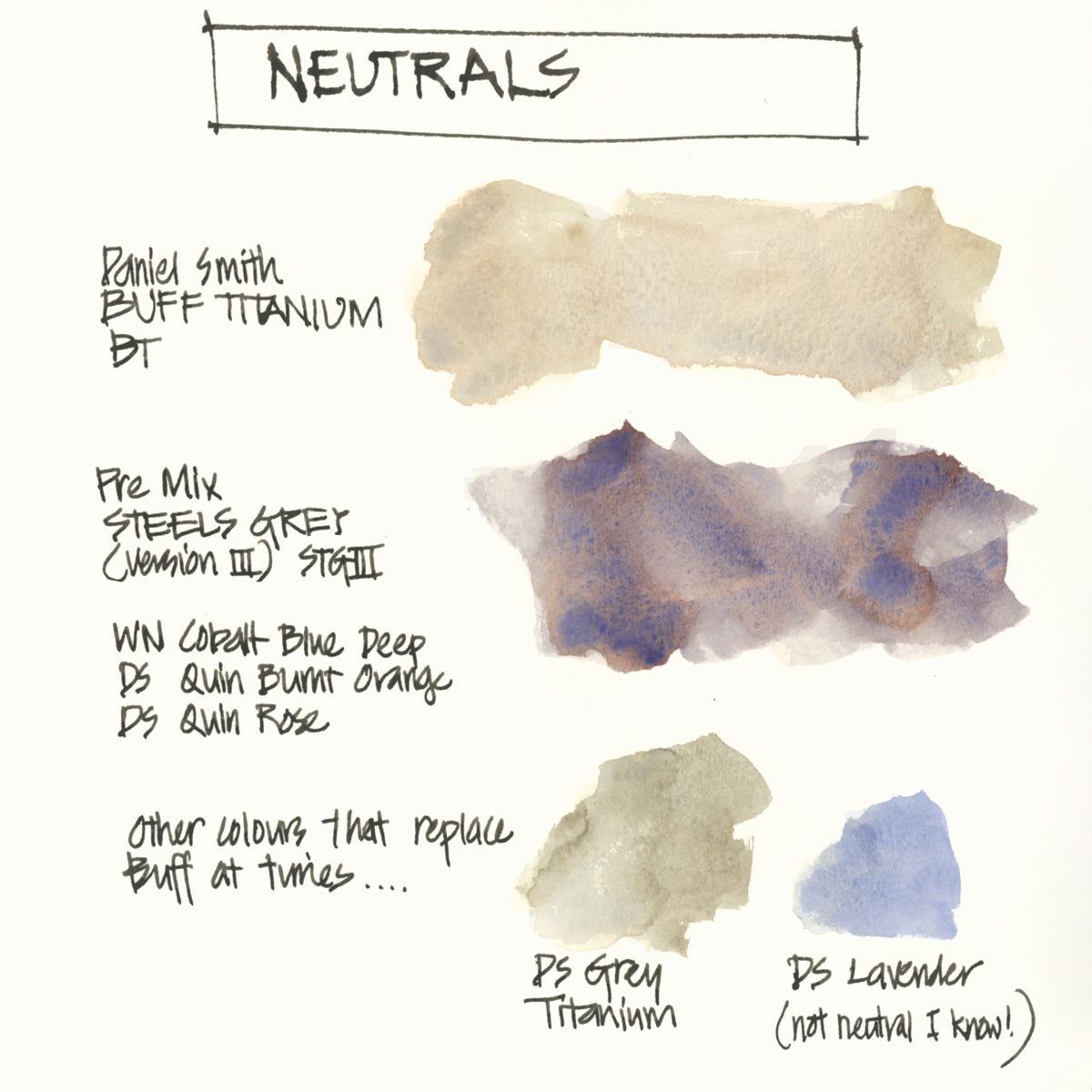
My neutral section contains two paints – Daniel Smith Buff Titanium and my own pre-mixed Steel’s Grey.

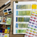
Buff Titanium
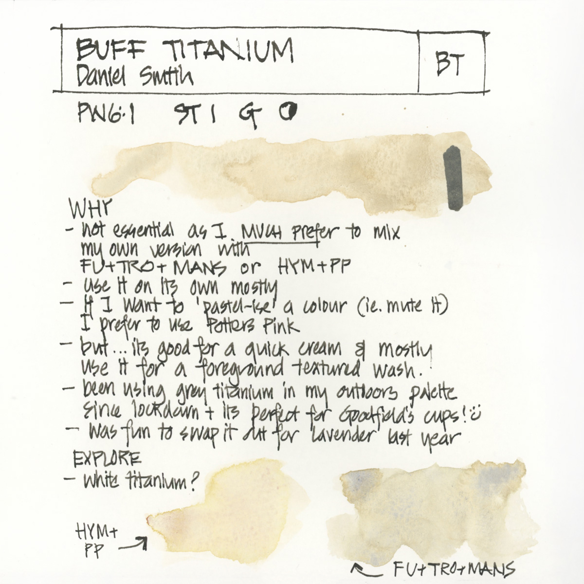
I’m not really 100% convinced that I need Buff in my palette. I much prefer to mix my own version of it – a version which is more transparent and is full of separating pigment magic! So I only use it occasionally on its own or to make a pastel/muted version of another colour. But even then I often use Potter’s Pink for ‘pastelising’ as it creates more pigment magic.
The two mixes I use as a Buff alternative are:
- French Ultramarine, Transparent Red Oxide, Monte Amiata Natural Sienna
- Potters Pink and Hansa Yellow Medium – possibly with a touch of Cerulean Blue (chromium) if I want it more neutral.
I recently started using Grey Titanium in my outdoor sketching palette. It’s perfect for the coffee cups from my local cafe, but I don’t think it will replace Buff in the long term. Last year I swapped Buff with Lavender and that was a fun switch in my palette. But due to teaching Watercolour On Location I put Buff back again.
Steel’s Grey
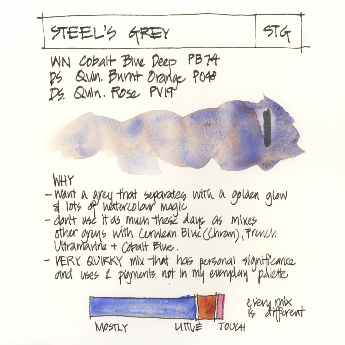
I got the idea of mixing up two colours in a pan after meeting Jane Blundell for the first time in 2013. At the time I had Winsor and Newton Cobalt Blue Deep in my palette and was using it for grey with Daniel Smith Quinacridone Burnt Orange (one of the many Burnt Sienna type pigments I explores – see my Earth colour article for more). So mixing these two colours together meant I could add Transparent Red Oxide as my ‘burnt sienna’ colour instead and it freed up a blue spot. To get this mix I simply put some tube paint of each three colours into a full pan (following the proportions shown above) and mix the colours together with a toothpick.
There is something special about mixing a synthetic staining pigment(or two) with a granulating sedimentary one. It’s not just about the resultant hue – it’s the magic that is created by combining pigments with different characteristics (something I explain in detail in my new Pigment Characteristic lesson inside of SketchingNow Watercolour)
Note: The original mix (Version I) was just CBD and QBO. Version II used a different earth colour – Transparent Brown Oxide – but it was only a temporary change. Version III refers to the fact that I now add a touch of DS Quinacridone Rose.
A lot of people use Moonglow for shadows, but I’m more of a blue shadow person and I want my shadow colour to separate so that it contains a warm glow.
You can easily achieve a similar result to Steel’s Grey with the right Burnt Sienna and Ultramarine combo – so there is no need for you to copy my quirky mix. It has historical significance for me (my dear friend Robyn who is no longer with us introduced me to CBD so I like keeping it in my palette for that reason.)
Other greys?
As for Payne’s Grey and Neutral Tint… I know these are very popular greys but personally I’m not a fan of either. I prefer to mix darker versions of colours using other methods (using compliments or adjacent darker colours as described in Watercolour Lesson 3) and I’m looking for grey mixtures with a lot of pigment separation. But I might have one of these in an expanded palette as they would be good for tonal studies and dark washes – such as a stormy sky.
I used to have a second pre-mixed grey – Soft Grey – in my palette. But since I added cobalt there is no room for it and I didn’t really need a pre-mix as it’s easy to quickly create.
Summary
In this last article for this series, I need to stress (once again) that I’m sharing my selections in order to share my thought process – to help you think through your own preferences and what you want to achieve from certain paints in your palette. Not for you to rush out and blindly buy new colours.
I hope you have enjoyed this series as much as I have. It’s been really good to document my current thinking about all my paints… and I have lots of things to explore further. Thank you so much to everyone who has left a comment – I really appreciate it.
So I would love to know….
What greys and/or neturals do you have in your palette? And why are they there?


13 Comments
I used to not like Payne’s Grey at all (too blue) but now it is one of my favourite go-to/all-rounder colours. It is a strong, staining colour which I mainly use in a much diluted mix e.g. capturing white for birds, cloudy/stormy skies, soft shadows. It also mixes well with Burnt Sienna and Burnt Umber to make an almost black colour.
Sounds great – thanks for sharing Jan. Those uses of payne’s grey makes a lot of sense
It’s always really interesting to read how others use their paints!
I really like Payne’s Grey and often come back to it, or to Schmincke Neutral Gray that’s a little less moody, these are the ones that are most useful to me. I’m currently using up all my other neutrals: Neutral Tint (too black), Graphite grey (a bit too soft), and also Buff Titanium, which is nice for sand and cream-colored birds, but other than that I barely use it. I have to add that I also have a gouache white in my palette, so I don’t need an extra pigment to make colors more creamy or pastel-like.
Thanks for sharing Julia – I always love to read of other peoples preferences and experiences. Never tries Sch Neutral grey
I’ve been messing about with Moonglow and so far, I really love it. I’ve also tried DS Bloodstone Genuine (which I won’t refill once I’ve used it all. Just didn’t suit me) and Joseph Z’s Warm Grey. Still deciding on that last one. I’ve really enjoyed this series, Liz. Gets me thinking about my colors and why they are important to me.
Hi Barbara – glad you enjoyed the series and it’s great to read of your preferences. I haven’t used Joseph Z’s Warm Grey but Moonglow is a favourite for many people
Thank you for this series. It has been a great resource for me.
My pleasure Kristina – glad it has been helpful!
Always love your color mix choices. Bought DS Buff awhile ago and don’t love it but will experiment mixing with other colors to see what happens. Love your Steel Grey!
I love your greys! Just wondering- how can you live without indigo?
Hi Petra – I use Indanthrone instead. 🙂
Roman Szmal has a PW6:1 that is a warm dove grey, called Aquarius Grey (#253). I find it is not as opaque as buff, in my opinion.
Thanks doe sharing Melanie – I do have that colour back home so I’ll test it further.
NEWSLETTER
Subscribe for first notification of workshop + online classes and more.