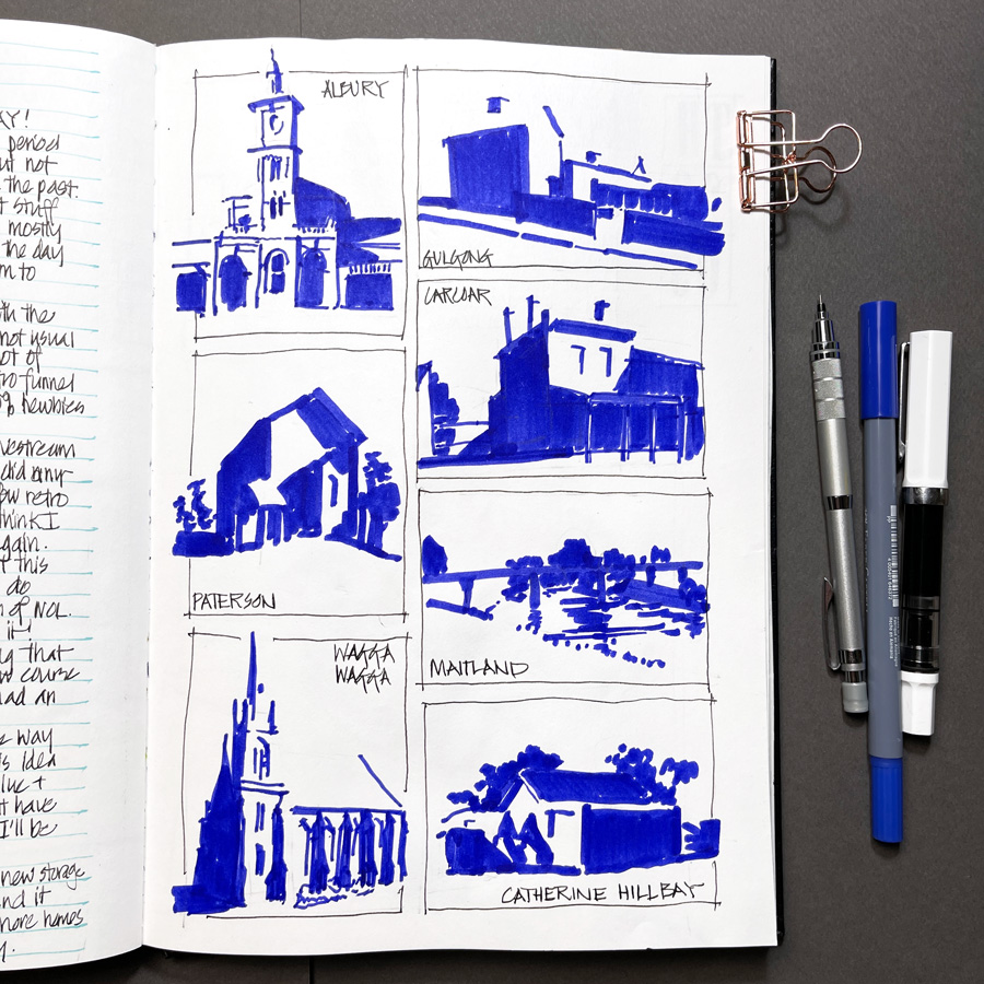
It’s so good to be going through Watercolour On Location again and to be doing the 6-day thumbnail challenge. 3 days of drawing thumbnails recording the main edges in a scene and 3 days of ‘painting’ thumbnails (just recording the shadow shapes). I’m mixing it up and alternating between the two types of thumbnails.
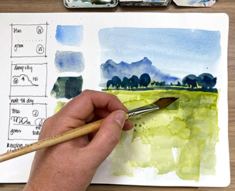
On Day 2 I decided to do some shadow shape thumbnails and as there isn’t a lot of sun around I did these from photos. So much fun to do these and that Blue-Violet GoldFaber Aqua Marker strikes again! These thumbnails are critical training for creating lively sketches of complex scenes with good values!
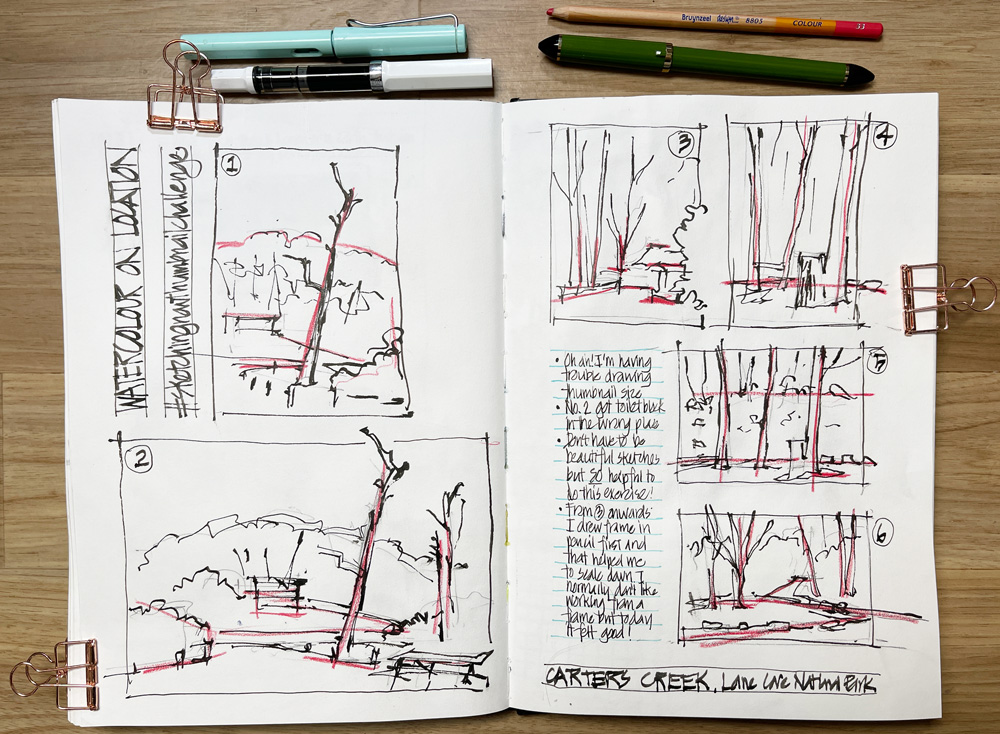
On Day 1 of the challenge, I decided to do a few thumbnails during my visit to Lane Cove National Park. I have a long history of doing thumbnails (thanks to my architectural background) but for some reason, I was struggling when I started to draw small enough. The first two attempts where bigger than I intended them to be 🙂
I normally prefer to draw the scene first and then add the surrounding box, but here it was working better for me to start with the frame. I also added red pencil over the lines that I considered the main edges and in doing so, started thinking about composition. This is what we will be looking at in a few days’ time when we start Lesson 1.
Thumbnails don’t need to be pretty – their purpose is to help you work out the main elements of your subject and what you are going to sketch. There is also a danger of putting too much detail into them so that they become a min-sketch. So working small (credit-card size) is the best way to limit the information you put into them.
More thumbnails to come in the following weeks!




4 Comments
WOW! Love those blue violet thumbnails! They could be the start of a painting all on their own – some type of acrylic or mixed media semi abstract piece, maybe. Very inspiring! Thanks for sharing!!
Thanks Liz for such a timely reminder. I often forget to do a thumbnail and then wonder why my painting suffers from what I call “death by mid-tone”, that is no strong contrasts to make the focus of my painting stand out. Sometimes I leave the back page and inside cover for thumbnails, as I always want to save the good paper for finished works.?
Another WOW for the blue marker. The only thing I have in a similar color is Noodler’s Bay State Blue ink which I have one Lamy Safari dedicated to but as you probably know that ink is challenging to handle and has to be cleaned up with bleach if you spill any. It also feathers on a lot of papers so having a tidier choice and still have that wonderful reddish blue color is great. I will look for one asap. Your sketches with it are gorgeous!!
Please let us know if you find a good replacement for Noodler’s Bay State Blue. I, too, have a bottle and it sits in the back of a drawer, not being used, for precisely the reasons you’ve listed. Thanks!
NEWSLETTER
Subscribe for first notification of workshop + online classes and more.