I’m really enjoying the challenge of using only 6 colours in my Foundations palette. I’ve become so used to my usual full palette, that it’s been really useful to spend a little more time getting to know some of my paints.
As I’ve said before a lot of the choices in my full palette were made because of pigment characteristics, not just hue. So as I try to achieve similar mixes from my 6 colour palette, I’m realising anew why certain paints are important to me. BTW more about the reasons why I have certain colours in my palette can be found here.
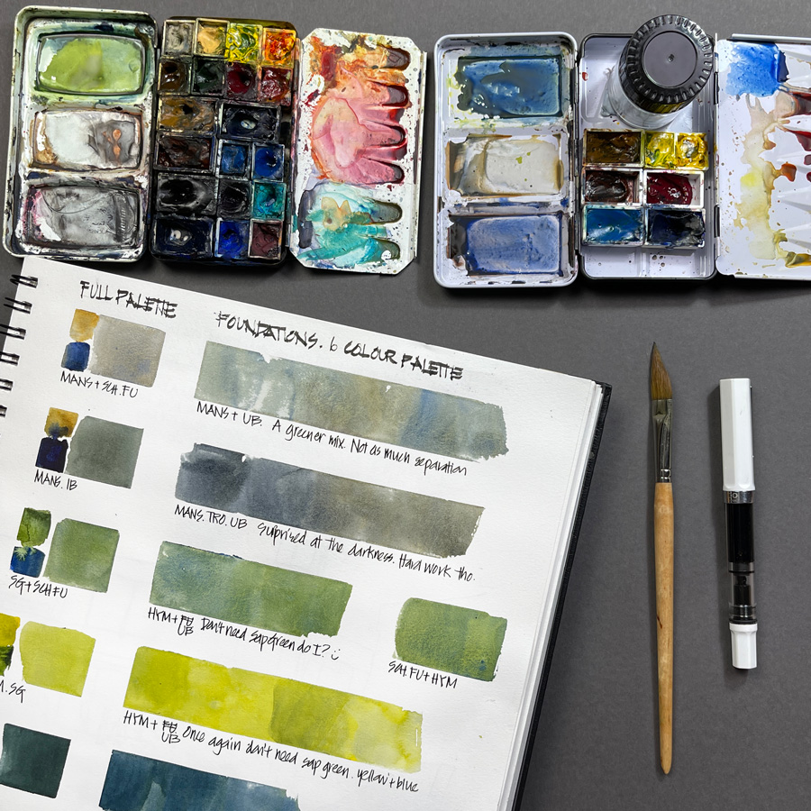
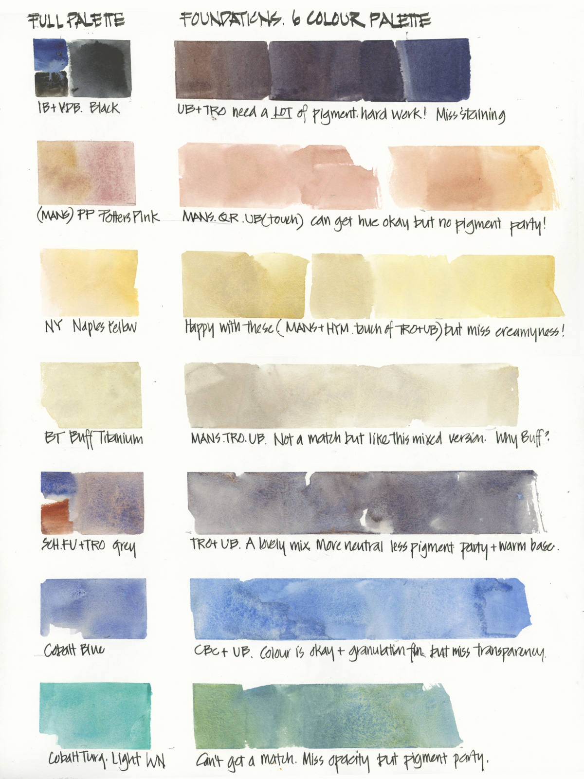
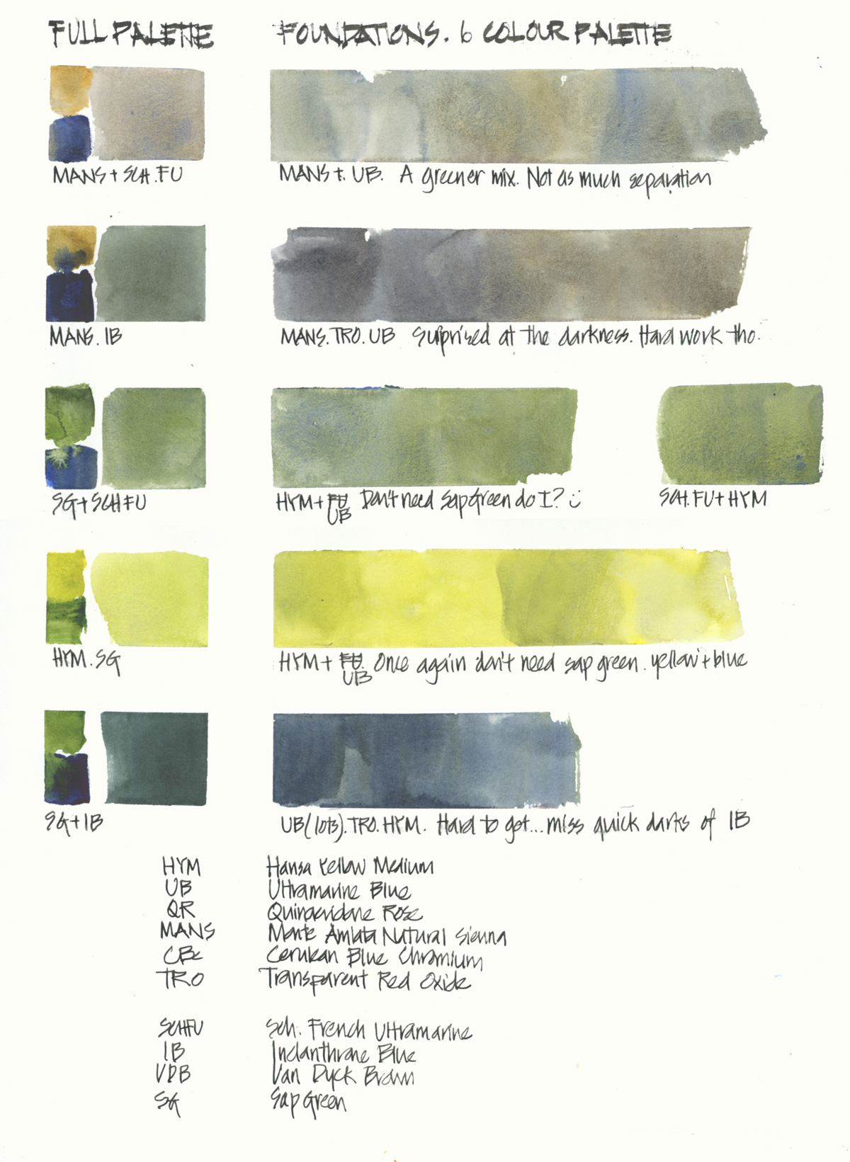
Yesterday I created two more mixing pages comparing some of my standard mixes from my full palette with the best that I can achieve at the moment with my 6 colour palette. I know that over time my mixing skills become more attuned – I’ll be able to create the mixes I want more quickly, using the right amount of each paint colour with the right amount of water.
As for doing colour charts… they are really important as a way of understanding your paints. But they must be supplemented with real-world location mixing so that you learn how best to achieve the result you want. Being able to refer to a colour chart is great, but really what you want to be able to do is know instinctively how to achieve the colour (and amount of watercolour magic) you want.
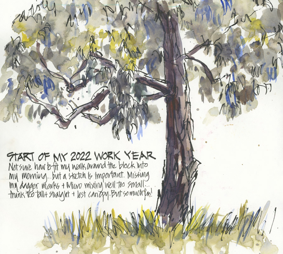
I thought that you might be interested to see how mixing greens from this limited palette became much easier by doing three sketches over the course of a few days. In the first sketch I wasn’t sure how best to achieve the grey-ish grey I wanted and found the small mixing wells of the Micro palette a little challenging. Immediately afterwards I moved to a bigger palette.
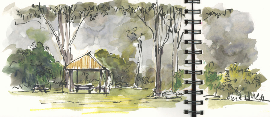
Next was a Lane Cove sketch (I was talking on the phone at the time) so wasn’t totally concentrating on the sketch (or the mixes) but this was really useful for me to explore my reflex mixing of greens.
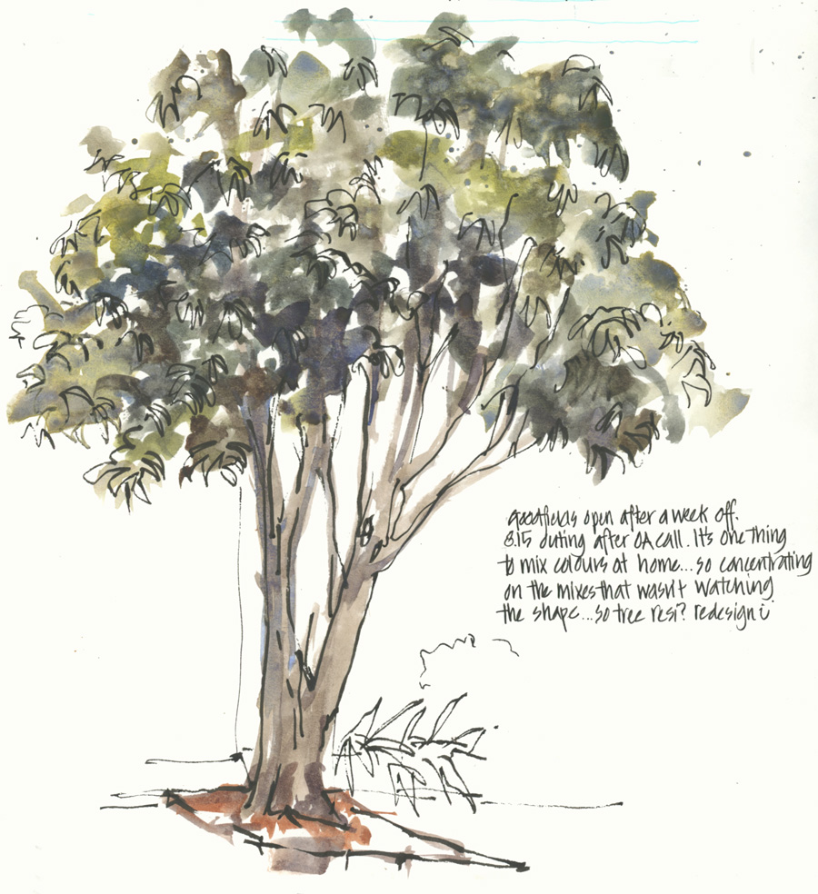
By the third green sketch, I was feeling comfortable mixing greens!
Okay… time to share my mixing pages in full now!
I have uploaded large versions of each so I trust you will be able to read my notes by clicking on the image.
Anyway… this is a big topic and one that I could discuss for ages!
In summary, the colours I’m missing the most are:
- Indanthrone Blues – for quickly creating darks
- Cobalt Turquoise Light – my favourite colour – just makes me happy
- Cobalt Blue – due to its transparency (favourite for skies)
- Schmincke French Ultramarine – although Ultramarine Blue is a great colour and versatile for a limited palette like this one, I’m missing the amazing pigment parties that Schmincke French Ultramarine creates (it’s essential for my bush scenes).
As I mentioned at the start, it’s been really good for me to reduce my normal palette from 16 to 6 colours.
How many colours do you have in your watercolour palette. If you have 12 or more, have you ever considered reducing it down to 6 for something different? I highly recommend this as a challenge! 🙂


9 Comments
I’m definitely enjoying using the six color palette right now, and it is a great challenge! I haven’t achieved that light cobalt teal yet, either, though I can get a decent darker turquoise. We all do love color mixing experiments, don’t we? I still haven’t managed that lovely creamy substitute you are getting for buff titanium. I’m still too heavy handed with that one! My standard palette has shadow violet which I use for all light greys, so I find myself having to mix those light greys a lot! I know when I expand back I’ll be keeping my shadow violet. But I may ditch sap green!
Great to hear Jamie! As for Sap Green… an article about that is coming out later today! 🙂
The pan of cerulean blue chromium looks unsullied, not seeing much action so far. Maybe a cobalt paint could swan in? I try to limit my palette on a per-painting basis, but I’ve had a micro palette sat empty for a year now that I just can’t decide how to fill.
Hi David, the Cerulean was filled up more than the others and has been used… but there is no doubt that it’s the least used. And yes, I could swap it for cobalt but keeping it as is at the moment while going through foundations.
Micro palette is wonderful for ’emergency’ or casual use… but I found it a bit fiddly for an everyday palette. I need something a bit bigger and easier to hold and get out; 🙂
I have 18 colors .. too many plus I always use je same ! I also have several watercolor boxes and I play with it. I really need to mix and try different colors together so if I reduce it to six it might happen !
Hi Isabelle – ah! so easy to collect different colour hey? Reducing to 6 is hard… but hope you have fun exploring your paints regardless of how many you end up with.
Normally I have 26 colors in my palette. For Foundations, I have reduced these to 10 colors. I already miss at least 3 colors. However, I found a way to mix them in a similar way. It just takes time.
But – by properly exploring the 10 colors, I have found blends that I never expected and that produce wonderful watercolor magic.
So thank you Liz for giving me this challenge! I’m already looking forward to the watercolor course – then finally I’ll be able to get to know my colors down to the last detail 😉
Wow Kerstin! 26 is a lot! And well done for reducing to only 10. Yay!
I have an eye shadow kit of 9. Ultramarine and Phthalo blue, Quin Rose and Windsor red. Light and medium Hansa yellows, and wee samples of raw and burnt sienna, and sap green. All but the red are Daniel Smith. I miss my other colors but more than that I miss having mixing space. I don’t care for water brushes, except when I use them with WPC. I find that helpful in maintaining pigment when I use those.
NEWSLETTER
Subscribe for first notification of workshop + online classes and more.