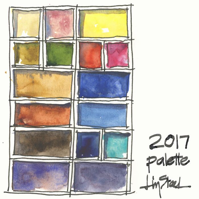
I used this palette from Dec 2016 – Dec 2018
Click here for my latest palette.
DS Hansa Yellow Medium PY97
DS Transparent Pyrrol Orange PO71
DS Quinacridone Rose PV19
DS Ultramarine Blue (not French!) PB29
DS Cerulean Blue Chromium PB36
DS Indanthrone Blue PB60
WN Cobalt Turquoise Light PG50
Soft Grey (a premix of DS Cerulean Blue Chromium, Hansa Yellow Medium and a touch of Quinacridone Rose)
DS Buff Titanium PW6
WN Potters Pink PR233
DS Quinacridone Gold PO49
DS Sap Green PO48 PG7 PY150
DS Monte Amiata Natural Sienna PBr7
DS Transparent Red Oxide PR101
DS Van Dyke Brown PBr7
Steels Grey III (a pre mix of WN Cobalt Deep Blue with a little DS Quin Burnt Orange and a touch of DS Quin Rose)
Note 1: DS = Daniel Smith, WN = Winsor Newton, SCH = Schmincke
Note 2: I am listing them as I think of them – right column first and then left column (as I’m a leftie) – so please excuse that this list doesn’t relate to the way you are probably reading the above image!
Note 3: Cobalt paints have toxicity issues so please make sure you are aware of this. Check out this great section on the Handprint site about the topic.
My previous palette can be found here.
Other articles to check out:
My watercolour section – with lots of things to consider when choosing your colours
Recommended minimum palette of 6 colours
A basic 12 colour palette
Putting together my palette for a big trip
Plus:
Brenda Swenson on filling a palette
Jane Blundell on filling half pans
Jane Blundell on ramp filling pans


19 Comments
ooohhhh new palette selection! I love that! I recently bought potter’s pink and i find it’s really not pigmented, how do you use it? And why not the french ultramarine? 🙂
thank you for sharing as always!
Hi Gabrielle,potters pink is somewhat muted (and not a pigment for everyone) but I use it for granulation and to reduce the intensity of colours without adding more water.
French is series 2 (more expensive) and more red shade – so ultramarine blue mixed better greens.
Thank you! 🙂
I work with two palettes. One of Daniel Smith traditional watercolors and one of Daniel Smith Primatek Colors. My regular/traditional palette is: Quin. Rose, Pyr.Red, Pyr. Orange, H. Yellow Lt., New Gamboge, Quin. Gold and Quin. Gold Deep, Sap Green, Ph. Green BS & YS, Ph. Blue, Ph. Turquoise, Cerulean, Fr. Ult. Marine Blue, Shadow Violet Sepia, Brnt. Umber, Quin. Sienna, Indigo and Sodalite. In my Primatek palette I have: Gen. Garnet, Rhodalite, Minn. Pipestone, Sedona Gen., Indian Red, Mon. Sienna, Gold Ochre, M. Bauxite, Yavapai, Boh. Green Earth, Tiger Eye Gen., Apatite Green, Serpentine, Zoisite, Diopside Green, Green Turquoise, Sleeping Beauty Turquoise, Malachite, Blue Apatite, Azurite, Amazonite, Gen. Lapis, Vivianite, Mayan Blue, Amethyst, Sodalite, Kyanite, and Sugilite. I enjoy working with both palettes and rarely cross over with paint from one to the other. The semi-precious stones and mineral pigments are all so gorgeous together, it is challenging to paint with just that range of colors. The one thing I miss when painting with those is a true red. Garnet is as close as you get. I follow you on IG and enjoy your posts! Thanks for encouraging us all.
Love this colour palette!
Want to understand how to use DS Buff Titanium color? Do you usually mix it with something else, or do you use it as a stand alone color. What would be an example of what subject to use it on? Thanks!
Liz – Please please give me your recommendations for replacing the 12 pots in the Cotman travel kit – I am a little tied to my white (I replaced with white gouache, making all colours gouache-y if I choose). So I guess I’m asking for the 11 best and most essential colours for my travel journal…
Thanks! Mary
Hi Mary please check out my 12 colour palette – you should see it on the home page- scroll down.
Since Daniel Smith Quinacridone Gold is no longer available what color have you substituted for it in your palette?
I still have plenty of my own stock… but good timing for your question as I did some tests this week and will share soon.
Hi Liz,
Did you post about the Quinacridone Gold (PO 49) dilemma for those of us who missed out on the end of it? I may have missed the post.
Thanks,
Margaret Black
Hi Margaret-I have plenty of stock but this is what I have done so far
https://www.lizsteel.com/watercolour-mixing-green-and-gold/
Wait. What? No! I still have a tube left, now I will have to treat as actual gold.
Thank you, Liz for your input. I have the DS new Q Gold (PY 150, PO 48) and I like the color of it but not in mixes. I’ve just been working in watercolor for the past 1.5 years and was working with a limited palette to begin. It’s probably good that I missed the beauty of the old QG.
I appreciate all your online information. Thank you!!
Maggie
Hi LIz, where do you buy your paint? I’m looking online for several of these colors and they don’t come up… starting with the DS Hansa Yellow Medium PY97. Blicks? Nope. Jerry’s? Nope. Short of spending several days, perhaps you could provide the info where you buy. Many thanks! Love your work!
Hi Marta. I’m in Australia so that won’t help you. I’m surprised that Blick’s doesn’t have my colours. They should. Have you tried Daniel smith directly.
NEWSLETTER
Subscribe for first notification of workshop + online classes and more.