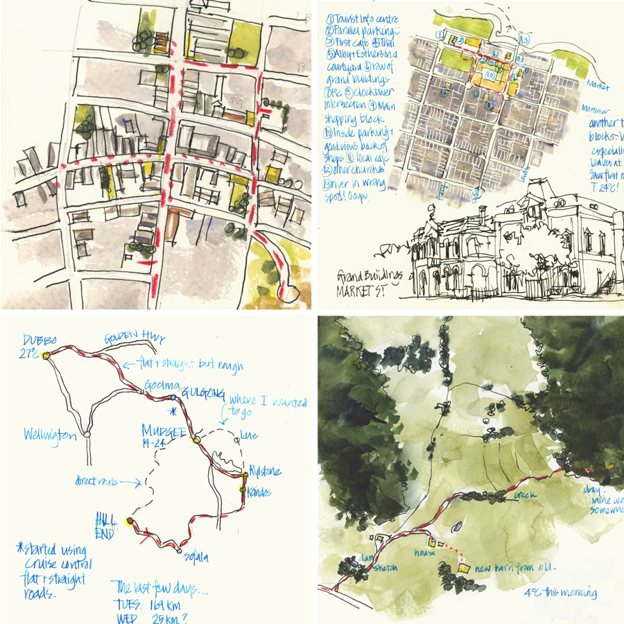
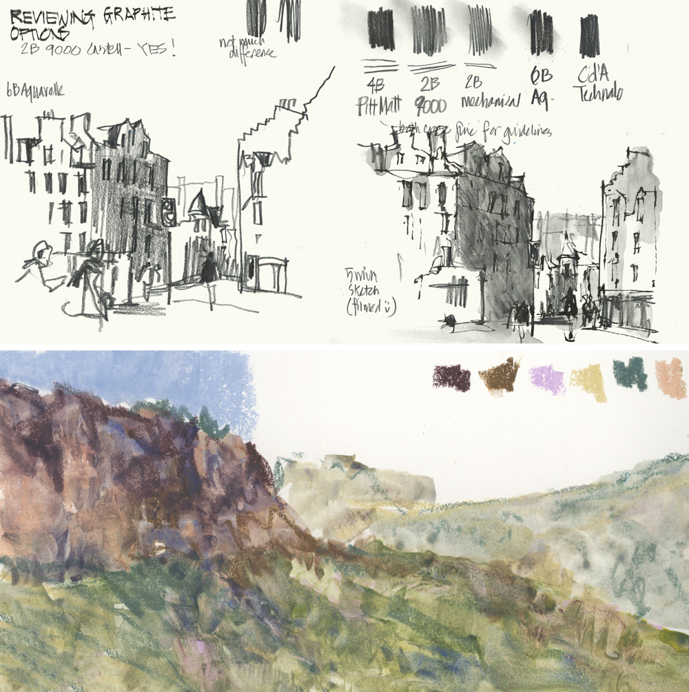
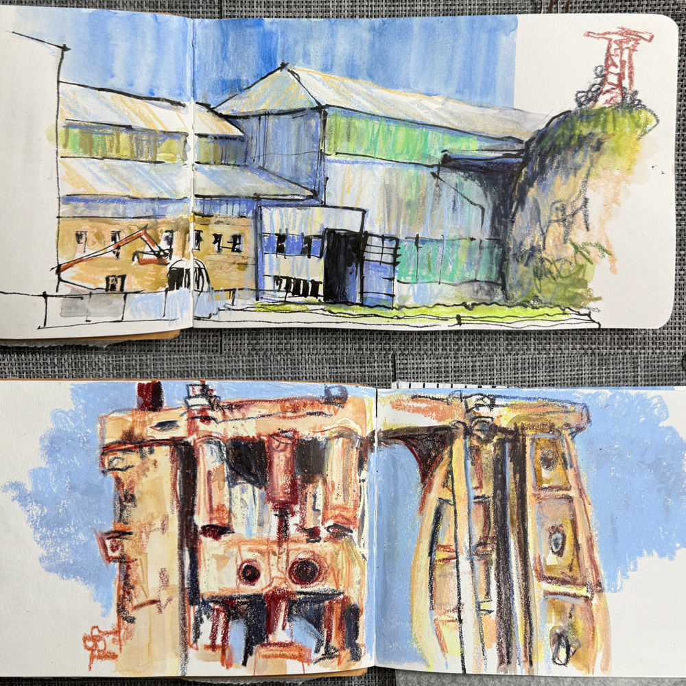
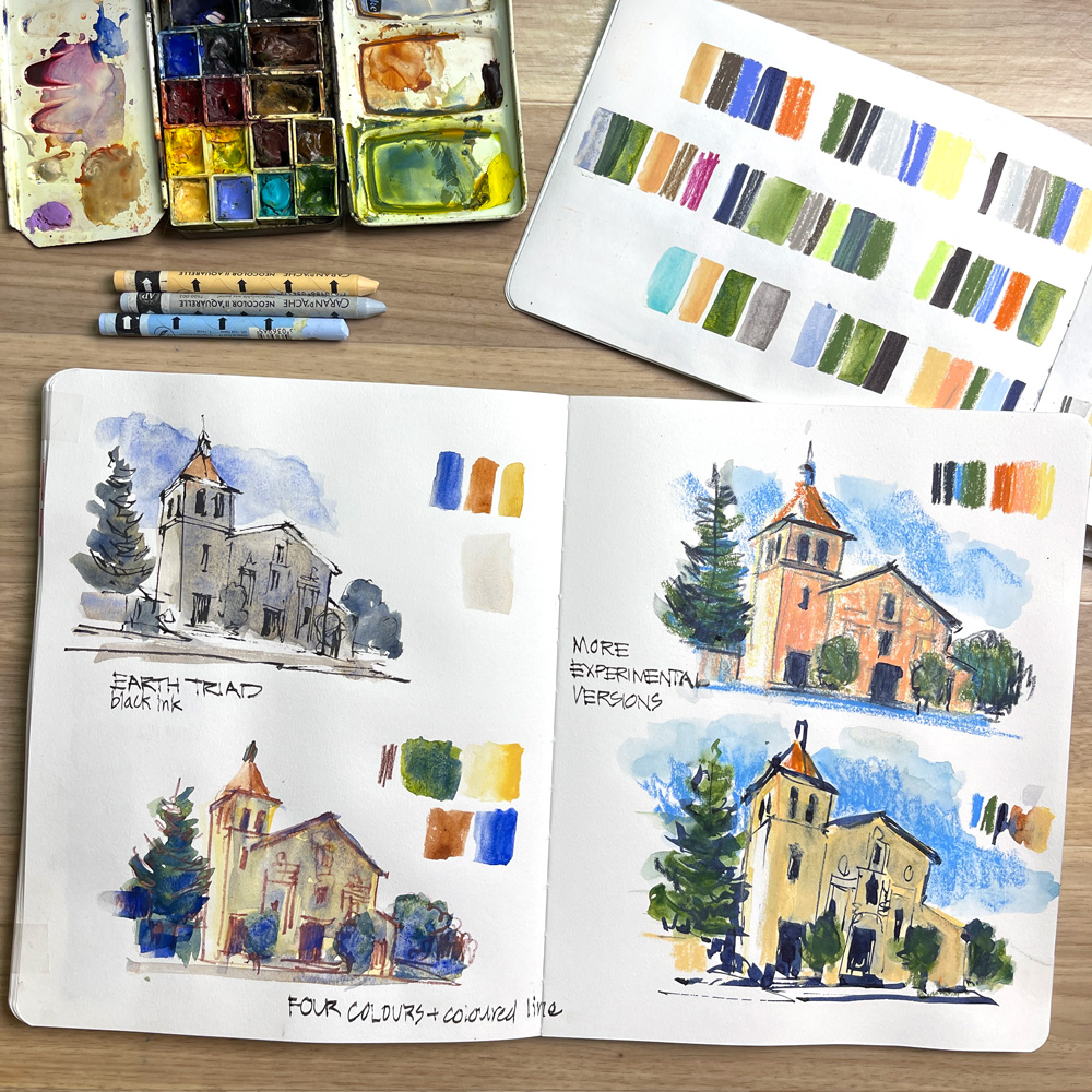
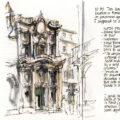
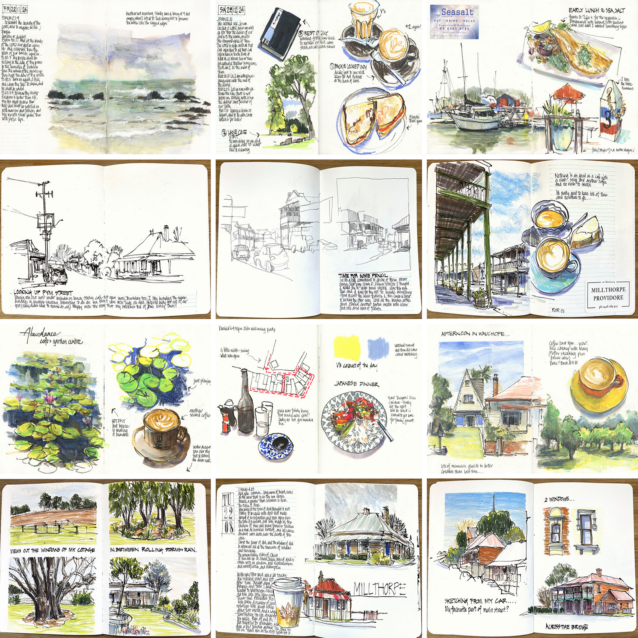
My upcoming sketching class in Sydney:

Saturday, May 18, 2013

Why Blogging is an important part of my creative journey


There is a lot I could write on this subject… but this week I was reminder of this fact during my preparation for my sketching class - we were looking at lines and the interface between colour and line (ha! I can't just look at line without thinking about colour can I???). In going through my work I came across a series of sketches I did as part of a great online course with Cathy Johnson on watercolour pencils. I will copy the original images and text below and also include the links to the original flickr posts as the comments are interesting as well.

Three things about the content of these posts: (continue reading below to read the original posts)
- amazing to see that back in 2009 I was already experimenting with mixing watercolour and watercolour pencil
- taking away my inklines was not something that can happen immediately - I was pushing and trying it for a few years before they disappeared. Part of this I think has to do with the confidence in colour
-  the impact that the line had on my colour is fascination

Three things about blogging and your creative journey:

- Firstly I must say that keeping a journal of my life has been an enormous help to the development of my art. The desire to record my life gives me a reason and incentive for sketching and also has an inherent narrative nature which helps in the mind set of 'process rather than product'. Each single sketch is part of a story and is therefore valuable whatever the 'success' of the work is at the time. AND I see blogging as an extension of it. An opportunity for me to record just a little bit more of that journey (ok- some days I write a little bit more than a little bit!) I see the whole online posting process as the final part of my work of art, not as something extra that I have to find time for. I think my background as an architect and the daily discipline of finishing a drawing, scanning or pdfing it and then emailing to the client with description/questions explains a lot of my efficiencies in blogging.It is a discipline that is ingrained in me.

- Blogging about the process of the sketch is incredibly useful - once again it helps to reinforce the creative journey aspect of the work - it also helps with the learning side and discipline of self critique. Not stressing about 'success or failure' (how do you know at the time which is which???) but trying to take away something from the experience for next time. Coming back on these posts is then a really rewarding experience.

- I primarily blog for myself- in the sense that I am recording my thoughts experiences of that moment…just like a diary. In one sense I don't care if no one sees it or comments because it is there for me to re-visit and it is part of my process (are you sick of me mentioning this?) BUT of course the fact that I am sharing this with others, that so many of you comment and follow and are return 'hits' has been an incredible motivation for me and encouragement.

SO here is another opportunity to say THANKS for coming along and sharing my journey with me.

And here are the original posts from 2009


http://www.flickr.com/photos/borrominibear/3677623043/in/photostream/

Ok - these are just really quick sketches which I didn't focus on greatly(I am exhausted tonight!)... to get the feel for sketching in pencil  - something I never do unless I am using my chunky architect 5.6mm lead clutch pencil(which I used to use quite a bit...mmm need to try it again)

I found the pencil(HB) a bit fuzzy to use but much preferred the sketch before I added the WC pencil. I think I need to go back for a bit more definition and that I should have used a softer pencil! Ha! using something different is so much fun?!

The ink version I did in a very lazy mood (made a mess of the colonnade...as I said ...lazy!) but without realising  it, I  was bolder with the colour for the first stroke - the crispness and strong ink lines frees my use of colour- no doubt about it.

Now I want to try a thick pencil one and a watercolour version with some WC for texture - but maybe tomorrow night (I have had it tonight - as you can tell from my rambling notes!)


http://www.flickr.com/photos/borrominibear/3680795299/
Ah! SO NICE to get my chunky pencil out again! I have had this pencil since my 3rd year architectural students when it was the absolutely coolest instrument to do preliminary design sketches with. (not that I was the coolest student but I had the pencil that only a few elite had!)

I have been telling myself for the past year or so that I am a real ink person and don’t like pencil ... But a review of my travel sketches from 2007 (see links below) has reminded me that I have used this thick pencil for real quick sketches for many years – some of my favourite sketches in past years have been quick ones done with this pencil. When travelling in 2007 I used it when I only had under 5 minutes to sketch (because at the time I didn't have the confidence to do ink sketches without pencil setups)

So really enjoyed this one – though I simplified the portico and missed two columns as there was no way that I would be able to fit them in.(shameful!?) Also, I really felt like splashing paint on this and not using WC pencil... So I suppose I have another version to do tomorrow night!


http://www.flickr.com/photos/borrominibear/3684457186/in/photostream/
I thought I might get sick of sketching the same scene four times but I didn’t one bit! Maybe because it was a fairly easy form but probably because I left the one I expected to enjoy the most to last!!!

My previous use of WC pencils used to be to hide a bad watercolour job... So this is one of the first times I have used it with purpose. I can see that the pencils could be extremely useful to create texture that I don’t want to do in ink. Also they are great for adding life into shadows!

A few quotes on the side for those that are interested.... Last time I went to Venice I spent three months researched and created my own architectural guide by supplementing a very basic architectural guide I bought with a whole lots of extra notes I collected during my research – so it was a real treat for me tonight to pick this one book up and read three different opinions of this building.

Another aside – I like listening to music related to the place I am visiting, reading about, sketching so I have been listening to Vivaldi tonight at the same time and just realised that the piccolo concerto is on at the moment.

Also I made a typo in that quote - it should read"I have seen churches without domes before, but I’ve never, until now, seen a dome without a church."

Friday, May 17, 2013

Updated basic palette

I made a slight change further to my post the other week on a basic palette of 12 colours...

And if you missed it- the actual palette I am using at the moment is slightly different - refer here

slightly modified from the other day- out goes the Winsor Blue Red and in comes CTL!!! I love that colour. Also Sepia has been replaced by Burnt Umber so all single pigments.

I normally use a few more colours in my everyday palette so it is hard to trim down to 12 and I still feel that it might need more refinement. I am thinking of whether it is possible to replace pyrrol red (which is the only really scary heavily pigmented colour in the mix) with transparent orange (a pigment I absolutely love....either Schmincke or DS Trans Pyrrol Orange which I only discovered this week) ...like everything in my art I like to evolve and refine. All still the same principles but slightly adjusting over time.

 The change to the blue came about after this little exploration  trying to match the amazing blue sky colour that we get in Sydney.

The most glorious autumn weather imaginable in the last month... SO warm and sunny. This photo has of course darken the colour of the sky - so hard to show you how much of a match it is. Our sky is still a little warmer than my mixes.

I made an interesting discovery today....looking up handprint.com for some pigment information randomly came across a statement claiming that you can match a pthalo blue by mixing cobalt turq light and a french ultramarine. Now I have winsor blue (red) shade in my palette for two reasons - it makes a good(well good-ish!) match for our blue skies (this is the top splash of colour) and also makes some nice bright greens when mixed with quin gold. The middle splash of colour is W&N Cerulean Blue - it is just not the right shade for our intense blue sky on a day like today.
The bottom mix is French Ultramarine with CTL and it is indeed a close match for the top one but with much nicer as you have pigment interaction and granulation (this is just a 105 gsm cartridge paper not serous watercolour)
I am excited as I have no found a way to get CTL into my basic palette... I just simply ADORE that colour. You have to have a few 'I just had to have it in there' colours in your palette - friends that just make you smile!

Thursday, May 16, 2013

Every Day In May


A little late…but I am IN! Everyday in May starts today for me! (it is funny because on previous years I normally have to give it up around day 15...this year I am starting at 15)

EDiM15 Draw a pencil … well maybe I got carried away.
I am doing what I told my class yesterday they had to do - work out how their watercolour pencils come out dry and wet and mixed.
On the left is my old standard collection which is what I recommend for my classes…but funny enough I lately have developed a very odd collection of different pencils - the only two being the same is the burnt sienna and ultramarine (funny that hey?)
I am REALLY tired but somehow doing this loose sketch was a great way to wind down and give me a little thinking time.

Ah! feels good to be part of the EDiM group again… can't promise every day but see how I go!
Thanks again to Wendy Shortland for organising again this year!

EDiM 16 Something that scares me…. how can tubes of watercolour paint SCARE me!?!

...it is the number of them that I have- and all the ones I still want to try.

Some are because I am trying to refine my palette and make the best selections - the colours that will mix the most number of different colours and that work well with lots of water, that never go muddy etc.

Others are because I just love colour and want to try something new. In recent weeks I have been introduced to more "must try' paints in the Daniel Smith range… I don't need to… but well I would like to!

I can assure you one thing… if a paint makes its way into a half pan and then into my rectangular palette (which holds up to 30 pans- mixture or half and full) that is sitting on my drawing board in my studio…it will be used!! I have really been mixing up the paints I use lately (and noting which colure I use in my sketchbook) But apart from the tube of moon glow I bought the other week - splurging on new watercolour paints is just not something that I will be doing at the moment. Trying Daniel Smith dot cards…on the other hand….

Just for the record this pile, in fact, is the current selection that am  I using..so these actual tubes don't scare me on bit- they are like old friends!

Wednesday, May 15, 2013

Manly Sketching Week 2


Another fun day with my class sketching in Manly. We had the MOST glorious May day today and ended up down at the beach sketching. Hard to believe that the supposed start of winter is only a few weeks away! I am wishing that all my readers can have a day like we had!! Maybe you have to come and visit us in Sydney to get a dose of Sydney sun and blue skies!

Today we looked at lines - how to use them to define edges. Hard vs soft edges … what is the best way to define these. How much line work do we need for soft edges ( how does pencil compare with ink) and how much can we do with colour later? We also looked at texture and pattern and how to make sure we don't get to distracted by these till after we have defined the important edges. There is so much that we could say about line… but hopefully we all have some new things to think about after today!
Next week …tone!

Once again I am so impressed with the work, enthusiasm and dedication of the people in my class - and we all sure enjoyed our lunch!  It is such a joy to spend Wednesday morning with you!!!
Casual spots are available on a weekly basis.

How my lines have changed???


I am really loving all the preparation for my sketching class in Manly… in particular I have been going through my work and seeing threads and developments and evolving ideas and techniques (sometimes recurring themes I was not aware of). Today we will be  looking at lines.

What often strikes me now when I look through my first sketchbook (started in Jan 2007) is not so much the baby steps in watercolour but how my linework has  changed.
When I started I worked small and neat - totally reliant on pencil setups OR I was very sketching building up the volumes with multiple lines. I was heavily reliant on my architectural drawing skills - either the 'neat presentation' approach or the 'design sketching'.
 The sketch on the right is from 2 years ago… at the end of a 3 week trip when my hand and eye coordination was really in sync - I looked at the building and my hand just recorded it (there is one of those quick gesture like setups in red lines but in essence when I used my pen I was looking at the object and not tracing the red lines!) I was also highly distracted by double decker buses that kept blocking my view…but that only added to the fun and joy I experienced when sketching out on location.
The 2007 sketches were still enjoyable at the time but not in the same way - there is something about sketching out on the streets that gets me excited!

oh! I am rambling… but thought you might be interested in seeing some sketches that have never been scanned.
Blog Widget by LinkWithin