
I’m really enjoying reading everyone’s comments on last week’s article working out which of my early sketches were done with WN Cotman paints rather than WN Professional Water Colour. A huge thanks to everyone who left a reply and especially those who explained the reasons for the choice). If you missed it, please go and have a look before reading this article.
It’s finally time to reveal the answer. But before I do I have three thoughts I want to share.
1. The clue
There was actually a big clue in the introduction of the article. To quote:
“I spent a little time looking through some old sketchbooks and what I discovered was very interesting! There were examples of good use of student grade paint and examples of poor use of artist grade paint.”
Now, I wasn’t going to choose a selection of sketches which created an easy choice between student and artist watercolour, was I? So you should have expected me to find the best possible student grade sketches and the worse examples of using artist quality.
In many ways, the statement in bold above is the main message I want to share. But more about that later.
2. Intensity
Anyone who has seen my SketchingNow Watercolour Intro Lesson 1 will know that it is possible to achieve a good intensity of paint with student grade, but you just have to work harder. When I say ‘harder’ I mean going back to the pan to pick up paint repeatedly – up to 10 times.
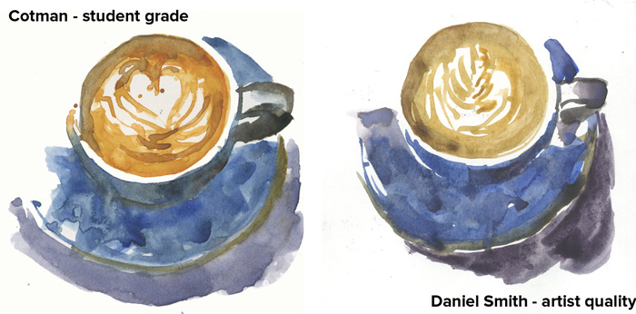
Here is the Cotman coffee cup from my previous post compared with one done in similar colours with Daniel Smith Artist quality paint. There really isn’t a lot of difference between the two – both are lovely and vibrant. What you can’t see is that the Cotman was more difficult to paint because I had to work hard in the palette getting nice vibrant washes.
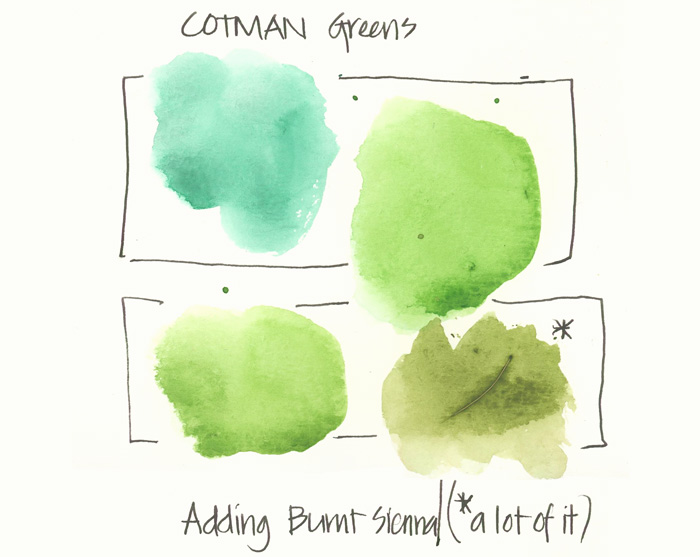
Some student paints colours once you achieve maximum intensity are not very nice. The greens from the Cotman set are a bit too intense – very unnatural looking! I had to work quite hard mixing some burnt sienna into the sap green before I got a green I was happy with.
Note: Some student sets, such are the Koh ones (in the discs) are generally too bright and with no granulation.
3. Granulation and pigment magic
Believe it or not, some student grade paints can create lovely granulation, but once again it is harder to achieve.
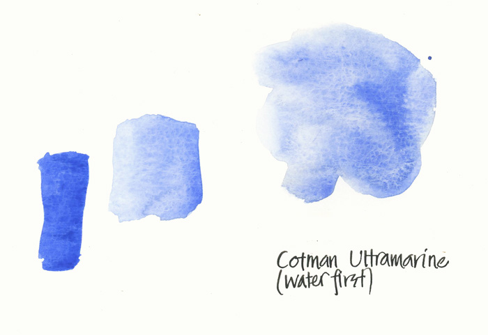
This swatch was done with Cotman Ultramarine and you can clearly see some nice granulation.
There is little pigment magic – separation of two pigments in a wash. You can see this in the purple shadow of the DS coffee cup above, while in the Cotman version there is none.
So… have you changed your selection from earlier? Is it time to reveal the answer?
At one point I thought no one would get the right answer, but I’m happy to congratulate Alessandro. He was worried he was a fool, but in fact he was the only one to get it right.
And at the last minute Michelle also came in with the right answer – she picked up on the clue.
So well done to both of you.
Okay, it’s time… drum roll please.
The artist quality examples were A and C.
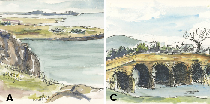
How can you tell? Well it is hard, because the sketches were painted with very dry washes and are muted in colour. But a few indicators are
- there is almost a bit of pigment magic in the rocks to A – there is some interesting interaction between multiple washes but generally the washes were a little too dry for it to happen properly
- more natural greens – as mentioned the greens in the standard Cotman kits are quite artificial and it’s harder to make nice greens with them
- the sky and water in A almost contained magic – as did the water in C. I just needed a little more water and perhaps a little more pigment
- although not related to the paints used, both A and C were painted with a bigger brush indicating a later period.
Also, I have to admit that these sketches look better (not so flat) in real life. Sketch A is supposed to be muted washes as it was an overcast day.
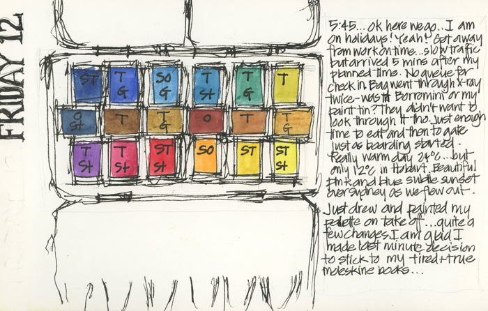
Just out of interest… this is the kit that I used for the two Tasmanian sketches. I didn’t record the names but they were all WN Professional and the palette was put together after reading Jan Hart’s book.
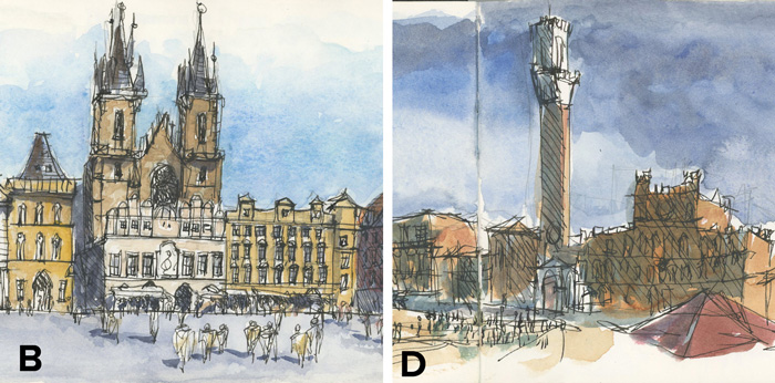
So this leaves B and D as Cotman
It is interesting that I got such good granulation in the sky for B, but as the swatch above shows it is possible with Cotman to achieve granulation. So B was obviously a case where I put water down first.
The sky in D is a bit flat and there is no pigment magic. If these washes were done in artist quality there would be some separation from this amount of pigment and water used for these washes
But basically it’s really hard to tell as I was obviously able to achieve a good intensity when I was using Cotman!
My Takeaways
So the first big takeaway for me from this exercise was that it confirmed my belief that it is possible to achieve good results with student grade – in this case Cotman paints. However, it requires a lot of work and care when mixing in order to achieve a nice intensity and pigment load. This amount of ‘work’ would be hard for a beginner, so in a way student sets are better for more advanced painters. What? did I really say that, did I really mean it? No not really, but I hope you can see why I said it.
But I suppose the point I want to make is that if you only have student grade paint, and you are not in a position at the moment to upgrade, it’s okay. You can get nice results! I would recommend pre-wetting your pans with a spritzer bottle or even just a drop of water (a waterbrush is great for this) and this will help you pick up enough pigment. I’m still recommending that you upgrade as soon as possible, but if you can’t right now, please don’t think that it’s not worth trying.
Aside: some of the student kits come in great containers.
The second big takeaway is that having artist quality paints doesn’t mean that you will automatically achieve beautiful washes. It’s really easy to develop bad habits when sketching with watercolour, either using it too dry, or working too wet because you are dipping into your water container too many times.
You really need to learn how to mix so that you have the right amount of water and pigment. This is so important, and that is why I devoted a whole lesson just to this in my SketchingNow Watercolour course. You can see a sneak peek of this in my recent article: Watercolour Magic.
I have learnt a lot a lot doing these few articles. It will be really helpful when I teach as I now have a useful strategy to get betters results if anyone turns up with a student grade kit. I think it can be very discouraging if a beginner turns up to a workshop with a cheap set and gets ‘shot down’ for not having artist’s quality paints. I never do that anyway, but I now have a greater appreciation of the differences.
So although you can get reasonable results with student grade, it’s really really hard (too hard for a beginner). Therefore, I am still recommending that you start with artist quality paints (even if only a few colours). Be generous with your use of pigment and water and try to create watercolour magic!
Anyway, would love to hear your thoughts – are you shocked by the answer?


13 Comments
Not exactly shocked by the reveal – it was just very interesting to read your experiences & insights about paints. Your paint knowledge is so organized and so well expressed.
But the fact remains:
Artist quality paints (I’m mostly familiar with D.S.) are a joy to work with – they give and give and give.
But like driving a Ferrari in the city, I often find myself struggling to hold them back!
totally!! Artist quality are a joy… student grade are a huge struggle!
For me the most compelling argument for trying to buy artist paint is that to get good results out of student grade paint you really have to understand water to pigment ratio, picking up enough pigment, known about mixing to get colors like virulent green to calm down and look more natural: and that makes painting for a beginner even harder: many people that paint for years haven’t wrapped their heads around this stuff, so why would a beginner be able to do it?
But I see what you’re getting at: IF you know what you’re doing, you can get pretty good results out of student grade colors. Yeah. But like bpass says, you’ll miss the ‘joy’ bit.
Yes… totally its about the joy and the water for me!! And student grade can’t provide that. Still it has been fun to look back and study my early work 🙂 and it’s been super helped for me as a teacher as I know now how to help ‘my students’ get better results if they have student grade.
These 2 articles are SO Fantastic and Full of Information! Thank you muchly, Liz!
thanks KathyAnne! I’m glad you enjoyed them
Sorry, I didn’t “play” — I don’t think I know enough about artist vs. student grade paints to be able to distinguish — but your analysis was fascinating! I learned about watercolors just reading that.
Much fun. It seems I was the only one to guess right 🙂
Way to go, Alessandro and Michelle! I don’t mind that I guessed wrong, because the reveal and analysis are so compelling. I think that this comparison merits inclusion in a future iteration of Watercolour. Thank you so much, Liz!
Interesting! I had to go back and read the previous article first. I guessed correctly too. Maybe because I’ve used WN Cotmans for many years in my sketchbook. Guess I recognised them because of familiarity.
I picked it, I just didn’t enter my comment. For me it was the sky in B that gave it away and in D in was the flatness of colour in the buildings and that reddish roof. I could also tell how much effort had been put into working that sky – a sure sign that it was hard work. A really good exercise Liz, it really made me look very hard at each sketch.
Hehe … I’m not shocked at the answer … 🙂 However, the takeaway for me is to go out on a limb and join in the discussion, which I’m glad I did.
I appreciate the time and energy you put in to explaining all this, Liz. It is very hard to resist the thought that the ‘right’ materials will make up for lack of knowledge. However joy, work, ever trying and learning are the secret sauce not the exact perfect paint.
But oh it does feel good to buy supplies.
I must say, the reveal shock me.. particularly this statement “student sets are better for more advanced painters”.
I came across this blog while I was googling for a question “At what stage should I start using professional/artist grade colors”. I have been using Winsor Newton cotman series for years and thought of giving a try to artist grade colours.
After reading his I researching on different brands and tubes or cakes kind of question. It an ocean out there and it is difficult to choose. The cake sets are handy and relieves you from making lot of decision but the you have to live with it.
But I’m gonna give a try soon for sure!!
NEWSLETTER
Subscribe for first notification of workshop + online classes and more.