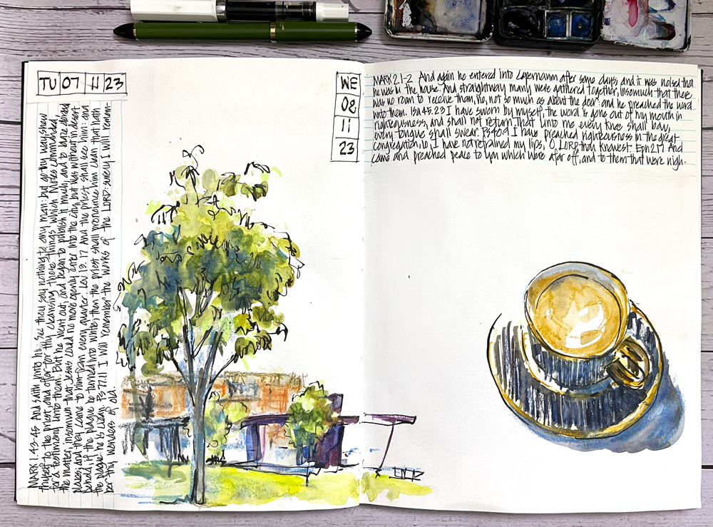
 My everyday sketching strategy is to do whatever sketches I can during the day and then at night finish my pages by adding notes and other ‘elements’.
This act of finishing my pages is a totally separate process from sketching but it uses many of the same skills ( relying on my sense of composition, balance, colour). I love this process of sketchbook design (and if somehow you don’t know, I have a course on this very topic – see here for more).
On Tuesday this week, I was busy prepping for a fun livestream on perspective (as part of the Live Version for my Buildings course) and didn’t get to touch my sketchbook after my usual morning sketch. I normally try to complete a double-page spread each day but as that didn’t happen I started Wednesday on the same spread.
As I haven’t had a chance to finish this particular spread I thought it would be fun to ask for suggestions!
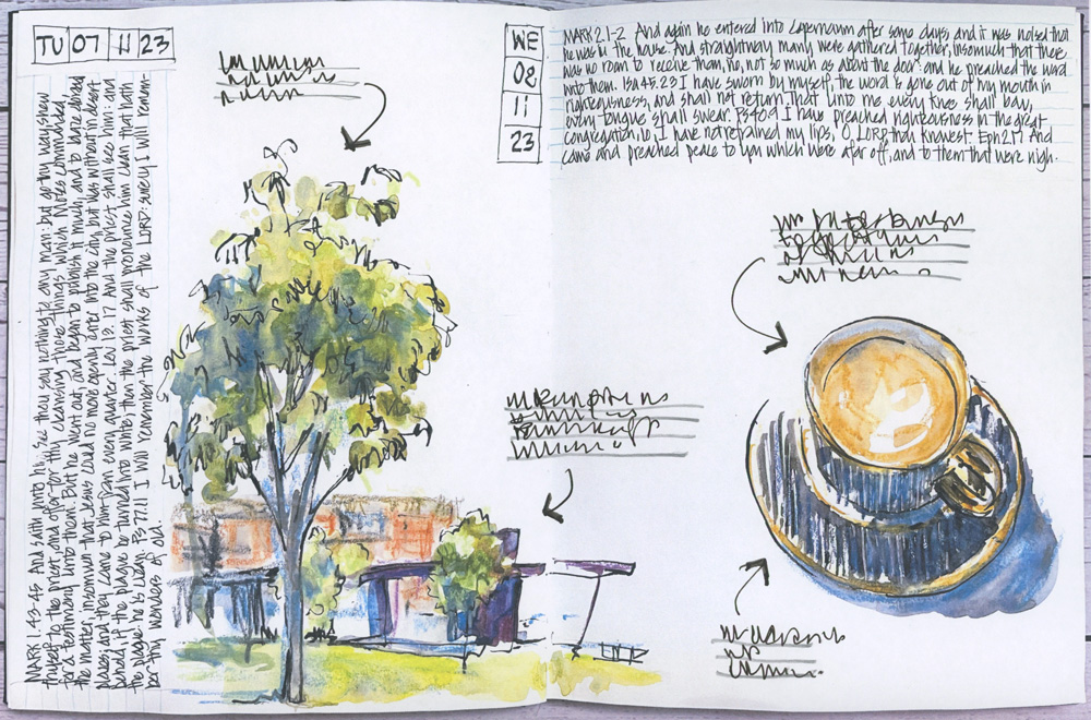 The simple option would be just to add random notes (as shown above) but I’m thinking that adding a bit more colour (a sky or a colour block) or a border might make this page more interesting.
So I would love to hear from you if you have any ideas! Please leave them in the comment section below.
(If you are reading this via email, please click on the article title link below and add a comment on my blog. Thanks!)

23 Comments
Hi, maybe a pattern from the mug that runs across the two pages making a connection?
Well, i do like the added comments it adds a little texture and removes the white space nicely. how but you write one on a color band or shape if you fell the need.
I took the Sketchbook Design course, and was thinking “How about a color block?” And then you mentioned color block!
I like the little notes (perhaps a bit smaller or with a bit less writing), but think what’s really missing is some color to tie the 2 pages together.
Katherine
I would try a small architectural detail of the building. In color like a close up study. Allowing the edges to fade into the background.
What about a colored napkin, maybe even with the name of the coffee shop on it? The napkin set at a bit of a angle?
I like it just like this ?
I like the notes because they invite the reader in. And if you are the reader, (I.e. this sketchbook is for YOU, the creator), the notes can be useful: what supplies used, what you want to try next after doing this sketch, what you would change or what you especially like about the sketch, for example. Or, it could be notes of a different sort, whatever is meaningful for YOU.
Sorry, not meant as a reply to Renata but a general comment
I like the idea of some blue sky ( maybe as a colour block?) around the tree reflecting the bit of blue on the cup’s shadow. Then add a minimal amount of further text.
I suggest a blue sky colour block from below the tops of the branches and across the fold.
I feel it needs another drawing in the middle, a detail of the tree leaves, or an up close detail of something else as suggested. It has enough print, but the middle across etween the two needs something, even color patches of the paint colors used would be good.
Why not leave the white space? It might be an interesting “breathing room” moment in the flow of the sketches.
I like the notes because they invite the reader in. And if you are the reader, (I.e. this sketchbook is for YOU, the creator), the notes can be useful: what supplies used, what you want to try next after doing this sketch, what you would change or what you especially like about the sketch, for example. Or, it could be notes of a different sort, whatever is meaningful for YOU.
Close up details of insects, birds, bark,etc of the area always draw me into sketchbook pages.
I like Maggie’s idea. Or a napkin with something that might have gone with the coffee. The the cup and saucer are beautifully done, very elegant!
I meant to say something “sweet” that may have gone well with the coffee.
The quotes denote a personal page, the illustration is only the closing of the page
In the other hand if the page have only a sketch, then it is completed
the author draws an imaginary circle around, left to right, that shows the viewer a story.
I initially read it as “Should I finish this page” rather than “How should…”, and my thought was “no”. My vote would be to leave it with all the white space, breathing space amongst your more usual filled pages.
Hi Liz! I like a combination of the notes AND a sky color block. Not too large of a block, more like a partial square to the top right, and hopefully overlaping one or more added comments. So many choices!
(PS: I have not been able to participate on the re-runs lately, but highly enjoy reading every email and post. I always either learn something or feel like trying something you tried!)
Hi Liz, here is a little brainstorm:
* draw an overheard conversation or imaginary conversation that happened in the house or cafe
* add an elaborate table cloth inspired by the beauty of the tree, leaves, pods , animals of the environment,
*Add 3 delectable desserts
* add a book and hand with jewelry
* add something totally unexpected real or imagined ….example tiny dancing figures around the rim of the coffee cup
* add an image from a photograph you have taken
* add a mandala or pattern repeating the circle motif
*repeat coffee cups getting smaller in the distance
* draw the music you are listening to while drinking coffee
Mainly just have fun!!!
thanks for all the great suggestions everyone! I’ll be doing some options to share with you later this week!
A little sparrow that may have just taken off from the crown of the tree, or be about to land on the coffee table – or both : )
Option B is my favourite. I find it gives unity and variety (but not too much).
NEWSLETTER
Subscribe for first notification of workshop + online classes and more.