This week we’re looking at Colour and Value as part of the Group Run-through of SketchingNow Watercolour On Location. It’s a really special lesson!
I absolutely love doing value studies and talking about how to design in values. But I just realised that I’ve never discussed why I like using grey markers for my value studies here on the blog.
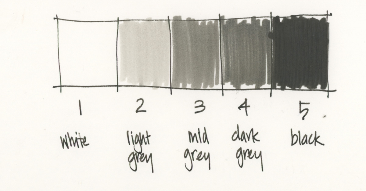
When I’m doing value studies I like to work with a 5 step value scale and this scale has become second nature to me. So even when I’m not actually doing a value thumbnail I’m always thinking in terms of the numbers 1-5 when I’m assessing a scene and mixing my washes.
Pencil vs Grey Markers
Using a pencil is the normal tool for doing value studies and this gives you the flexibility to increase to a 10 step values scale if you want. But I’m totally in love with using markers for three main reasons:
- I love the crisp graphic look they create! No matter how roughly I do my thumbnails, they always look cool and it’s always easy to read the values.
- They force me to make definitive decisions about which value to use for each shape. These decisions can sometimes be ‘hard’ but that’s great training for designing the values of my sketch. This is a topic that I absolutely love talking about! It’s not just a matter of documenting the values as you see them, it’s all about adjusting them to create a sketch with compelling contrast.
- The separate pens are really useful to see different values more clearly. The act of picking up the number 3 pen, or the number 2 one helps to think in terms of number and this then makes it easier to then convert a value study into a watercolour sketch.
Yes, they are extra supplies to carry, but I think that it’s totally worth it!
Post-sketch value study
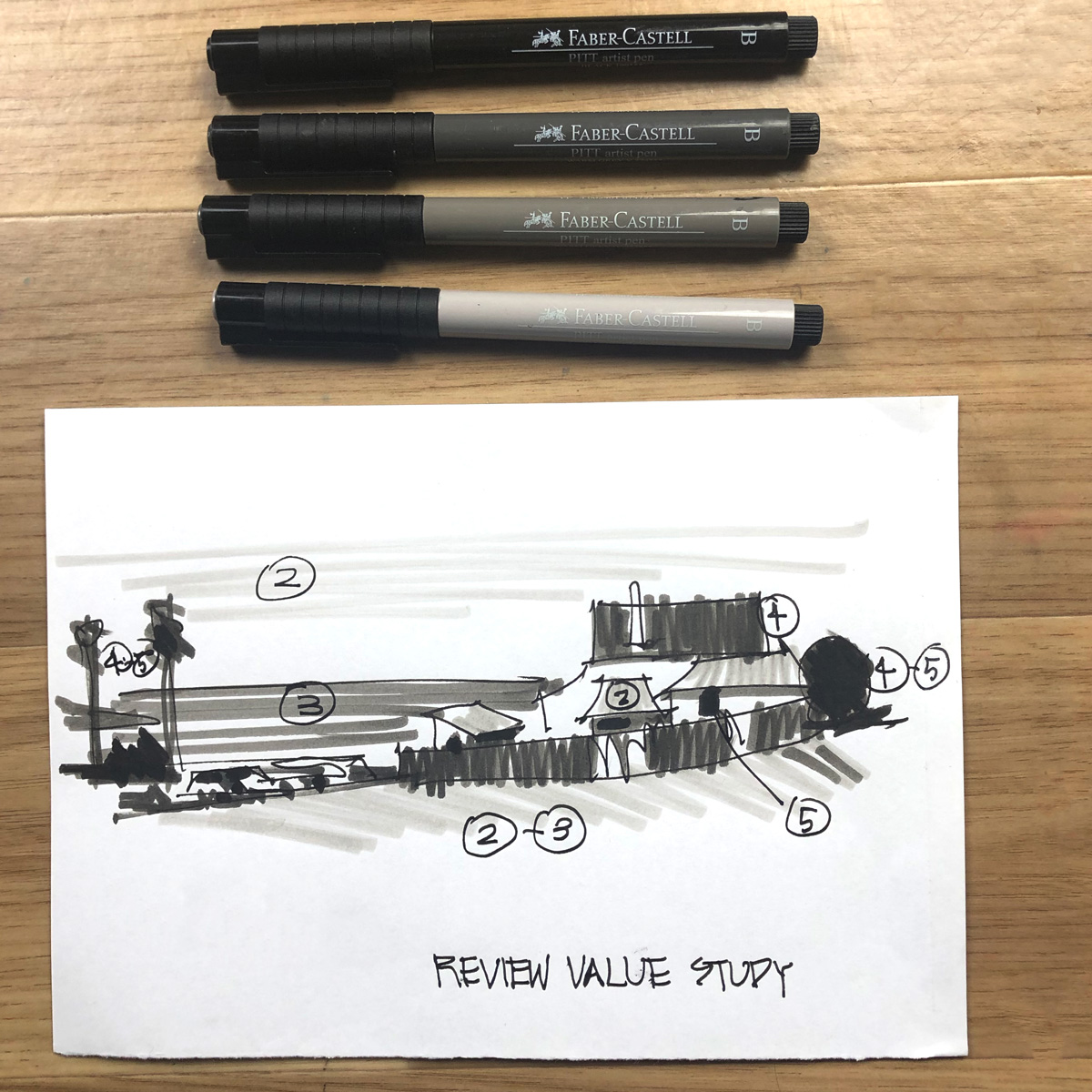
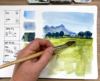
The value study in this article was done last week after I’d been sketching out on location. I got my sketch to the 70% mark but was a little too distracted at the time to work out what to do next. So I stopped early and then did this value study back home. It instantly gave me the direction I needed to finish the sketch. I’ll be sharing more about this sketch in this week’s Watercolour On Location Livestream.
BTW I can’t express in words how much I’m loving doing weekly livestreams as part of this Group Run-through. It’s so amazing to chat with everyone, answer your questions, address topics which have come up in the classroom and share some behind the scenes for my own sketching for the last week. If you have signed up for Watercolour On Location at anytime you can join these livestreams! Just check the info inside the classroom.
The markers I use
And oh! I haven’t shared which pens I’m using!
They are Pitt Brush Pens: Warm Grey 272, 273, 274 and Black 199.
What tool/s do you use for your value studies?


19 Comments
Is there a reason (there will be!!) you use warm grey rather than cold grey? I’m drawn to the cool colours but would use warm if I understood why it mattered! Thanks.
Hi Rachael,
I’m a warm grey person! I would chose warm over cool any day. So it’s personal preference!
The actual selection I use is less important than the concept of using grey markers – any grey markers for value studies. 🙂
Thanks for your answer. One more question…..why grey? Why not dilutions of indigo or sepia? Is it simply convention or does the convention exist for an arty reason?
And although there is not a lot of difference… I felt the warm grey Pitt pens are closer to the 4 step value scale than the cool grey pens.
Very much like Ansel Adam’s Zone System for photography.
I used Pitt Markers last about 5 years ago. I just could not take the constant plastic trash (they don’t last long) and went looking found an acceptable replacement. I have 3 (I could do 4) Pentel Aquash waterbrushes with diluted DeAtramentis Document Urban Grey in (used to be their grey but I like the Urban Grey better — a warm grey). They last 2-3 years depending upon me dropping them and I always have what I need (no running out of ink) AND a better choice for the planet.
Love this solution. I’m not happy with the values of the cool gray Pitt pens, which is what I had on hand already. I have Urban Gray ink and will convert the Aquash pens instead. Thanks, Kate.
You are welcome!
Love love love this solution (for the reasons you give). Could I ask what ratio of dilution you use? And do you use a black?
For writing I use a 1:1 mixture of De Atramentis Document Blue and Brown – I’m just not a black ink fan! But I can see the sense in using it for value studies.
One more question for you @Suzanne McVetty – which size aquabrush do you use? Thanks
Oops that was meant to be Kate Powell! Sorry about that. But do appreciate the sharing of ideas.
I use two De Atramentis Document colors this way (and also as grisaille –look it up, and know I am doing it with waterproof inks). I use brown and urban grey. Black doesn’t dilute the same way but you can in a pinch — or to try it until you buy some grey. Like Liz, I like warm greys — just my preference.
An easy way to do it is to take your pens and draw (sharpie) a line where you want to fill the ink versus the water — then it makes refilling and getting you values very very easy. Also, I don’t fill mine completely to the top because I find they might leak when topped off.
Brush size? I use the teeny tips for detail work and the medium for the diluted greys. I save the big fat ones for doing washes. I paint a LOT in my journal with inks.
Thanks Kate. That’s a great idea. The pitt pens are about the only plastic disposable pens I use. So a refillable ink solution would be so much better.
Thanks for such informative replies Kate. I appreciate your generosity.
I’m gonna admit that I don’t do value studies! The first time I ran into it was in the watercolor class, and honestly, that lesson was hard for me, so I’m hoping it’ll be easier when I do it again (I’m running through the course on my own right now).
I copied your paragraph #2 into my notes for Watercolor on Location. I have done thumbnail value studies for years, but never made the true connection between the thumbnail and the painting until now. The key phrase was “adjusting the values to create a sketch with compelling contrast.” I used to do what I saw, but no longer! A breakaway moment for me! Thanks, Liz.
Anyone got a source for these? I couldn’t find a provider that sells these markers individually. Even though they are advertised online by Faber Castell I couldn’t find anything outside a 12-color marker set.
I make do with the white paper, a “metal” color cool gray Sharpie and a standard black one for value studies. I have a warm grey watercolor pencil to expand to 4-values.
Hi Cori – not sure where you are based – they are available in open stock in most stores in australia
NEWSLETTER
Subscribe for first notification of workshop + online classes and more.