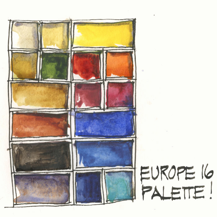
Well, one of the most important decisions regarding my big upcoming trip has been made today:
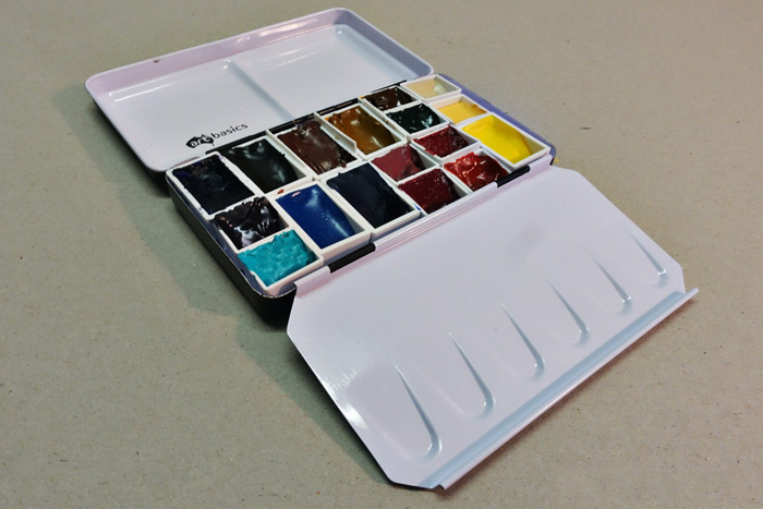
I have locked in the selection of paints in my watercolour palette. Yay!
The amazing thing is that it’s exactly what I was using this time last year and what is currently listed in my watercolour section – by the way there are lots of other interesting articles there if you have time to follow the link!
Since my Norfolk Island trip last October, I have been playing with a few colours but I have gone back to my previous standard selection. The funny thing is that I have been recently debating Buff Titanium vs Naples Yellow, and only just realised that in my standard palette I have both. But just for the record, I am taking a spare half pan of Perylene Green and might swap it with that Buff… but we will see!
I am really happy with this palette.
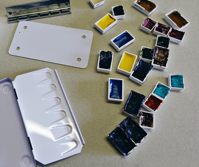
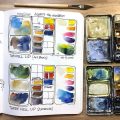
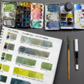
So now I am about to start the tedious relaxing job of filling up my pans. I normally treat myself to brand new pans for an overseas trip, but this year I am thinking that I will just clean up and top up. More about the process in this article from last year (that photo is from last year too). This is a task I normally do about three weeks out from my departure date, so I am pretty close to schedule.
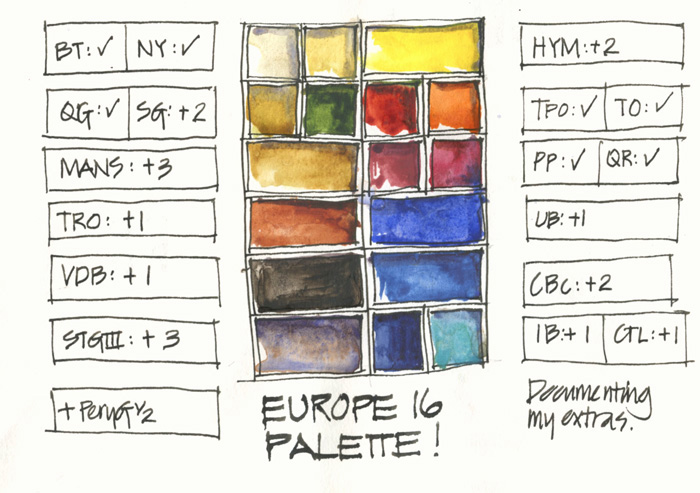
The biggest challenge however was guessing how many extra pans to make up. I have been a little remiss in recent years recording what extra pans I take (colour and number) and then what I end up with back home. So this year I am at least doing the first step!
The numbers on the side of this page look extreme but
1. I sketch a lot.
2. I have a big trip!
How big? Drum roll please… this trip is almost 8 weeks long! Wow! The ease of preparing a few extra pans now makes it so much simpler when I am travelling and they hardly take up any extra weight or space.
So okay, here is the listing:
Note 1: DS = Daniel Smith, WN = Winsor Newton, SCH = Schmincke
Note 2: I am listing them as I think of them from right to left (as I am a leftie) so please excuse that this list doesn’t relate to the way you are probably read the above image!
DS Hansa Yellow Medium – PY97
DS Transparent Pyrrol Orange – PO71
SCH Translucent Orange – PO71
WN Potters Pink – PR233
DS Quinacridone Rose – PV19
DS Ultramarine Blue (not French!) – PB29
DS Cerulean Blue Chromium – PB36
DS Indanthrone Blue -PB60
WN Cobalt Turquoise Light – PG50
DS Buff Titanium – PW6
WN Naples Yellow – PW6 PBr24
DS Quinacridone Gold – PO49
DS Sap Green – PO48 PG7 PY150
DS Monte Amiata Natural Sienna – PBr7
DS Transparent Red Oxide – PR101
DS Van Dyke Brown – PBr7
Steels Grey III (a pre mix of WN Cobalt Deep Blue with a little DS Quin Burnt Orange and a touch of DS Quin Rose)
And finally:
It’s very cool that I have just updated the image of my current palette in my sidebar! Ah, I am enjoying my new blog a lot and have been hanging out to make the most of that feature.
Other articles to check out:
My watercolour section – with lots of things to consider when choosing your colours
Recommended minimum palette of 6 colours
A basic 12 colour palette
Putting together my palette for a big trip
Plus:
Brenda Swenson on filling a palette
Jane Blundell on filling half pans
Jane Blundell on ‘ramp’ filling pans
Ok, questions or comments… please fire away!
IMPORTANT UPDATE: A few changes August 2016

35 Comments
Why do you specify ‘not French’ for the Ultramarine? And why prefer Cerulean Chromium over Cerulean?
Also…..you have included Quin Gold and Sap Green in the photo…but they are not on your list below.
Lastly, how do you transport the extra pans? Do you carry a spare palette box?
Gold Star to you Anne! That listing is from last year and no one has picked it up. Added now.
Non French is cheaper (series 1) and produces better greens and still ok purples – this is something I picked up from Jane.
Dear Liz,
you might have written it somewhere, but how do you fixate the pans inside the box? I saw that you dissambled the pan tray ….
Interesting that you move more to DS Colors.
KR,
Oliver
Hi Oliver – the link is included in the post https://lizsteel.com/trip-prep-getting-my-palette-ready/
Blu Tac!
I love this palette! Great color choices. You’ve got me curious about Naples Yellow now!
hi Emily – search the site (in the bottom menu bar) for more about this colour!
Hi Liz,
I’ve just been setting up the same tin for a trip to California. I could only fit 15 pans, so this is a great help!
May I ask why you have two oranges if they are both PO71? Are they that different?
Thanks again!
Hi Dory, The trans Py Orange is darker and used for reds, the Sch Translucent orange is in just because i LOVE the colour and it is ready to go when I want a nice orange!
I always love your trip planning posts! 8 weeks — that’s a LONG time to be away, but I’m sure it makes sense because you have to come such a long distance! Happy to know that I’ll be seeing you in Manchester somewhere in that 8 weeks! 🙂
Tina
thanks Tina… well I have 2 workshops and 2 other projects to work on. I was going to try to have a break, but 6 weeks is really easy to fill up in the UK!
I recently spent 3 weeks in europe, and did a similar exercise of choosing the right and perfect colors for my palette. I have much less experience in watercolor but enjoyed it grealty, and found that reading about the properties and uses of the different colors is definetly fascinating ! I used your blog as a reference, as well as the blog of Marc Taro Holmes. Thank you so much for taking the time in sharing everything here, it is always a highlight and an inspiration to find a new blog post !
I’m just curious why you choose the WN Cobalt Turquoise light as opposed to DS turquoises? I bought the WN CTL after seeing it on your palette, and I love it, but the DS charts of the other colors are really pretty too.
Hi Debi – in essence it’s just a bit nicer in colour and attribute IMO then the DS ones. Certainly not a lot in it, DC Cobalt Teal Blue is great too. I choose by the pigments rather than brands.
Hi Liz. Great post. Have a great trip! Just wondering about the +1, +2 and +3 numbers. I haven’t seen you use them before but maybe I’ve just missed it. What do they refer to?
Hi Murray. It’s the number of extra pans I need for my trip.
Thanks Liz! This is so helpful. So you don’t bring tubes with you at all? That’s really enough for 8 weeks? I’m new to watercolor so am curious. 🙂
I love your palette posts. Actually, I just love seeing anyone’s palette. So many colors, so many preferences. And I like adopting others’ palettes as my own and seeing what it’s like to work with those colors — how they work together, how they affect what I do, how they wake me up.
Thanks for sharing. I think I’ll give this palette a try.
Have a lovely and fruitful trip.
Have you tried the new BLUE? Scientists have created indirectly a new color blue…
no not yet Randall…only just heard about it and no idea how-when it will be available.
Echo everyone else’s comments about sharing your thoughts & choices. Hoping to catch up during the upcoming Symposium in Manchester. Meantime, have a question – notice in the blog photos that your small water container seems to be sunk into a board of sorts (the watercolour palette is also attached to it with bulldog clips). Can you shed some light on this … Please. Thanks. Mo.
Thanks mo. Check out sketching tools – kit in action section for full details
hi Liz, how do you potter’s pink? just got it fro your recommendation its a nice light pink with granulation but not sure where to use it.. 🙂
I use it to add texture ( granulation) and to dull down colours. Mix with yellow to get cream. I rarely use it on its own. It’s a mixer!
Ah! Thank you for this will try it. The only place i have used it is in painting ham! Haha but will try to mix it with other colours to see that i get.
I’m very interested in Potter’s Pink. How would you compare Daniel Smith’s versus Winsor and Newton’s? I wonder which one is best for maximum granulation.
I want to do another comparison to check but at the moment I use WN
Hi Liz! Just to follow up, I bought the W&N Potter’s Pink, but couldn’t get over wondering about the DS. I can’t explain why I became so obsessed with this one paint color, but I’m a huge fan of granulating colors and things spun out of control. In other words, I bought the DS Potter’s Pink as well and have done a comparison, wet on wet.
DS wins a slight edge for me and was also less expensive (Dick Blick). Daniel Smith’s is a bit deeper in color and the granulation is more dramatic. Winsor & Newton’s is a little sweeter in color and the granulation, still considerable, seems finer. That said, the differences are modest and I don’t think anyone could distinguish them from their performance in a painting. I like them both but there’s no way I needed them both. I have a lot of Potter’s Pink to use up now. Merry Christmas!
ah! that is very interesting thanks Lori.My main problem with the DS version is that it separates in the tube more, and doesn’t set in the pans. SO I need to re-test and shake the tube well before squeeze it out.
Hello liz. I have an oil painting from my elderly aunt. It is of an outback man maybe a jackaroo fighting a bush fire. Very strong red colours it is signed but steel. Would you have any idea who the artist might be please. Mant thanks Rosslyn
Oh that sounds cool. But sorry no ideas who the artist is
Hi Liz. I’m trying to make a decision on which Schminke palette to buy for the upcoming symposium in Chicago. I see in this post of yours that it looks like it’s a 24 (1/2) pan palette. But your photo shows 2 divisions on the top for mixing. The Schminke 24 (1/2) pan palette that I see online has 4 divisions on the top. It measures:
Tin for 24 Half/12 Full Pans – 03434-2412
Closed Dimensions 2-3/4″W × 8-5/8″L × 1″D 7 cm × 22 cm × 2.5 cm
Open Dimensions 8″W × 8-5/8″L × 1/2″D 20 cm × 22 cm × 1.3 cm
The one pictured in your blog looks smaller (plus the mixing area configuration is different.) I don’t want the one that I get to be too big to clip onto my board, because I’ll have my sketchbook & water pot on the board as well. Are the dimensions of yours the same as this one?
Thanks so much.
Carla
my tin is the 12 half pan tin which closed is 7cm x 12.5cm the schminke version used to have 3 rectangular divisions on the lid. hope that helps
Liz –
I’m curious about a couple of your colors.
1) I’m assuming the Monte Amiata Nat. Sienna is a substitute for Yel. Ochre. Why do you prefer the MANS?
2) Why do you prefer Cerulean Blue Chromium over Cerulean Blue?
Thanks.
Carla
quick answers – MANS is more transparent, glows and mixes a neutral rather than a green with ultramarine. CBc is brighter so mixes with my other colours better (than the subtle WN version) and closer to the australian skies.
How long doe watercolour sketch to dry so you can close the book?
NEWSLETTER
Subscribe for first notification of workshop + online classes and more.