In the past week, I’ve been focusing on Cobalt Blue and how I use it in my everyday sketching. This has been prompted by the current Watercolour On Location lesson – Value and Colour – and recent discussions within the classroom and livestreams about shadow washes.
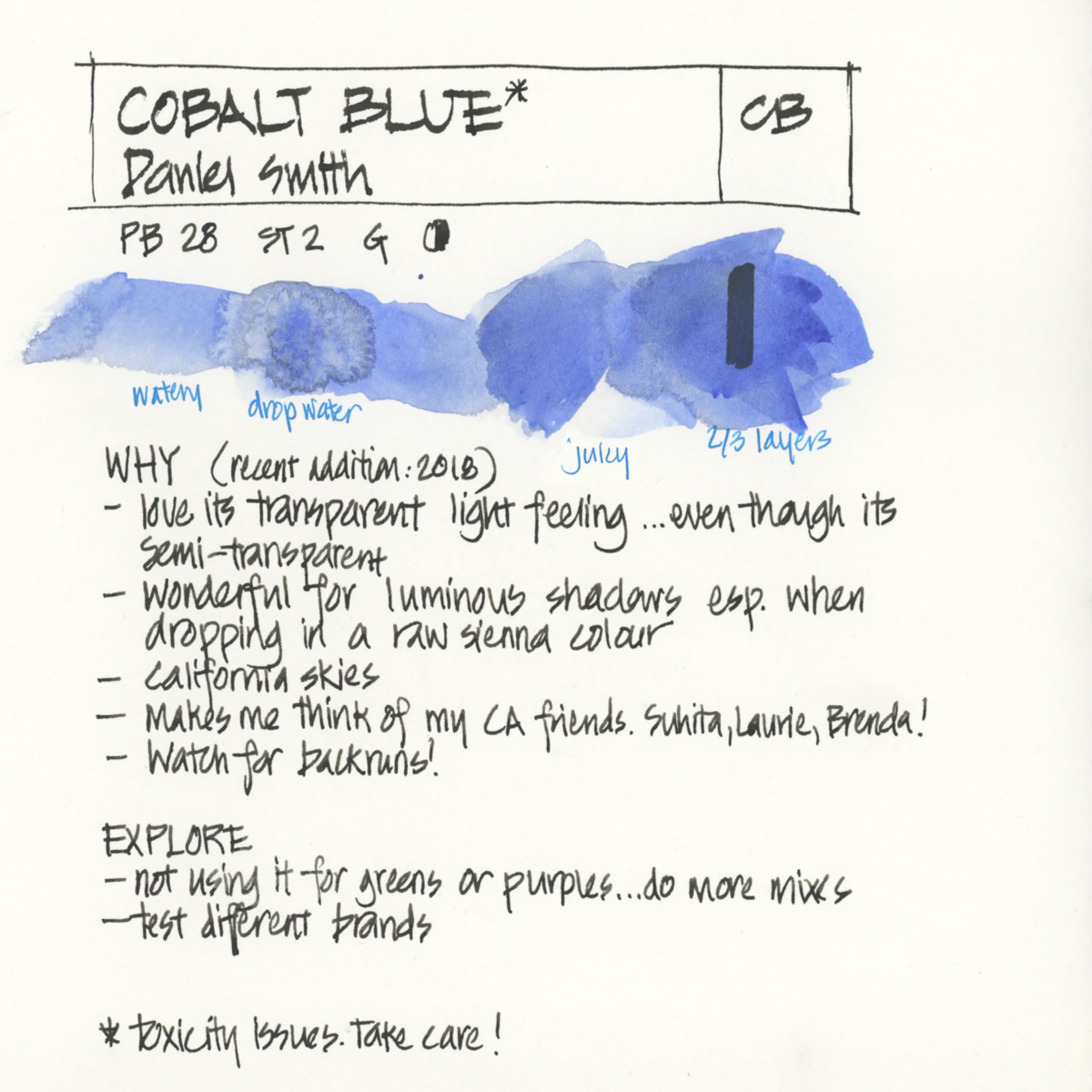
This is what I wrote about Cobalt Blue when I was doing the Colours In My Palette series and is still a good summary of why I love this colour so much. Read the full article here.
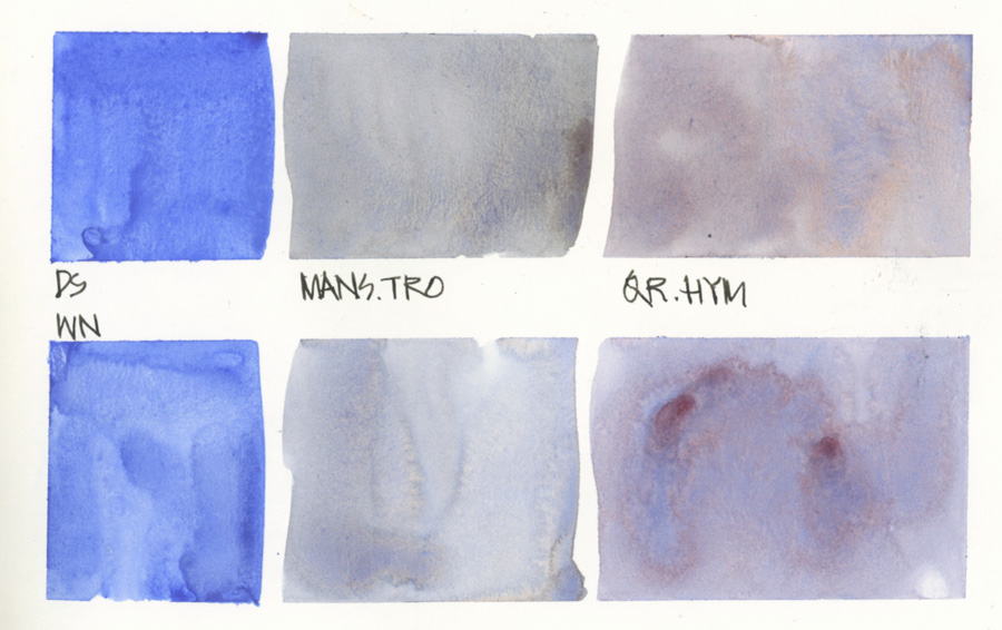
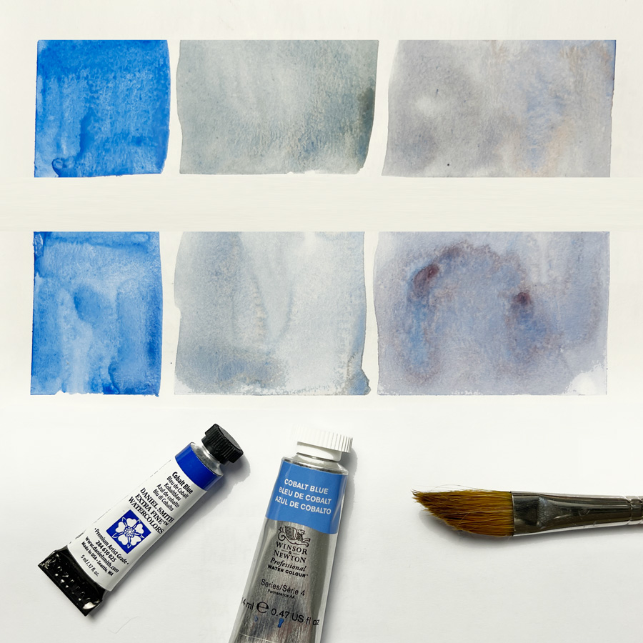
But as it’s a more recent addition to my palette (since 2018) I haven’t tested it fully. So last week I decided to compare Daniel Smith vs Winsor and Newton and decided to try using the WN for a bit in my studio palette. It appeared from this quick test that although the DS feels more transparent, the WN might create more pigment parties.
When I’m out and about, as mentioned last week, I’m using an Aquarius palette. So this means I’m also testing Aquarius Cobalt Blue.
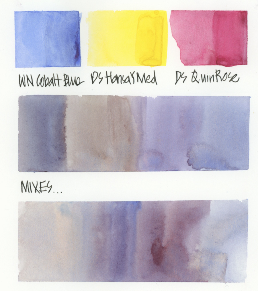
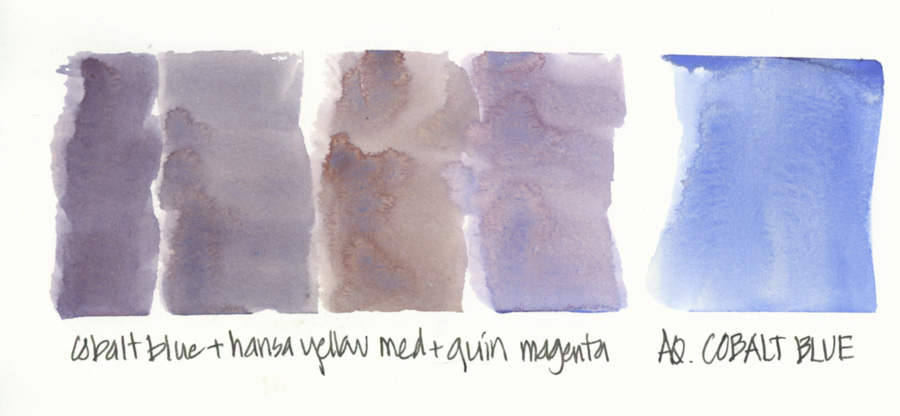
At the moment my favourite shadow mix using Cobalt is to create a grey (a blue-grey, a purple-grey or a warm grey) with Hansa Yellow Medium and Quin Rose. This creates a lovely soft grey that is perfect for shadows (shade or cast shadow), particularly on white objects. It’s great for creating shadows of a Value of 3, but a little harder if you want a Value of 4 (assuming a five-step value scale).
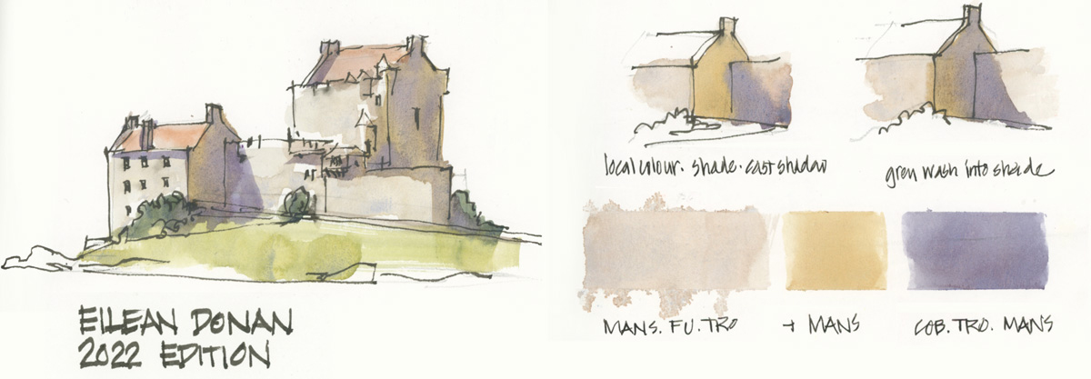 But I’m also using it with Monte Amiata Natural Sienna and Transparent Red Oxide. Here is it in action while re-doing one of the exercises from the course.
This is just the beginning of my explorations so stay tuned for more Cobalt-related shadows in the weeks to come.
In the meantime, I would love to know…
Do you use Cobalt Blue regularly? What brand do you use? What do you use it for?
(If you are reading this via email, please click on the article title link below and add a comment on my blog. Thanks!)


5 Comments
Interesting approach. Shall experiment it as I am rebuilding my palette!
Merci
Just returning from Venice sketching with Jeremie Bonamant!
As you know, I love Cobalt blue, even though it can be cranky and difficult in the palette. In tropical places where the weather is hot and moist it becomes really gooey and drips all over the adjacent colors, while in the mountains of northern California it gets so dry that it’s hard to pick up enough paint on my brush. If I’m planning on spending a week in the Sierra I’ll mix some M. Graham cobalt in with the Daniel Smith paint to soften it up and make it easier to re-wet. Because Cobalt is such a wimpy color I need to refill the palette a lot, so there’s usually room in the palette well to make a special mix before a trip. (When I’m teaching about pigments, I sometimes say that if colors were animals, Phthalo blue would be a grizzly bear and Cobalt a squirrel.)
So why use it? Cobalt blue, straight out of the tube, is the exact heart-breakingly glorious blue of a high Sierra sky on a summer day. It’s especially good for skies because it doesn’t granulate much. You could get close to that color with Ultramarine blue but I mostly don’t want granulation in my skies. Phthalo blue would give you a flat sky, but when you mix Phthalo with magenta or purple you end up with a much duller color than pure Cobalt.
It’s also handy for situations where you want flashes of startling, semi-opaque pure blue, like the sail covers in a marina or a bright T-shirt in a crowd.
And because I get emotionally attached to colors, Cobalt has always been a beloved friend that I am happy to see in the palette. Even if I don’t really need it in a particular situation, I’ll find excuses to mix my friend into the conversation.
Nice story! Thanks
I use Da Vinci brand – bolder, more pigmented and easier to rewet than Daniel Smith. It’s also a bit less granulating but I can still persuade it to make pigment parties. In Exploring Watercolor, I used Cobalt wherever you’d usually use Ultramarine. I love it diluted for blue skies in place of Cerulean as well.
I can’t remember a time when I haven’t used cobalt blue – mostly for skies, shadows and the soft, blue-grays in feathers, which I love to sketch and paint. I’ve used various brands, but after taking Watercolour and now Watercolour on Location, I bought a tube of Holbein (Brenda Swenson’s preferred brand) for its transparent and non-staining properties. I have yet to try it, but I want to be able to lift it if necessary. Using cobalt to mix my darks has helped me “lighten up” the other values in my watercolor sketches, which is an added bonus!!
NEWSLETTER
Subscribe for first notification of workshop + online classes and more.