In Monday’s article, I mentioned the need to be generous with pigment and water in order to get lively ‘juicy’ washes. This is because the most common mistake when starting to paint with watercolour (particularly in the context of urban sketching – using travelling palettes and a waterbrush) is to use washes that are too dry with hardly any pigment.
But there is also the danger of having all your washes too juicy and as a result, your sketches becoming too intense and heavy.
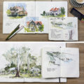
And that is why it’s important to make sure your sketches have plenty of beautiful watery washes! They are particularly essential for skies and backgrounds and foreground surfaces (such as grass) and for values that occur on the light side (as we discussed in my last article). But just because they are ‘watery’ doesn’t mean that they are not lively and full of lots of pigment parties.
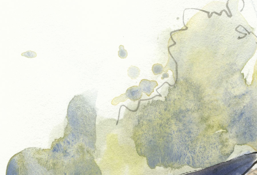
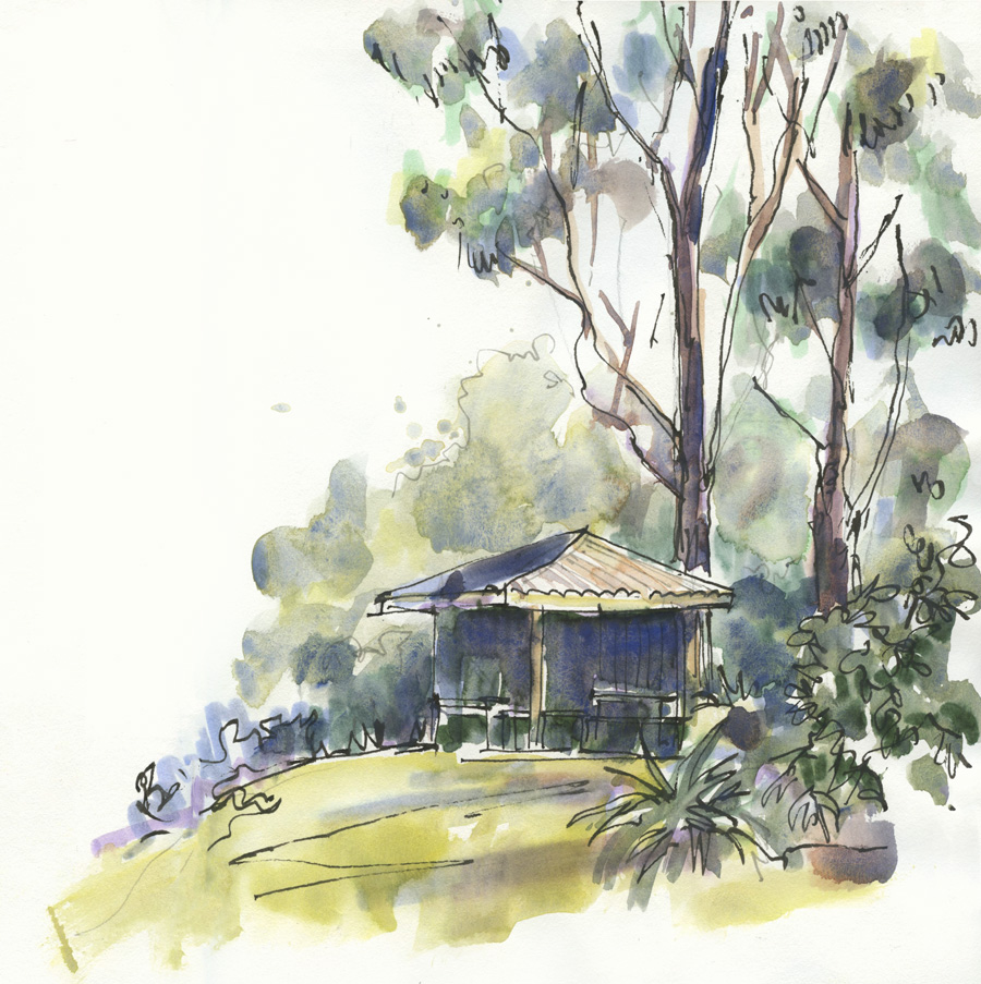
Notice how much colour and texture there is in my background tree washes. (SCH French Ultramarine once again creates its own special kind of magic!)
If you haven’t seen this already – last year I put together a short video showing how I create watery, juicy and pasty washes.
Of course, I go into this in much more detail inside my Watercolour course. 🙂 A cohort will be working through the lessons over 7 weeks starting on 15 March – Find out more here.
And while on the topic of mixing greens, I thought I would share my current favourite green mixes.
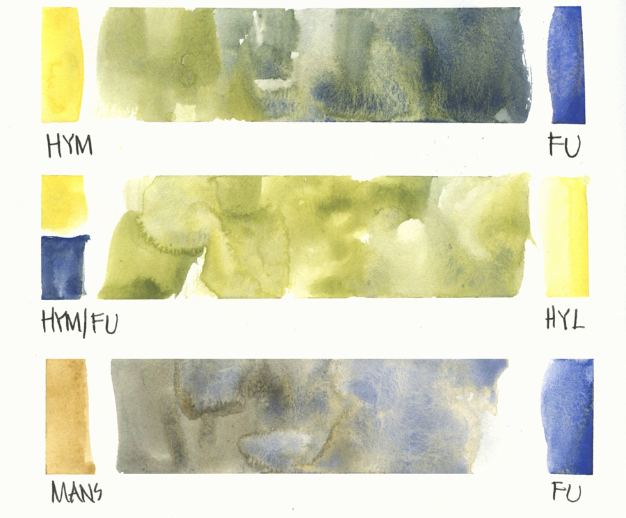
1, If somehow you missed it, last year I replaced Sap Green with my own pre-mix of DS Hansa Yellow Medium and SCH French Ultramarine.
2. Recently I’ve added DS Hansa Yellow Light to my palette and I use it to adjust my Mixed Green for ‘sunny greens.’
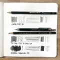
3. I use DS Monte Amiata Natural Sienna (MANS) with SCH French Ultramarine a lot for all the Australian greens in my bush sketches.
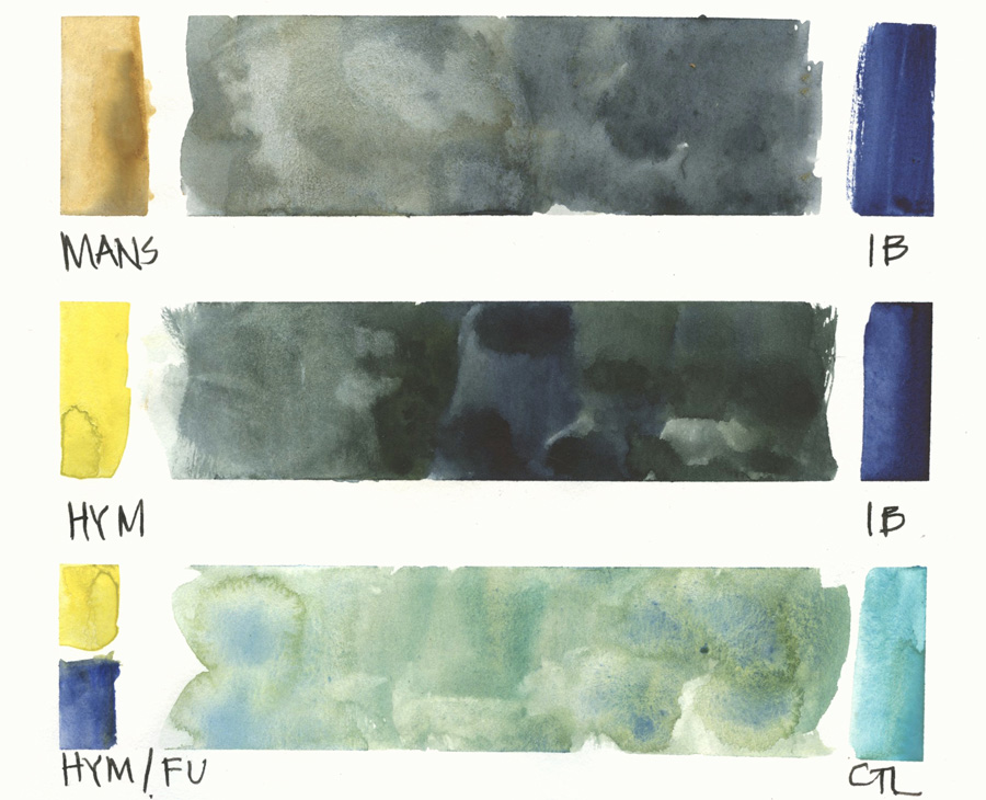
4. Mixing MANS with DS Indanthrone Blue creates another beautiful Australian green but without any crazy granulation.
5. For a dark green (similar to Perylene Green) I mix DS Hansa Yellow Medium with DS Indanthrone Blue.
6. Adding a little Winsor Newton Cobalt Turquoise Light to my Mixed Green is good if I need a brighter and more turquoise type of green.
There are more green mixes that I create using cobalt blue, cerulean blue, quin gold, transparent red oxide and quin burnt scarlet but these 6 combos are the ones that I’m using the most at the moment.

Finally … if you want to explore previous blog articles related to the current one, please click on the tags that are always included under the title (such as Greens or Mixing). If you are reading this article via email please visit the blog (click on the article title) to see these tags.
(Thanks to Jamie for a recent comment that made me realise I should remind you all of my extensive tagging system that indexes all blogposts going back to 2008. I use tags all the time to find related material and regularly update them and old blog posts.)
I hope that you have enjoyed these watercolour-themed articles this week!
Reminder of my Watercolour course where I explain these concepts in more detail and have designed some specific exercises so you understand how to get more lively watercolour washes in your sketches. Find out more about Watercolour here.


7 Comments
Green is the most complex color for me.
So many possibilities related to each season and each country. I live in France, and soon we enter spring (different from you…). The range of greens is unlimited during this period until May-June. And I tell myself when I see your watercolors that Australian greens are not quite the same as ours, pulling more green yellow or “apple green” or dark green like pines. I use a palette close to yours, with the addition of a Hooker green and a lemon yellow. This combination looks like your green for grass, but I don’t get nice granulations. Do you have other solutions?
On the other hand, I wanted to ask you why you don’t use indigo blue?
Thank you for your blog, so informative! 🙂
Hi Laurence, Indanthrone Blue is similar to Indigo but doesn’t have any black in it so it is more lively. The granulation in my greens all comes from the SCH Ultramarine 🙂
That was most informative. I’m an amateur just starting out on this journey. So everything is a wonder and I try to put into practice some of these marvellous suggestions. It is a very steep learning curve for me.
THANK YOU
Manfred
My pleasure Manfred. All the best for your journey!
I’m seeing the purchase of Schminke French Ultramarine in my future! That granulation is gorgeous! I’ve been doing pages of green mixes lately, practicing. The addition of Cobalt turquoise light is lovely, too. Thanks for this article, and your current mixes. Especially those Australian greens. My desert cactus greens have very similar greyness to them and I’ve yet to get it looking good, lively, and not flat.
I notice I also struggle on adding the lights and darks in a scene, or a bush, or tree. It will look more like a blue polka dot instead of a shadow or darker area of the foliage!
Hi Jamie, Glad it’s helpful. As for darks try to group the areas together into bigger shapes
That’s a good idea! Why have I not thought of that! Lol!
NEWSLETTER
Subscribe for first notification of workshop + online classes and more.