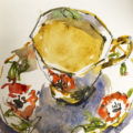
Last week during a live demo (for my Buildings course) I watched as a dark brown mix turned blue as it dried!
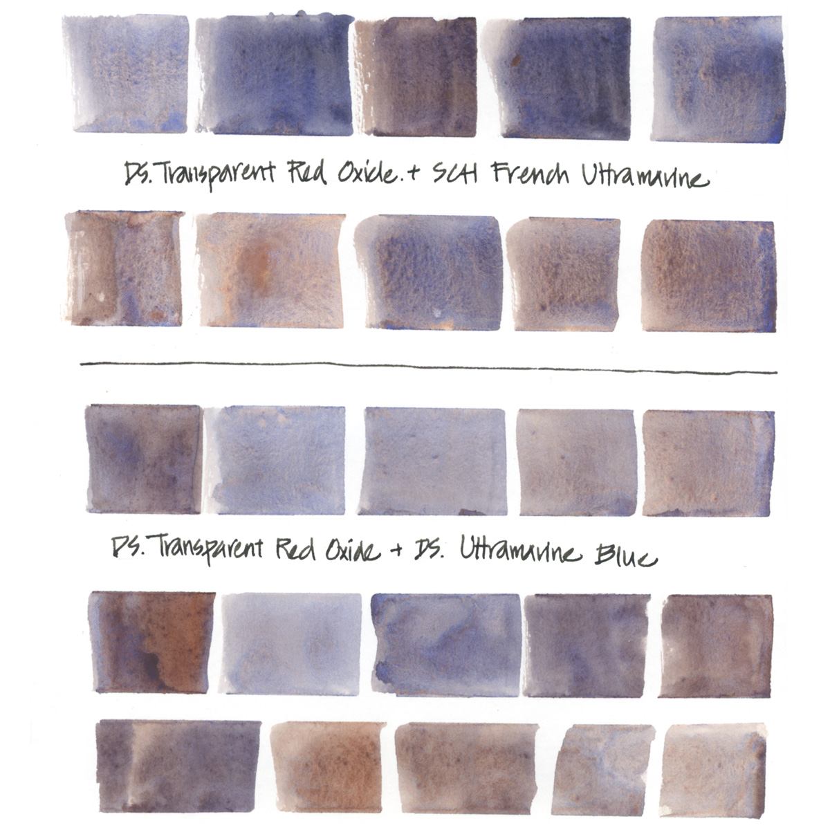
This is because I made it with Daniel Smith Transparent Red Oxide and Schmincke French Ultramarine. There is something about the Schmincke French Ultramarine pigment that means it completely dominates mixes, making them dry blue. So I thought I’d do a few more tests.
And yes, it’s really hard to get a neutral grey or a brown mix with this combo – but look at all that crazy granulation!
I did also a comparison with Daniel Smith Ultramarine Blue (the other Ultramarine I love to use) and you can see that the hues are similar. However, it’s a much more consistent combo with little colour shift – the colour didn’t become bluer as it dried. It also has less granulation which is handy on occasions. So it’s good to have both versions handy depending on what I want.
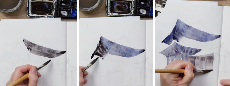
Here are three screenshots from the livestream demo that shows just how quickly the colour shifts when using Schmincke French Ultramarine!
The hue of the wash in the mixing well was brown and I was happy with what it looked like when I first put brush to paper. But by the time I had moved on to the next part of the sketch, the hue of the previous wash had shifted to blue. Just for the record, I did not mind the resultant blue wash at all… it’s just that it wasn’t what I had intended.
For those of you who have enrolled in the Buildings course at any time you can find this livestream replay in Lesson 4 Part 4.17 – Look for Livestream 8 and the Nanzenji Temple Gate demo.
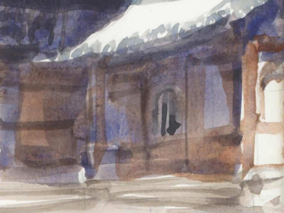
The final image for today is my favourite part of this sketch – where I adjusted the hue by a few random strokes of TRO.
BTW this lesson in Buildings is completely dependant on the core ‘abstracting shapes’ skills which we learn in my Foundations course. I’m looking forward to going back to basics and applying these shape skills to other subjects in the new year. Find out more about the Group Run-through of Foundations here.
Ah! It’s always worthwhile to spend time getting to know your paints!
What Ultramarine do you use?


13 Comments
This is why I try not to mix manufacturers when I am building a palette. I have on rare occasions when taking a class. Both Thomas Schaller and Iain Stewart have included a different brand of paint on their palettes but I figure if it is that one color and they’ve been using it then the results should be predictable and consistent.
I recently purchased an all Schmincke palette from Art Toolkits and one from A. Gallo. A. Gallo uses honey so I will not be using any other brand with those. My preferance is still Daniel Smith but sometimes I like a change. I am liking the Greenleaf and Blueberry for plein air urban sketching.
Hello Liz
Winsor & Newton Ultramarine Blue does everything I need – from greys to granulation and deep darks, and mixes well with the other W&N pigments that I always use, so the colour characteristics of the various mixes are already known, and I can concentrate on other aspects of the painting. Have really enjoyed the buildings run through Liz – particularly the live sessions, and will miss the interaction when it finishes this week.
Happy Christmas to you and your family –
Best wishes, Marion
Thank you Liz, for the beautiful swatches! I just went back to read this other page of yours, which compares the Burnt Sienna parts of the equation: https://www.lizsteel.com/exploring-mix-burnt-sienna-and/
I agree with your comments there and have found the DS Burnt Sienna a bit too red and opaque. I like the WN Ultramarine and the WN Burnt Sienna but I need to try the DS TRO!
Hello Liesa, I find the D.S. Transparent Red Oxide negligible in difference from the D.S. Burnt Sienna. Little enough different in all aspects that I feel I’ve wasted my money, and having both colors are redundant.
Another color I tried that I found no different than Raw Sienna is the Goethite Brown Ochre. I purchased the Transparent Red Oxide and the Goethite Brown Ochre at the same time, and having swatched all four colors side-by-side, the colors and properties of both new colors are nearly identical to RS and BS.
I suppose they could WOW me in some mix I haven’t tried yet, but this has been a cautionary tale for me. I find that even on a computer, DS color charts are very accurate for comparing colors prior to purchase.
Thanks Morgana — good to know!
Has anyone tried using DS Permanent Brown? I have it and a small sample of DS Transparent Red Oxide. I am not sure which full tube to buy once these samples are finished? Any suggestions? Preferences?
I’ve used D.S. Quinacridone Burnt Orange as a substitute for Burnt Sienna.
Hey Morgana. I use both DS TPO and Burnt Sienna. I agree that their hues etc. are pretty close to identical but one (the Burnt Sienna) is much more opaque than the other. That difference might be helpful. Tbh, I rarely use DS Burnt Sienna because I find it to be very drab. But, when I’m looking for a more opaque earth tone it’s a go to for me.
I use WN ultramarine blue (green shade) with American Journey (Cheap Joe’s brand) burnt sienna when I want less granulation for painting feathers, and with DS quin burnt orange or transparent red oxide when I want livelier washes. I tried DS ultra blue, but it dries very hard in my palette and is difficult to re-wet. The above combinations give me a nice range of gray values.
I’ve had that problem with DS Cobalt and Ultramarine and have started to put a drop or two of gum arabic in the pan and mixed them. Then they don’t dry hard, crack and fall out of the pan. There are a few Primateks I have to do this to as well.
I have no problem with DS French Ultra and Burnt Sienna.
Wow! That is alot of separation! Liz, did you every try DS french ultramarine? I dislike how hard ds ultramarine dries on my palette. But was wondering if ds french ultramarine was any better?
If you hear a rattle in your closed palette, it is almost certainly the chunk of UB. I’ve usually used DS French but have been trying the Schminke French lately. It hasn’t had much of a chance to attempt escape yet, seems softer than DS.
When I fill my half or whole pans with the DS ultras and cobalt I add a drop or two of gum arabic to give them just a bit more moisture. Then they don’t crack, harden and fall out of the pan. I add a drop or two to some of the Primateks too. I keep a small bottle of gum arabic just for this purpose.
NEWSLETTER
Subscribe for first notification of workshop + online classes and more.