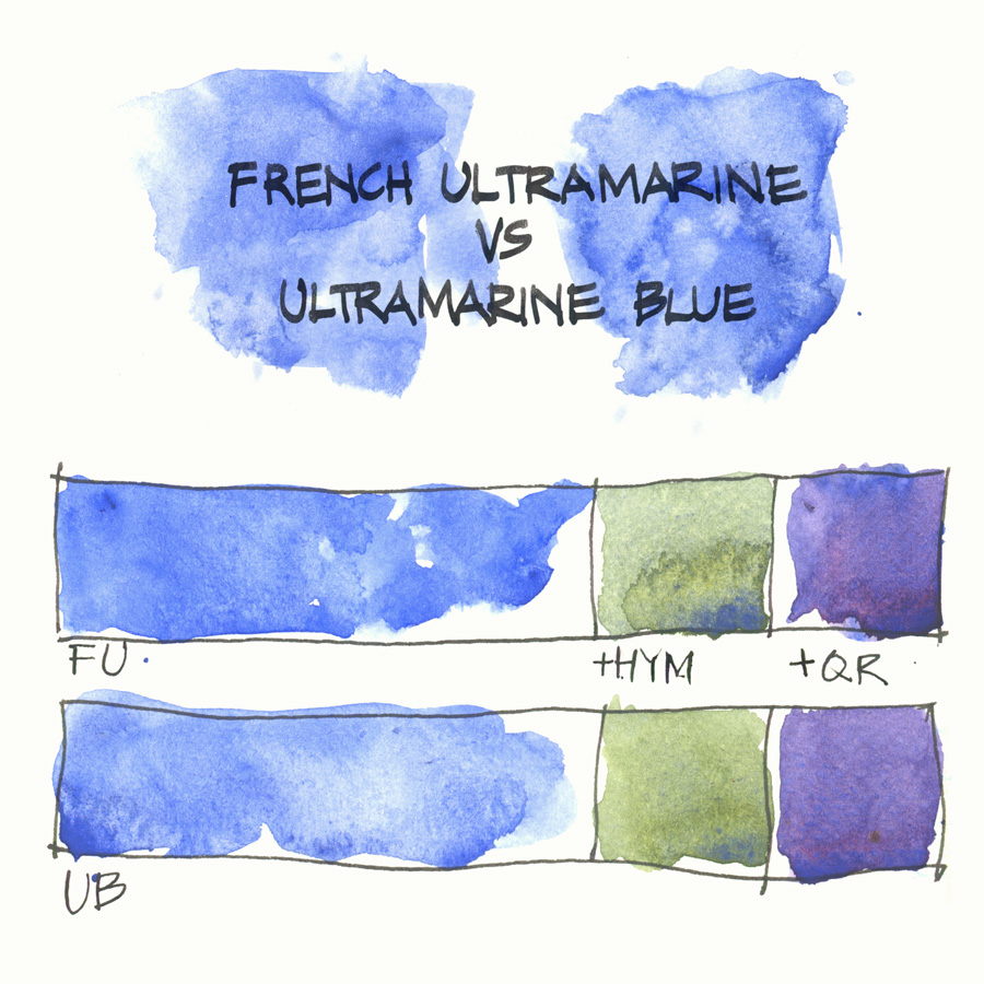
I love receiving emails from readers and especially when they send me information that I might find interesting. Last week a reader sent me the following quote by John Lovett (an Australian watercolorist, whose work and teaching I love).
French Ultramarine Blue: Warm Blue, tending towards violet, so contains some red. Non-staining and sedimentary, so will lift off easily. Built up washes will clog paper texture after 3-4 layers, after which pigment will tend to lift off. French Ultramarine is a higher series than plain Ultramarine, so is more expensive. It is however, a much stronger pigment and will out last 2 tubes of plain Ultramarine, so in the long run is better value and much better to use.
This is John Lovett’s website here and I note that he doesn’t include Daniel Smith in the list of brands for this colour. Maybe this is the case with some other, but I have not found a difference between DS Ultramarine Blue and DS French Ultramarine in quality.
The main reason for my choice of Ultramarine over French is that it makes better green. I am very grateful to my great friend Jane Blundell for first telling me this. At the Daniel Smith event we attended last year, John Coglan mentioned the difference between the two versions: French Ultramarine has a bigger particle size and is warmer (redder) than Ultramarine Blue.
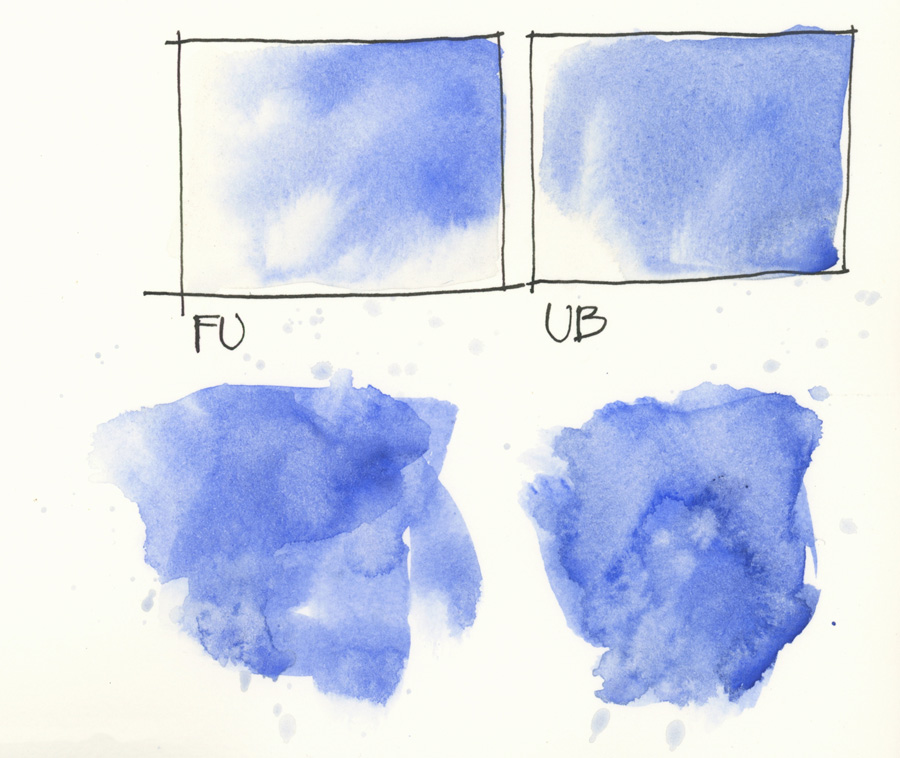
But I thought it was worth testing again and that is what I did. The slightly warmer (redder) hue of French was noticeable but I couldn’t see much difference in the mixed purples.
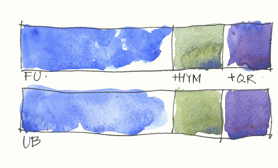
However, I did notice a difference in the greens. I’m not sure to what degree you can see this but the Ultramarine Blue is brighter and more lively and this variation is important for me. I am not super sensitive when it comes to subtle variations in purple hues, but getting good greens is more of a big deal for me.
In conclusion, there is not a lot of difference between the two from my tests and usage so I am happy to stick with Ultramarine Blue. But as always, I would love to hear from you, if you have found differently, or simply just to share which version or brand of Ultramarine you use.
2021 Update
I now use Schmincke French Ultramarine as it creates more beautiful granulation when creating greys, browns, greens and purples. In Dec 2018 I got frustrated by how hard DS Ultramarine Blue dried in my pans so started looking for an alternative… and I ended up with the SCH version of French Ultramarine. Find out more here.




9 Comments
I haven’t gotten to try Daniel Smith’s French Ultramarine, but I did try Winsor Newton’s–its in my travel palette because I couldn’t find a tube of DS Ultramarine at the time (that’s what’s in my larger palette). I like DS Ultramarine much better. The red tones are definitely more evident in the WN French Ultramarine, and I definitely don’t like it as well. I know it’s not a direct comparison, but “plain” UM definitely works better for me!
This is so helpful for me! I have a class the instructor suggests using WN French Ultramarine for, but I’m just going to stick with my DS Ultramarine Blue. THANK YOU!
Thank you Liz 🙂
As you say, it must be that John appreciated that difference in W&N paints 😉 not in DS.
Have you ever tried to make your own colours , made from pigments and Gummi arabicum?
Look: kremer Pigments.com
Thanks so much for mentioning John Lovett. His website is a treat. By the way, I vote for DS French Ultramarine.
I’m finding that DS French Ultramarine separates/granulates markedly when mixed with warm primaries like New Gamboge and Transparent Pyrrol Orange – have you experienced this? I haven’t tried Ultramarine Blue yet, as I got the French Ultramarine in the DS Essentials set.
This happened to me, I was surprised to find my trees dried very yellow and very blue and very not green when I mixed DS French Ultramarine with DS New Gamboge. If I am not careful with my pigment/water ratios FUM loves to separate. I have been fanning any wash that contains FUM to help it dry before the separation happens (rather unsuccessfully). Does Regular DS Ultramarine separate as severely?
In oil paints, the Williamsburg French Ultramarine is richer than any other that I’ve used.
Thanks for sharing Paul!
NEWSLETTER
Subscribe for first notification of workshop + online classes and more.