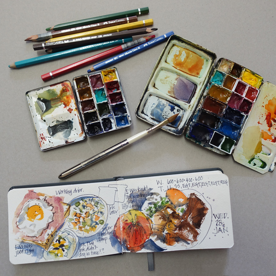
When I started my food diary in ThePerfectSketchbook it was essential to put together a small compact kit that I could bundle up with the book so it was convenient to have with me wherever I found myself eating. My first thought was my little palette which contains 14 colours in half pans. Halfway through the first day I realized that this wasn’t going to work for two reasons: not enough mixing area and not enough in-between colours to reduce the amount of mixing required. The most important aspect of keeping a food diary is SPEED not how compact the kit is. So I decided that I needed to ADD colours to my standard kit no reduce them. Eating food hot is essential to a sketching diet – it is all about a joyful and colourful celebration of healthy food in moderation – not a stressful deprivation.
So I started thinking about what colours I would use the most of while painting food, how this would be different from my normal subject matter and subsequently what was lacking in my palette.
The answer – lots of orange (carrots, oranges, peaches, pumpkin) lots of bright greens (all manner of veggies!) creams (NOT for cream as in scones, but pasta, rice, pears, chicken etc) and bread colour.
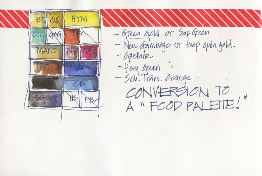
You can see above the page I did working through these choices. I have swapped two blues for greens (one vibrant green, one dark perylene green), changed my one ‘Australian’ green for Goethite (perfect for bread and other wheat-related foods) and split my dark transparent pyrrol orange (which BTW it is perfect for tomatoes!) so I could include a pure mid orange (a favourite colour of mine Schminke Transparent Orange).
 Amazing how easy this decision was to make and how neatly I was able to make the change. My big question was which green to use for the vibrant green. I also wanted to test out a few mixes for the goethite and orange. And if you are wondering, the red striped tape is hiding a bad heading with a spelling mistake!

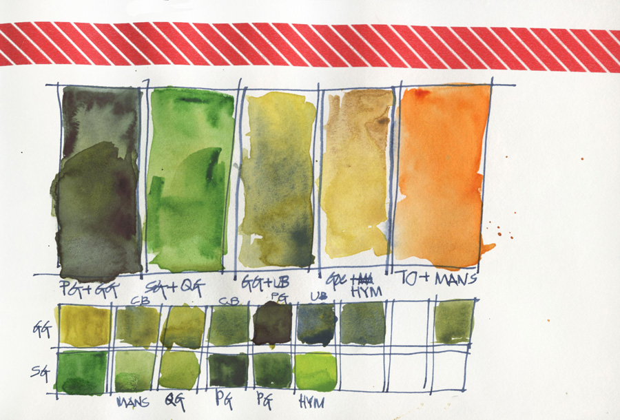
I only had a half-used tube of WN Permanent Sap Green which is way too bright, so after talking to Jane Blundell (as I LOVE to do with any colour related stuff – talk about peas in a pod!) I added a touch of burnt sienna to ‘knock it back a little’. She did happen to mention that the DS Sap Green was beautiful and usable straight out of the tube. So guess what? Yesterday while visiting the Art Scene(my local art store), I weakened and bought a tube I haven’t bought a new paint colour for ages!!!! I also remembered I had a some DS Pthalo Green (yellow shade) in my pocket palette so did a test with that as well. This page, showing my green bottles and tea tin, is more of a color mixing chart than a serious attempt at a sketch.
I prefer to mix my greens and would always prefer to have a blue rather than a green since blue is more versatile for mixing. The bright sap green replaces Pthalo Blue(red) which I use to mix my bright greens and the dark perylene green replaces Indanthrone Blue which I use to mix my dark greens. So it is a very logical and neat swap.
BTW this is my second palette, the one that stays at home in my comfy chair studio location, so I still have my standard palette intact and functioning for my normal stuff. Please refer to the Current Sketching Tools page before asking me questions about my normal kit.
It feels very weird to have so much green in my kit but it is not a permanent change – I don’t think! After making this radical decision I recalled reading lately that my great friend and amazing watercolorist Shari Blaukopf – a total triad champion – has started using tube green. Her mention of Naples Yellow in this recent post reminded me of the colour and I just might end up sneaking it into the palette as well.
IMPORTANT NOTE: Please don’t take any of these paint selections as final and please don’t rush out and buy any of these selections… yet!!! I know some of my readers are total art supplies junkies – so please give me a change to test these decisions first before spending any of your money! I am in pure experimentation mode and already have plans to make a few more minor tweaks… maybe, perhaps! Who knows? What I wanted to share with you in this blog post is the thought process behind my changes!
I am excited about the slight adjustment in my colour palette and the different colour schemes I will explore. I mean, how out of character is that green page above???
Oops, I am raving about colour! I will stop now!
Tomorrow’s post will be about my initial thoughts about ThePerfectSketchbook and finally sharing my first sketching diet pages.
LOVING the sketching diet and the sketchbook so far.
Subscribe to my mailing list for my monthly newsletters including first notification of my new SketchingNow Online Sketching Courses and face-to-face workshops.


7 Comments
Really interested to hear your thoughts on having a ready mixed green in your kit. I am trying to mix greens but often run out and the next lot is slightly different. Tempted to buy a DS green but was overwhelmed by the choices…. now I will wait for your conclusion. As a newbie it is so tempting to buy new colours all the time rather than getting to know the colours I have. Great post and much appreciated.
I have seen how an artist's palette is affected by geography and season. I hadn't thought about theme, which is more in one's control.
I like Daniel Smith Sap Green also. I often use it out of the tube as well.
Looking good Liz 🙂
Since my plein air palette has five greens in it – three single pigment and two mixed – I am obviously in favour of convenience greens if you know what went into them to keep colour harmony in a painting. My favourites are Phthalo green BS (essential mixer), Perylene Green (wonderful convenient dark shadow green), Undersea Green (Aussie gum trees in a tube made from Quin gold and Ultramarine), Sap green (convenience Phthalo green + Quin Gold for MANY botanical studies) and Rich Green Gold (PY129) which just gives that glow of sunlight at the top of trees.
But then there is that stunning Green apatite geniune that I also add to some paintings. It's all about having fun and enjoying the pigments, not having lots of rules 🙂
It was interesting to read this article.The idea of looking at the food stuff and choosing corresponding colour is great one.
Thanks
Hello, Liz – I’m brand new to watercolor (actually, i’m brand new to art of any kind) and working hard to develop a palette. My husband is a veggie farmer so discovering this post is fortuitous. However, i can’t full determine what your final paint choices were for your Veggie Palette. Can you help me? Thank you – for this and so many of your posts.
Oh Liz, I got this figured out – the PBr really threw me (kept thinking it was a pigment abbreviation) as did the GAG, which i now realise is Green Apatite Genuine.
PLEASE don’t bother to post my submission as i’m now all set.
Best, -karen.
NEWSLETTER
Subscribe for first notification of workshop + online classes and more.