Last week I started exclusively using the art supplies that were included in my Colour4Life box sent to me by Faber Castell. (See here for more about the exciting box.)
I began with the materials that I was most familiar with – the Albrecht Durer watercolour pencils. But there is a catch! The colour selection is very different from what I normally use – lots of bright colours and no browns or greys!
And so last week I had the fun challenge of using a different colour scheme and it was interesting to see how much it initially threw me!
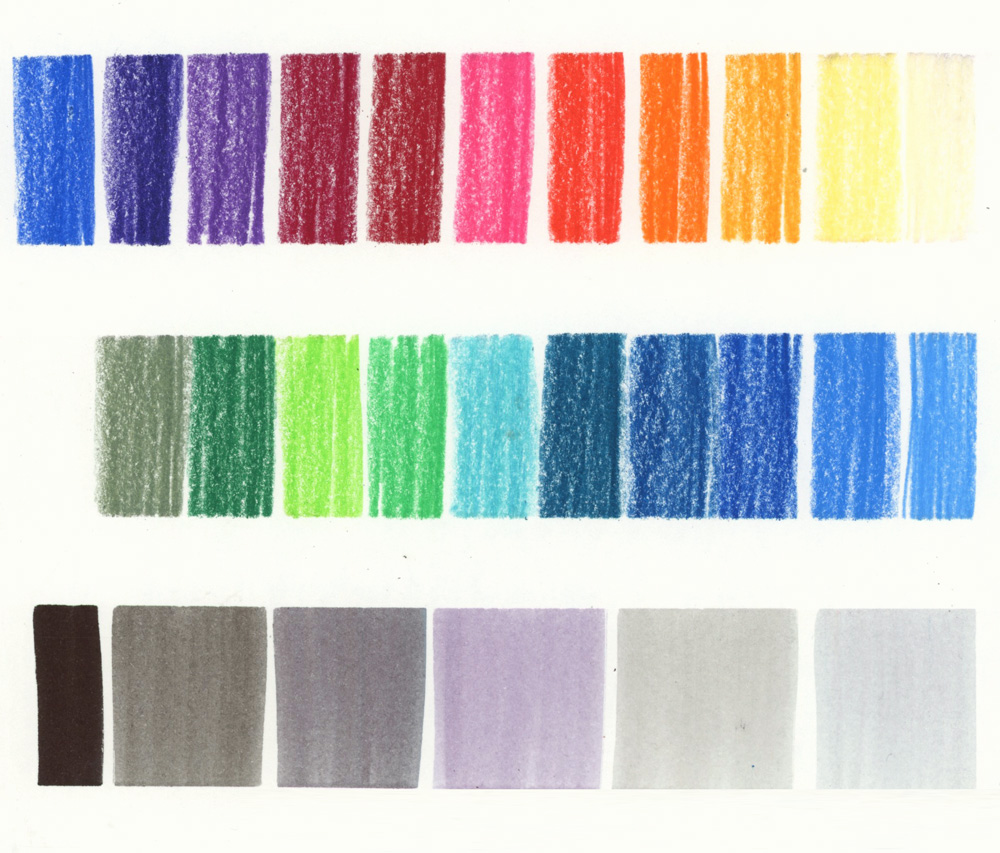
Here are the WCP colours that I was using and I also decided to combine them with the greyscale set of 6 GoldFaber Aqua Markers. So yes, I admit that the heading to this article is somewhat misleading as I do have some greys in my kit! 🙂
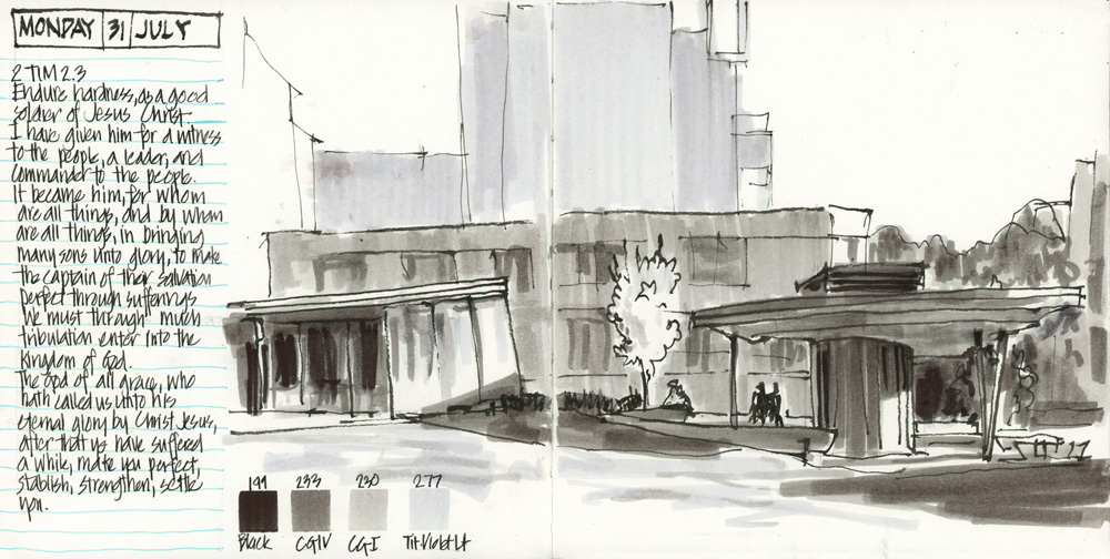
I started the week thinking I would use the markers for a grey-scale version of this standard view of the Village Green. I wasn’t sure how I would use the bright-coloured WCPs so I chickened out and did this value sketch!
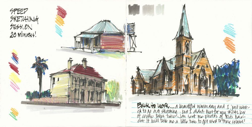
That night I decided to do some experiments using the WCPs with some markers. I set a timer for 20 minutes and then did a few quick sketches of some regional NSW buildings from photos (buildings in Bathurst, Sofala and Temora) to see how I would go without any brown, grey or nice green WCPs. This was a lot of fun but I wasn’t totally happy with some of the results.
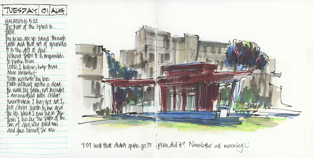
So the next day I tried a similar technique for my usual Village Green sketch… and it did not go to plan! It was a bit too dull.
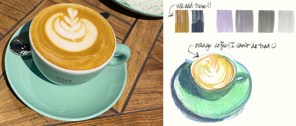
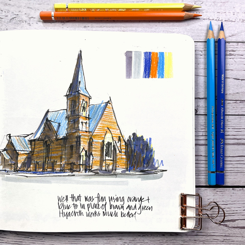
A few hours later I stopped in a cafe at Chatswood and decided it was time to start using the bright colours but I didn’t really want to do an orange coffee!
Now I know that I could probably mix a few different colours and achieve a close enough match but I prefer to use watercolour pencils without much layering. So I decided that I would add a Brown Ochre and a Dark Indigo pencil (my two favourite Albrecht Durer colours) to my kit for occasions when I really felt I needed them. Ah! cheating already on Day 2! 🙂
I also thought that it would be good to use the two purple greys in the marker set rather than the cold greys which I thought was making my sketches a little dull (despite the bright WCPs!)
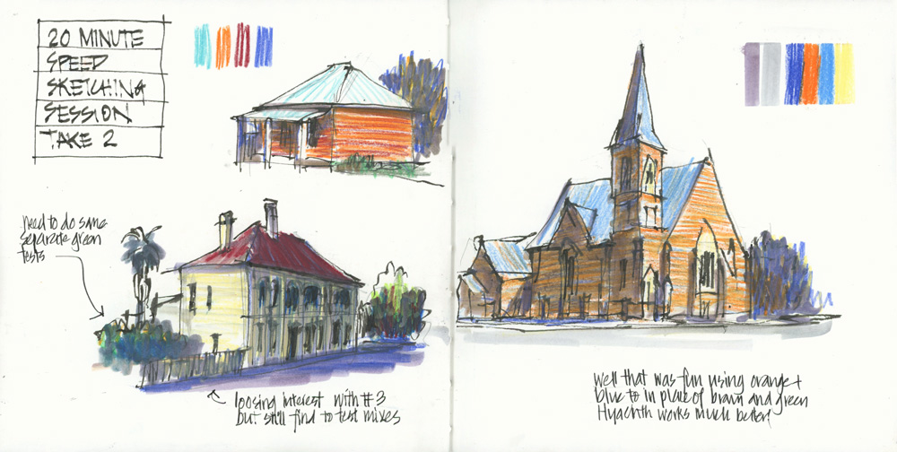
So I redid the ‘Speed Sketching Session’ of the previous evening using these purple greys. I was happier with these versions and felt as if I was actually getting a feel for these new colours!
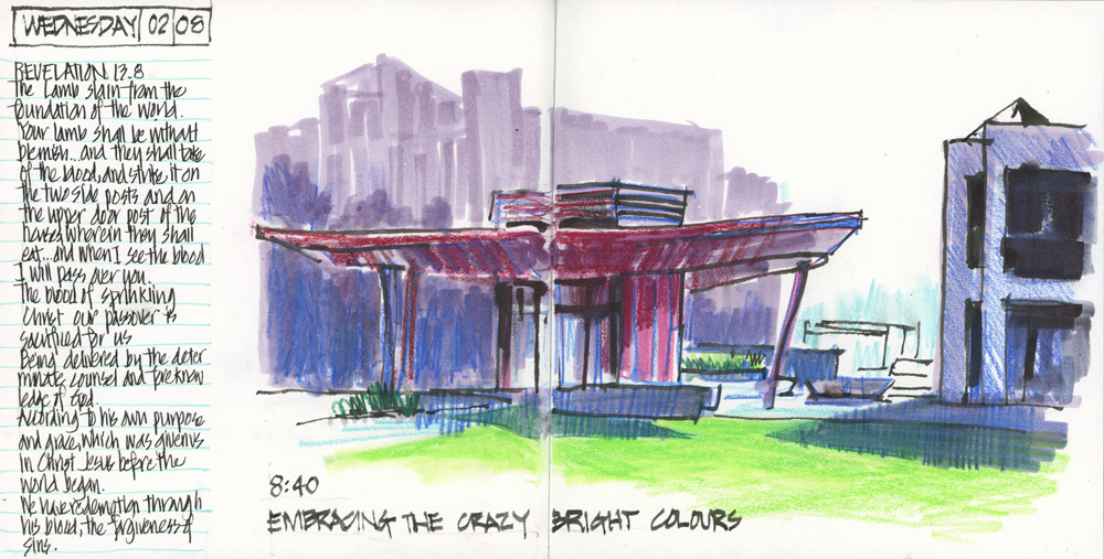
The next morning I decided to just use the bright colours and see what happened. The result was a colour scheme that is very out of character but xzI really enjoyed doing this sketch – including using that wild artificial green!
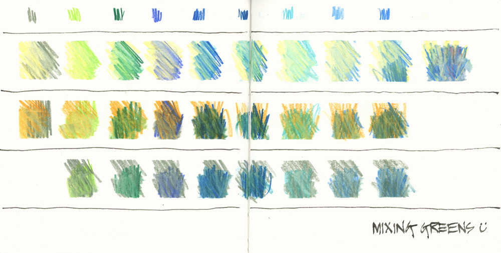
The greens in the set include Earth Green (a lovely muted green that I do actually include in my normal set of WCPs) plus light green and dark phthalo green (which are super bright greens that I would never touch!) So the next task was to explore how to mix some useful greens. I don’t have a normal yellow in the set (just Cream and Dark Chrome Yellow) so that is also a little limiting.
If you can’t already tell… I was really starting to enjoy this challenge of working with a new selection of colours.
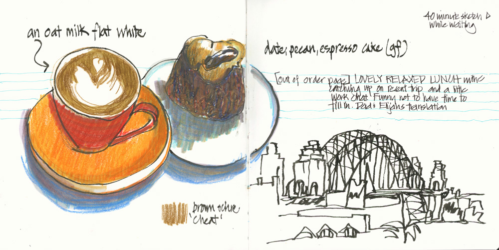
Another cafe visit and I cheated by using the Brown Ochre for the coffee and also for the cake. I’ve got no idea how I made the dark brown cake but I like the result.
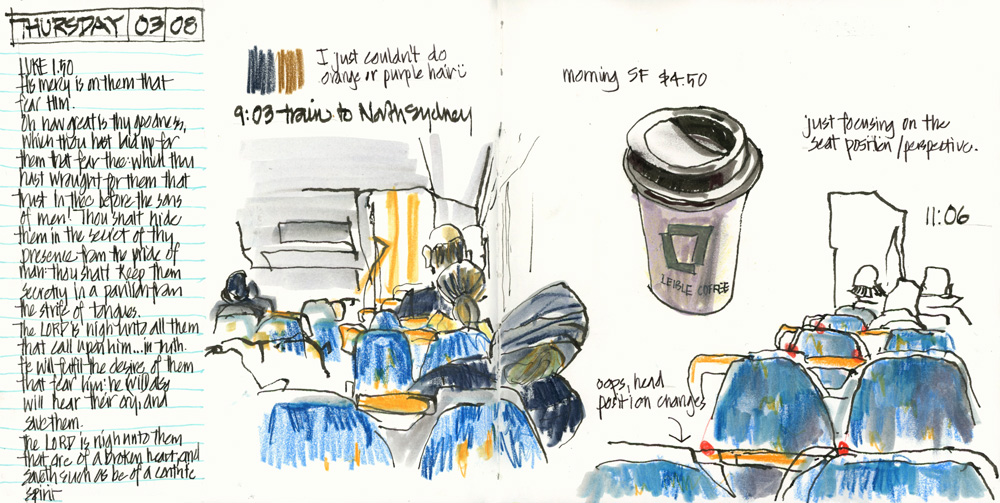
My goal is to use the Colour4Life colour selection as often as possible and only use my 2 cheat colours if I absolutely have to! Sketching on the train and looking at people mostly wearing black was one such occasion! As my note says “I just couldn’t do orange or purple hair.” 🙂
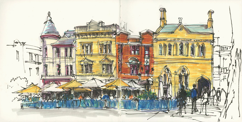
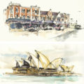
The last sketch in this article (George St in The Rocks) was a bit of an achievement as I only used the Colour4Life colours. I used yellow (Cream and Dark Chrome Yellow) for the sandstone buildings and mostly orange for the brick building (Orange Glaze plus some Dark Red).
It’s been really fun to use a selection of colours that I would never have chosen in the past week. But I will admit that I’m relying on the grey GoldFaber Aqua Markers to help tone down the bright WCPs.
I was a little thrown initially without my beloved browns and greys! It made me realise how strong my sense of colour is – knowing what type of hues I feel comfortable with. Whenever I start using new materials I always try to find colours that closely match what I’m used to so that I don’t have to reinvent the wheel. This week I knew the materials but not the colours so that was a really fun change.
Finally – just a reminder for those of you in Australia of Faber Castell’s Colour4Life competition – find out more here.


11 Comments
I often use a limited palette of just a primary triad or secondary triad. When using the latter, I often mix orange + purple or orange + green to get very useful browns!
Hi TIna,
Yes I can get a brown out of orange and purple from this set but its not a brown that I like to use. 🙂 It seems that when I use coloured pencils or WCPs I like using the colours without too much mixing/layering and like pastel hues!
I like your last sketch in this post and its color composition so much!!
Looking at it brings up a distant memory, an atmosphere, a feeling… sweet nostalgia… Thanks, for that, Liz 🙂
Colors and light can be like scents sometimes,… so strongly linked to memories.
Thanks Susanne!
IMO, gotta have a brown. In pencils it just doesn’t quite work to sketch with mixing the colors like it does in wet paint. I would lose two of the blues (this from someone who sketches rivers and the Pacific all the time) and give me two browns or a brown and grey or white.
I am most curious about the Matte graphite. Is it more like a pastel? Or have they actually made a matte graphite. Having used pencils all my life as an architect these are very interesting.
Yes, there is a “Pitt Graphite Matt” 2B that I got included in a sample box of Faber-Castell art materials. I tested it next to a regular old pencil and it does not have that sheen (which I had never even noticed before).
Hi Kate – yes ideally I would have brown but this was a fun challenge not to have any!
my first thoughts on the pencils are here https://www.lizsteel.com/faber-castell-graphite-pencils/
I live these experiments! Are the black lines ink? You don’t mention them anywhere, but I’m guessing those were your initial sketch?
Hi Susan – yes the black lines are De Atramentis Document INk in my 55 degree Fude de Mannen fountain pen
What a massive color challenge! I’ll bet you are learning so much and having so much fun! That last sketch really looks like your usual colors, rather than the brights you used to create it!
Hi Jamie – yes it was a fun challenge and it is good to see how I could combine colours to achieve results similar to my usual colour choices!
NEWSLETTER
Subscribe for first notification of workshop + online classes and more.