If you haven’t already heard, I’m hosting a Live Version of my Sketchbook Design in the New Year (starting on 4th January).
We’ll be working through the lessons over 9 weeks and I’ll be hosting 6 bonus livestreams where we’ll go through the concepts together. You’ll be able to ask me questions and watch additional demos and reviews of work from the classroom.
(Note: If you have purchased the course previously you can join this Live Version of the course for free – simply go to the Sketchbook Design classroom or look out for an email from me later this week).
I’m super excited to be going through this course again as it’s always very inspirational. I get SO many ideas from the incredible work posted in the classroom. I don’t know about you, but I can always do with new ideas when it comes to designing sketchbook pages.
As part of my prep for this Live Version, I recently did a quick review of all my everyday sketchbooks from this year and marked a few pages that I found interesting. And in the process, I ended up with a summary of my sketching throughout 2022.And this is what I’m sharing with you in this article.
I decided to combine them into pairs and post them together so they appear smaller than usual. This is intentional as the focus is on the design of the elements and not the individual sketches. If you want to see the sketches in more detail just click on the image to view it larger.
This collection doesn’t necessarily contain my ‘best’ sketches from the year. It’s simply the pages that jumped out at me as ‘interesting’ as I scrolled through all my scans.
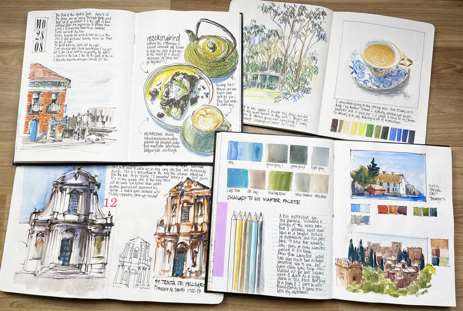
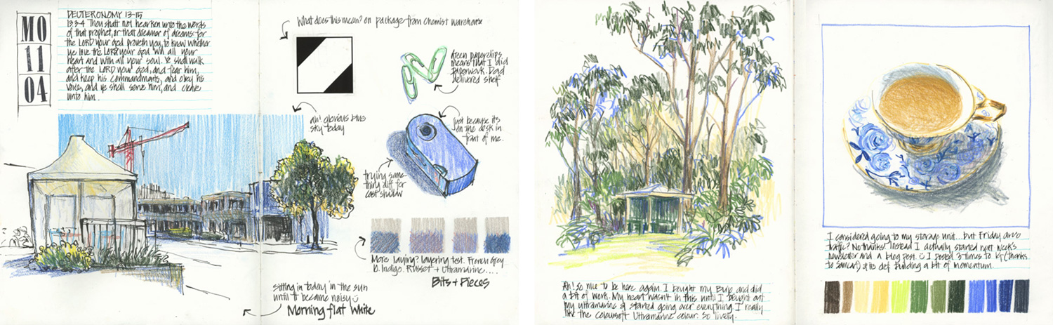
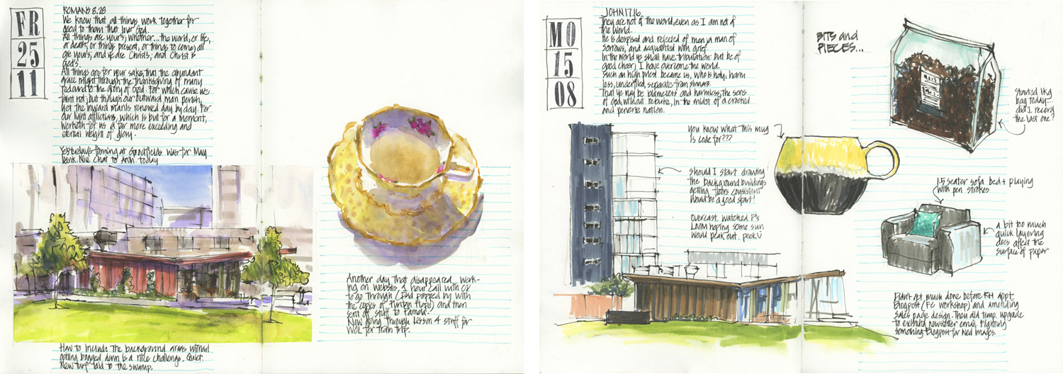
I started the year using a few different spiral books.
Sketching across the spiral doesn’t bother me but it did make me super aware of placing my sketch in the best way to suit the spiral.
Note: In some ways starting the year with a different type of sketchbooks than I normally use, established a theme of experimentation for the rest of the year.
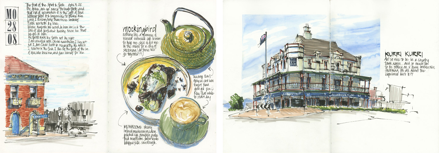
I was very happy to get back to my favourite format 8×10″ softcover Alpha and did a few pages with some crazy combos – enjoying the freedom to work across the gutter.
Note: the double-page spread on the right was done a few months later but is a good example of taking risks and experimenting with combining images.
And then I had my break from watercolour and started using coloured pencils. In terms of my page layouts, this period started another strong trend of the year – colour charts! 🙂
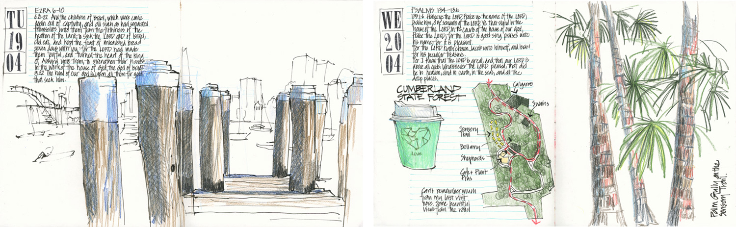
The ability to easily add colour when I was out and about led to a few different styles of layout – this is particularly true concerning the example on the left.
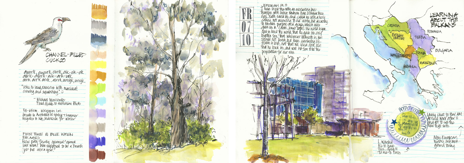
And ah! it’s always good to include a map!
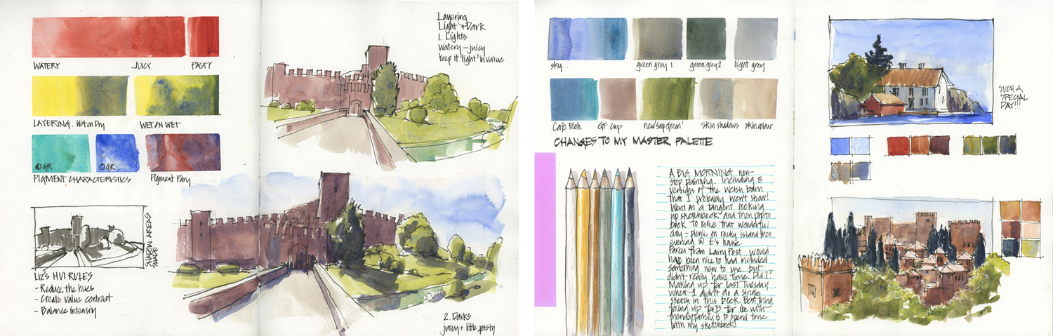
In June I went back to watercolour – both because of the 30×30 challenge (see below) and the Live Version of my Watercolour course. While doing the exercises from this course I realised that I like doing a number of smaller scenes on a double-page spread.
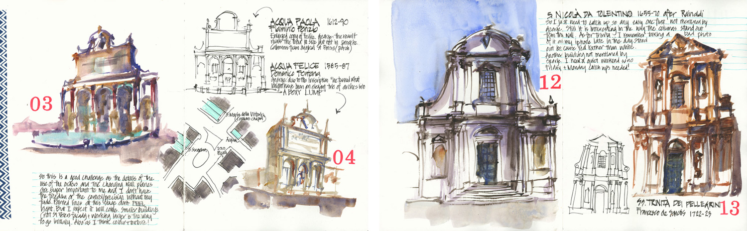
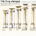
My 30×30 challenge of sketching Baroque buildings gave me the opportunity to do a number of spreads where I included secondary sketches. (One of the elements I explain inside Sketchbook Design.)
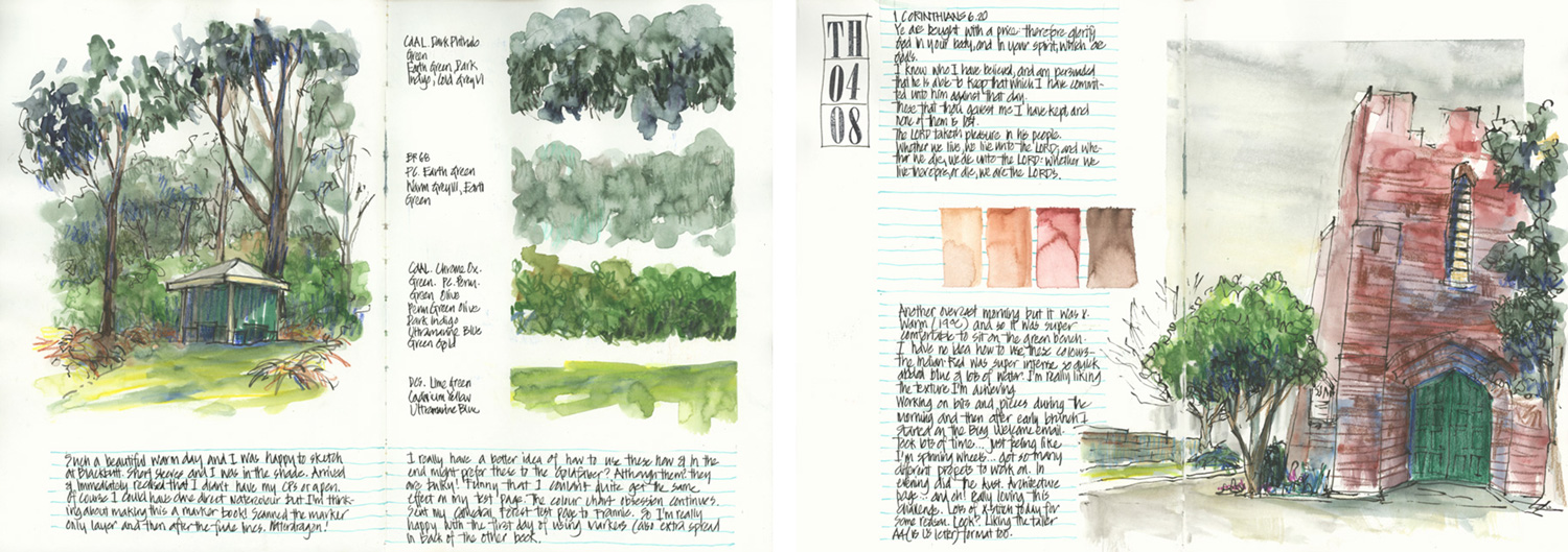
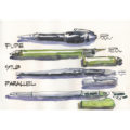
Starting to explore markers meant more colour swatches! In these two spreads, you can also see how I’m constantly mixing up contained compositions with more open or overlapping ones.
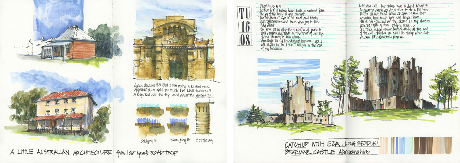
More pages made up of a number of smaller sketches – Australian architecture using Albrecht Durer Watercolour Markers and coloured pencils, and then Scottish architecture with Pitt Pens.
And even more colour swatches and tests! 🙂
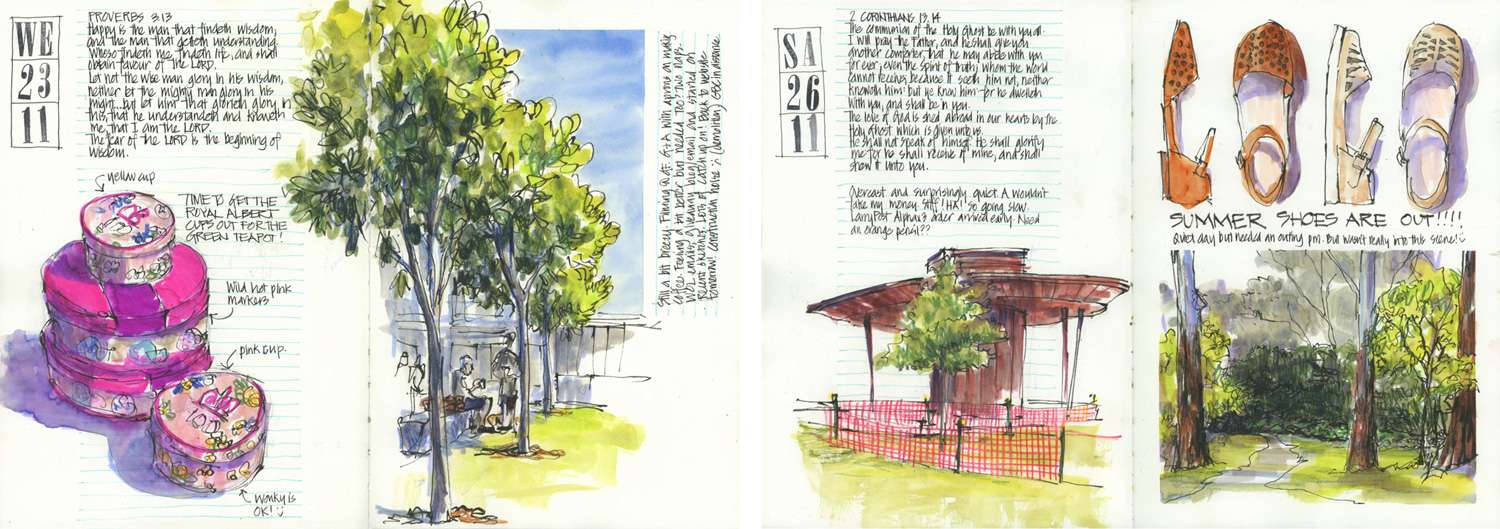
Another common design theme of my sketchbooks is exploring ways of balancing positive vs negative and letting the white space do lots of work.
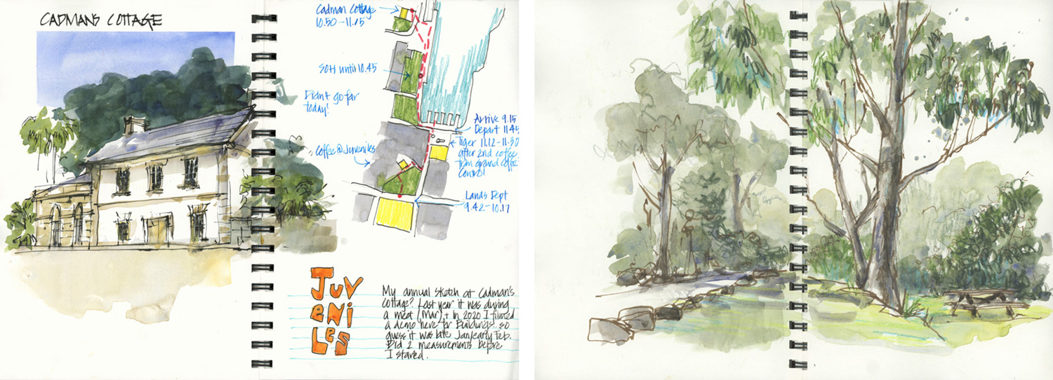
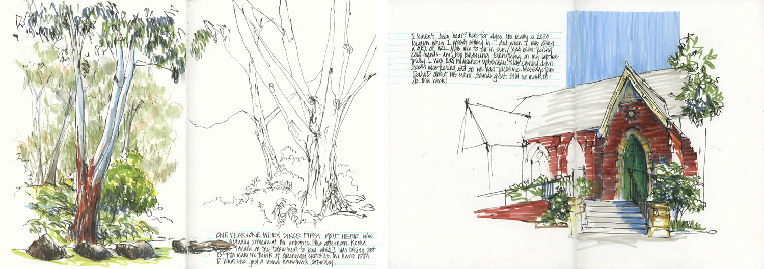
A challenge that I’ve had all year is working out how to create an interesting spread that incorporates my morning local sketch. Here are two spreads featuring the Spanish Mission building.
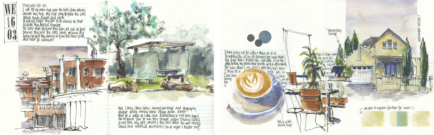
 And here are two spreads done of the Village Green.
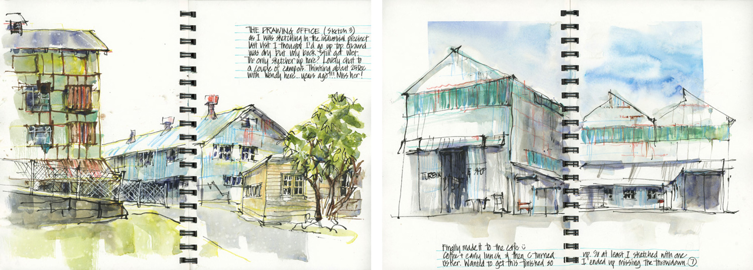
I like varying the design across spreads – multiple images with a vertical emphasis followed by a single image with more horizontality.

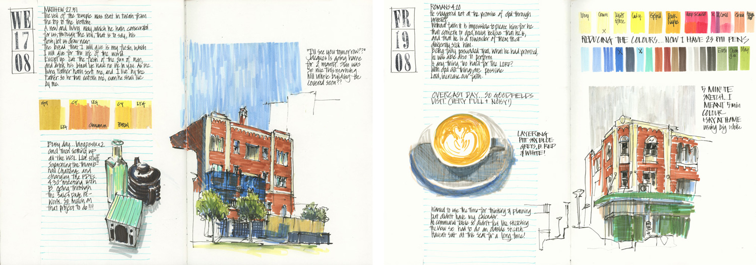
In the past few months, I’ve enjoyed incorporating exercises from my Watercolour On Location course. Here are two double-page spreads made up of numerous two-colour studies.
In the past few months I started using GoldFaber Aqua Markers with watercolour. This has led to some interesting colour combos.
 The last examples in this collection… two recent examples with vibrant colours and playing with open vs contained compositions.
Although it is just a quick collection that I put together, it’s been really interesting to do this review. One of the big realisations that I’ve had is that I like pages with multiple images and this explains my preference for using larger-size sketchbooks (A4 portrait Alpha hardcover is my current favourite).
And preparing this article has definitely made me even more excited to go through Sketchbook Design again! Will you be joining us?
Finally…
To celebrate the Live Version I’m making three Sketchbook Design Intro Lessons available for a limited time only (until 6th Jan 2023).
These cover the following topics:
- Why keep a sketchbook? (including some teacup demos!)
- Tips for architect’s handwriting
- How to choose a sketchbook
To get these free lessons all you have to do is sign up for them here.
I hope that you have enjoyed this little review of some of my sketchbook pages from 2022. It’s been a great year for my everyday sketching – so much experimentation and fun!
How has your sketching been this year? I would love to hear in the comment section below whether you have been satisfied or not!
(If you are reading this via email, please click on the article title link below and add a comment on my blog. Thanks!)


2 Comments
Whenever I haven’t sketched for a while, looking at your blog is all the inspiration I need to get back into it. I love that you still blog, it’s worth 100 art books, and all for free! It’s an amazing resource. Thank you!
Hi Sandra! Glad my blog can provide some inspiration for you!!!!
NEWSLETTER
Subscribe for first notification of workshop + online classes and more.