Last Thursday I decided to ask you a question “Why do you sketch?” and was blown away by the responses. If you missed it, I suggest you read through all the amazing comments here.
This week my question is much easier… perhaps!
It’s something I have been thinking about a lot lately as I prepare the lessons for my upcoming online course – SketchingNow Watercolour. I’ve been thinking about colour and how we all have such distinct personal preferences. So…
What is your favourite paint colour? or two … or five!
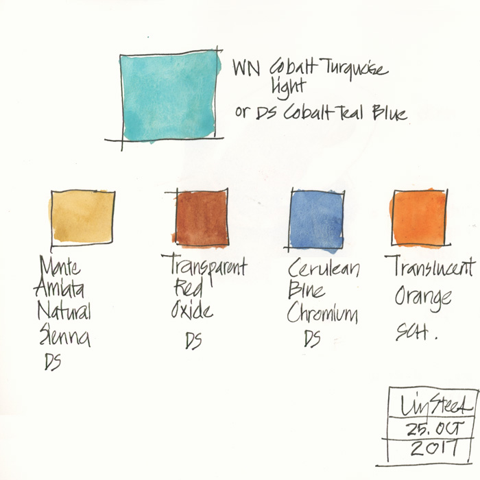
My favourite colour is turquoise and favourite watercolour paint is Winsor and Newton’s Cobalt Turquoise Light. (Daniel Smith’s version is called Colbalt Teal Blue)
Using this colour just makes me happy!
I have a few other paints that I adore:
DS Monte Amiata Natural Sienna – a gorgeous glowing earth yellow
DS Transparent Red Oxide – a wonderful crazy granulating transparent earth red
DS Cerulean Blue Chromium – a lovely blue which is also granulating and the colour of Australian blue skies
and last of all, a paint which I love but doesn’t make it into my sketching palette as I just don’t use it enough for it to justify a spot – Schmincke Translucent Orange
So now it is your turn!
You are allowed to list a maximum of five colours – ok?
( I can’t help wondering if there will be a few popular colours or whether it will be completely random.)


40 Comments
Where to start? So many colours I love! My current favourites are:
PG50, which I think is the same as Daniel Smith’s cobalt teal blue – every brand seems to have a different name for it
Pyrrole red – it’s so strong and transparent, you only need a touch of it. And actually PG50 and Pyrrole red mix beautifully – a touch of pyrrole red into PG 50 makes the colour of the Irish sea in the autumn!
Moonglow (Daniel Smith) – I’ve recently discovered this colour (thank you Marc Taro Holmes) – it granulates beautifully
And then, I’m going to cheat here, I love mixing ultramarine blue, vanadium yellow and PV19 (another one of those pigments that has many names – it’s a pinky red): I could paint for the rest of my life with just these three!
Are we allowed a second entry?
Marie-Hélène
totally!!! go for it Marie-Helene. I love your comment 🙂
Q gold by Daniel SMith
I have always liked orange or red as my favorite color, and Q gold fits that crittera and is a great mixer with other colors
Susan, if that’s your fave, you should know it’s been discontinued. I just got two tubes to last me a year or so. You might want to contact your paint store right away and get a few of the old one before they’re out and start carrying the new mix.
Ooohhh gosh, this is like saying pick your favorite child!! Lol!! Ok, well, I do love Sennelier’s Opera Pink. I’ve tried DS’s version not realizing how different colors can be! DS is so bright and not my style vs Sennelier’s which is so rich and deep. I love it!!
Hands down, cobalt blue and green gold. I am liking the M. Graham water colors , made in the USA .
Oh this is hard….but I’d say my favorite is DS Phthalo Turquoise with DS P049 Quinacridone Gold as a close second. Third favorite has to be DS Cascade Green – I just love what this pigment mix does when it moves on the paper – settling into lovely bits of green, blue and gold.
Hmmmm… well, I have to agree with you, Liz – I got W&N’s Cobalt Turquoise Light by mistake once, and it must have been fate because I fell in love with it at first sight. I makes me think of a light breeze, holidays and clear warm sea water! Mixed with Viridian (NOT one of my favourite colours, but of course good
for mixing) it’s intoxicating! I also love W&N Manganese Blue, a sort of 1950’s kitchen-blue. And their Aureolin yellow makes my heart sing. Oh, and just about all the Violets…sneaking in a few extra there under one umbrella. Better go before I think of more…Permanent Rose…
Daniel Smith Imperial Purple!
Daniel smith Quinacrodone Gold
Can’t live without them!!
For years , my favourites ….Prussian Blue and Naples Yellow…usually Daniel Smith.
Agree with you there, Pam – they make such lovely mixes! Have you tried a dash of Perylene Maroon with these two? It’s to die for!
I don’t have a favorite color… That really changes as I love most of them, as long as they are not muddy.
Favorite PAINT colors: DS Primatek Amazonite leads for sheer beauty… I could dive into that color (which is what it reminds me of — ocean swimming)… water water everywhere!
Again, for sheer beauty is DS Primatek Serpentine. And what it does on paper is unpredictable and stunning. Love it for deity paintings.
I tend to love the Quins. Quin Gold is a favorite to paint with, amazingly versatile, and I have it in every paint company because it is my test paint — so my favorite brands are Holbein (soft and makes amazing skin tones) and Da Vinci’s and DS’s Aussie Gold (because come on, they tweak a pigment 2 degrees and call it a new color!)
Prussian Blue, and I prefer Holbein’s. Again, DS is a bit harsh. Mix that with Lapis and what a sky!
DS Quinophthalone Yellow is the best yellow ever. Hands down.
Da Vinci is a new brand for me and I’ve fallen in love with their Rose Dore. It made it into my travel pallette!
A paint that was my favorite and DS decided to stop making it (and I hold it against them) is Caput Mortem. I’ve tried other brands and not even close to the same color…. Breaks my heart, as it was such a useful paint color in the city for mixing and for skin tones. MUCH better than Potter’s pink, which I have tired and am very meh about.
OOPS, broke the rule and went further. Oh Well. Artists break rules!
Nickel Azo Yellow
Cobalt Blue
Translucent Pyrrol Orange (DS and QoR)
Bloodstone (DS)
Green Apatitie
Yes, Laurie, how could I forget Nickel Azo Yellow and Green Apatite. Love them for mixing with just about everything!!
Putting in commas this time, because Bloglovin took out all the returns:
Nickel Azo Yellow, Cobalt Blue, Translucent Pyrrol Orange (DS and QoR), Bloodstone (DS), Green Apatitie (DS)
Easy! Sepia and Payne’s gray. I can’t do anything without them!
My answer is “It depends…..” on the brand, my mood, the season, the subject, and so on! I love mixing my colors and stick with mostly transparent primary hues. Of course, I’ve tried a few other pigments in my mixes and now keep quinacridone gold, quinacridone burnt orange, and cobalt turquoise on my palette.
I don’t own it yet; but, my favorite color, if I went by website images would be DS Sleeping Beauty Turquoise. This would come the closest to representing my birthstone since it is actually made from turquoise. When I look at other art that I have made over the past years, I see that I have used quite a few blues and greens and yellows. I am drawn towards cooler colors during the hot months of summer and warmer colors during the cold months of winter.
I love DS blues–all of them I’ve tried are just great. Blue is my favorite color. I’d probably have to pick DS Cerulean Blue chromium! I also love DS Goethite. I use it for so many things.
I think there is a difference between ones favourite colour and their most used colour.
My favourite: Green Gold (DS)
My most used: Quin. Gold (DS)
Its so hard to narrow it down to one 🙂 my two favourite brands of watercolour are for sure Daniel Smith for the beautiful colour selection and Schmincke for the granulation of their colours.
My favourites are two I picked up from your palette – the Cobalt Turquoise Light (essential for the lagoons at Norfolk and Lord Howe Islands, and the breaking surf on sandy coastal beaches), and Potters Pink – the basis of rust strokes on characterful detritus and old corrugated iron. My most used though is Neutral Tint (i.e. have to refill most often) – I mix it into so many other colours for shadows, windows and shopfronts, variations in foliage, tree trunks, driftwood, old fence posts.
It would be interesting if you could nominate the key uses for your favourites Liz.
Diox violet, quin burnt orange, new gamboge, azo green, indanthrene blue. This list will likely change tomorrow. You know how it goes…
WN Cobalt Blue Deep. Love the gorgeous purples and mauves I can mix with it. DS Q. Gold of course, DS Indanthrene Blue seems to sneak into a lot of my mixes and I’m renewing a previous love with Yellow Ochre. The of course there are so many other luscious colours. Such a difficult choice.
Jackson Blue and Opera Pink, by Paul Jackson. Naples Yellow (because it’s so useful) and Shadow Violet (because it granulates so intriguingly) from Daniel Smith. Leaf Green by Holbein (it’s electric!) and I like their Burnt Sienna, too. And Graham’s Ultramarine and Cobalt blues.
WN Cobalt Turquiose Light (after a recent artist in residency at Broome)
DS Moonglow
DS Quinachrome Deep Gold
DS Paynes Grey
DS Naples Yellow
to name but a few….. and no doubt will change as needs must
Learned from Liz: DS Cerulean Blue Chromium and WN Potters Pink—I adore the mixes these make! CBC dropped into clear water creates lovely California skies. Learned from Jane Blundell: DS Pyrrol Crimson and DS Phthalo Green Blue Shade. These mix to make gorgeous darks, grays, and shading tones. One more favorite (out of so many): WN Permanent Rose PV19–simply sublime for so many flower tones.
Payne’s grey is my go to in a pinch. I love the shades Quin Gold with various amounts of water. Who can resist Quin Rose? Transparent Red Oxide is like is soulful. Cobalt turquoise makes me smile but I have yet to use it appropriately…too much enthusiasm 🙂
I am a Paynes Grey addict too ( the Winsor&Newton professional one) :)!
I love almost all granulating colours but I had had to choose the one I think it’d be cobalt violet.
My desert island colors would probably be ultramarine and burnt sienna by Daniel Smith and of those two, the burnt sienna would be number one. I love earth tones, since for me, they can stand in for every color of the rainbow . . .
If you have not already done so, you owe it to yourself to try Schmincke’s Cobalt Cerulean (PB36) and Maroon Brown (a gorgeous equivalent to Burnt Sienna PBr7).
My goodness — thank you! I appreciate the recommendation!
I really love my quartet of dark transparents: W&N Perylene Red, W&N Perylene Green, W&N or DS Indothrone Blue, and DS Raw Umber (dark yellow). I love using these to paint the darker parts of middle distance, or a touch of dark in a bright area. And they are great mixers too if I want to darken a colour without losing saturation.
A couple of months ago I started to use schmincke translucent orange instead of burnt sienna type colors to mix with ultramarine in my limited palette. Since then my burnt sienna pbr7 and pr101 colors are dried in the pans haha. I also find it amazing for mixing greens mixed with phthalos.
I know what you mean about Cobalt Turquoise Light (WN). Wonderful for mixing light greens. I tried to make up a 24 palette of only Daniel Smith colors, but I couldn’t, because I need Cobalt Turquoise Light (WN). I also love DS Indanthrene blue, WN Sepia and WN Paynes grey. My favorit color in the whole world though is WN Transparent orange. It´s very hard to come by, because it´s in a limited edition. But it´s just the most beautiful color ever. It makes me so happy. DS Transparent pyrrol orange is really OK though.
loving reading all your favourite colours! thanks for sharing!
Oh, this is hard but in 2020, my favorites are Quin Burnt Orange, Serpentine, Anthroquinoid Red, Quin Deep Gold, Verditer Blue
Thanks for sharing Sandy – some non-standard colours in that list. 🙂
Liz- Lately I am enamored with Daniel Smith’s Primatek colors. I like my watercolor with a little dirt in it! ?
NEWSLETTER
Subscribe for first notification of workshop + online classes and more.